Platinum Winner of the International Architecture & Design Awards 2024
ETERNO
Brand and Corporate Identity Design
Completed / Professional Category

Architect / Designer:
Kim Sunghoon
Studio:
hej
Design Team:
Kim Sunghoon / Creative Director
Kim Sunghoon / Design
park Sohyun / Contents Director
Country:
Korea, Republic of
ETERNO is a leading residential brand in Korea. ETERNO Cheongdam began in 2020 in Cheongdam-dong, Korea’s representative rich village. It is the first design work in Asia by Spanish master Rafael Moneo, who won the Pritzker Prize, a Nobel Prize in architecture, and you can feel the class of high-end residential spaces only allowed for 29 households.
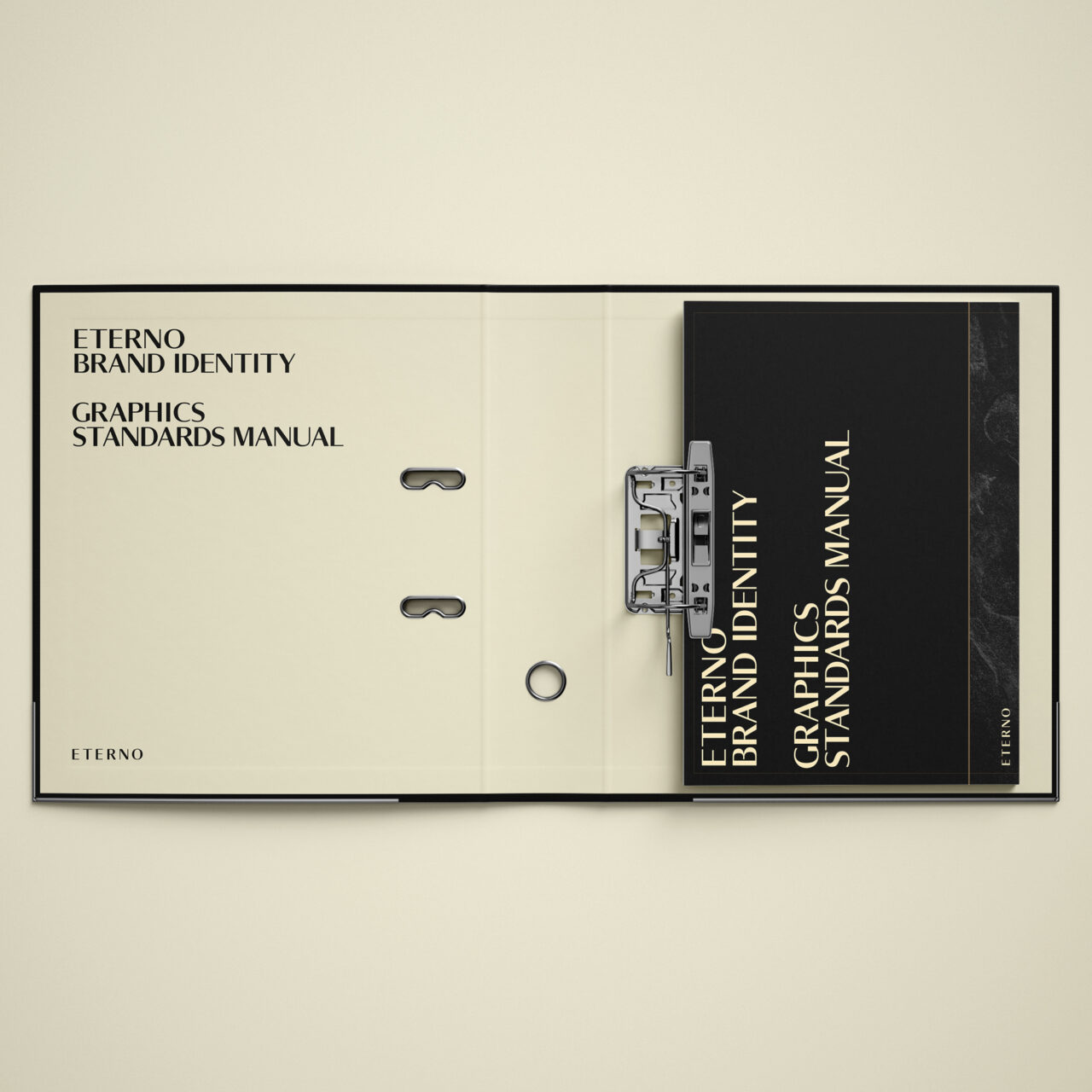
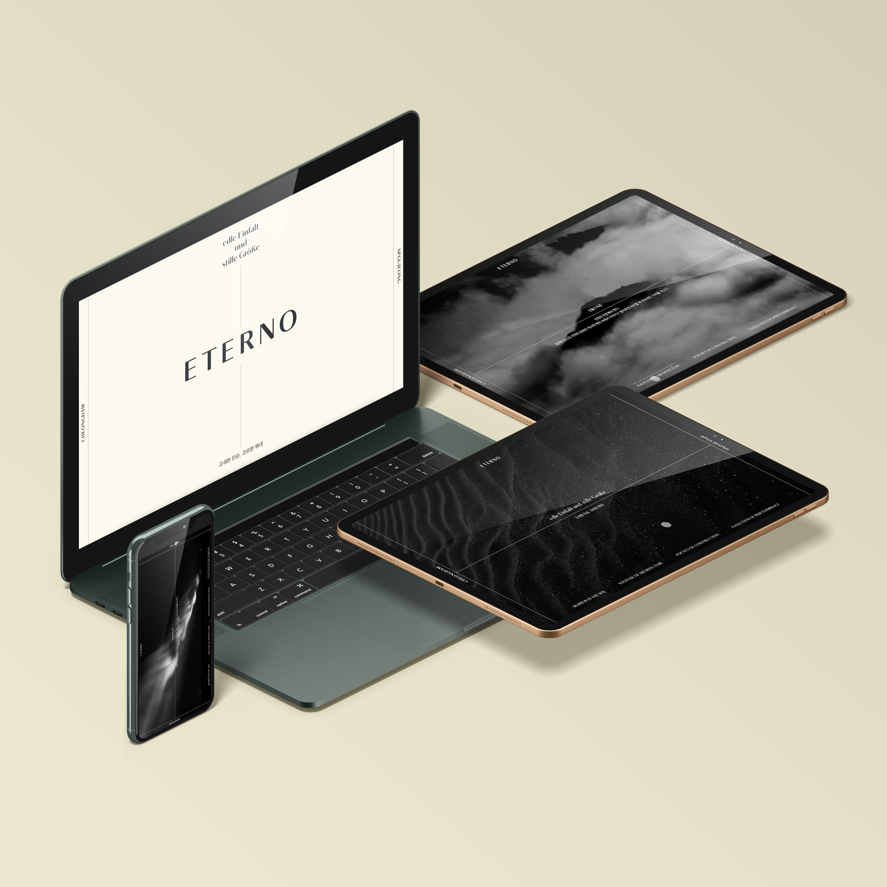
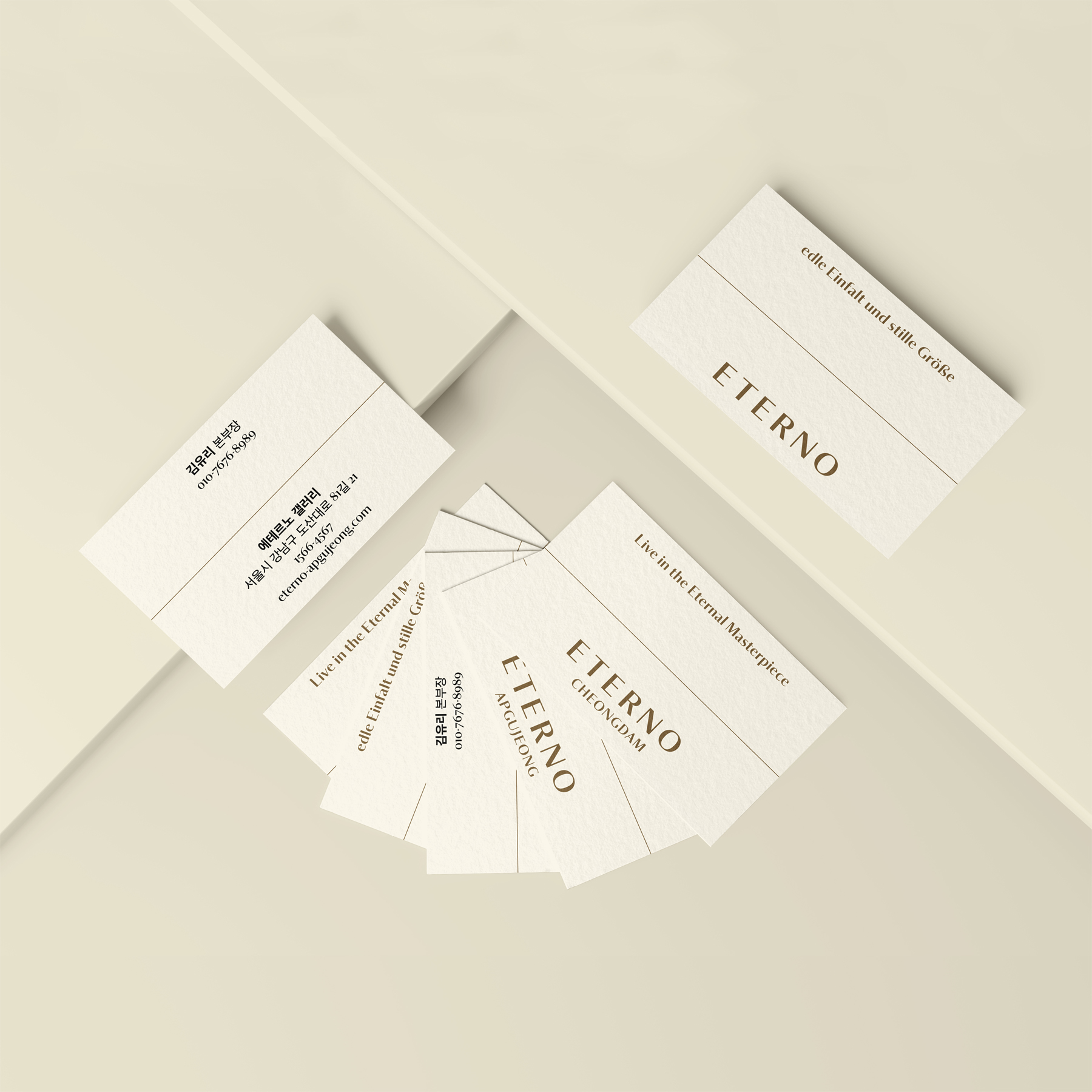
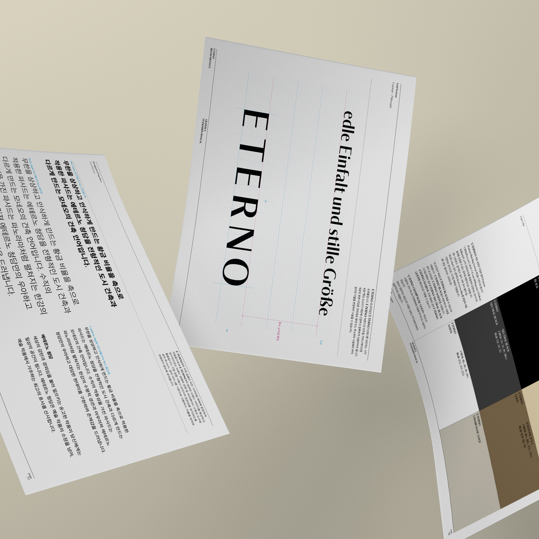
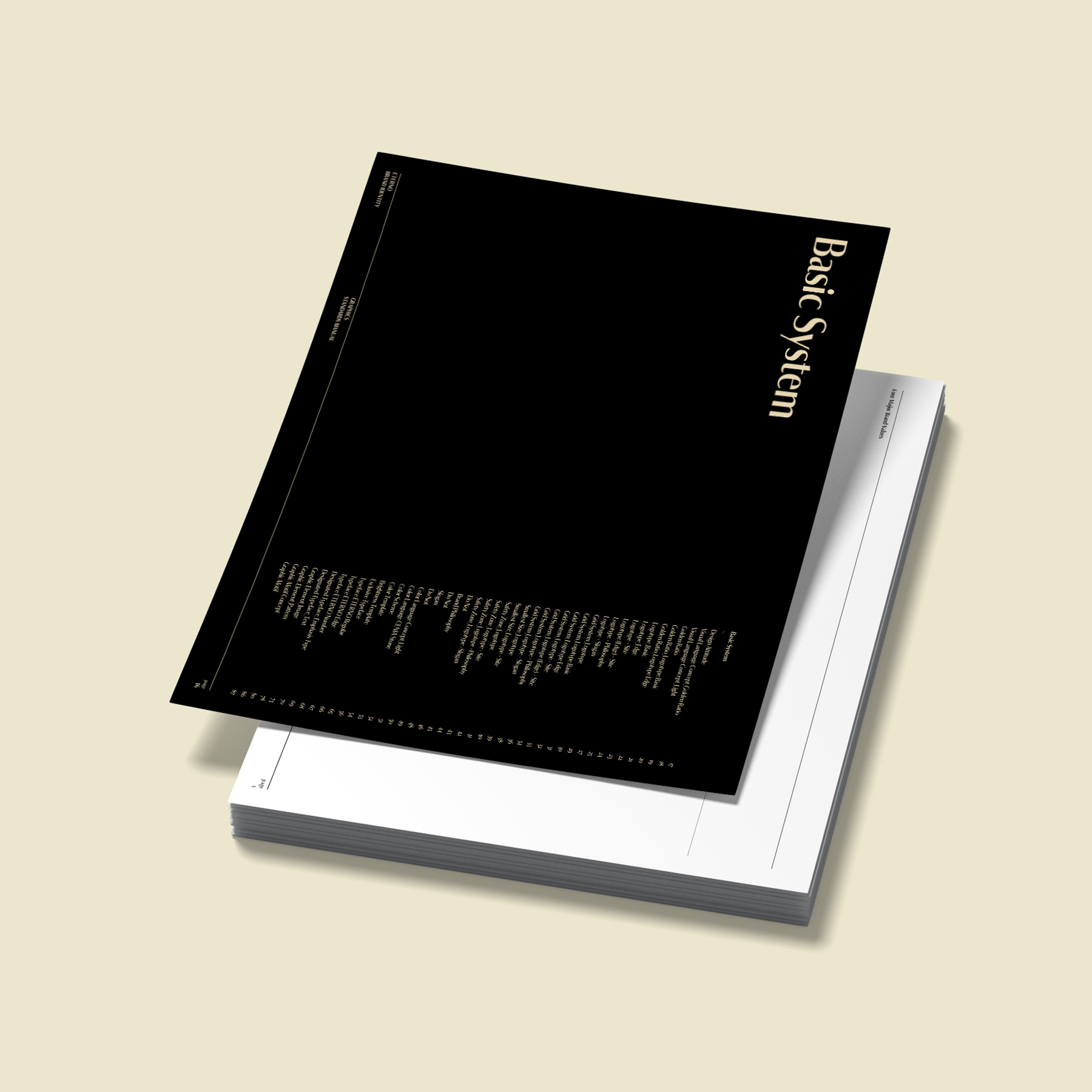
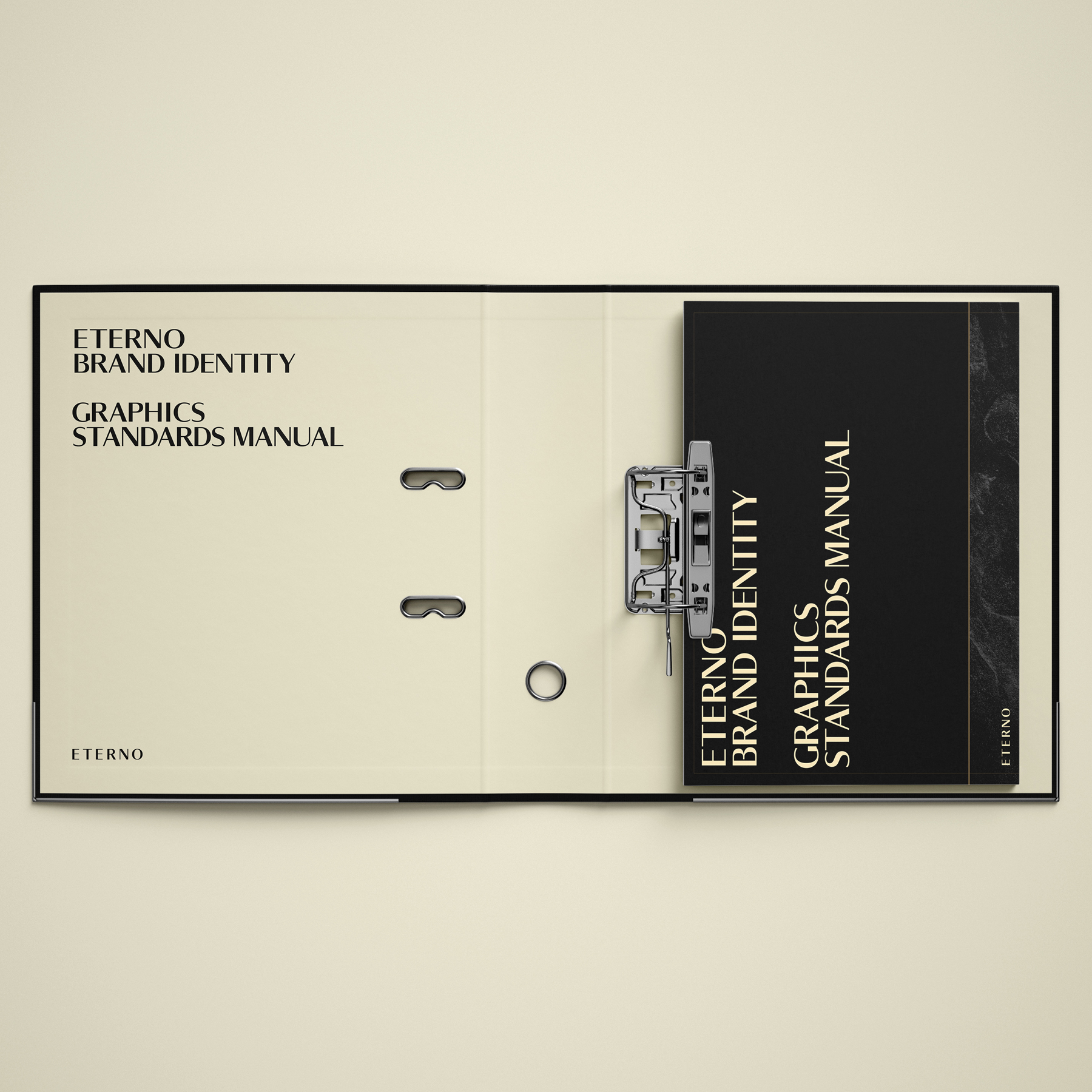
We designed ETERNO’s brand, which leads Korea’s top-notch residential culture. In order to become the first residential space and a leading brand in residential culture in Asia by Rafael Moneo, a world-class architect, in Cheongdam, a representative Korean rich village, we designed ETERNO’s brand by setting the direction of the brand and establishing a brand philosophy based on architectural works. The Greek Parthenon and the Golden Ratio, ETERNO’s architectural concepts, were directly inspired. By extracting the words “light” and “proportionality,” we were able to design the logotype by creating the basic form of the first letter “E” of ETERNO by using the golden ratio of 1:1.618 as a design element. ETERNO’s Roman alphabet was completed based on the completed logotype using the proportionality of the golden ratio. Since the golden ratio of the Parthenon is ETERNO’s architectural concept, ETERNO’s brand design also focused on the Parthenon and the golden ratio. The design of the logotype was thoroughly designed in accordance with the golden ratio, and all design results derived from this were expanded while maintaining the same concept. The golden ratio of 1:1.618 created from the golden ratio became the key ingredients in the design. With the birth of ETERNO, Korea’s best residential brand, we aim to lead a new residential culture. ETERNO Cheongdam, the first model where the ETERNO brand will be realized, ETERNO Apgujeong, which will be introduced as the second model in Apgujeong, another wealthy village in Seoul, and ETERNO’s brand to be introduced elsewhere, systematically organizing the value of the ETERNO brand. We would like to establish. This will be an opportunity for ETERNO to establish itself as a unique brand. ETERNO is a brand leading Korea’s high-end residential culture. Through timeless beauty, ETERNO pursues permanence that encompasses not only the artistic value of space but also the experiential value of time. We hope that every moment and every experience at ETERNO, built with a solid sense, will make each person’s life unique. Since this is a brand design project that announces the beginning of the ETERNO brand, the most important goal and starting point was to organize the concept of the ETERNO brand. The brand direction had to be defined based on ETERNO’s brand assets, including its celebrities, attitude, relationships, and good-looking and written language. We wanted to come up with a plan to unify the team that had become famous. We designed ETERNO’s unique brand environment based on an integrated branding strategy.
hej
Brand Design Studio hej is working on graphic design with a brand based on typography. Starting with graphic design, we are interested in using various visual languages such as images and digital as a means of communication and are working on brand experience design by considering methodologies for customers’ journey from brand birth to expansion. In addition, we are attempting and conducting a wide range of tasks beyond the boundaries of design in various fields, including graphic design, editing design, exhibition design, information design, signage design, and brand design.