Platinum Winner of the International Architecture & Design Awards 2024
Moments Sales Office
Commercial & Retail Interior Design
Concept / Professional Category


Architect / Designer:
Artem Babayants
Studio:
Babayants Architects
Design Team:
Babayants Architects
Copyright:
Babayants Architects
The Moments sales office is the first commercial project of the bureau. We started work on the basis of a preliminary design from a Dutch architectural bureau.
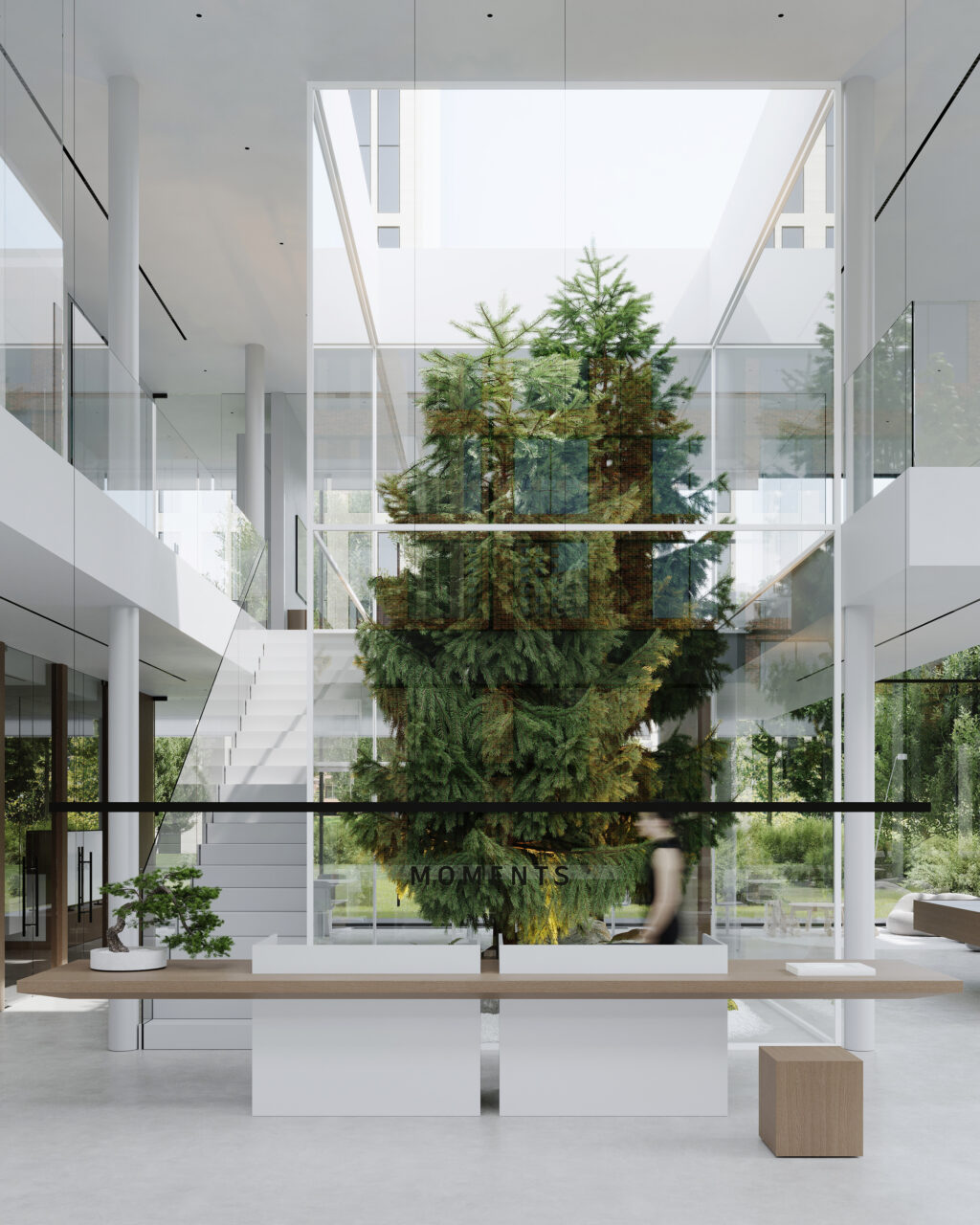
The office as a glass cube was intended to show the developer’s intention to create a modern urban environment. Complete permeability, openness, and interaction between the exterior and interior were our inspiration.
We proposed an interesting idea – to design a glass box with fir trees inside the building. The name of the residential complex – Moments – led us to it: every moment of life is unique. Thanks to completely transparent glazing, visitors will be able to notice all the changes around: the weather, the sky, the movement of the city. This idea permeates the entire concept of the sales office space and the main public spaces of the project.
The key feature is the comprehensive transparency of the space: in addition to the facade decoration, many interior solutions are made of glass – staircase handrails, all partitions in meeting rooms. Thus, the sun always creates interesting refractions, penetrates and saturates the interior. It becomes more spacious and modern.
We also tried not to remain in the feeling of a public space, but to add comfort and associations with home. A cozy, not too “office” environment is essential in a space where apartments are sold. That is why we added wood trim: panels, doors, and furniture parts.
We worked with a very clean, laconic geometry, which was supported by strict, precise forms. Upon entering the building, one sees a two-light atrium space. One is greeted by a composition of two supports made of artificial stone and a two-direction wooden console. The bonsai at the reception desk refers to Japanese laconicism.
We designed our own furniture for a play area and a lounge zone: a shelving unit, upholstered furniture, a coffee table, an armchair – everything was made according to our sketches by Russian manufacturers.
In the play area, a soft frameless sofa becomes the center of attraction. We sewed according to our sketch together with partners from Kazan. Next to the sofa, there is a place for computer games and a space for the youngest children.
The interior is dominated by an exceptional neutral palette; we completely abandoned working with accents, complex textures, and colors. Despite this, the space looks full and self-sufficient. All textures are very laconic: stone, glass, wood inserts, even perforations on the ceiling maintain minimalism. All attention is paid to the volumes, structural lines of the building and lamps, beautiful glazing lines, and correct proportions. The entire composition consists of well-constructed geometry, clear and clean solutions.
Babayants Architects
BABAYANTS ARCHITECTS team has been looking into contemporary architecture, interior, and design for 9 years.
We’re famous for being the main minimalists in Moscow. But for us, minimalism is as much artistic language as a way of perceiving the world and its beauty. There is a place only for essentials.
We live in the future trying to be ahead of time in each sketch. We set the goal to create something new and make a discovery in each project. We design the sensual experience, internality, and emotions.
We work with space, products, and concepts. We design residential and public interiors, and architecture. We build brand’s perceptions. We produce furniture and participate in fairs and exhibitions. Passionately diving into new mediums, we are ready to collaborate.
Even in tough times, we believe that aesthetics is the core value of a human. Innovation, freedom, and sincerity are the foundation of a great project.

