Platinum Winner of the International Architecture & Design Awards 2024

Redesign for Burnout Kitchen outdoor kitchens

Web Design

Consumer Products & Services

Completed / Professional Category

blank
blank

Architect / Designer:

Wiethe Content

Studio:

Wiethe Content GmbH

Country:

Germany

The Wiethe agency created a completely new brand identity for its client “Burnout Kitchen”, a provider of high-quality outdoor kitchens, in just a few months. This included product and image photos and films as well as brochures and a redesign of the website https://burnout.kitchen/.

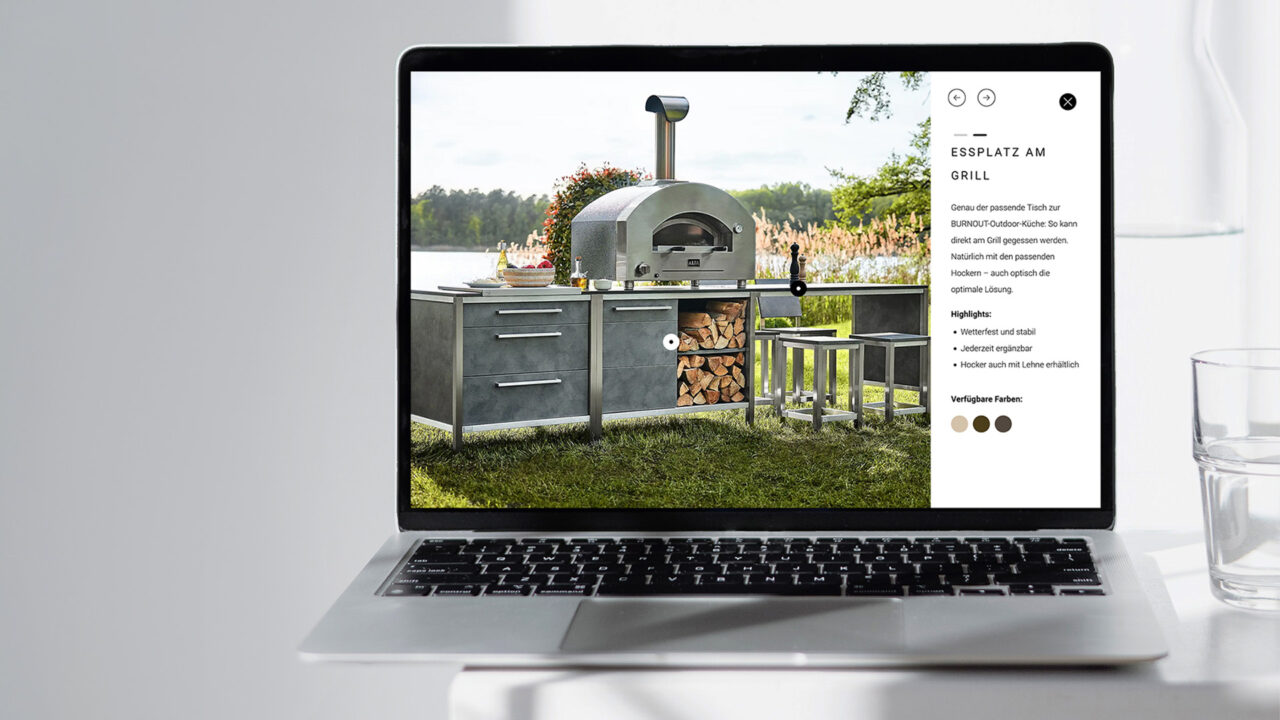
What could be better than barbecuing together in the open air, protected from the wind and weather, and enjoying life to the full – spiced up with a touch of infinity? – This is the idea behind the outdoor kitchens from Burnout Kitchen, and the website should also convey this feeling. Emotional imagery and a high-quality design set the brand apart from the competition.
Especially in the premium and lifestyle segment, it is important to address the target group in a customised way. Great importance was therefore attached to inspiring imagery and stimulating texts. A distinction was made in the concept between the luxury (LUX) and upmarket segments (BBQ). The aspirations of a premium brand were always at the forefront.
Aesthetics, clear design and emotionality are key aspects of the website. The content production for the website was therefore elementary, not just about product presentation, but above all about lifestyle. Therefore the production of the image photos took place at selected locations.

Thanks to a modern, user-friendly design, customers can easily explore the various outdoor kitchen models, especially the BBQ and LUX series. Clear UX, high-quality design and lots of emotion were the main focus. The entire product range is presented in a clear and informative way.

Clearer, more emotional, more informative, more inspiring: the new website makes a statement about the brand’s premium aspirations and clearly stands out from the competition thanks to its high level of emotion.
Even the first glance at the website shows that aesthetics and design are a high priority – an important aspect for a lifestyle product such as outdoor kitchens.
But function is not neglected either: robust, well thought-out, weatherproof – this is how Burnout outdoor kitchens fulfil their purpose. The website reflects this high-end functionality, for example through responsive design. Thanks to the online configurator, prospective customers can start planning their new outdoor kitchen in a playful way from the very first visit to the site, which awakens or reinforces the desire to buy.


Wiethe Content GmbH

Wiethe Content is one of the leading digital and content agencies with one of Europe’s largest photo studios for e-commerce. Fashion & lifestyle clients rely on the expertise of the 200 employees at the two locations.