Silver Winner of the International Architecture & Design Awards 2025
Sutton Real Estate Brand Identity
Brand and Corporate Identity Design
Completed / Professional Category


Architect / Designer:
Gonzalo Alatorre
Studio:
Etude.Digital
Design Team:
Gonzalo Alatorre, Creative Director
Miguel Manrique, Designer
Hilary Knock, Designer
Anna Ladd, Designer
Hana Park, Marketing Coordinator
Country:
Canada
Overview
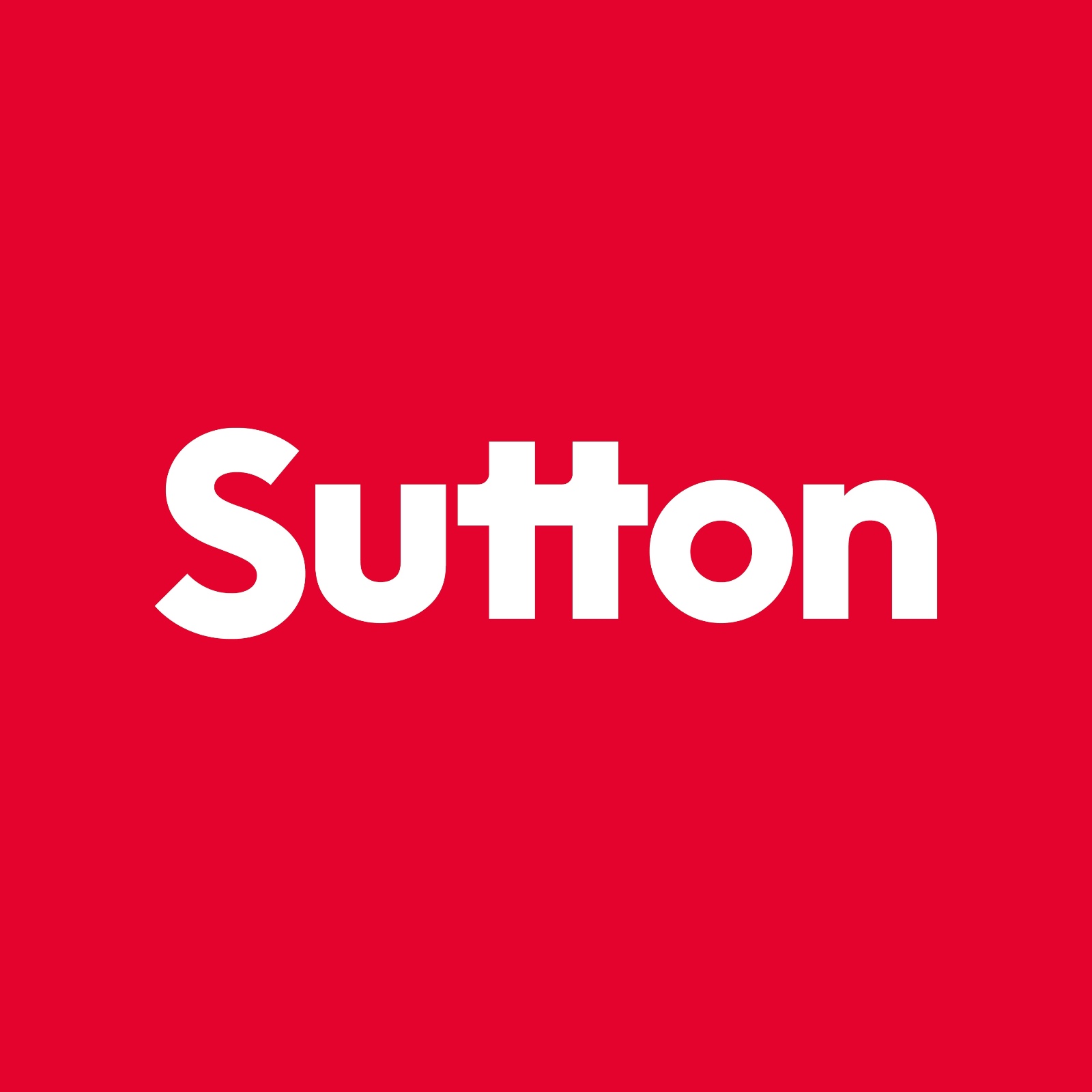
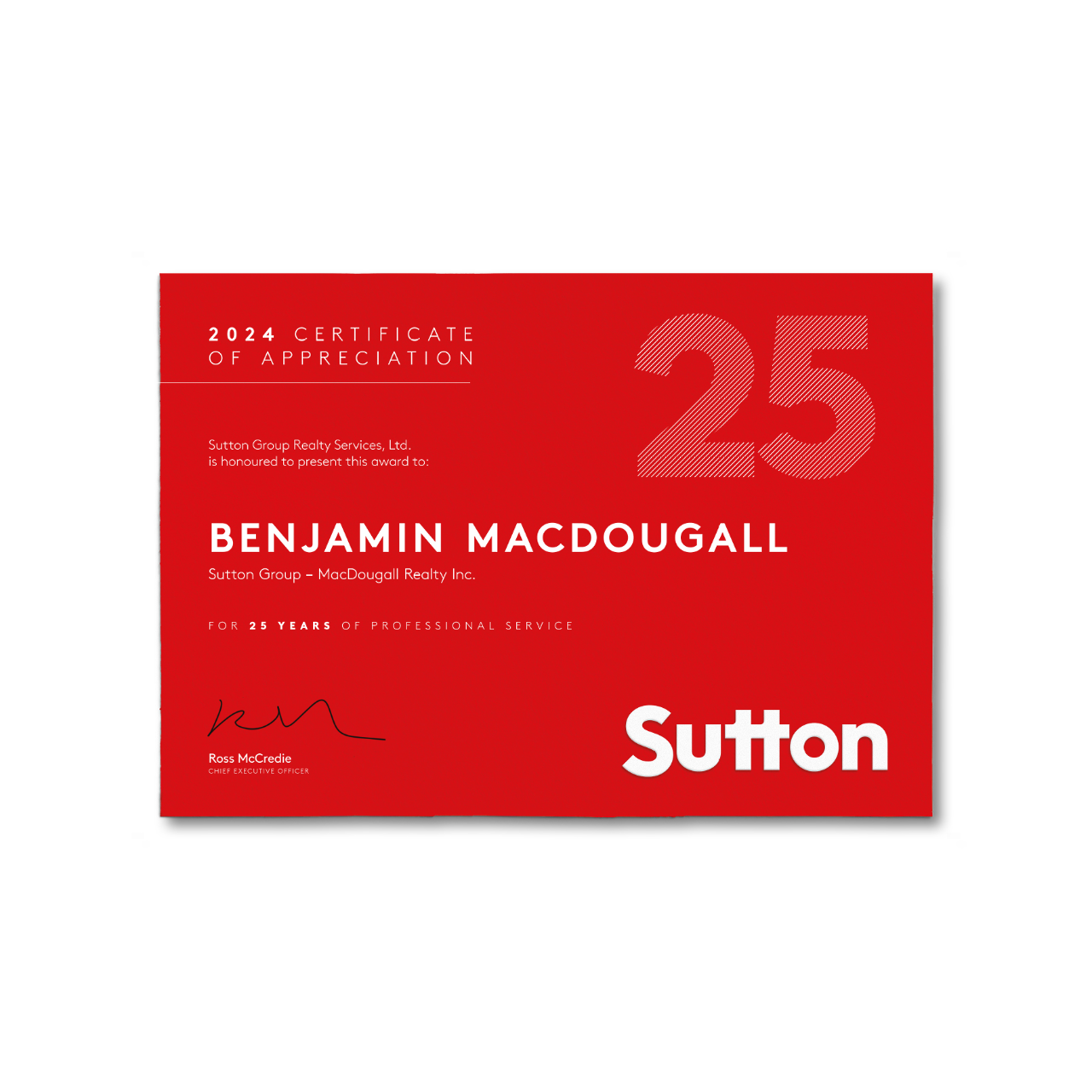
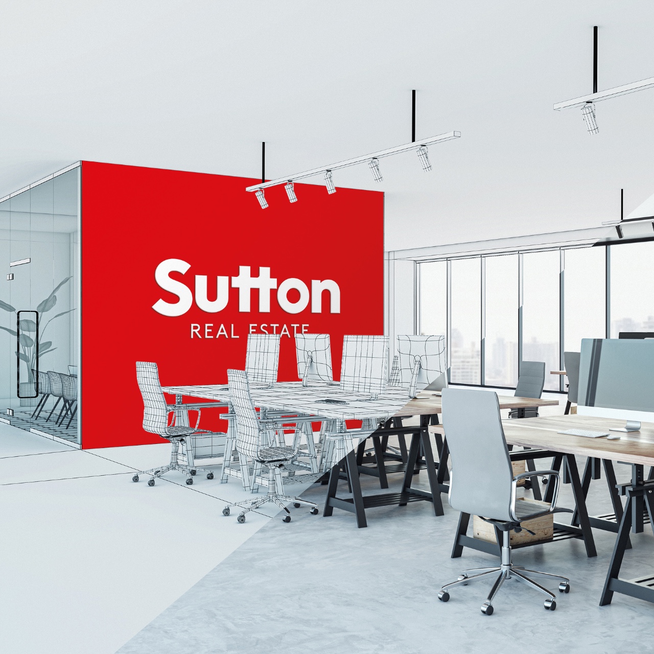
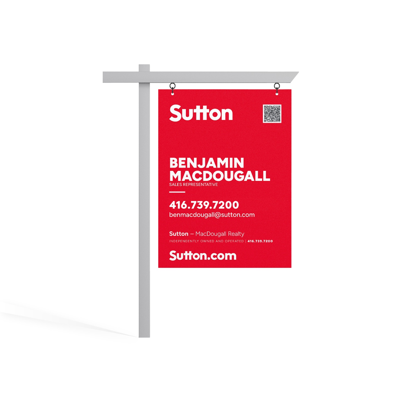
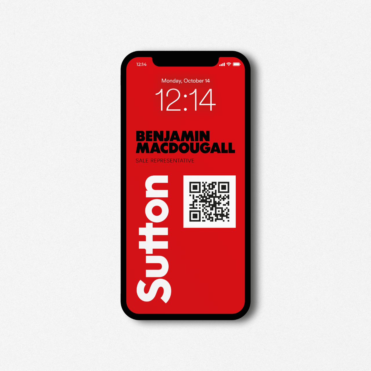
Sutton’s refreshed brand identity is a bold departure from its longstanding 1983 logo, crafted to stand out in a crowded real estate market while remaining instantly recognizable—even in peripheral vision. The design highlights the word’s natural symmetry, using the two “t”s as a defining anchor and softening the “S” for harmonious flow.
Inspiration
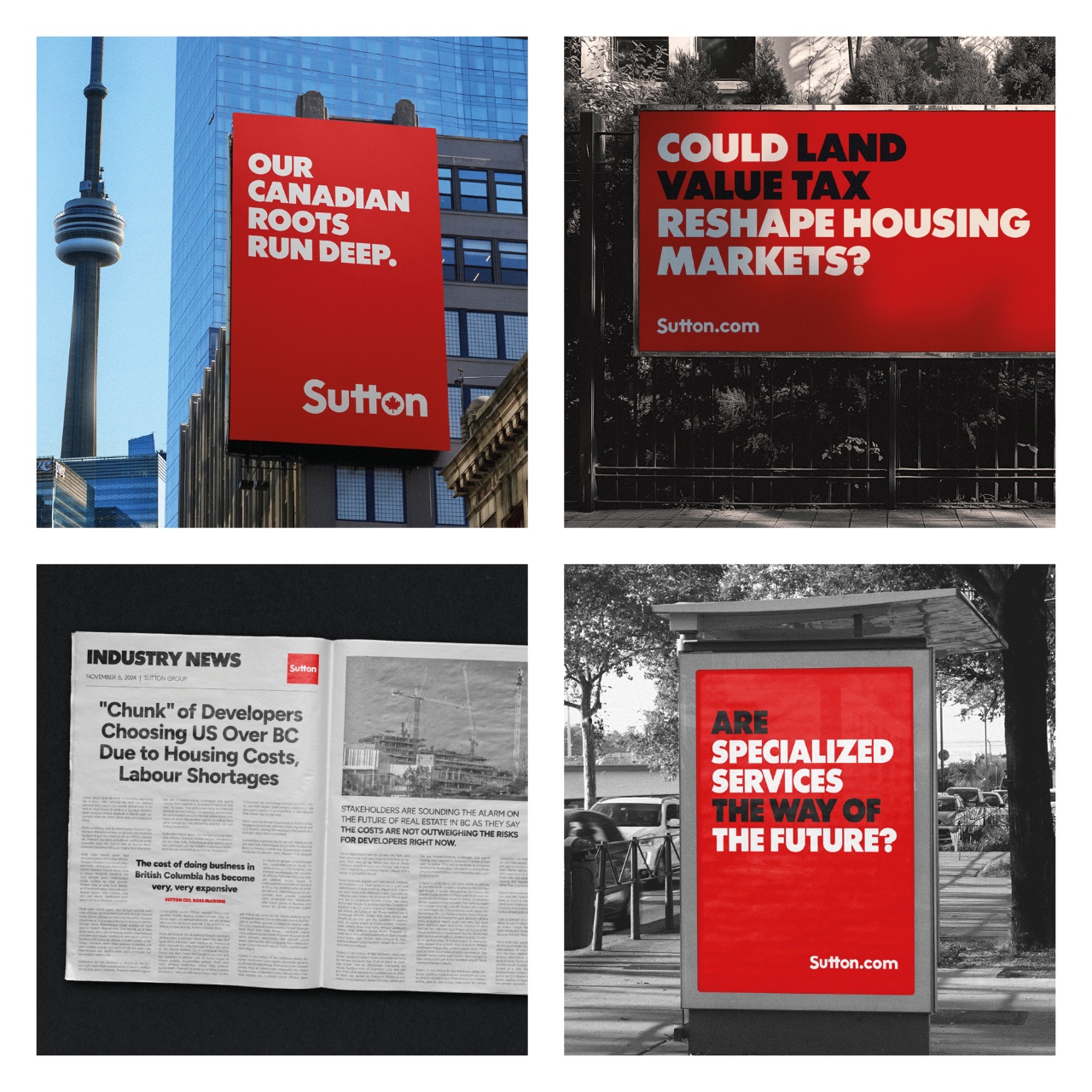
Rooted in the interplay of shapes and negative space, the concept subtly embraces Canada’s heritage through a red-and-white palette, avoiding the overuse of the maple leaf. This approach ties together Sutton’s Canadian roots and modern aspirations for the future.
Design Process
The project began with an in-depth study of Sutton’s history, context, and transformative business model. Our goal was to create an identity equally at home in rural Canada and on the streets of New York, reflecting both tradition and forward-looking ambition. Pencil sketches formed the groundwork for countless variations, each refined digitally until the perfect balance of minimalism and impact was achieved.
Production & Realization
Our studio’s designers worked collaboratively, leveraging both analog and digital tools to bring ideas to life. This blend of craft and technology ensured every element of the final identity was meticulously considered, from letter spacing to colour harmony.
Challenges
The most significant hurdle was change management for over 6,000 agents accustomed to the original logo. Careful planning, clear communication, and demonstration of the refreshed identity’s benefits were critical to achieving widespread adoption and reinforcing Sutton’s professional image.
Outcome
With its streamlined forms, vibrant palette, and instant recognizability, the new Sutton identity embodies a modern edge while honouring its past. The result is a cohesive, future-focused brand that stands poised to redefine how Canadians manage and transact real estate.
Etude.Digital
At Etude.Digital, we are an award-winning creative agency for organizations committed to standing out in a market saturated with sameness. Our clients are changing the world; we support their vision with clarity because clarity is compelling.
www.etude.digital