Bronze Winner of the International Architecture & Design Awards 2026
Eleology
Food and Beverages
Completed / Built / Professional Category

Architect / Designer:
Evangelos Tsirikos
Studio:
A|S Strategy, Branding & Communication
Design Team:
Copyright:
Country:
Greece
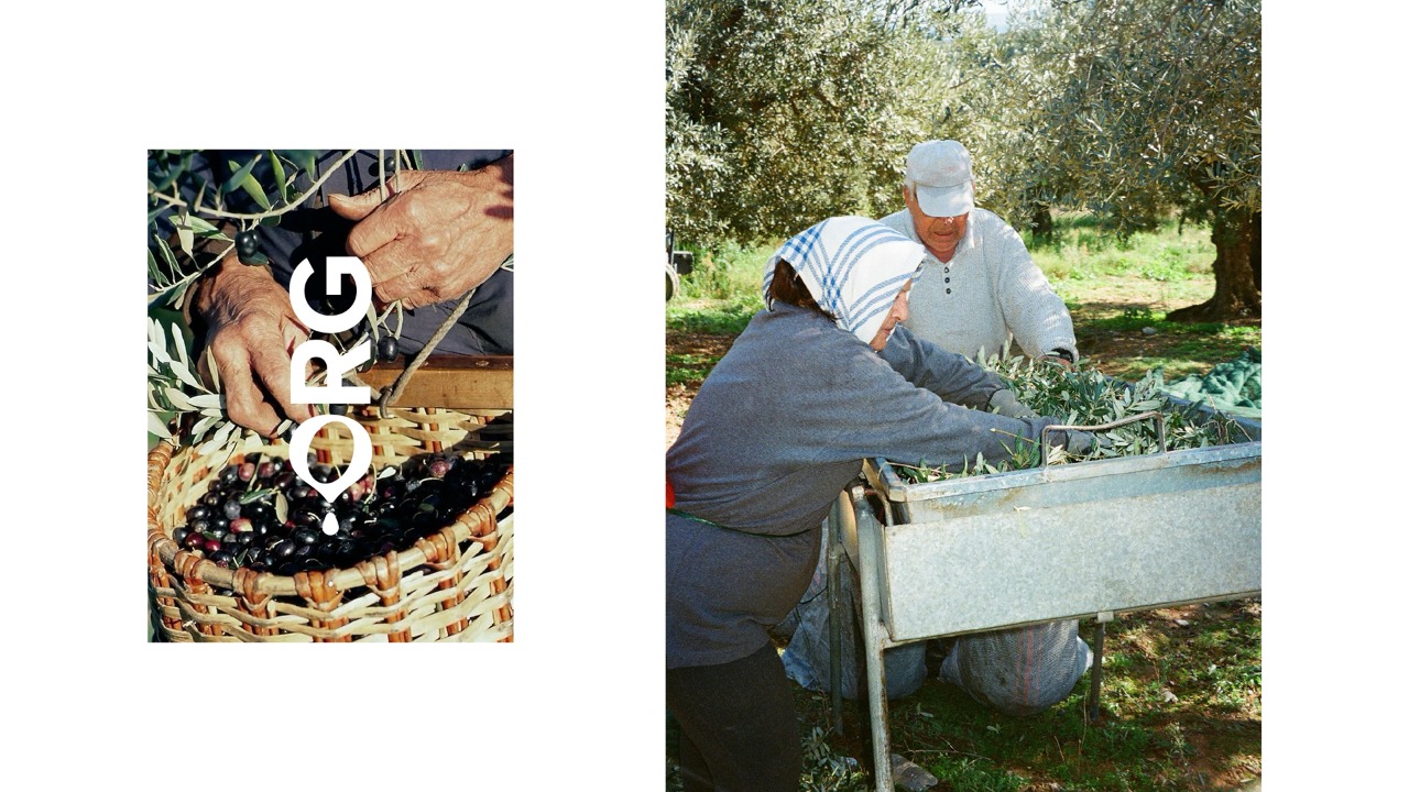
Eleology is an organisation dedicated to supporting sustainable organic olive oil production across Greece. Its mission focuses on transparency, long-term collaboration with small-to-medium scale producers and the preservation of olive oil as a culturally and economically significant agricultural practice. Sustainability is treated as an operational principle shaping sourcing, production and distribution.
The brand primarily operates in international markets, exporting organic extra virgin olive oil abroad. The brief was to design the packaging for Eleology’s Classic Series in a way that could clearly communicate this organisational role and its values to an international audience, without relying on localised symbolism or romanticised narratives commonly associated with olive oil.
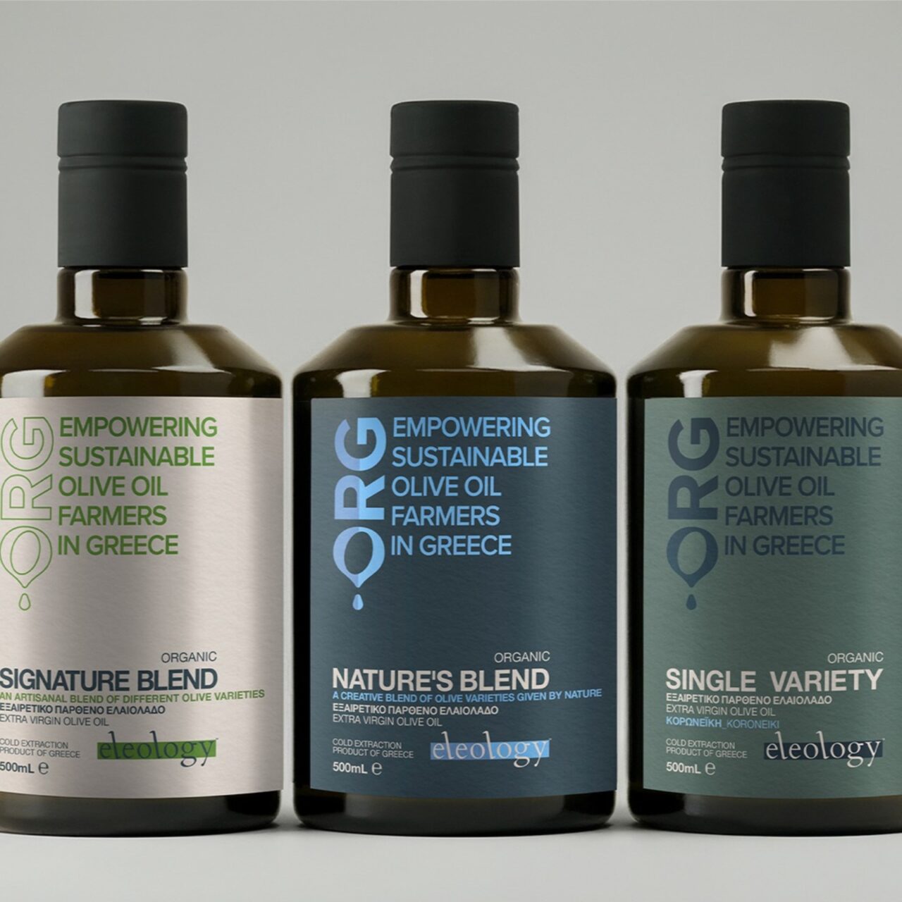
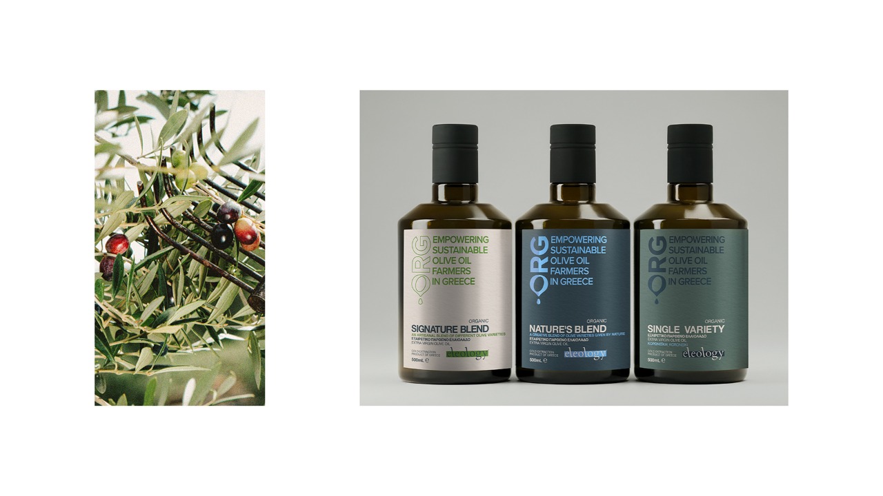
The Classic Series consists of three products:
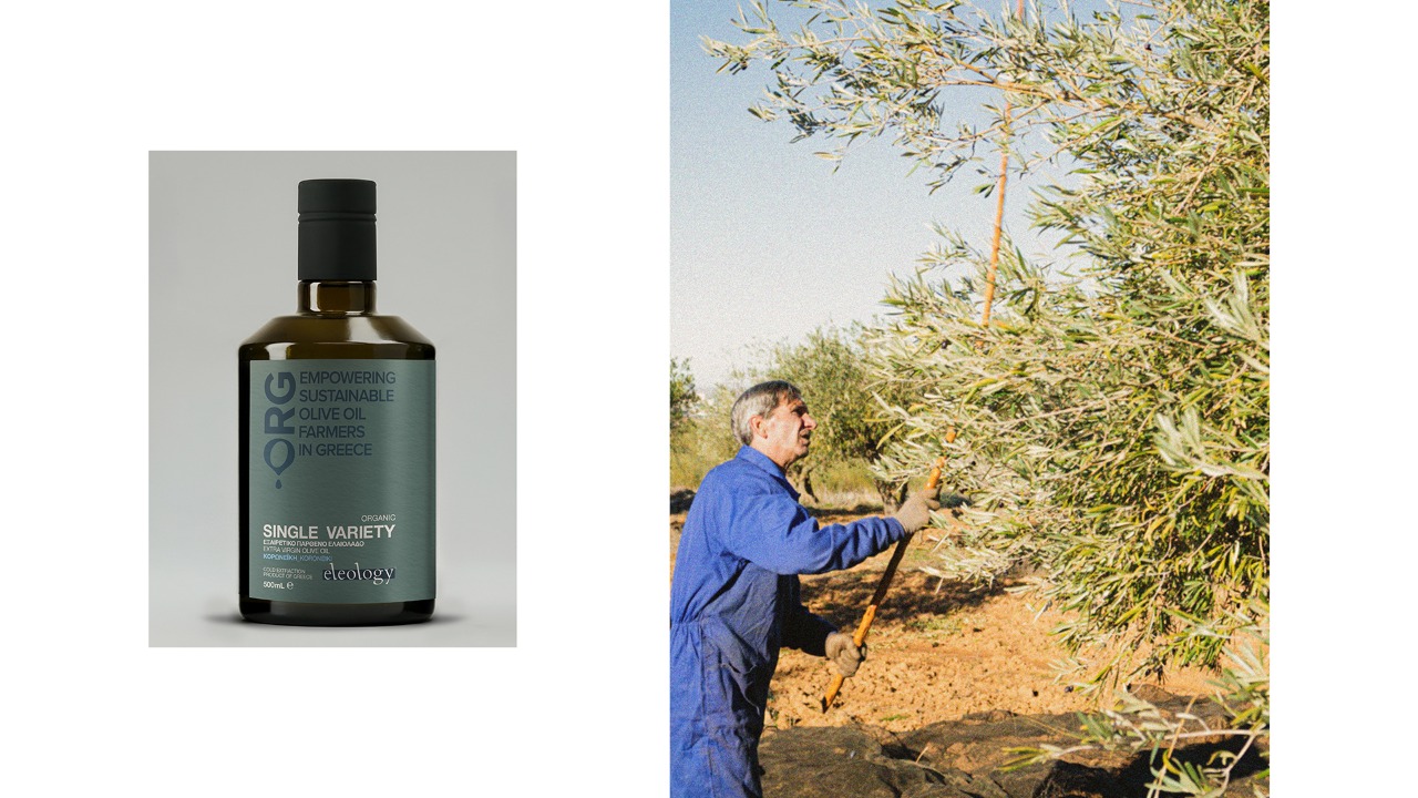
Single Variety, highlighting the unique character of a single olive variety, sustainably cultivated in its purest form.
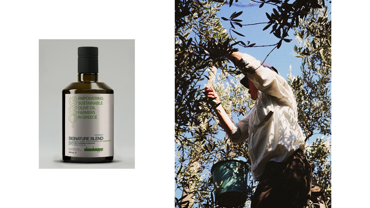
Signature Blend, an artisanal blend of different sustainably cultivated olive oil varieties.
Nature’s Blend, combining two olive varieties that naturally coexist and are sustainably grown.
The packaging was required to support international distribution, clearly structure information and communicate credibility, responsibility and transparency, while positioning Eleology as a collective organisation and movement rather than a conventional olive oil brand. The system needed to remain suitable for long-term use and future expansion.
A|S Strategy, Branding & Communication
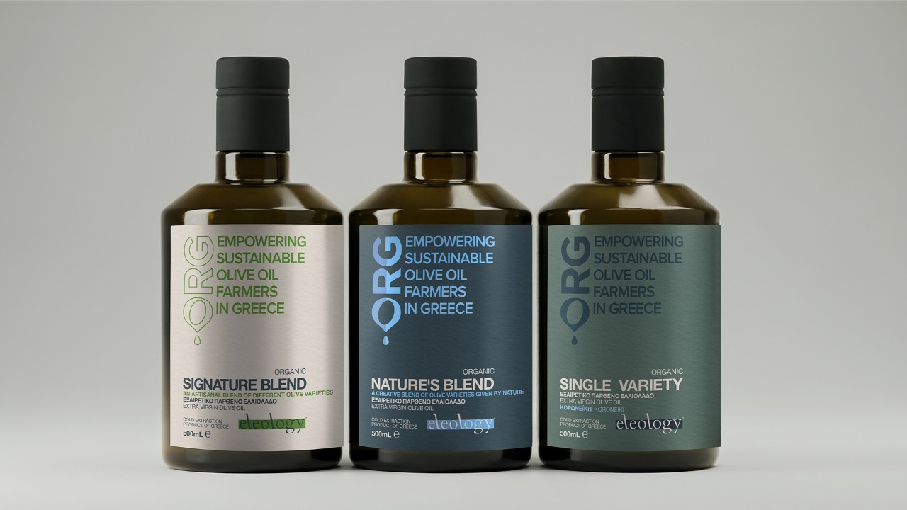
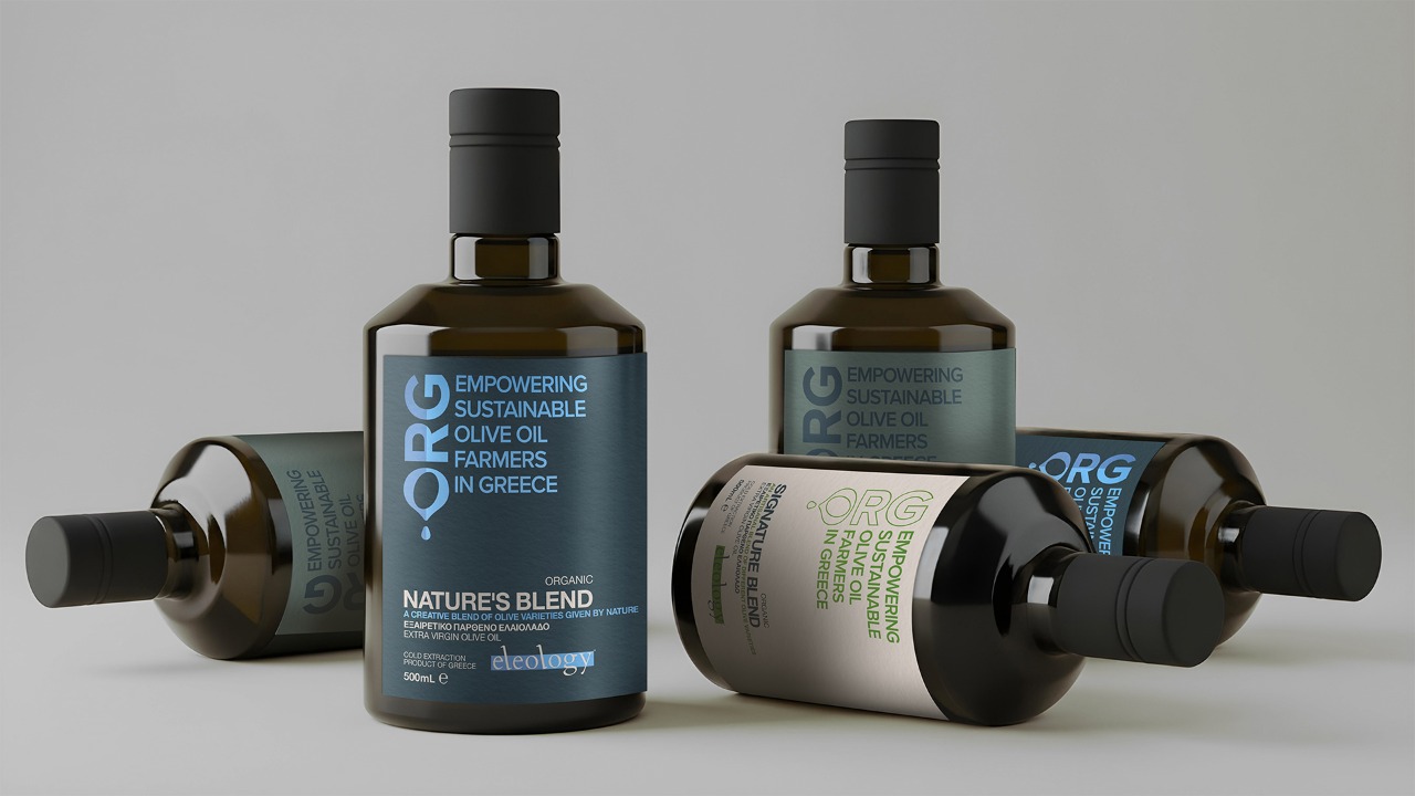
The design is constructed as a system, allowing the organisation itself to become the primary carrier of meaning. The phrase “Empowering sustainable olive oil farmers in Greece” operates as a core structural element. Repeated and given typographic weight, it functions as a statement of intent and positions Eleology as an active organisation and collective movement rather than a conventional olive oil brand.
This is reinforced through the large logotype and disciplined layout, which establish authority, clarity and trust. Focus is shifted away from product-centric storytelling toward the entity behind the product. Apothecary-inspired proportions, dark glass and restrained labels signal care, precision and responsibility.
Muted, mineral colours differentiate the three products while maintaining system coherence. Typography, grid and hierarchy remain consistent across the range. Meaning is carried through structure, repetition and proportion, avoiding illustration or romanticisation.