Silver Winner of the International Architecture & Design Awards 2026
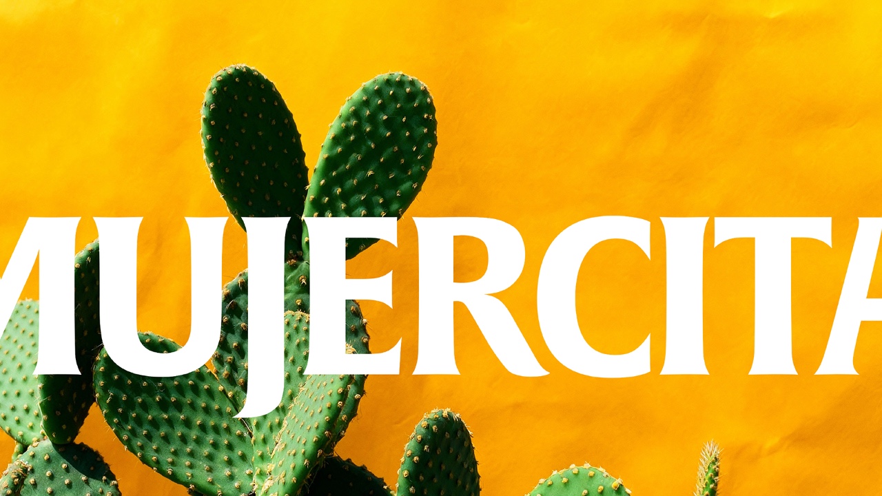
Mujercita
Food and Beverages
Completed / Built / Professional Category


Architect / Designer:
Antonia Skaraki
Studio:
A.S. Strategy Branding & Communication
Design Team:
Art Direction Andreas Deskas
Copyright:
Country:
Greece
The client is Victor, an established ouzo and brandy manufacturer based on the island of Chios, Greece. Building on its long production heritage, the company follows contemporary market trends and evolving consumer demands, with the strategic aim of expanding its activities into new categories and markets. As part of this development, Victor extended its portfolio to include additional alcoholic spirits, including a tequila-style product.
The objective of the project was to create a label designed within the visual and cultural codes of tequila, without treating Mexican heritage as a decorative backdrop. The brief called for a design with a clear point of view and an authentic personality of its own. The label needed to communicate intensity, confidence and presence, and to stand out decisively on a bar shelf.
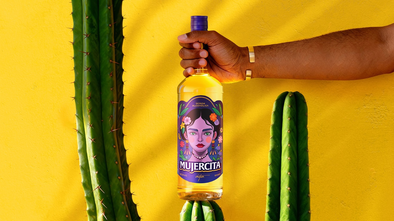
The target audience consists of consumers who seek drinks with identity and character. People who choose not only based on taste, but also on aesthetics and the attitude a product conveys. The main challenge was to design a label that holds the gaze, stands with confidence among competing bottles, and functions as a statement object rather than a neutral container.
A.S. Strategy Branding & Communication
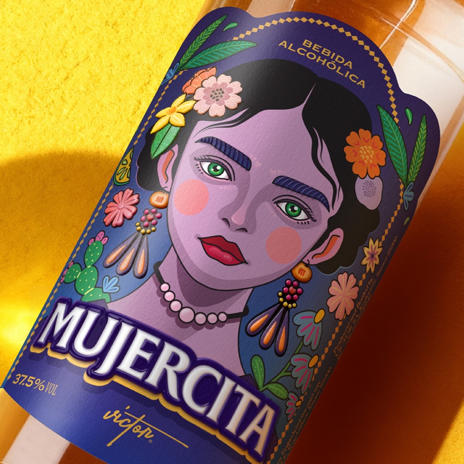
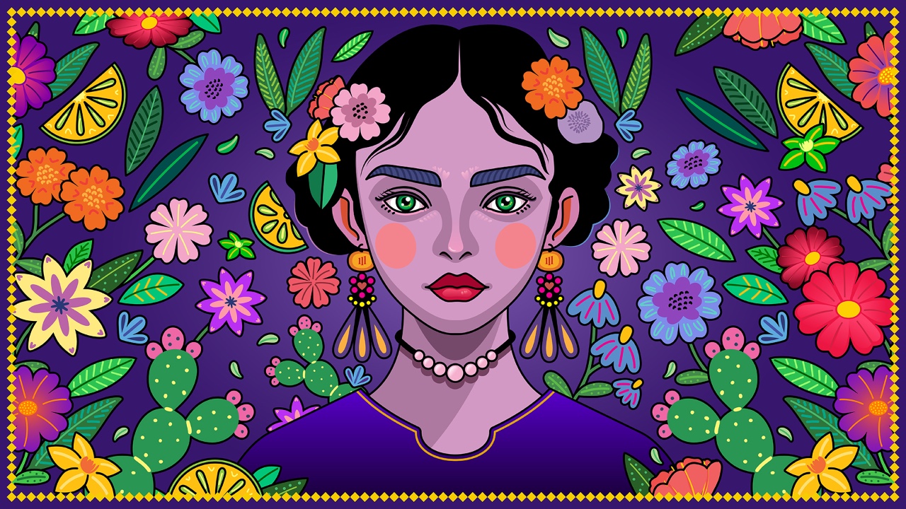
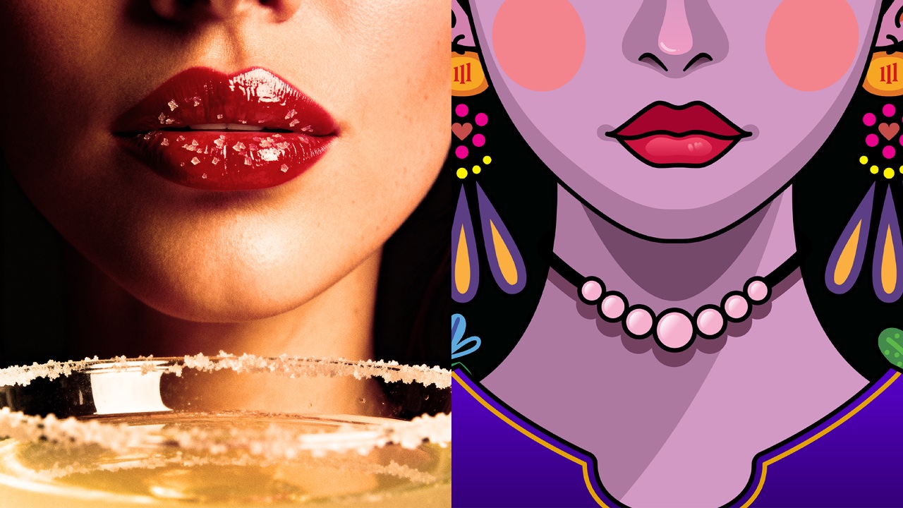
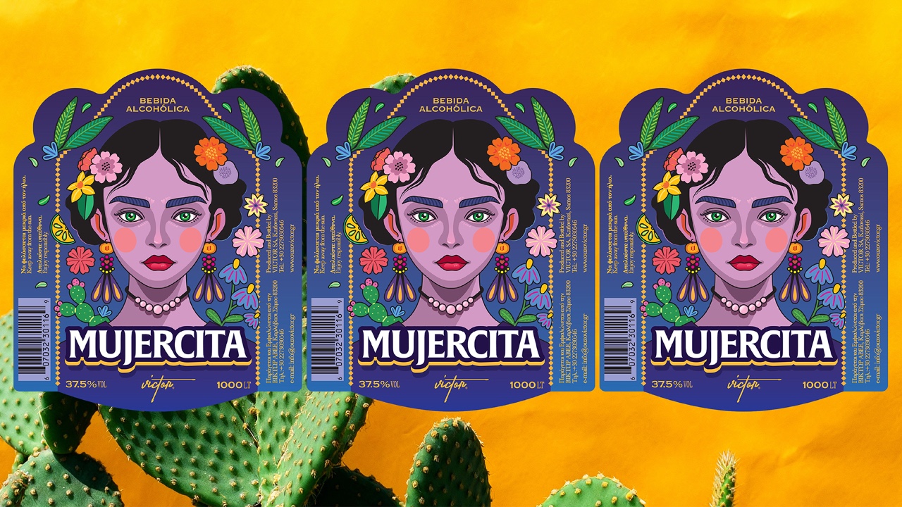
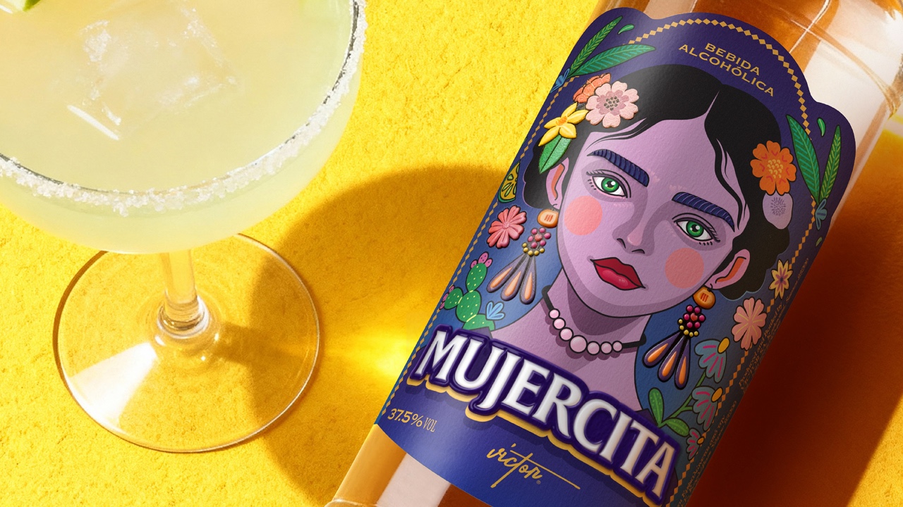
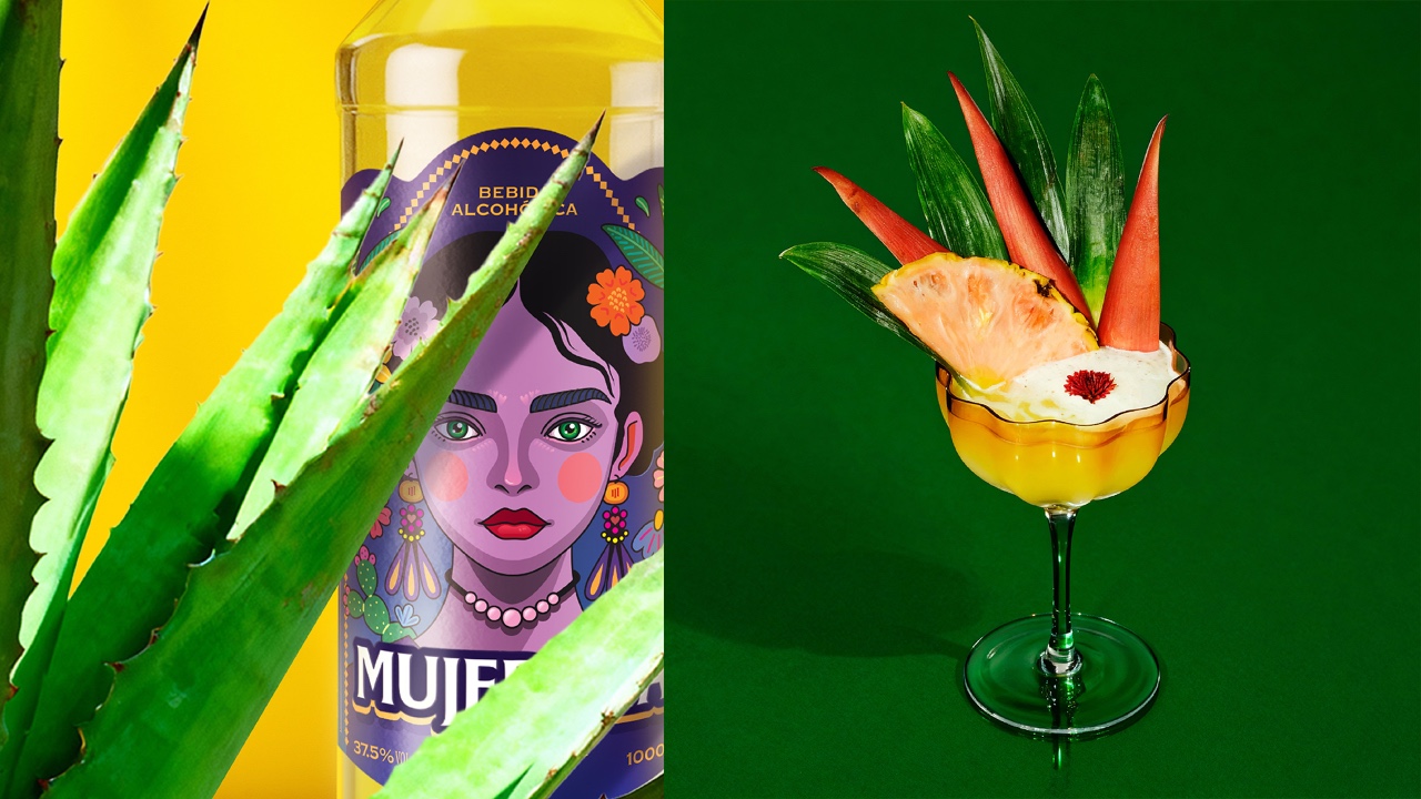
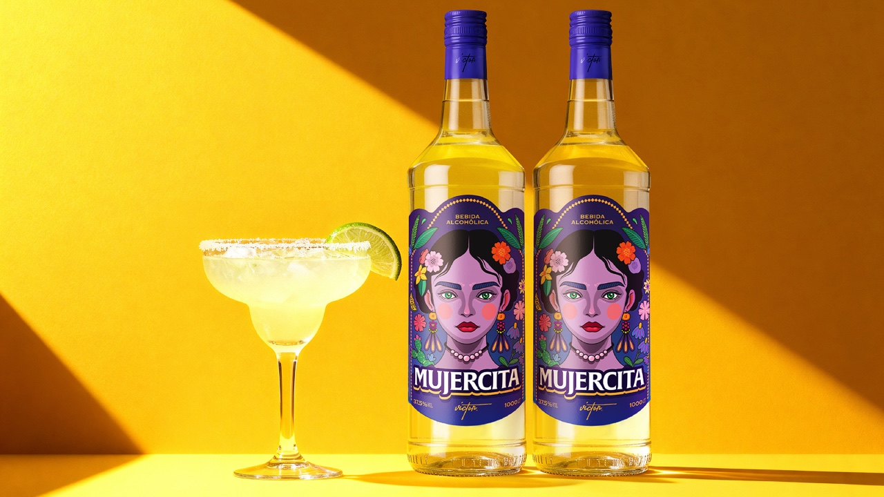
The design translates the visual codes of tequila into a contemporary label with a distinct point of view. Mexican cultural references are treated as a living visual language rather than decorative folklore. At the centre of the composition stands a female figure, frontal and self-assured, meeting the viewer’s gaze directly. Her presence establishes confidence, intensity and immediate connection.
Illustration draws from Mexican folk art, with floral elements and symbolic details forming a layered visual landscape. They are integrated into the figure, allowing identity and culture to coexist within a single composition.
Saturated tones and strong contrasts convey energy and emotional charge, ensuring high visibility and impact in a bar environment. Typography remains bold and grounded, anchoring the composition and reinforcing clarity and attitude.
The label shape introduces a subtle ceremonial quality, referencing traditional forms while remaining contemporary.