Silver Winner of the International Architecture & Design Awards 2023
Skhovok Hotel
Brand Identity
Built / Professional Category

Architect / Designer:
Dmytro Bielopolskyi
Studio:
Nos Agency
Design Team:
Nos Agency:
Dmytro Bielopolskyi – art director, designer
Daria Gordienko – strategist
Viktoria Liliakevych – strategist
Valeria Sharapa – copywriter
Skhovok Hotel:
Glib Kutepov – founder
Volodymyr Vesenko – founder
Country:
Ukraine
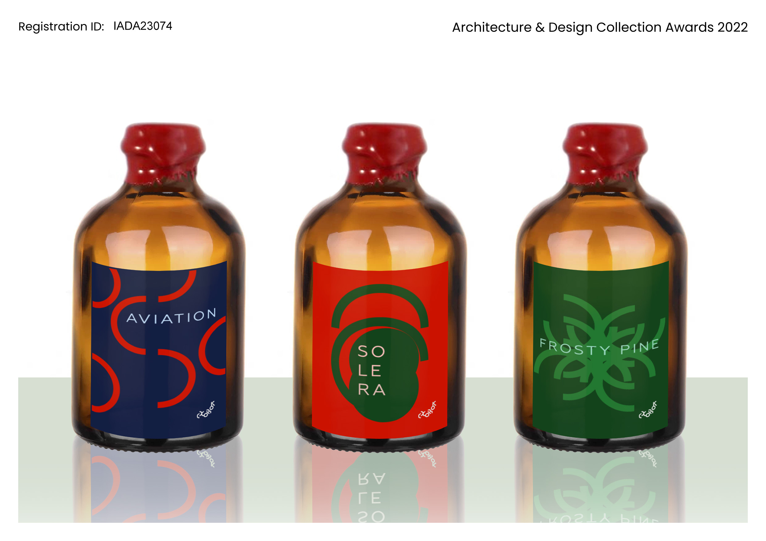
In the mountains, at an altitude of 1070 m, our client built a Skhovok (hideout hut in the Ukrainian language) hotel. A wooden house with panoramic windows overlooking the Hoverla mountain of Ukrainian Carpathian.
You can hide from the world in Skhovok, this is precisely the concept developed by the creative agency NOS.
Do you remember how we used to build a “Halabuda” (improvised play house for kids)? Now we’ve upgraded it. It’s a whole house hidden in the mountain, where the nearest neighbors are 500 meters away on foot. We want our guests to playback carefree moments they deeply hide in their memories. Open the gates to adventure and let us and your soul guide you!
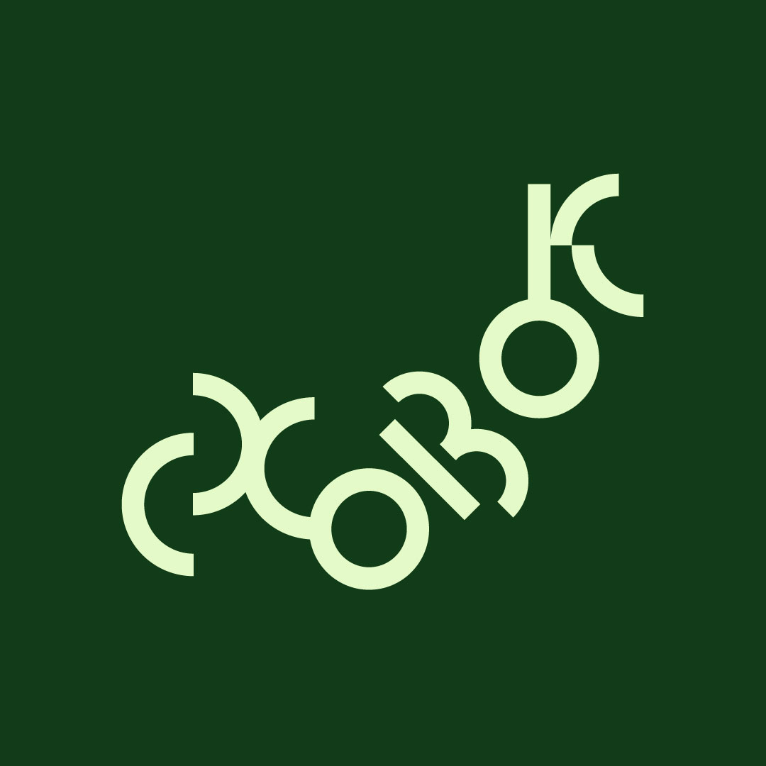
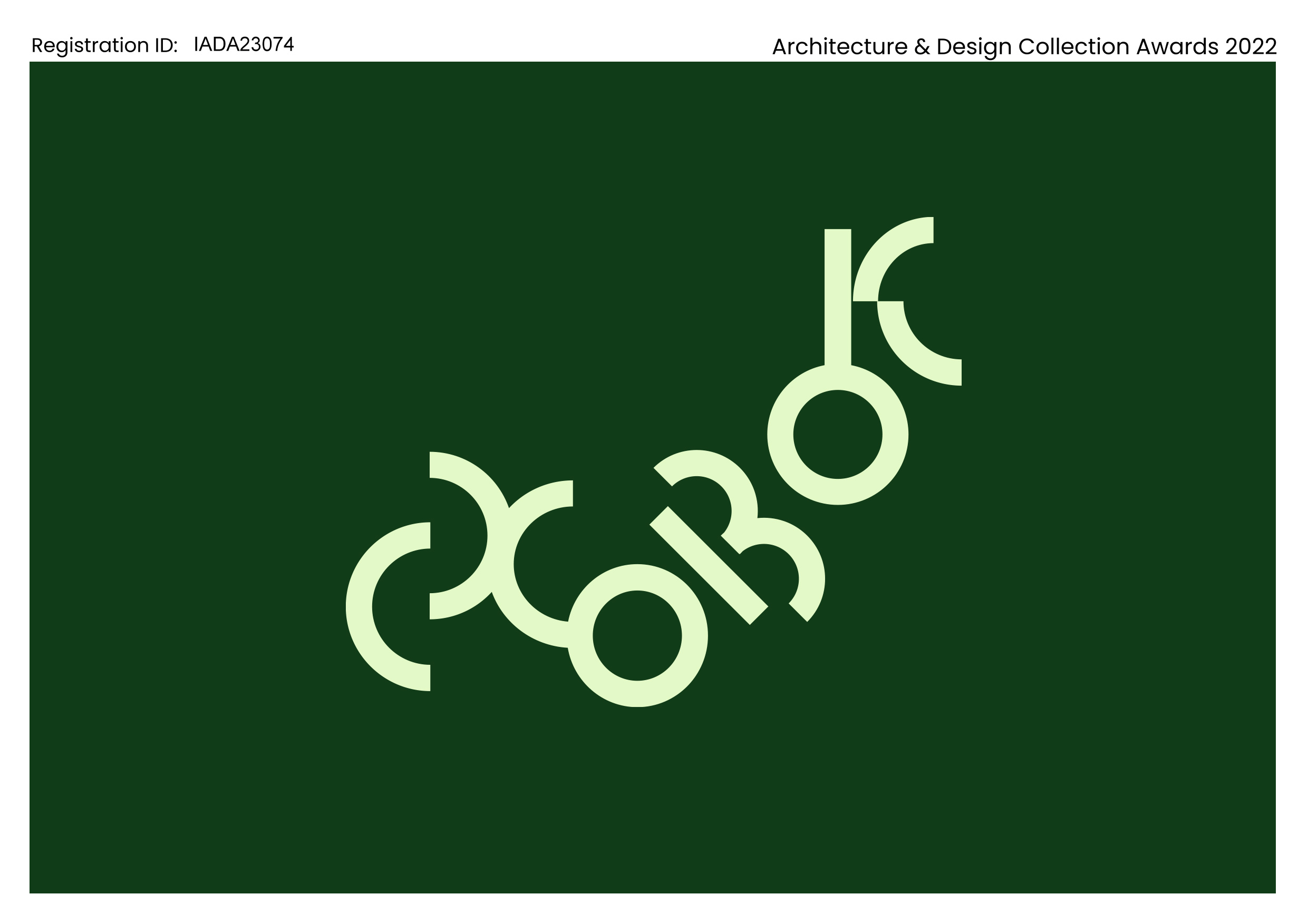
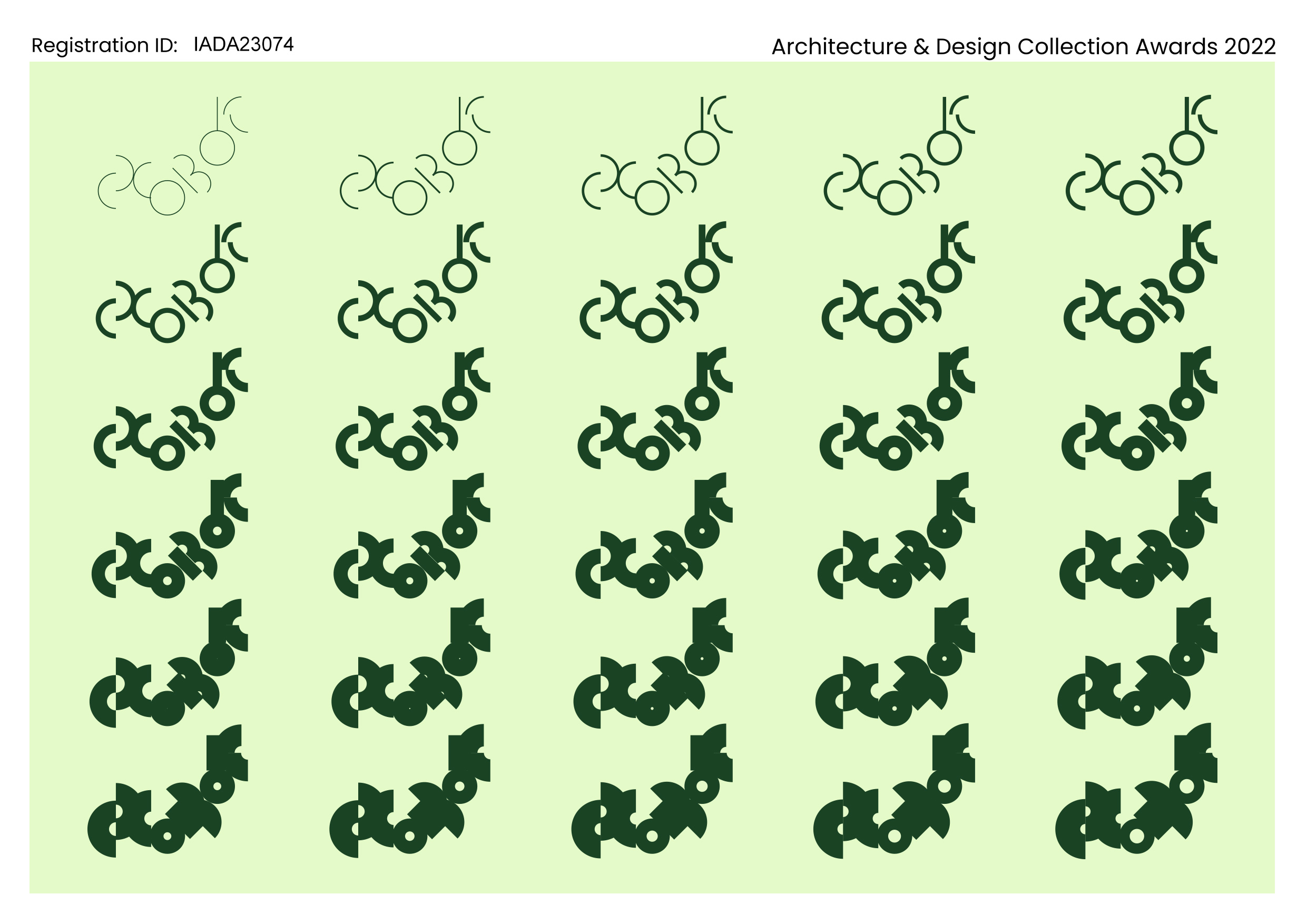
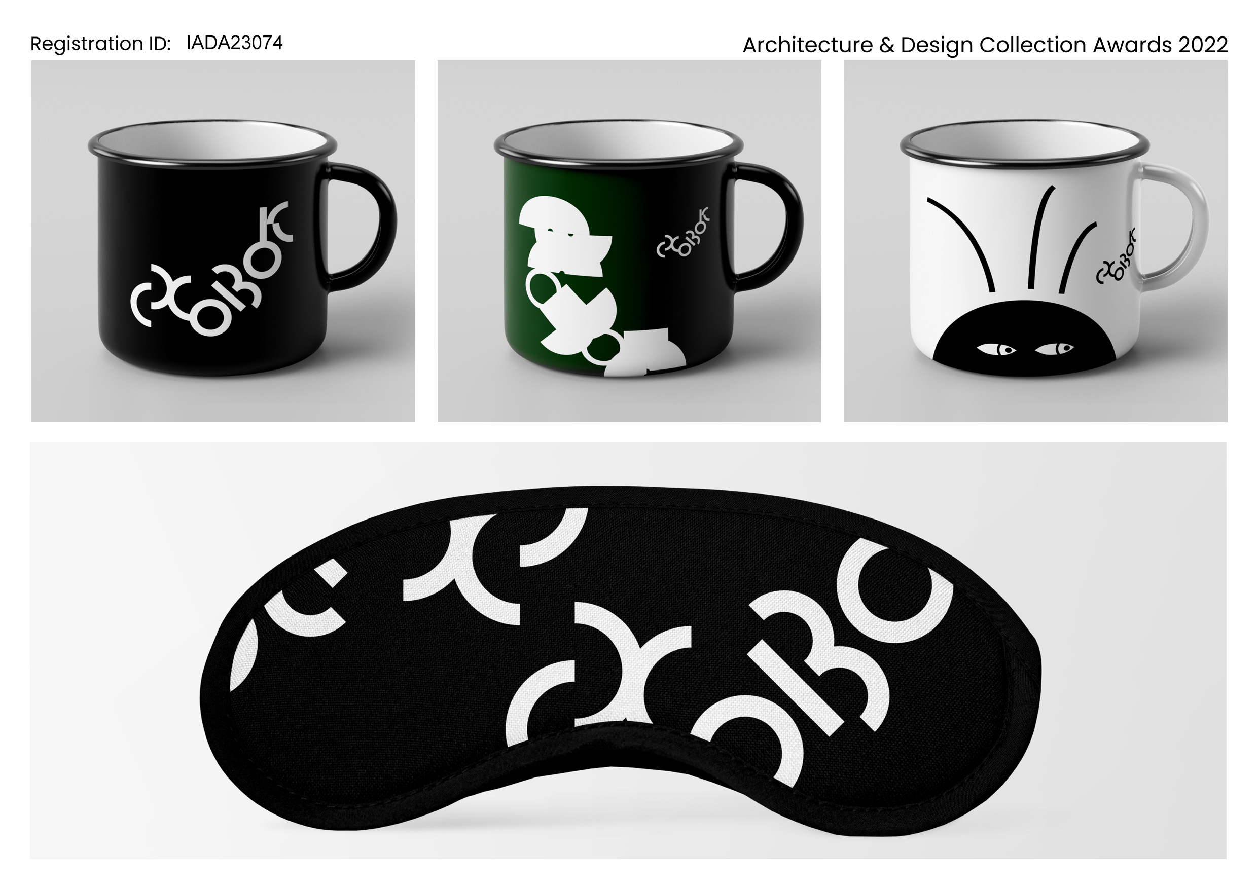
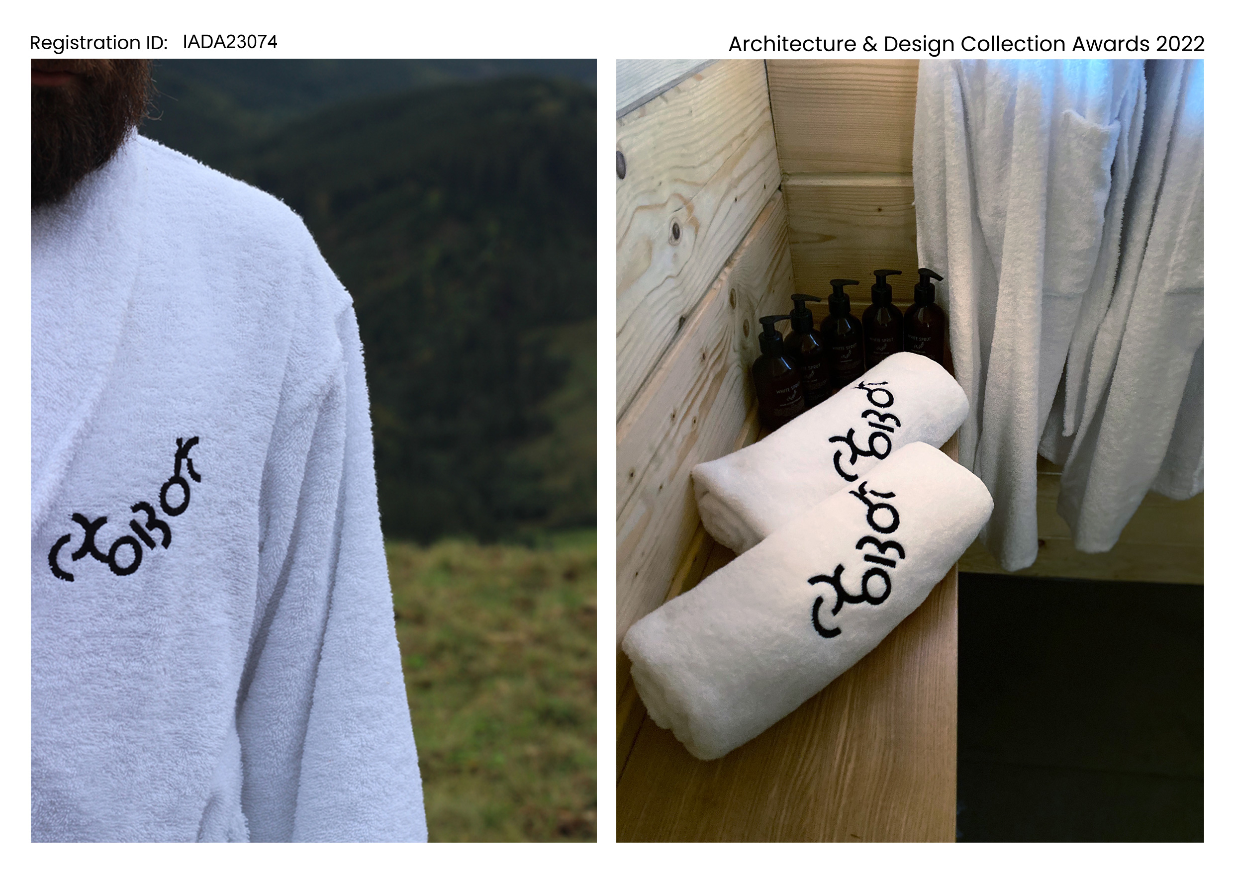
Our creative concept needed an appropriate visual identity to communicate 3 basic ideas: playfulness, adventure, and nature. That’s why our logo metaphorically plays the seek and hide game. It has several variations and dynamically changes its weight: from almost hidden from everyone to bold and eye-catchy. Also, its letters are constructed of arc modules to replicate the winding mountain roads. And the choice of brand colors reflects the power of the Carpathian mountains’ nature.