Platinum Winner of the International Architecture & Design Awards 2026
Jewelies
Rebranding and Brand Refresh
Completed / Built / Professional Category

Architect / Designer:
Antonia Skaraki
Studio:
A.S. Strategy, Branding & Communication
Design Team:
Antonia Skaraki
Andreas Deskas
Naya Koutroumani
Copyright:
Andreas Deskas
Country:
Greece
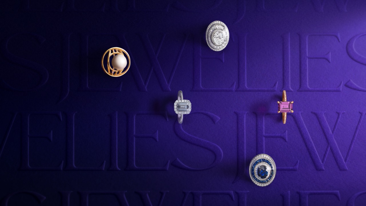
Jewelies is a brand of carefully crafted yet affordable jewellery that originally began its journey in South Africa under a different name, founded by Greek expatriates. Today, the second generation of the family is based in Greece, continuing the brand’s activity with a renewed vision. The jewellery is created not to be stored or reserved for special occasions, but to be worn daily and to live alongside the people who choose it.
The objective of the project was a complete renaming and rebranding of the company, in order to give the brand a more contemporary and creative character and allow it to address a broader audience with a refined sense of taste. The new identity needed to feel modern, approachable and joyful, while maintaining a connection to the brand’s existing recognition and heritage.
A key challenge was to develop a new name that would feel fresh and distinctive, without being disconnected from the brand’s established presence. At the same time, the visual identity needed to reposition the brand within the jewellery category without losing its sense of quality and reliability, while clearly moving away from the conservative image of its previous identity.
The brand was required to gain a confident and dynamic presence, with a clear character and narrative, in a category where visual expression often remains limited to the product itself. The goal was to create a brand system that treats jewellery as something deeply personal — not as a decorative accessory, but as an extension of the wearer’s identity.
Overall, the brief called for a cohesive brand identity capable of combining emotion and structure, art and technique, and of functioning consistently across all brand touchpoints, supporting Jewelies’ transition into a more expressive, contemporary and human-centred brand.
A.S. Strategy, Branding & Communication
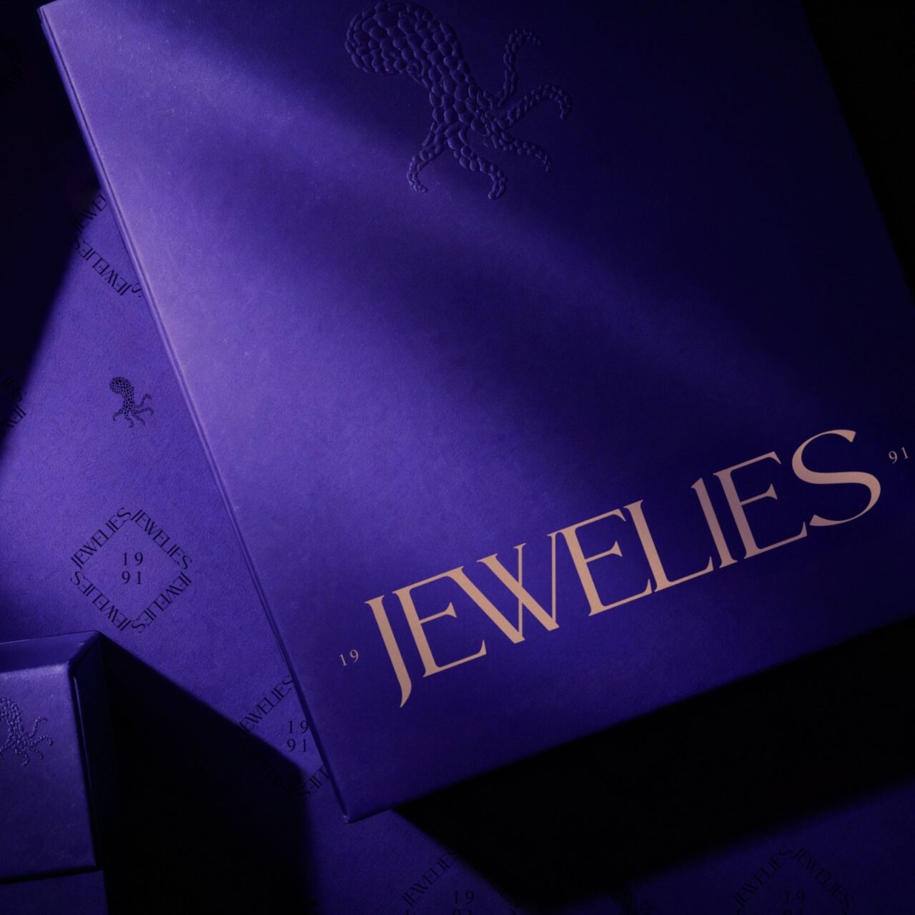
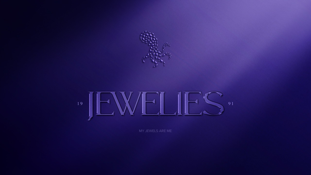
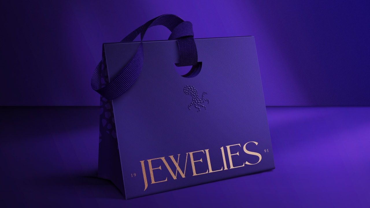
The design is built around the idea that jewellery is not an accessory, but an extension of identity. This belief shapes the entire brand system, translating emotion into structure and craftsmanship into visual language.
At the centre of the identity stands the octopus, used as the brand’s emblem. Intelligent, adaptable and deeply intuitive, it operates as a symbol of self-definition and collective creation. Each tentacle represents a different skill and contribution within the family behind the brand, forming a single organism that evolves and responds instinctively.
Typography combines sharp terminals and soft curves to mirror strength and sensitivity.