Platinum Winner of the International Architecture & Design Awards 2026
RE PETE
Logo Design
Completed / Built / Professional Category


Architect / Designer:
Laios Papazoglou
Studio:
A|S Strategy, Branding & Communication
Design Team:
Copyright:
Country:
Greece
RE PETE is a design studio founded in October 2024 in Thessaloniki, working across material, space and experience. Led by designer Petros Katsiotis, whose background is rooted in lighting design, the studio approaches design as a process shaped by use, time and the relationship between objects and the spaces they inhabit. REPETE draws inspiration from everyday life and traditional ways of making, treating design not as an isolated gesture but as an ongoing dialogue between material, function and lived experience.
The studio approached our agency to design its visual identity, seeking a system that would articulate its philosophy of care, durability and sensory engagement. The brief called for an identity that could reflect REPETE’s experimental yet grounded approach, its emphasis on objects built to last, and its belief that value emerges through use rather than spectacle.
Central to the project was translating the studio’s manifesto into a visual language: design as illumination, as a way to shape perception, provoke thought and create meaningful experiences. The identity needed to express REPETE’s multidisciplinary nature, bridging light, objects and space, while remaining understated, precise and timeless.
The challenge was to create a visual system that feels honest, material-driven and intentional—one that positions REPETE not as a trend-driven studio, but as a practice concerned with longevity, process and the quiet power of well-considered design.
A|S Strategy, Branding & Communication
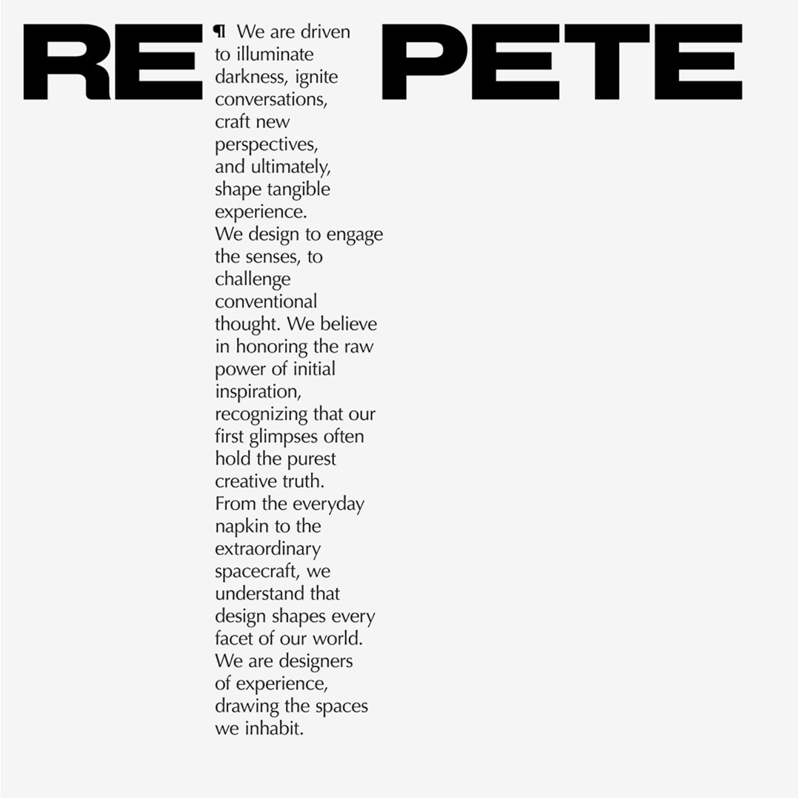
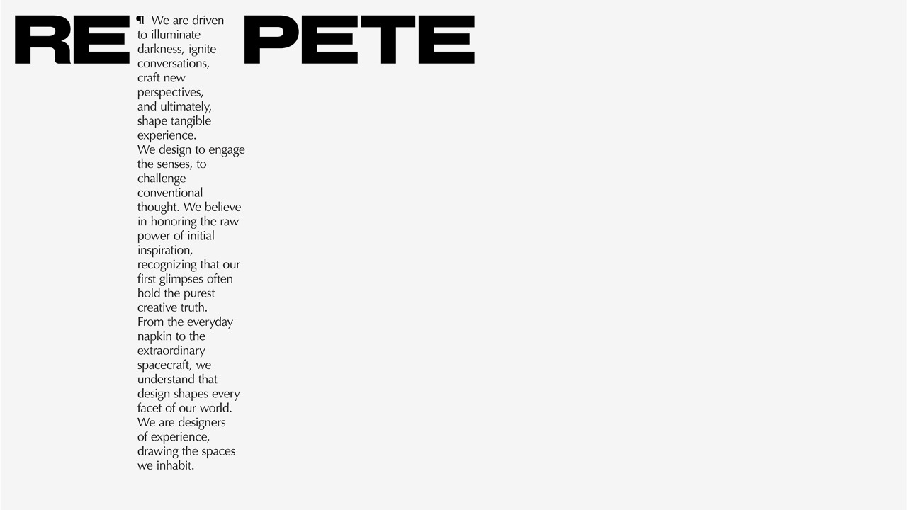
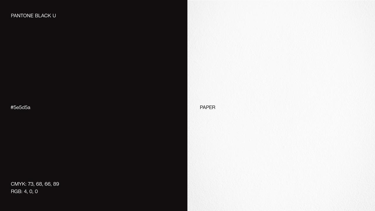
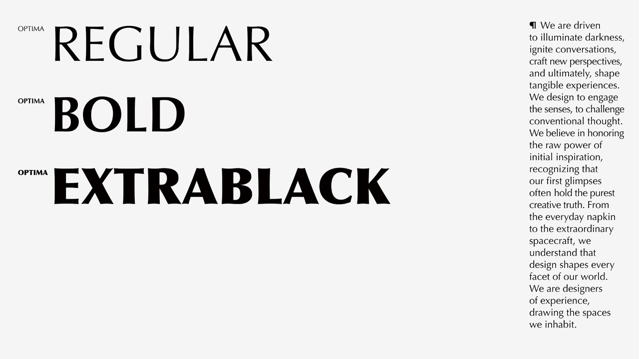
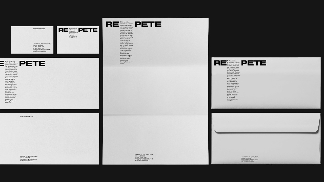
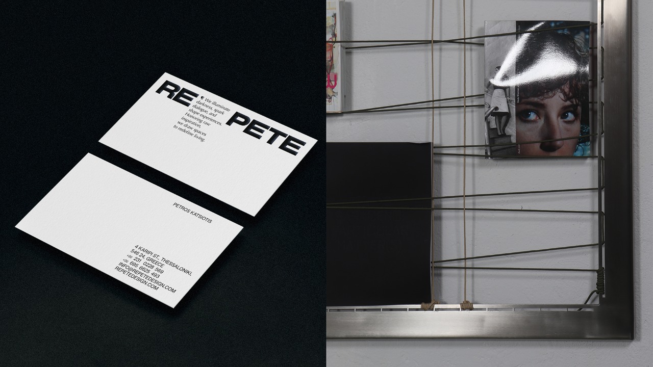
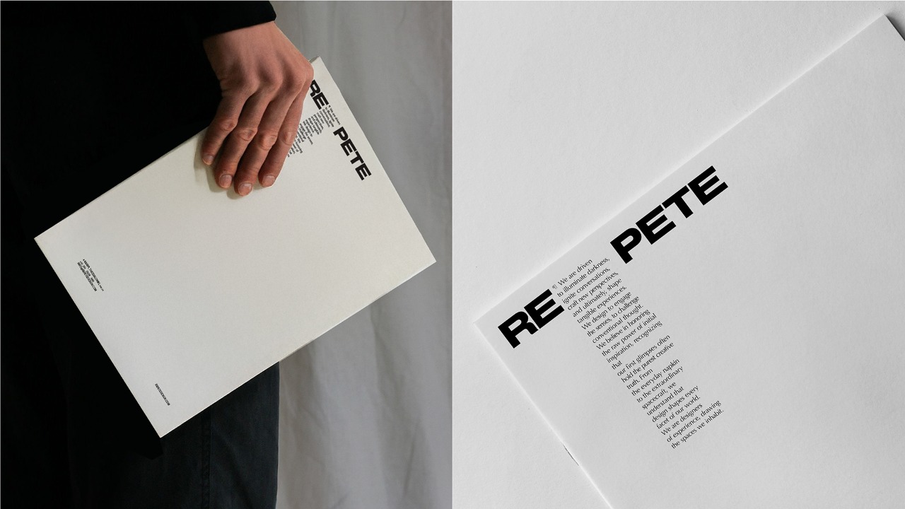
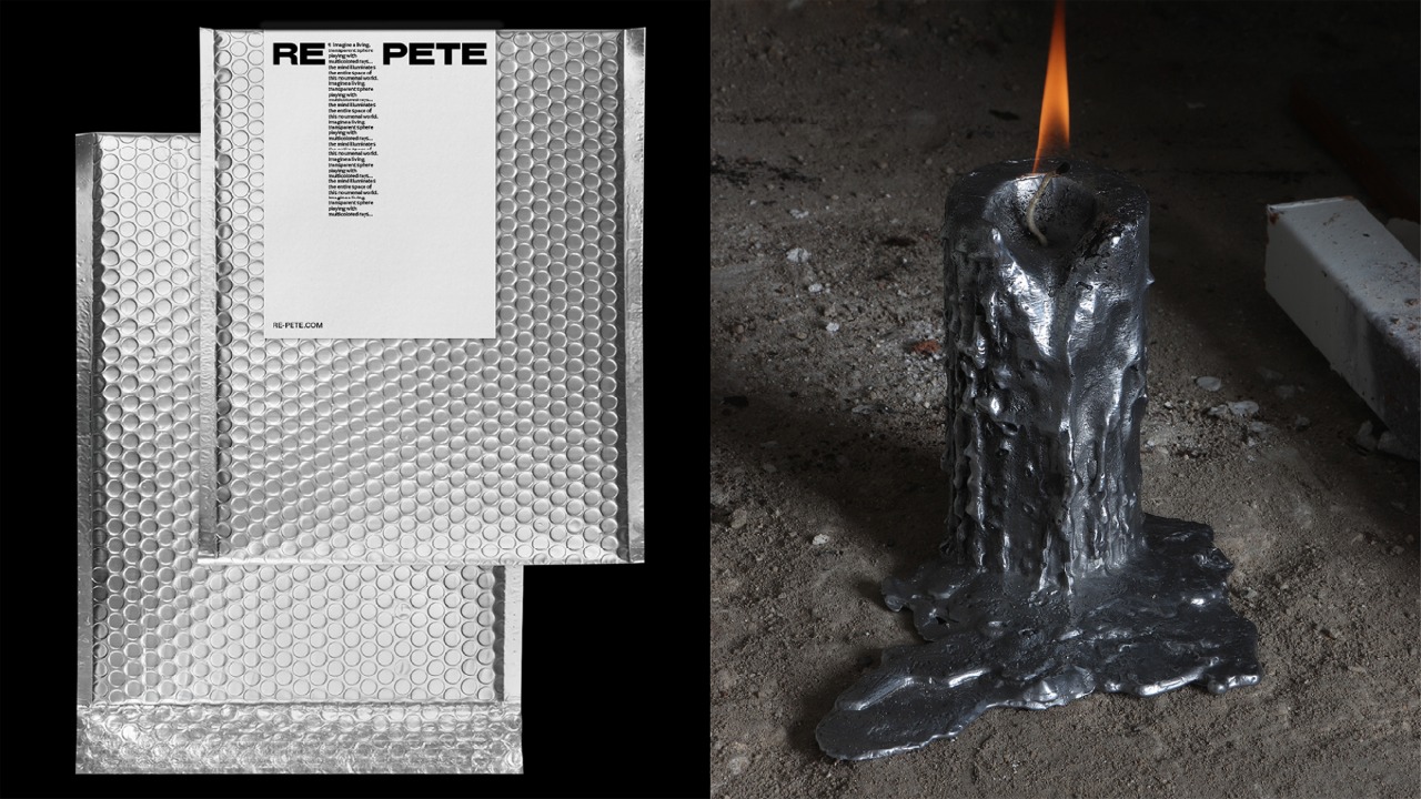
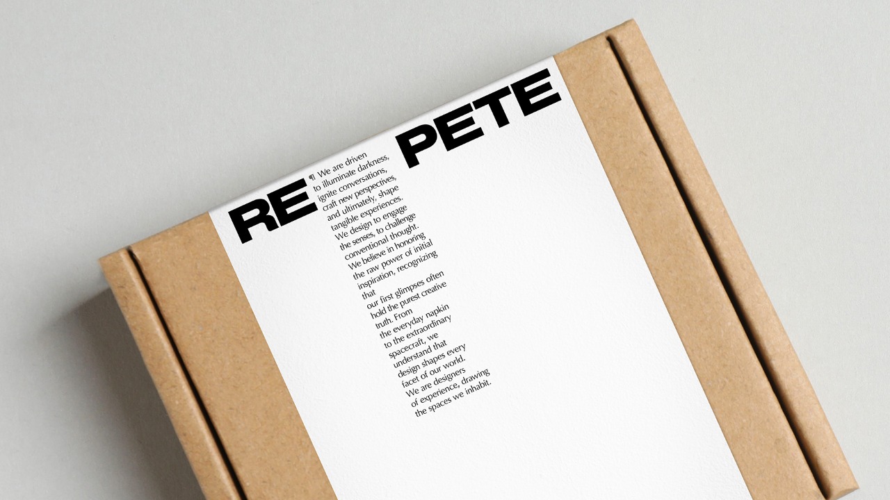
Drawing from the founder’s background in lighting design, the identity was built around the fundamental duality of light and darkness, forming a strict black-and-white typographic system where contrast functions as a material in itself. Presence is revealed through shadow, and meaning emerges through absence as much as form.
Central to the identity is REPETE’s manifesto, embedded directly into the design logic. A paragraph symbol is introduced at the point of separation within the name, creating a deliberate pause that symbolises the time required to think, observe, and allow ideas to mature before taking form.
Typography takes a central role and is treated architecturally, with letters behaving as surfaces rather than signs. The system emphasises space, restraint and precision. The resulting identity is spartan, conceptual and durable, designed to evolve through use and time rather than follow transient trends.