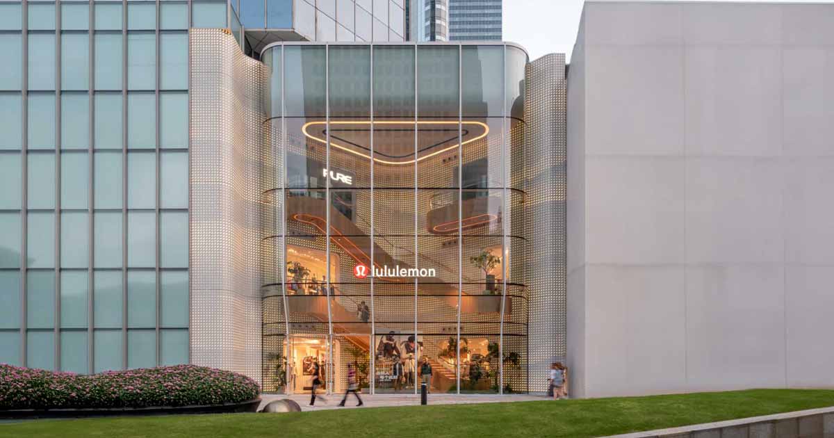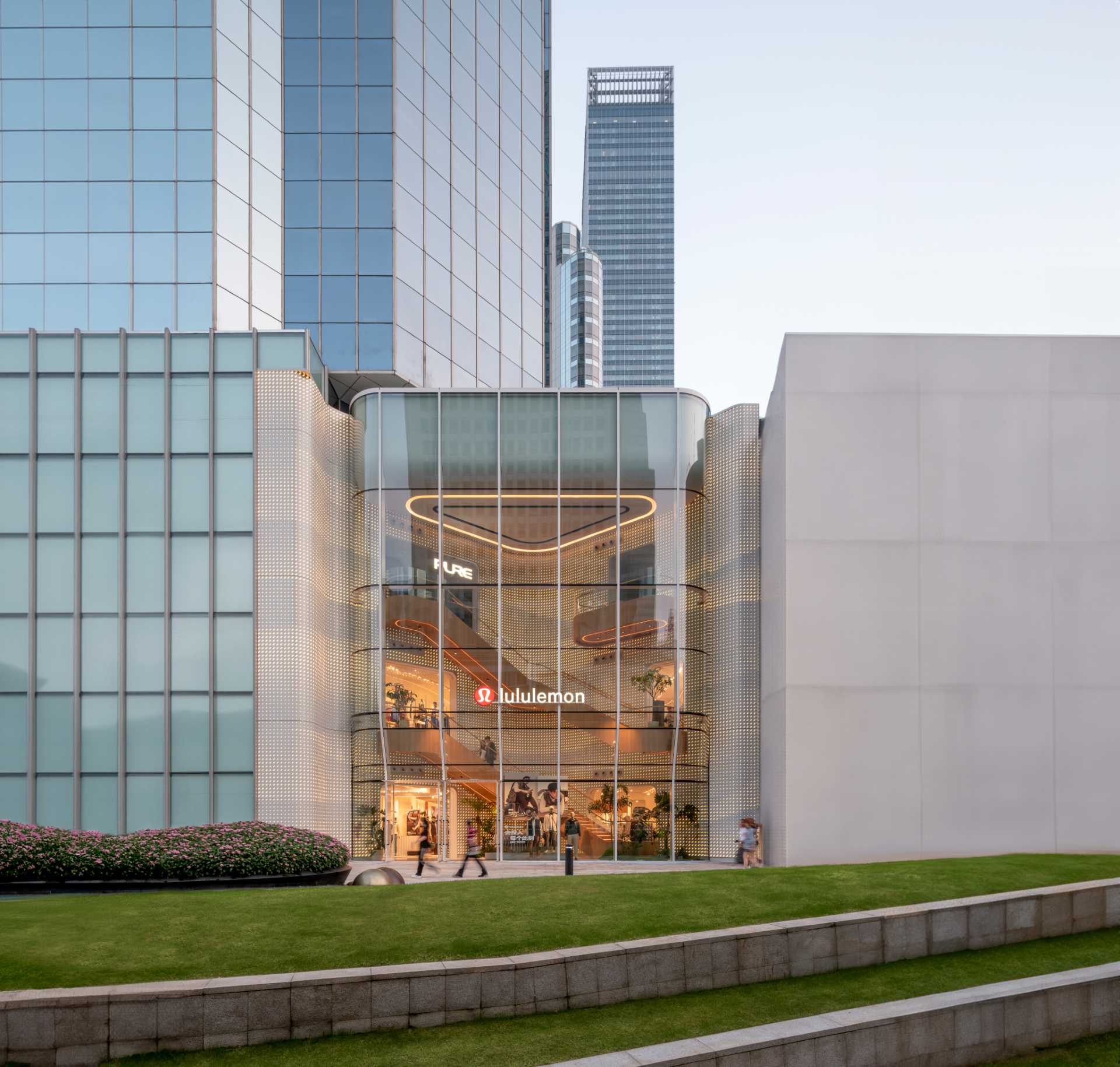
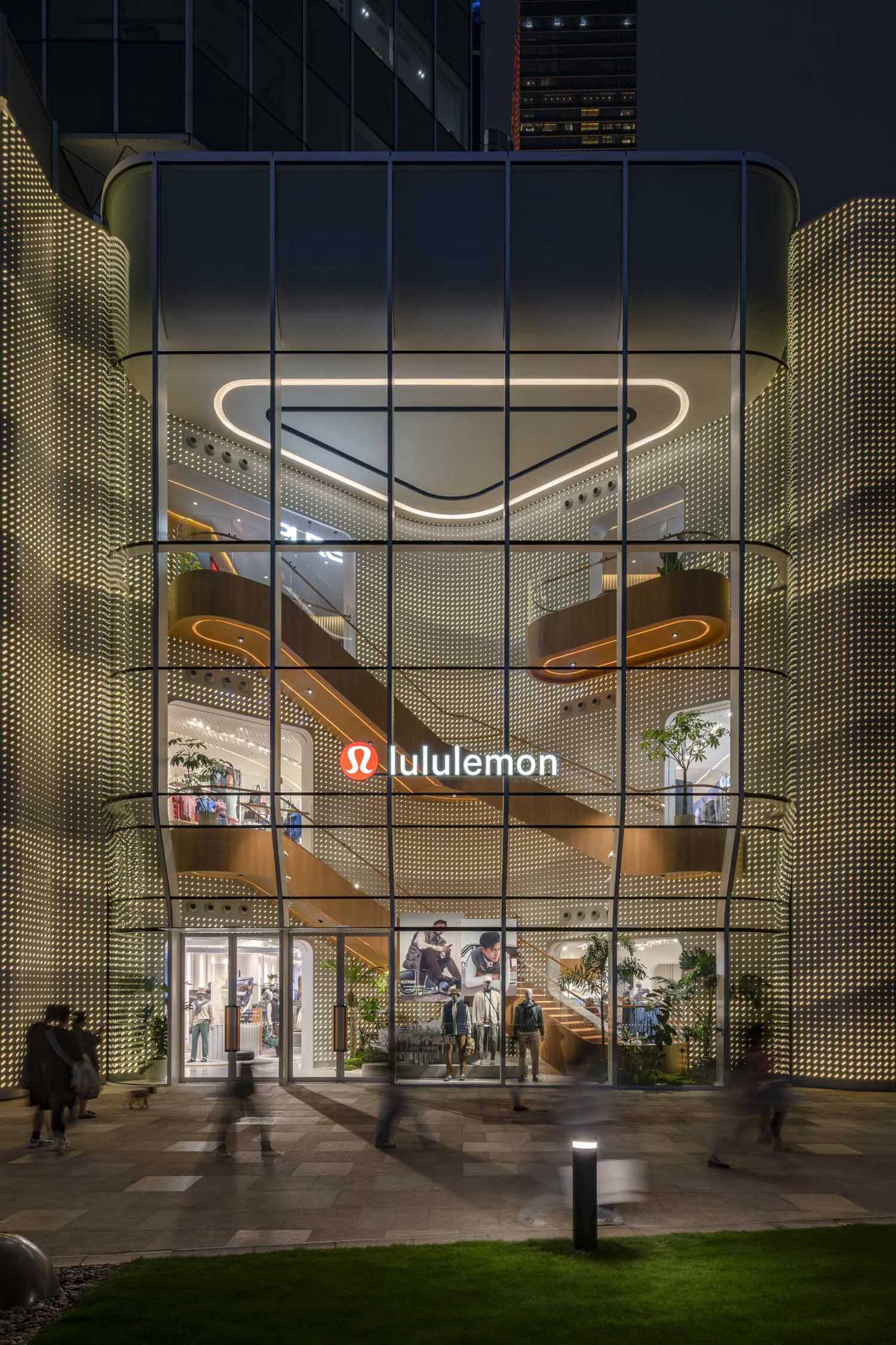
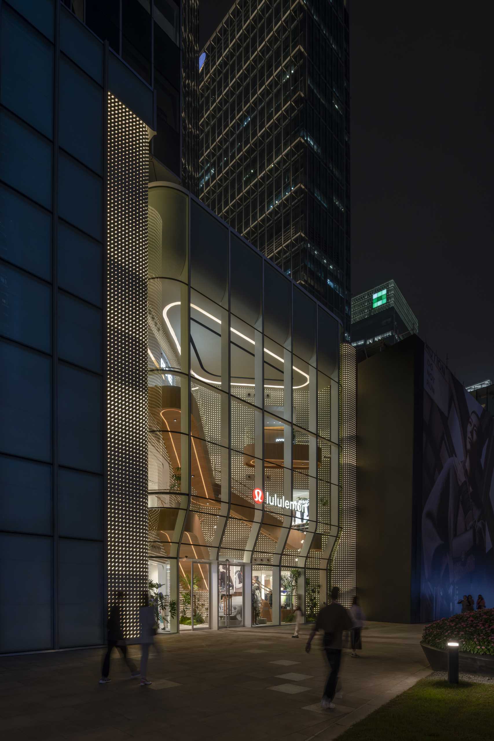
AIM ARCHITECTURE has shared photos of the LULULEMON Flagship Store they designed in Shanghai, China, that uses curved glass to create an eye-catching retail destination.
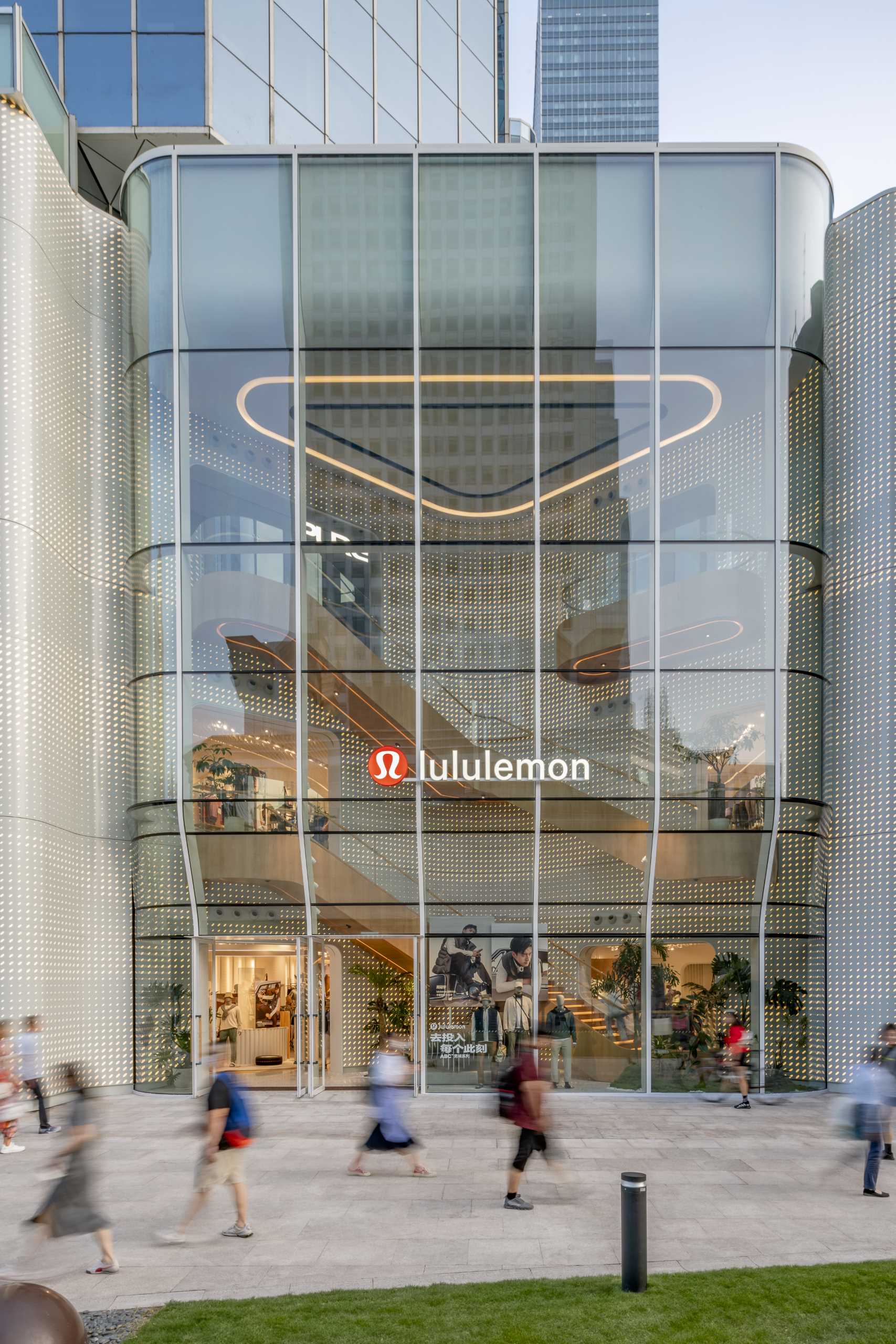
The facade with its curved glass window, allows people on the street to witness the movement of activity within the store, primarily through the grand staircase.
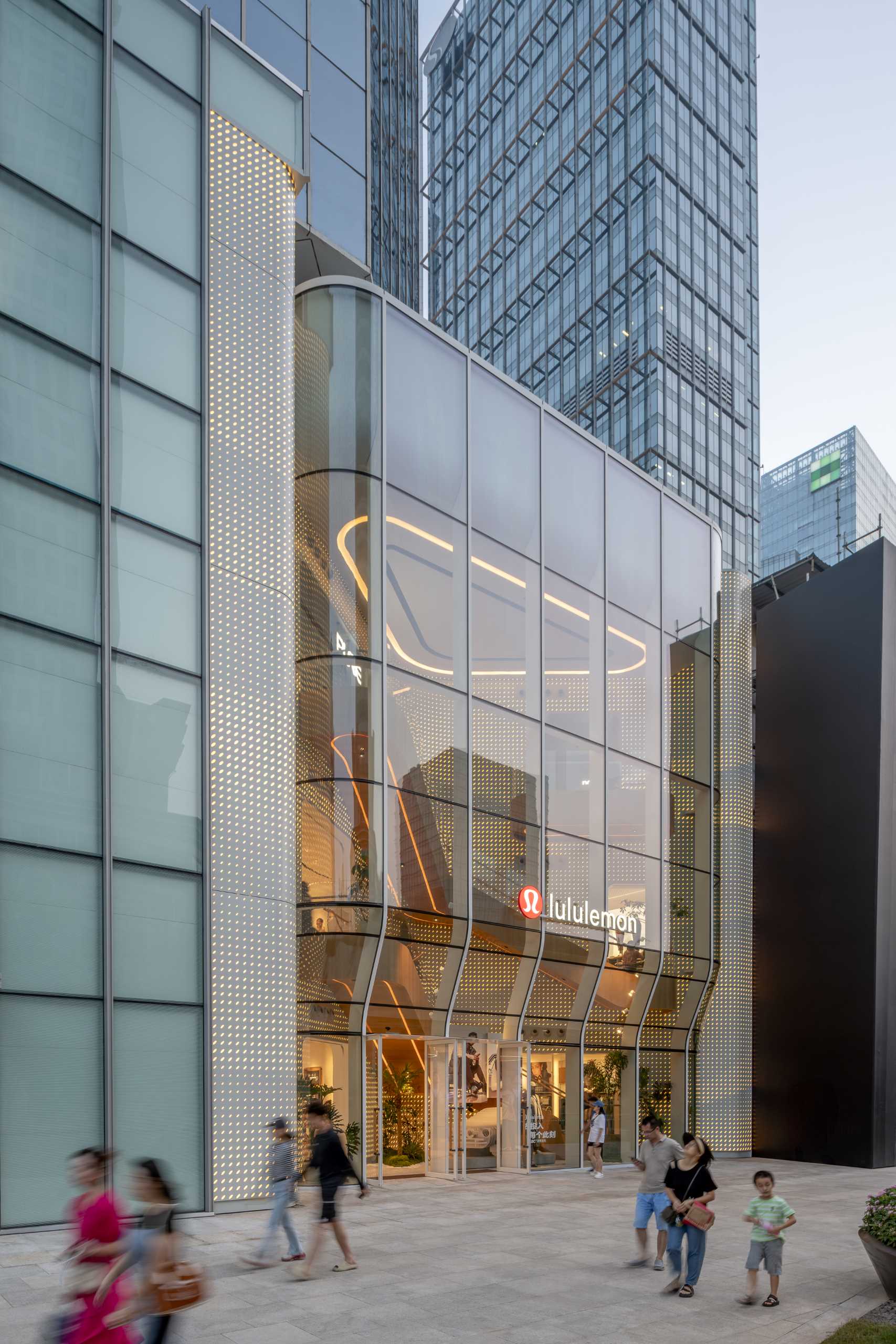
At night, the lighting allows the store to glow, showcasing the staircase and the multi-floor interior.
Inside, the iconic Lululemon pattern transforms into a more energetic and engaging expression. series of dynamic extrusions that playfully interact with the store’s spatial layout.
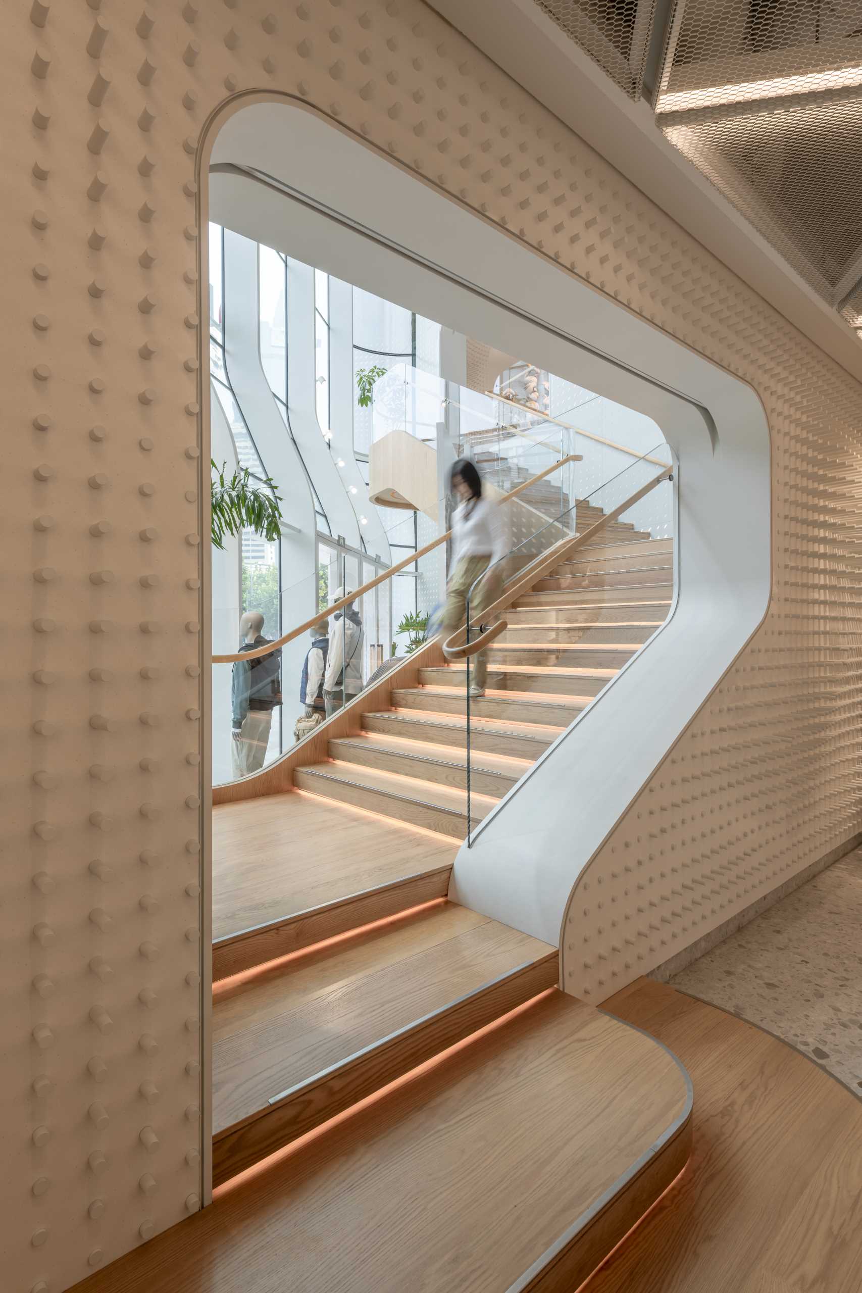
They traverse across the walls and even extend to the ceiling, embracing both levels of the store before subtly fading into the background.
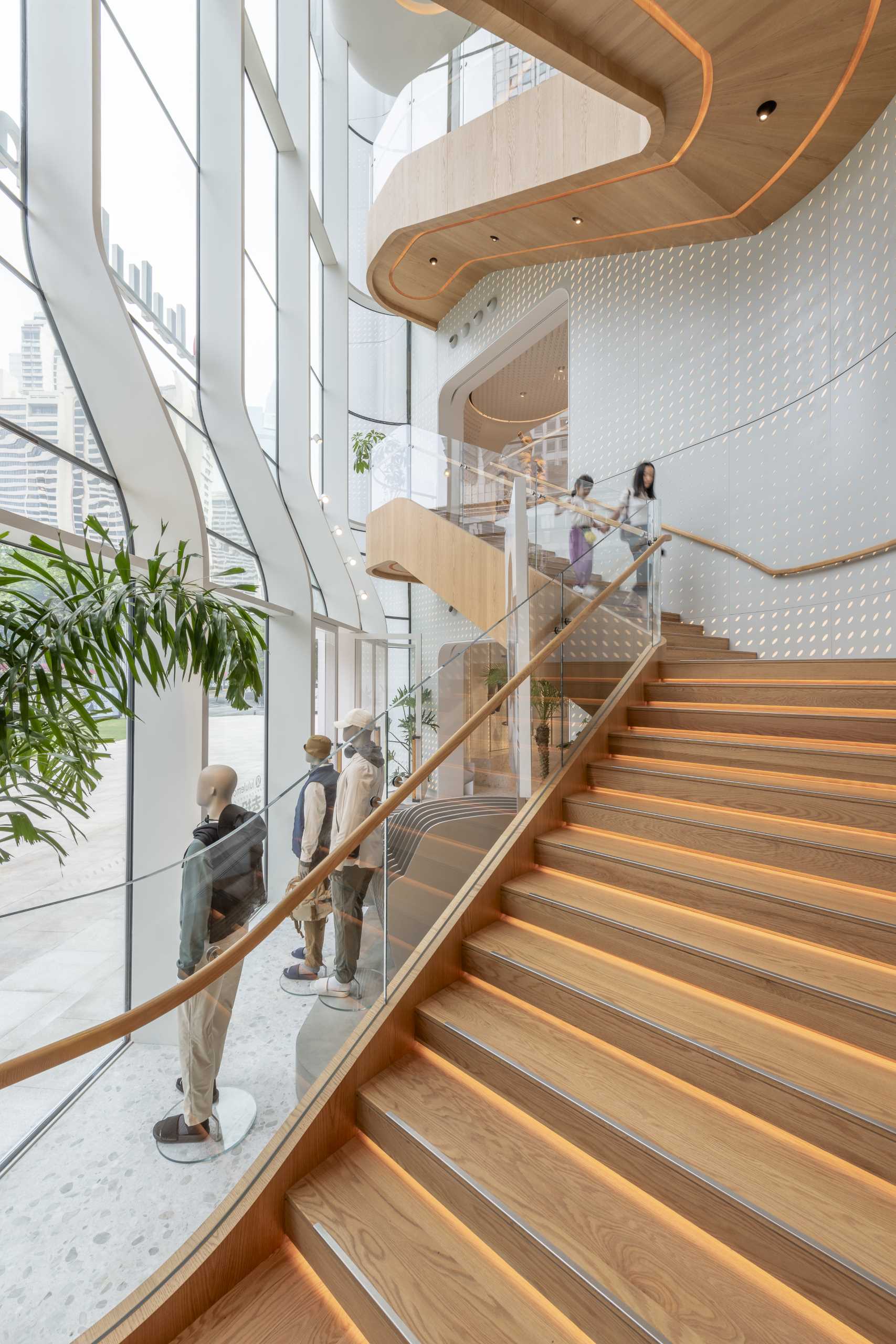
The wood stairs and balconies have hidden LED lighting outlining the shape underneath, as well as on each stair tread.
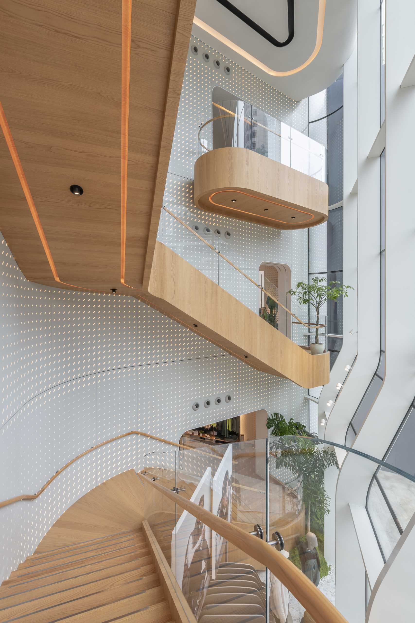
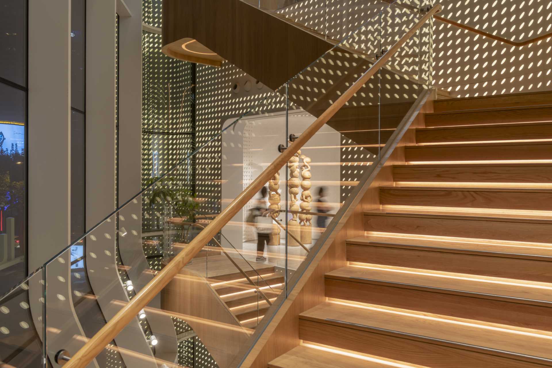
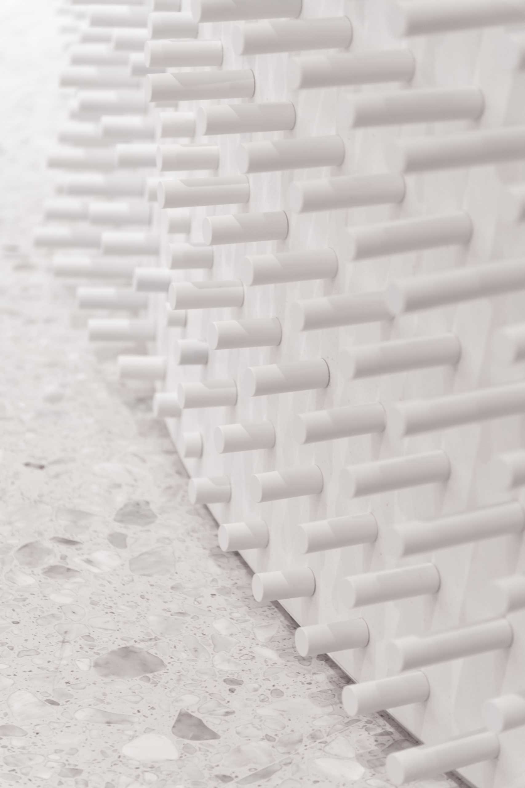
Here’s a close look at the details that line the fluid and curving walls.
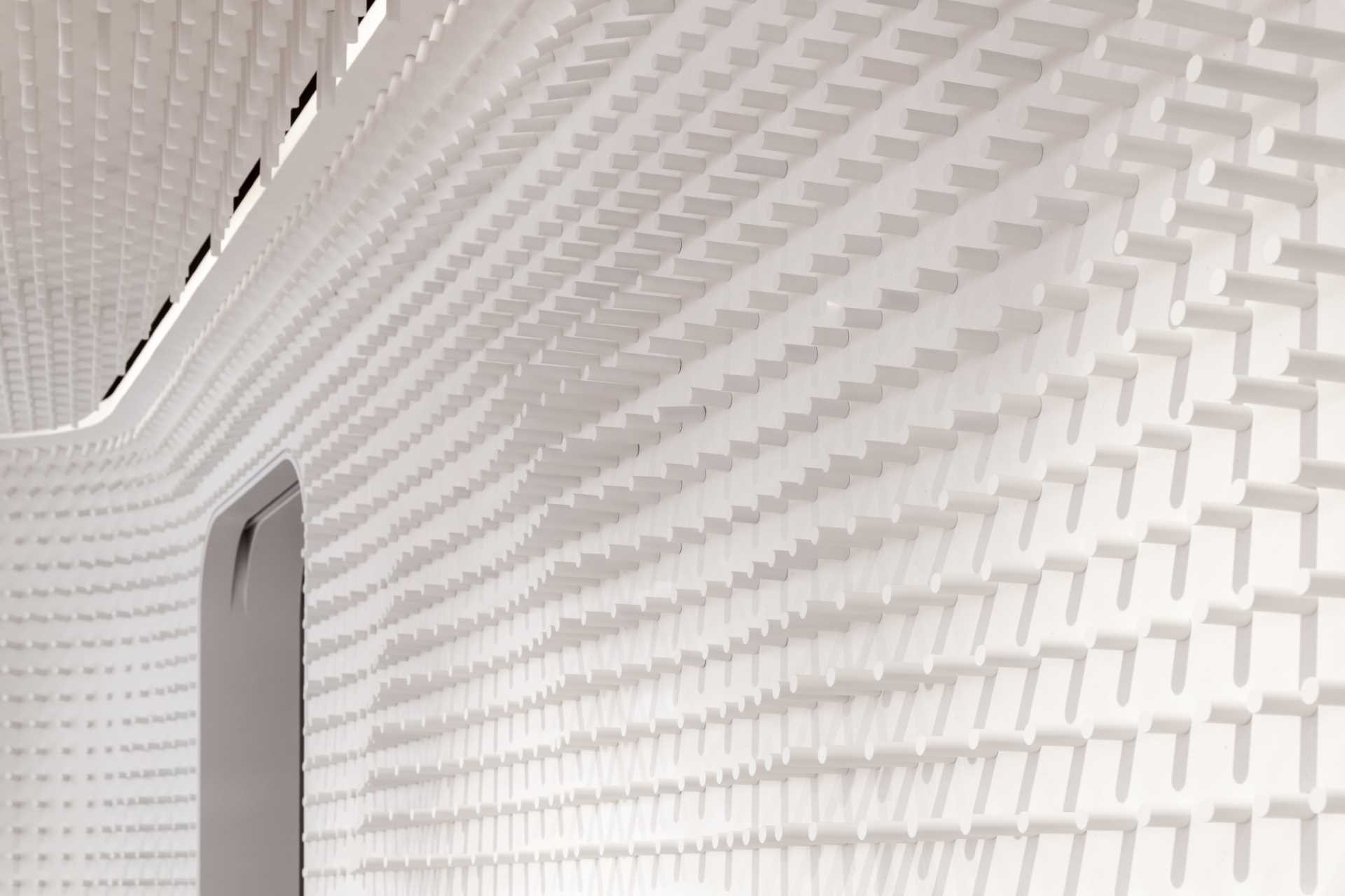
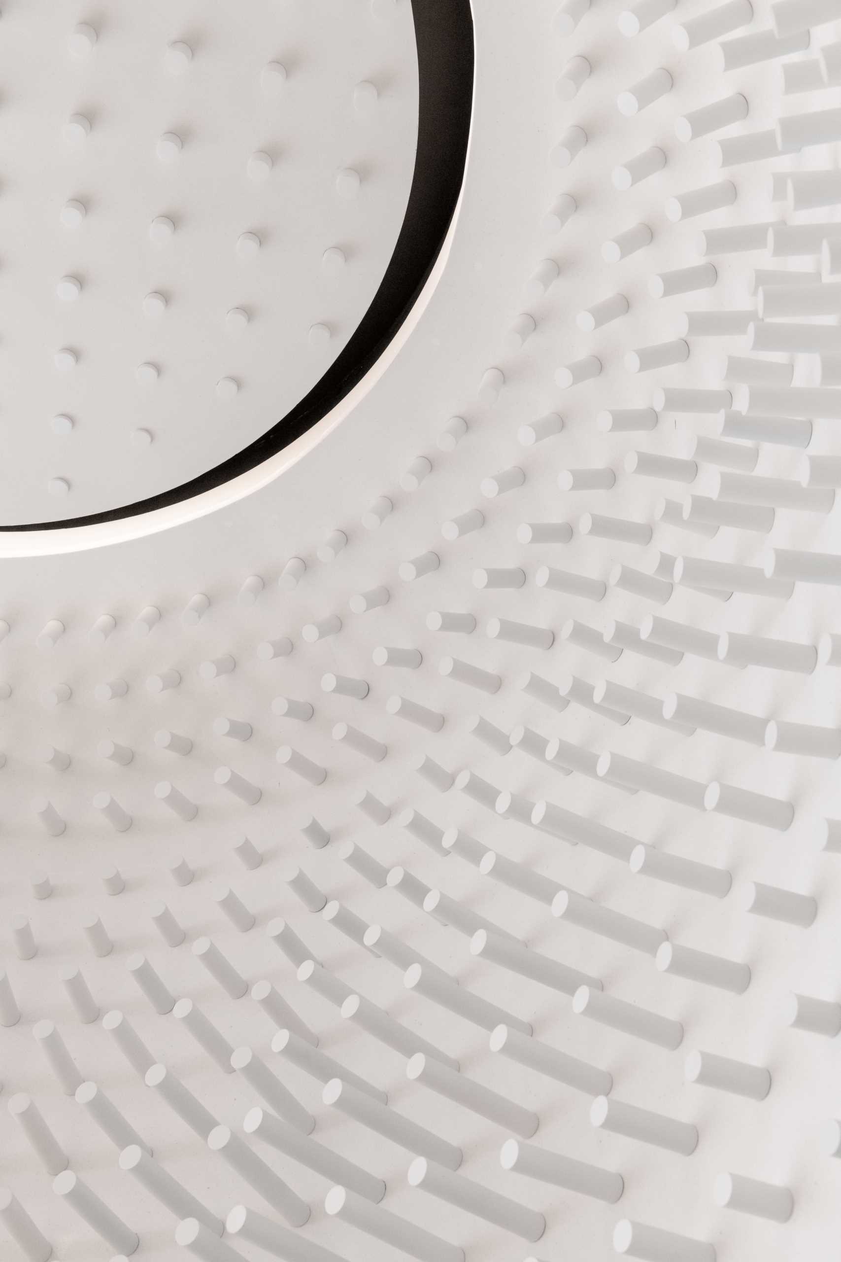
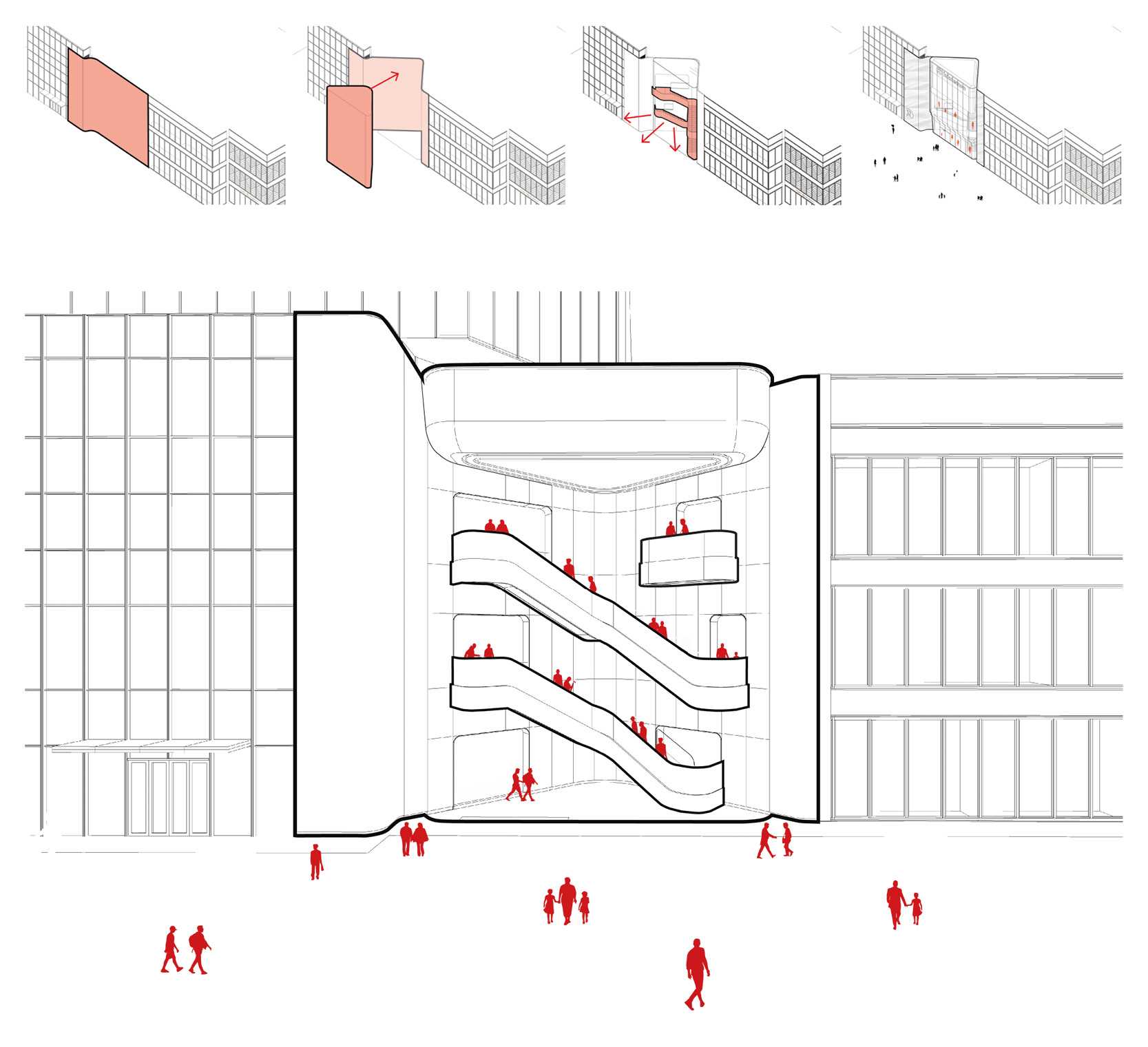
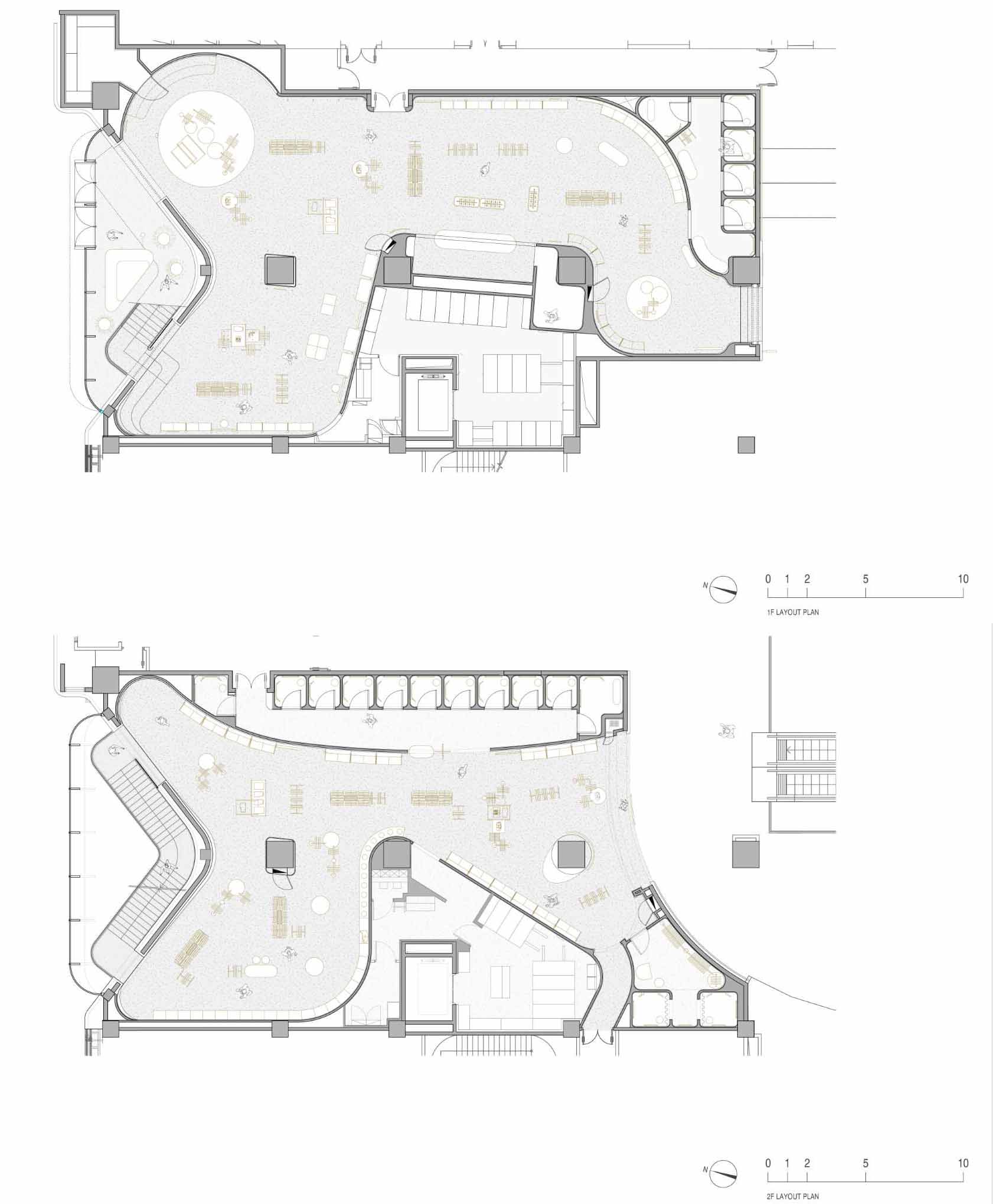
Here’s a look at the architectural drawings for the store.
Photography: Dirk Weiblen | Design: AIM ARCHITECTURE | Design Principals: Wendy Saunders, Vincent de Graaf | Project Architect: Youjin An, Jerry Guo | Design Team: Alba Galan, Caddie, Emilio Wang Chen, Mia Lei, Victor Mongin, Wenzhao Jia, Kexian | FF&E Team: Lili Cheng, Weisha Dai | General Contractor: Beatrix Space Design | Lighting Consultant: LPA
Source: Contemporist

