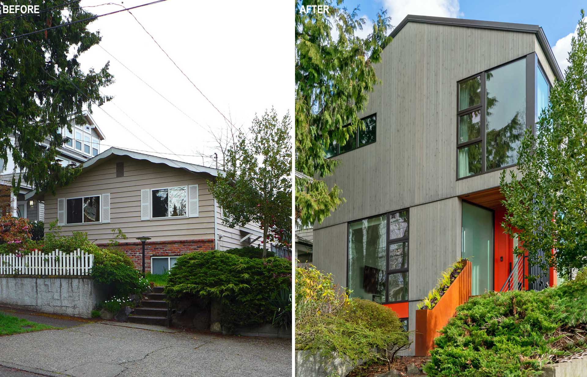
Floisand Studio Architects has designed the remodel of a 1960s home in Seattle, Washington, and transformed it into a modern house for a growing family.
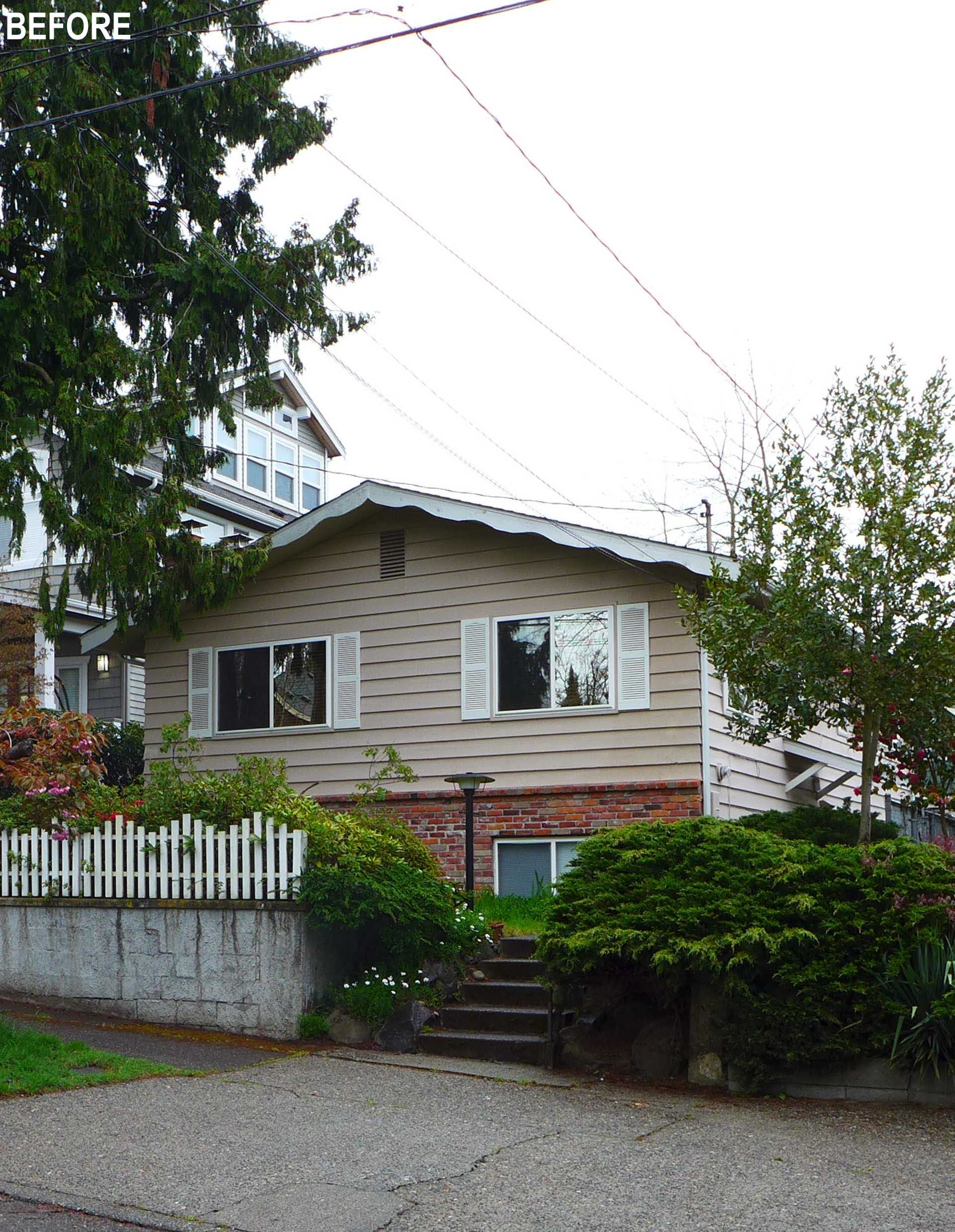
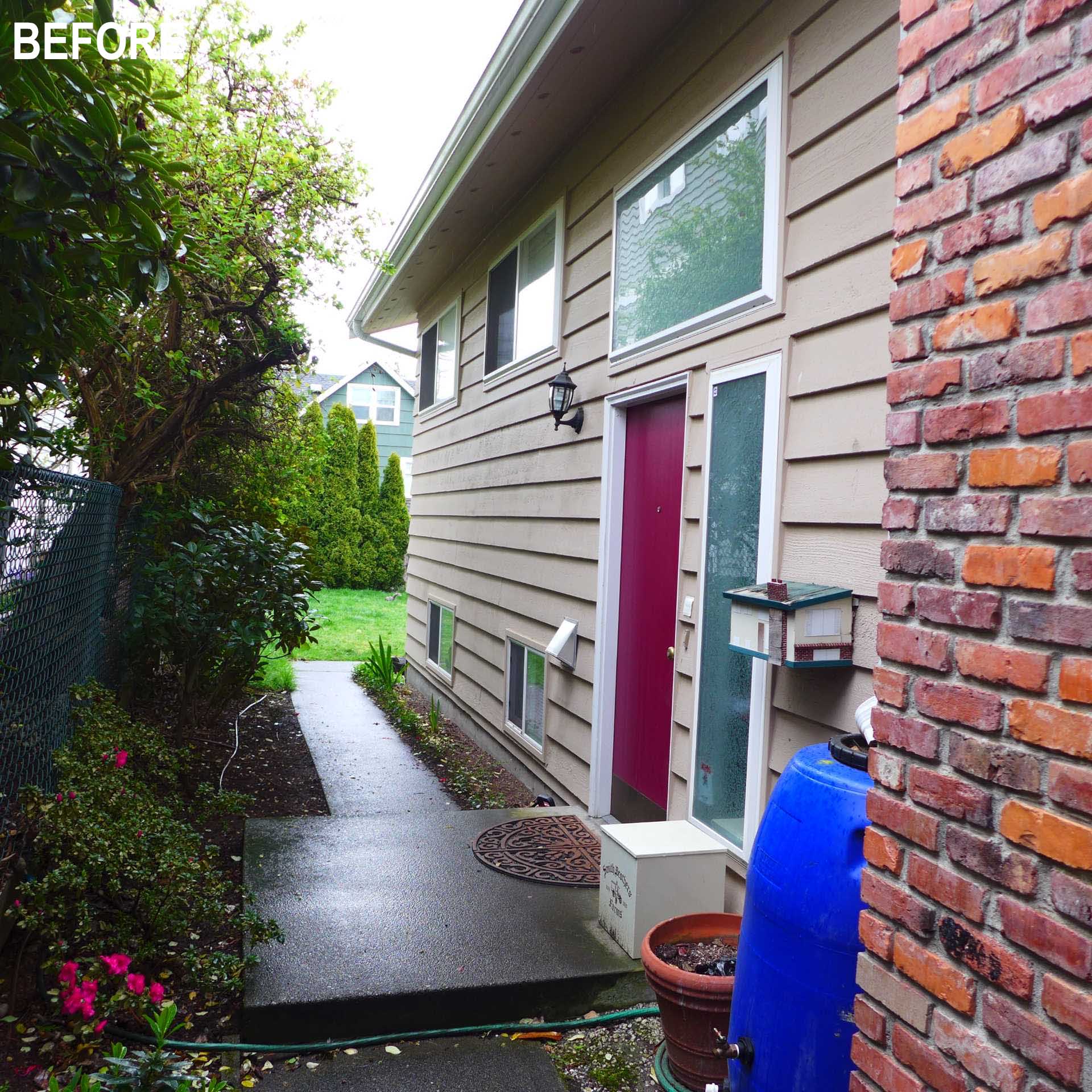
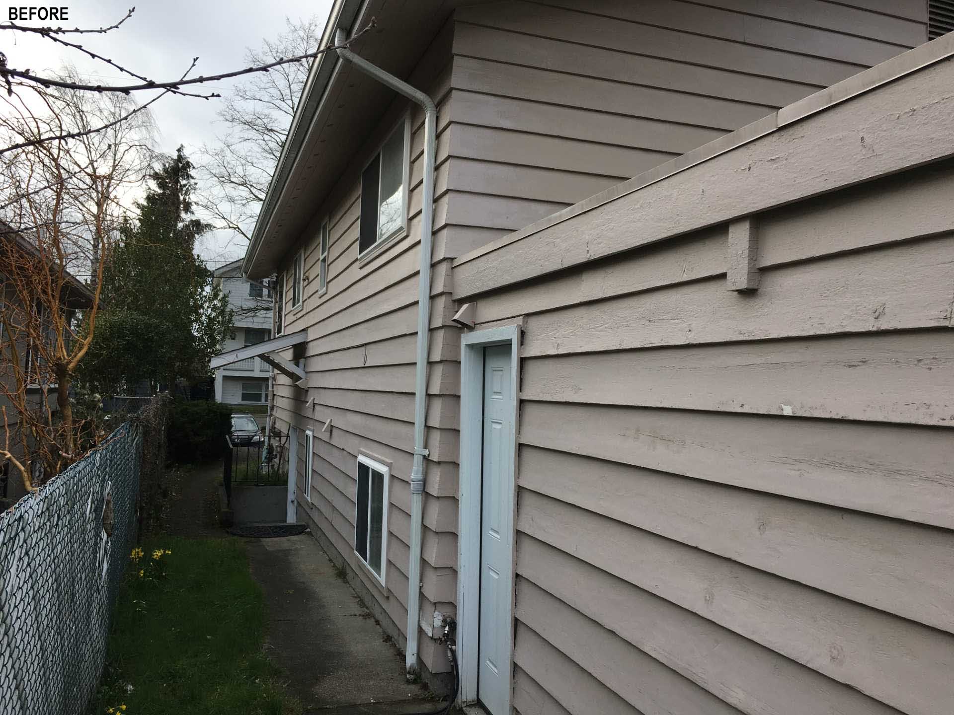
This remodel sits on the same basement and foundation as its predecessor, but that’s where the similarities end. Here’s what the home looked like before, with the front door accessed from a side yard.
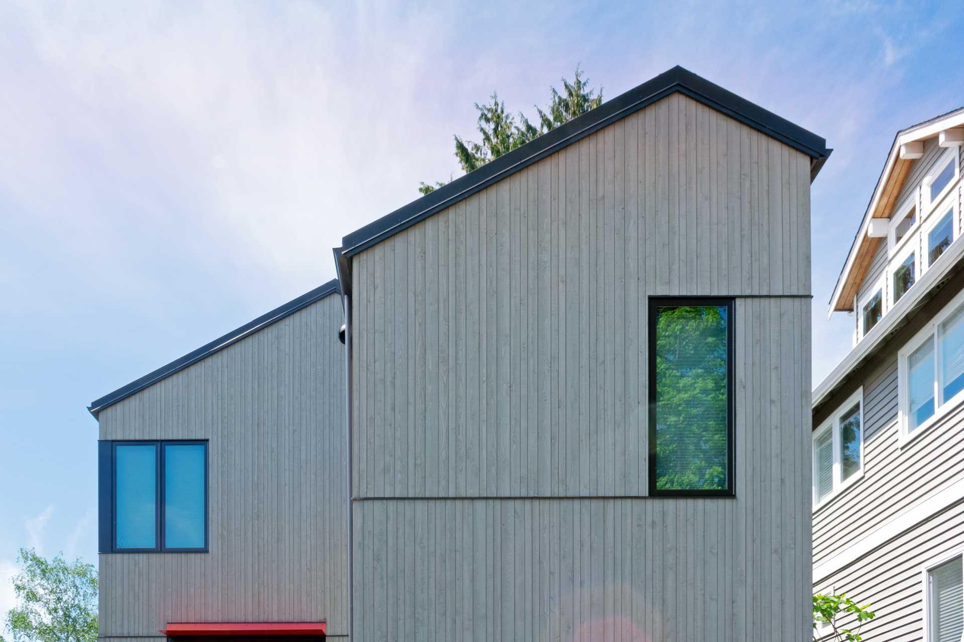
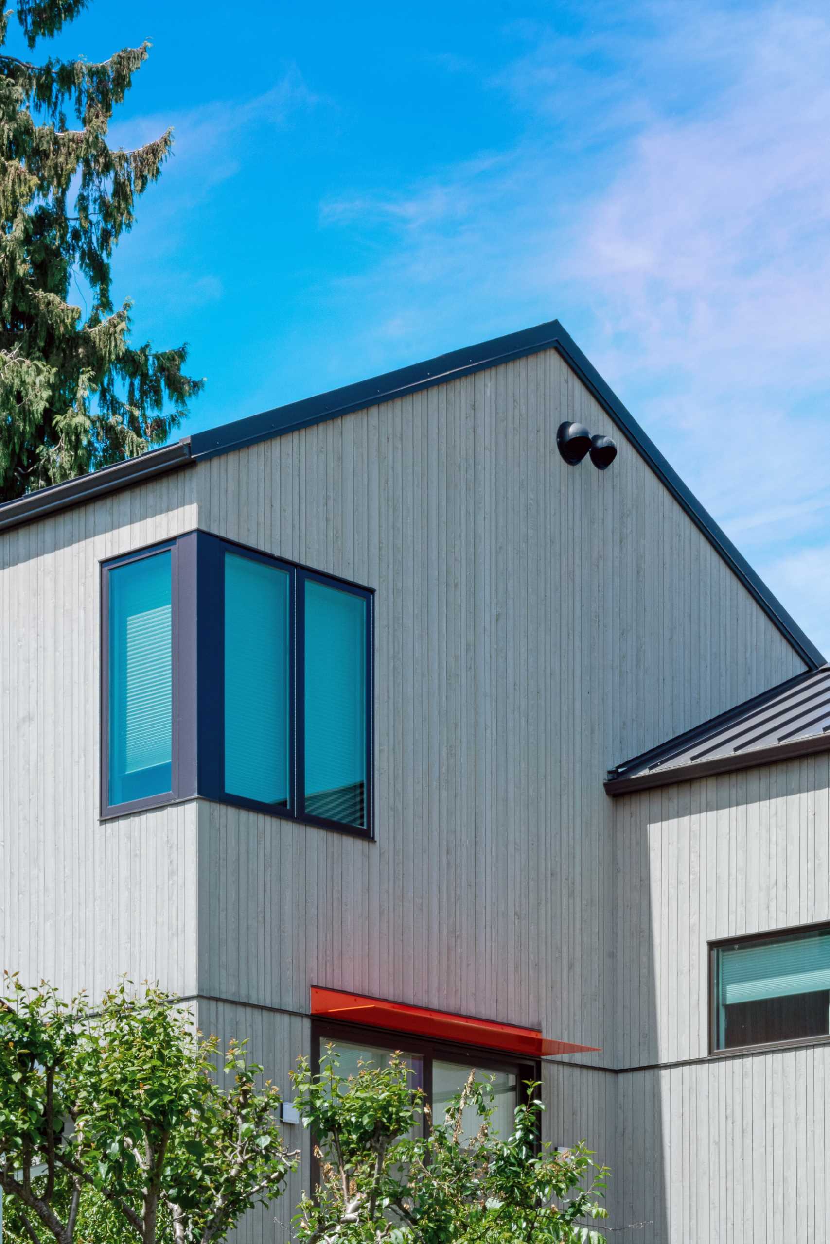
The updated home includes larger doors and windows along the street-facing facade that bring more light into the home and open up the view to the beautiful evergreen tree that anchors the front yard.
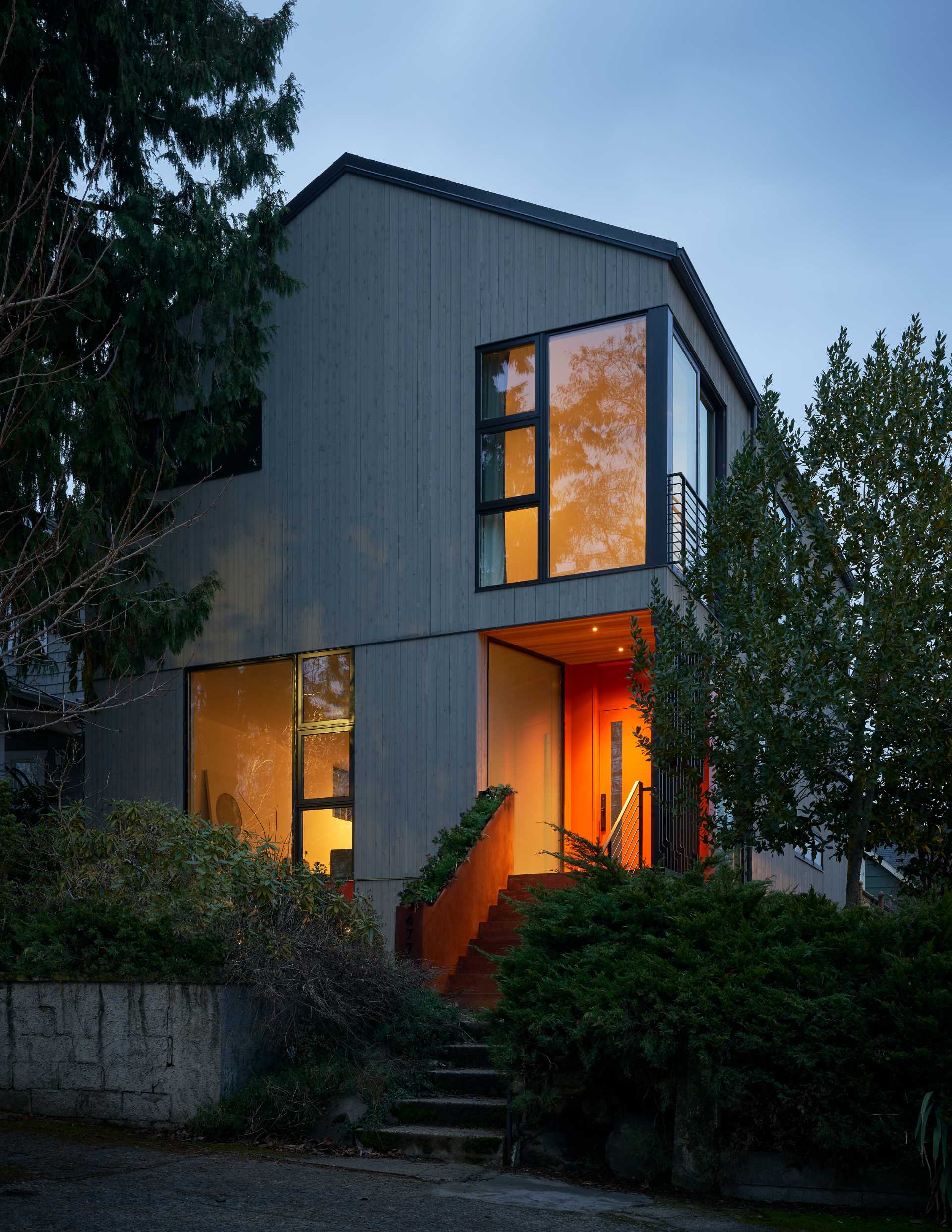
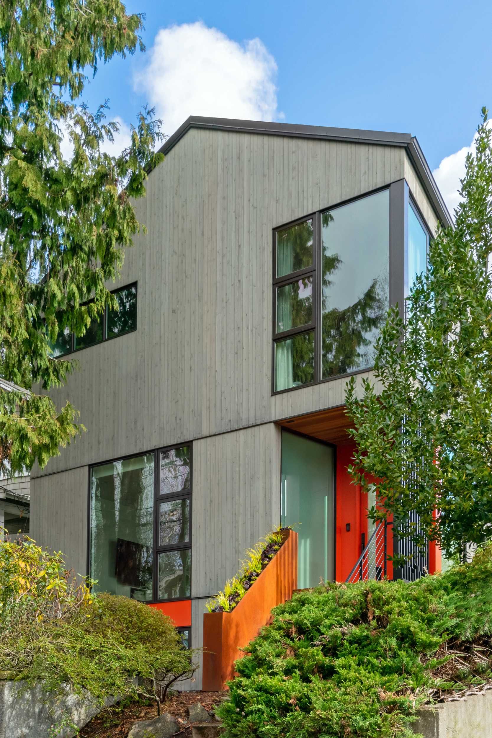
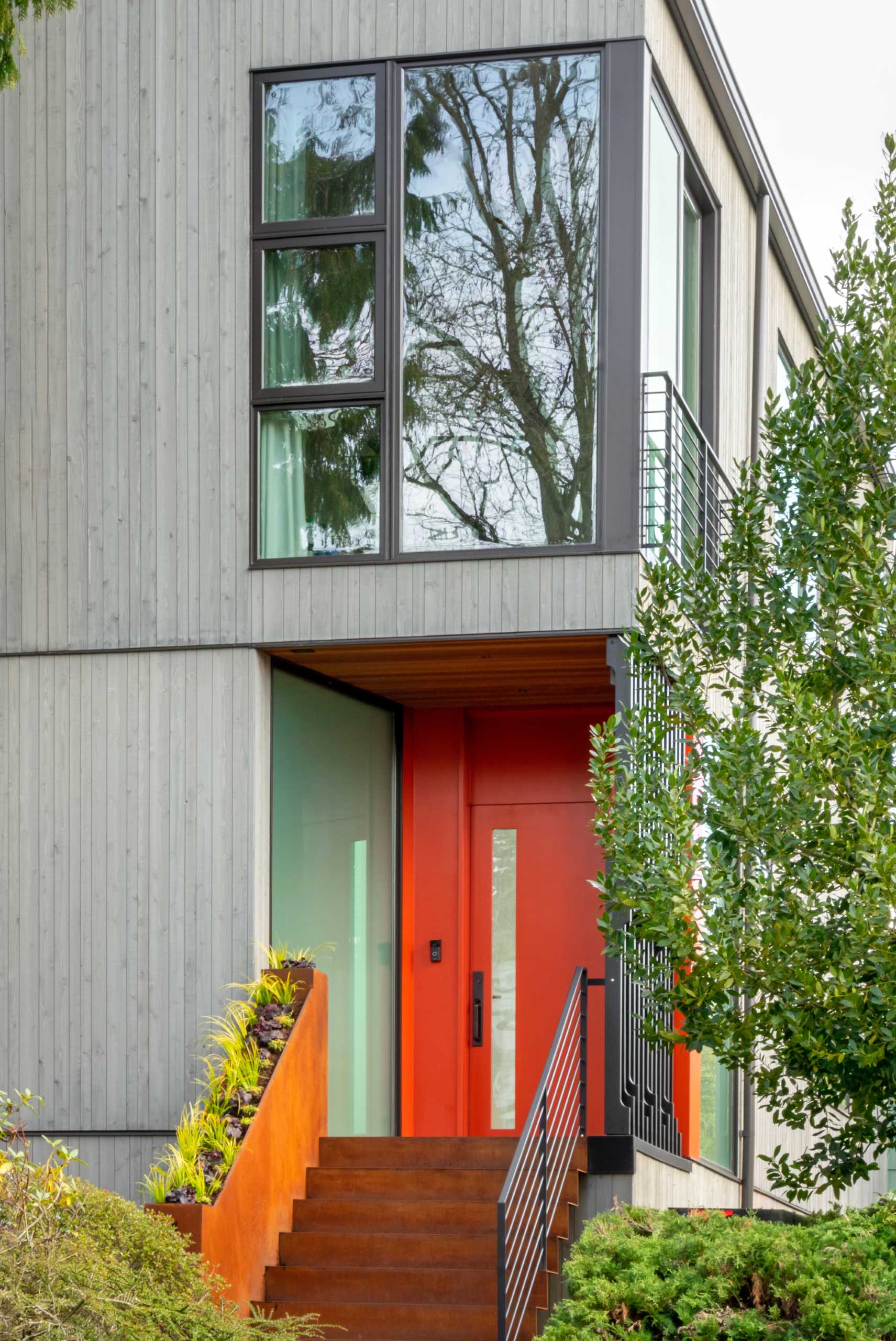
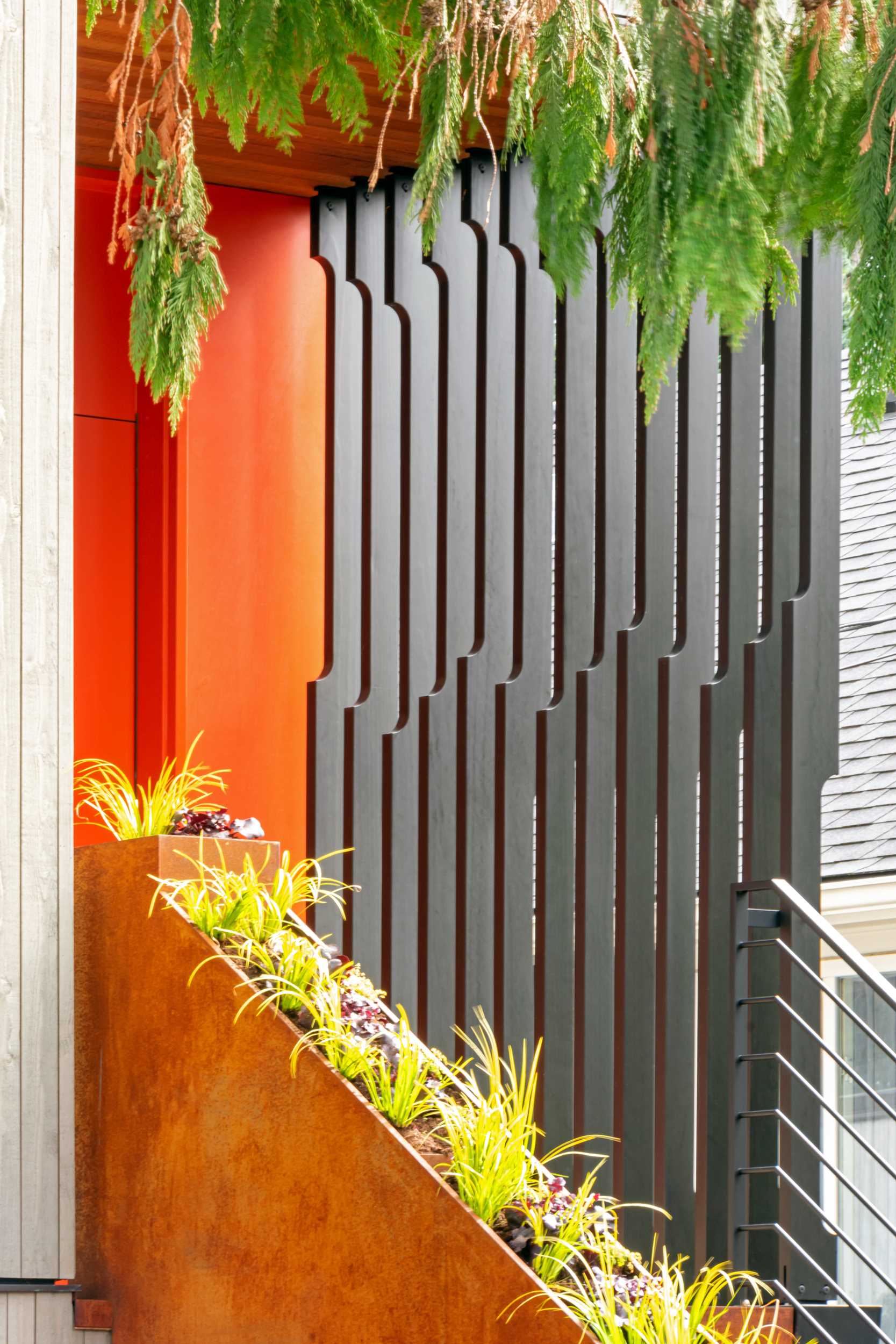
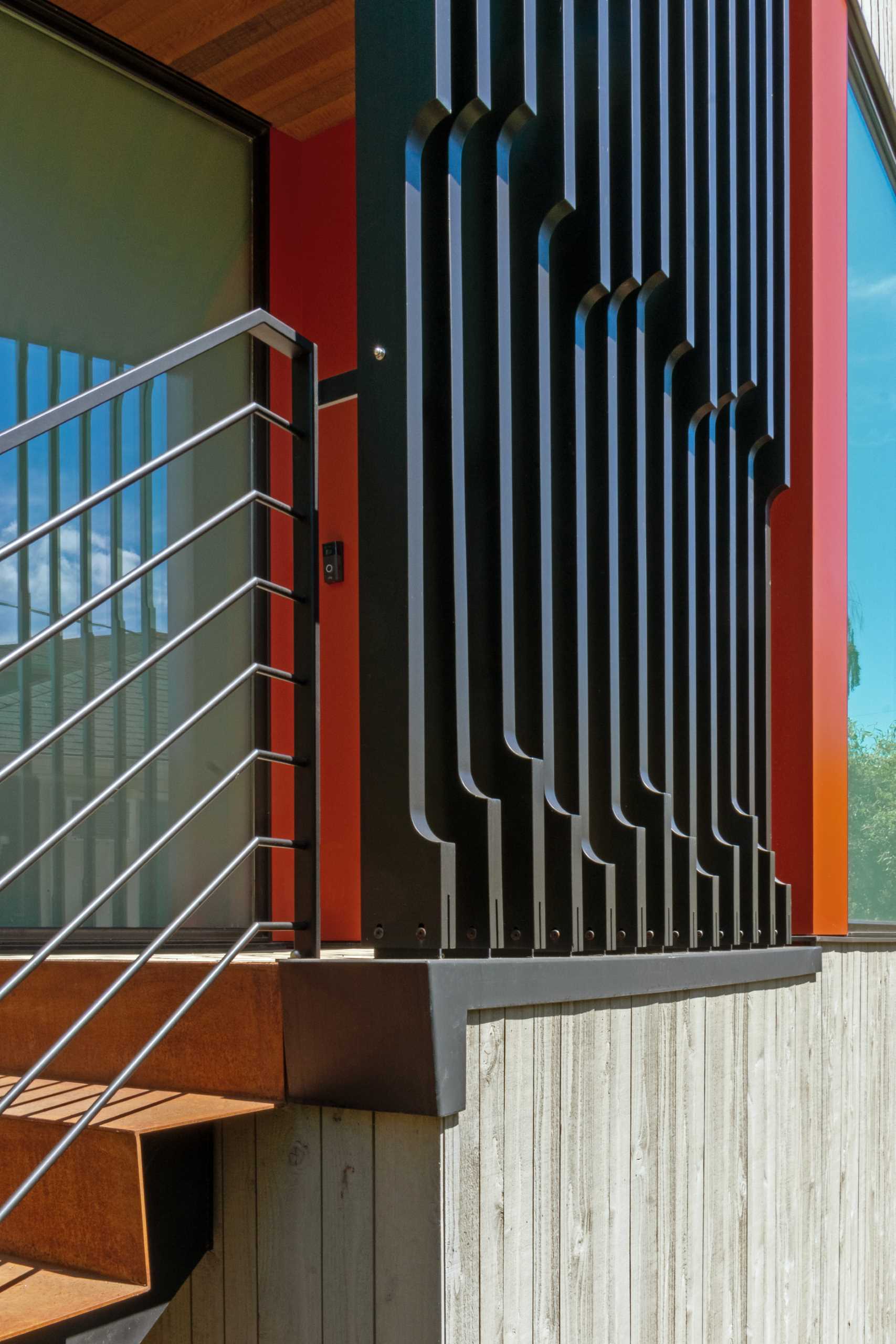
The architects converted the basement apartment into an ADU (Accessory Dwelling Unit) and relocated the home’s entry to the front of the house, where its bright color is eye-catching against the wood exterior. A steel planter runs alongside the steps leading to the front door.
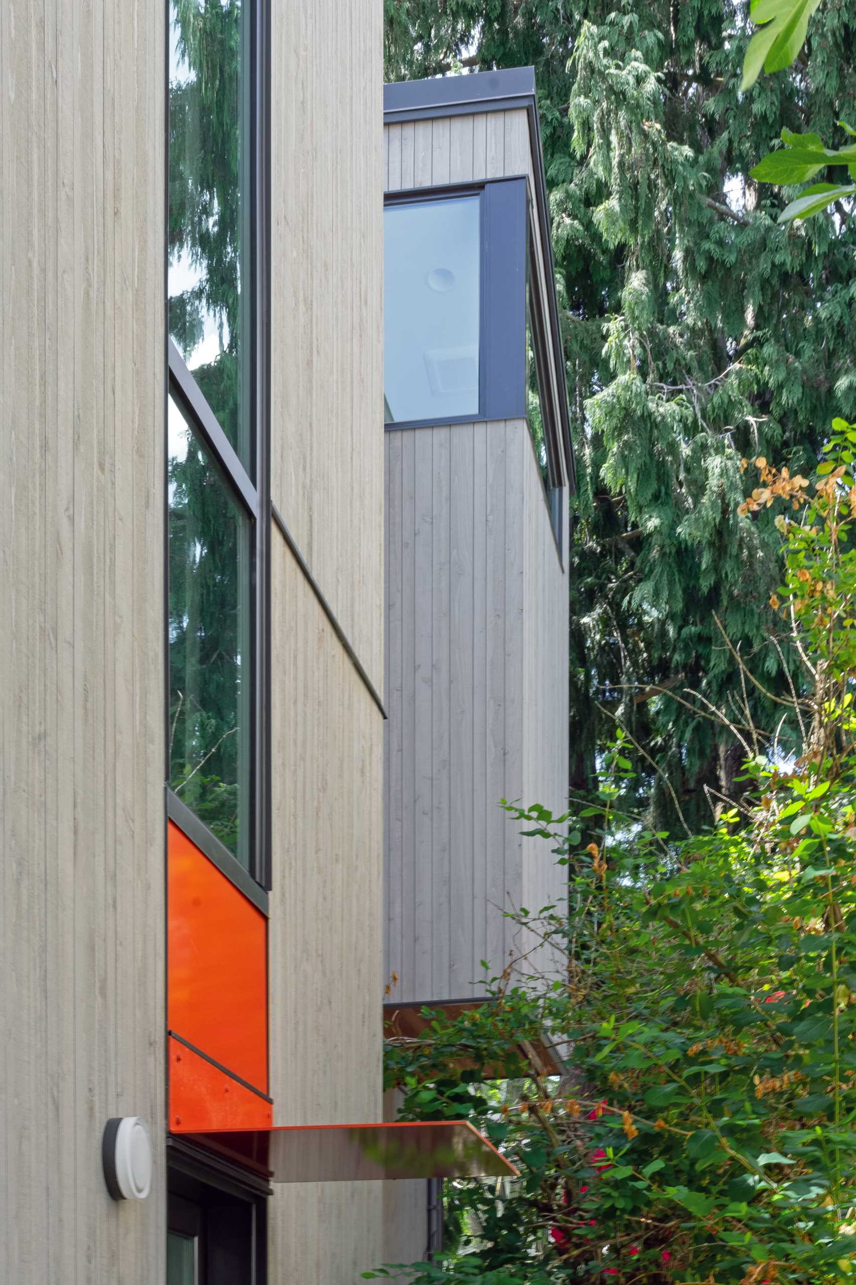
Here’s a closer look at what the siding for the original house looked like, compared to the new house siding.
siding after
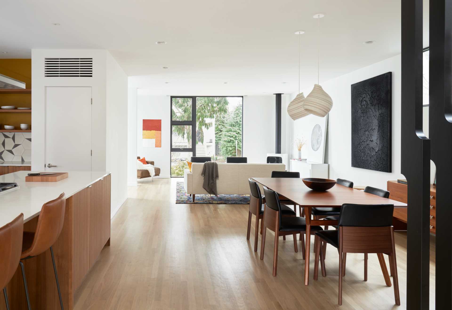
The entry, living, dining, and kitchen spaces are open and free of walls.
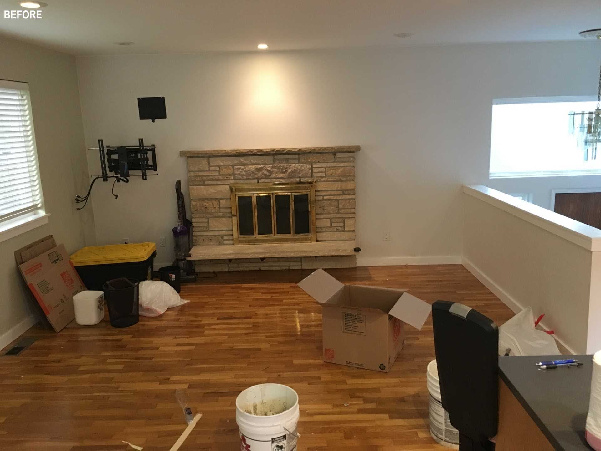
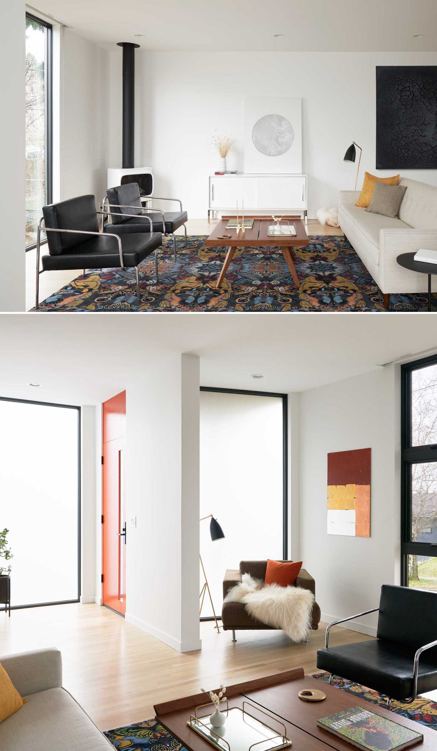
The living room now has the fireplace in the corner of the space.
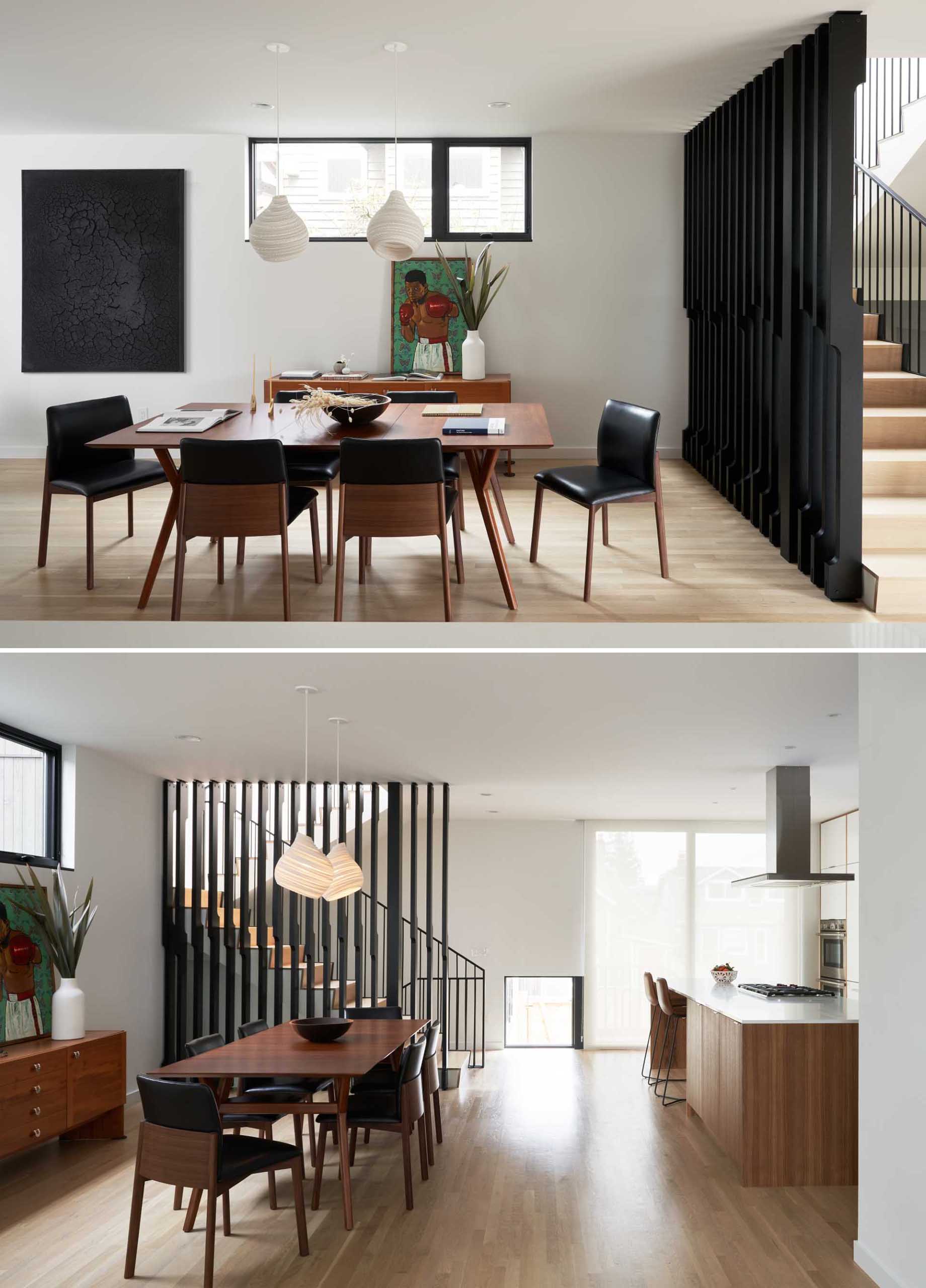
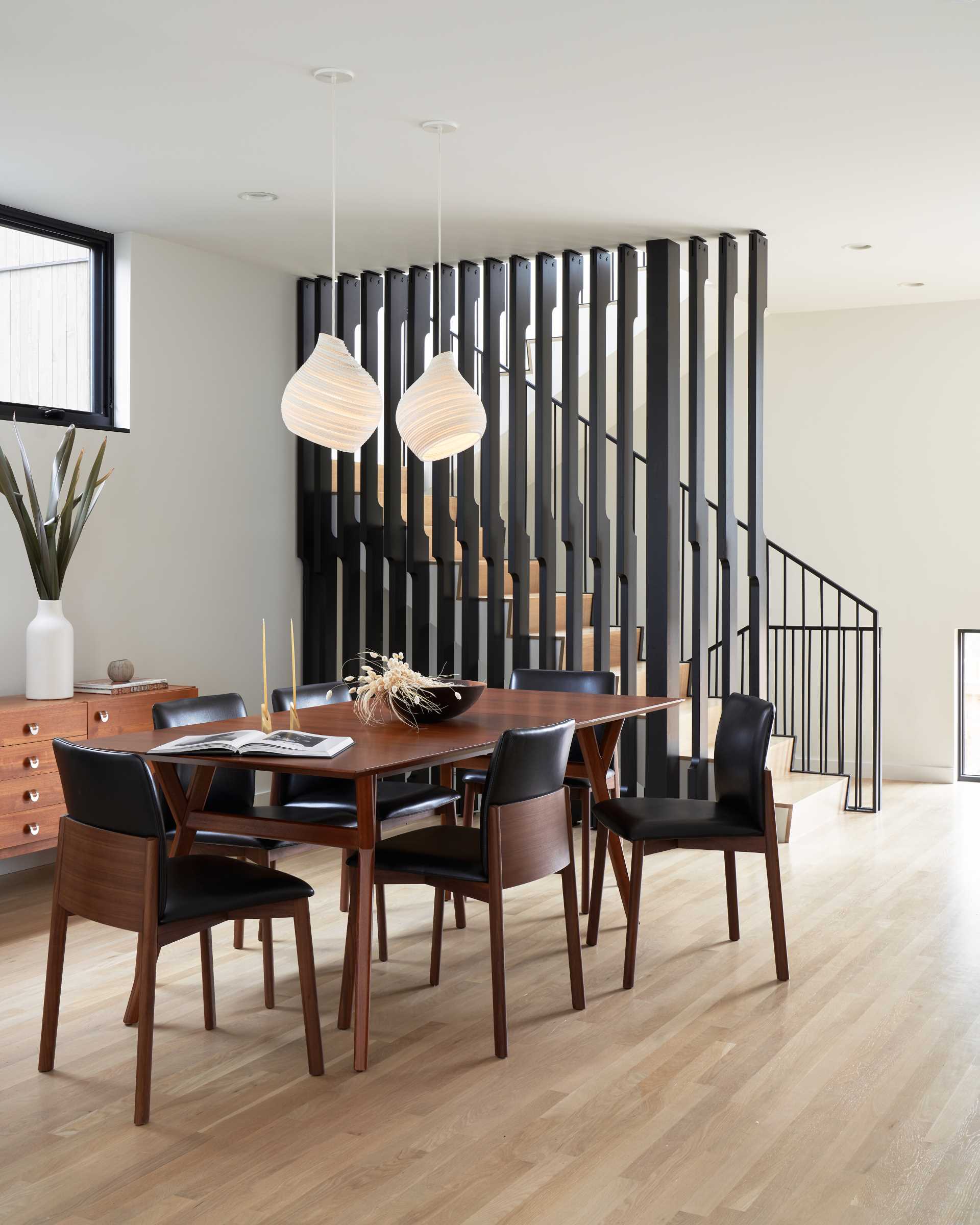
The dining area is behind the living room and is furnished with a warm wood table and a pair of sculptural pendant lights.
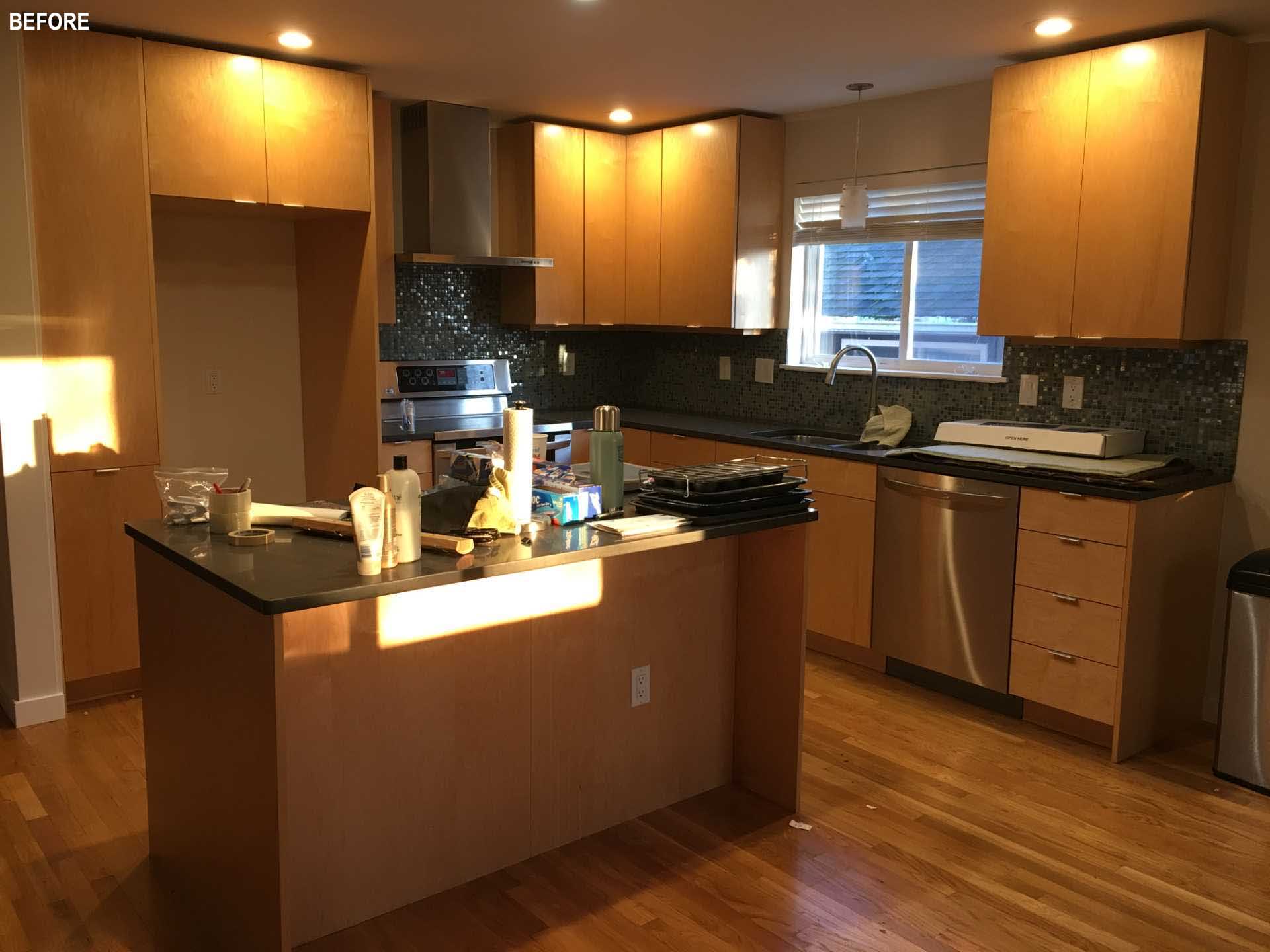
The previous kitchen had a small window and a backsplash that made the space darker
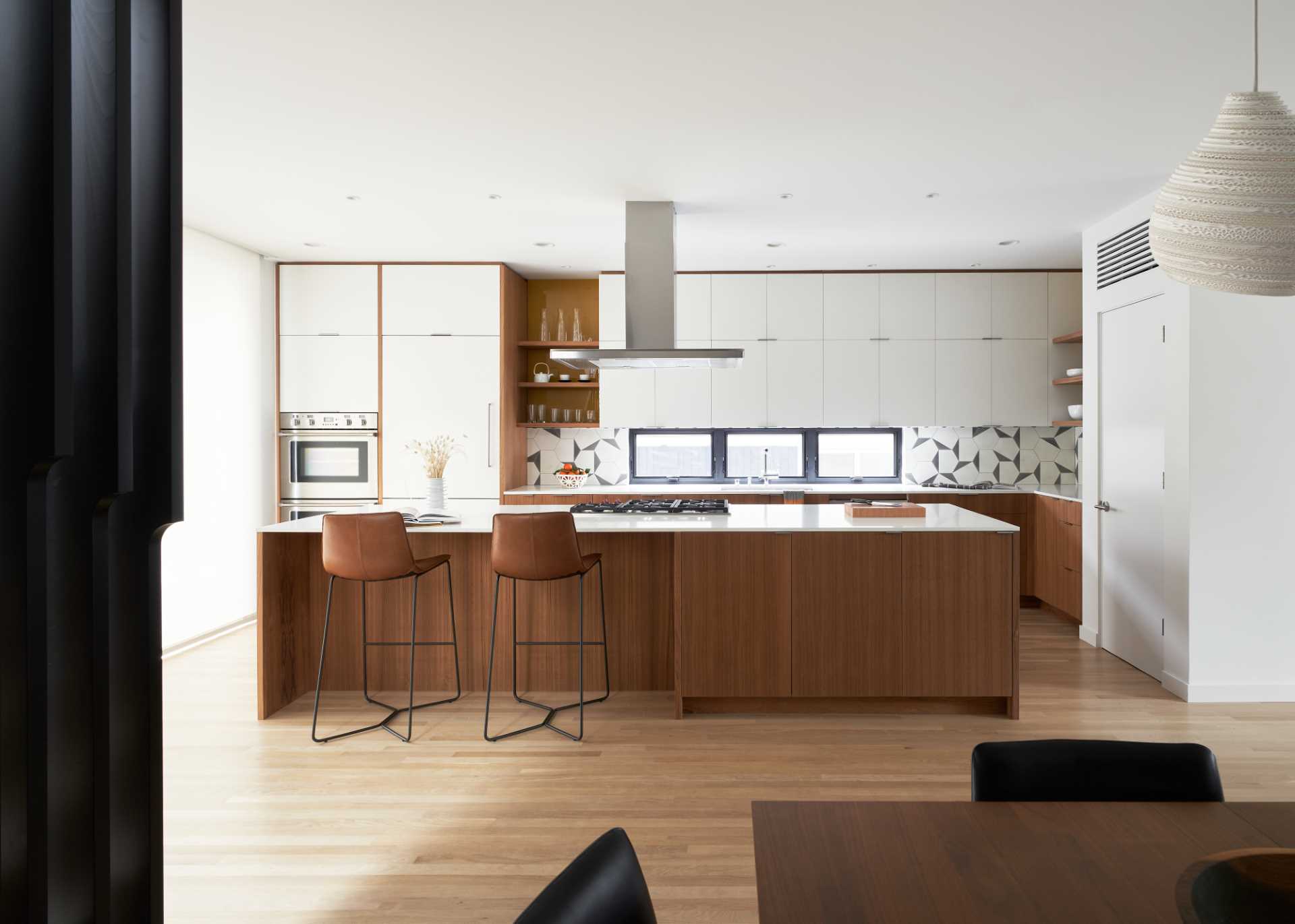
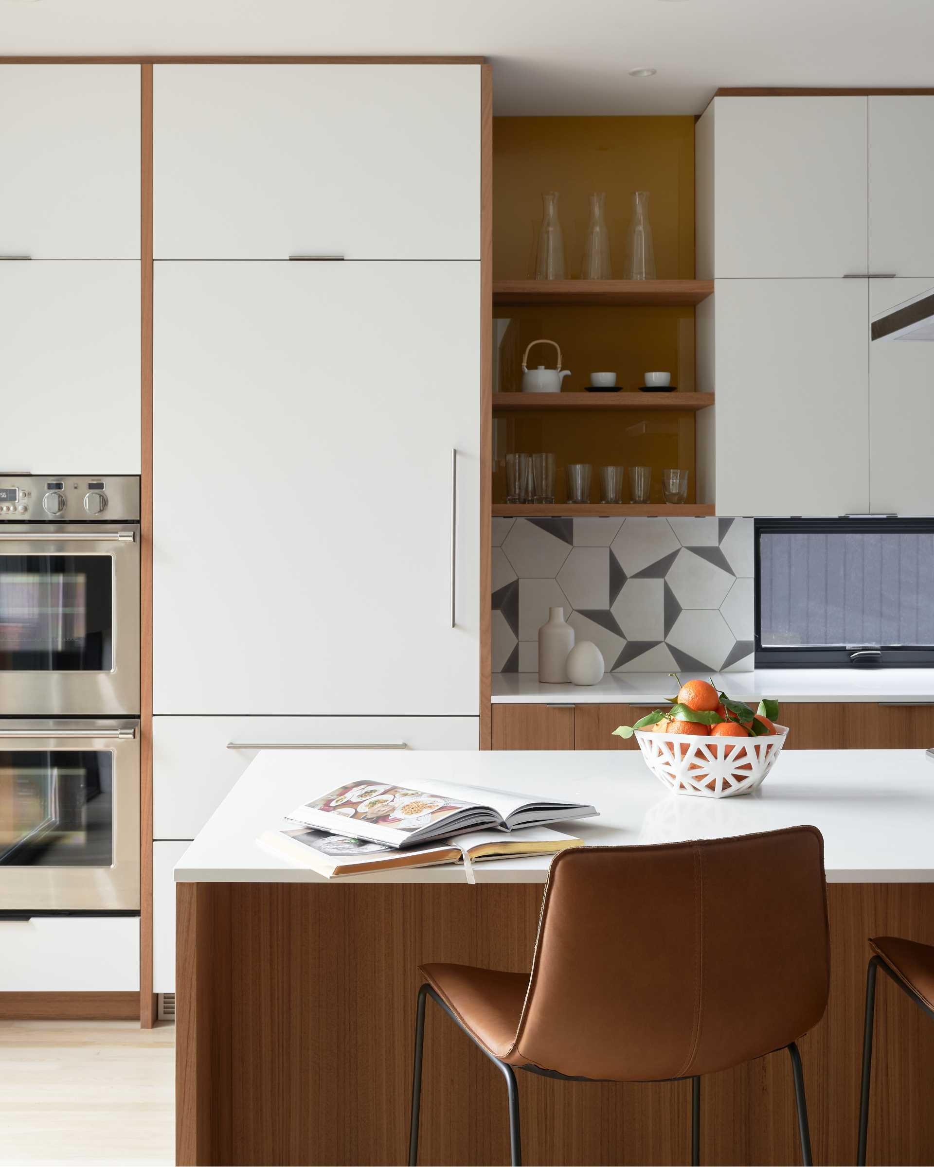
The new kitchen is bright and open, with white cabinets that reach the ceiling, while the lower wood cabinets add a natural element. Floor-to-ceiling windows and doors open to the front and back yards, while counter-height windows provide light and privacy from the side yards.
An undulating wood screen divides the main stair from the dining room while allowing light to filter in from a window/skylight that wraps up and over the stairwell. There’s also a small office nook tucked away into a niche.
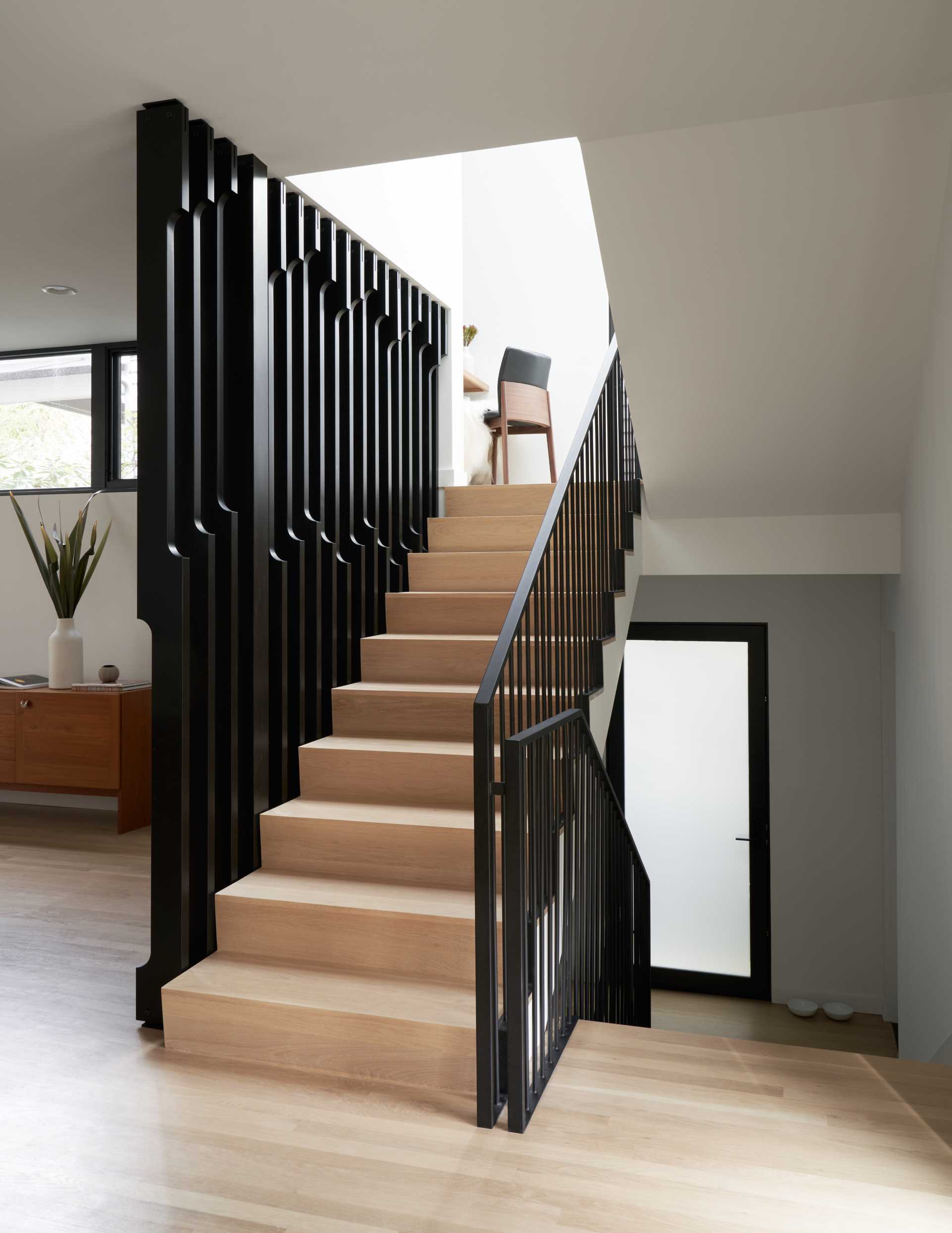
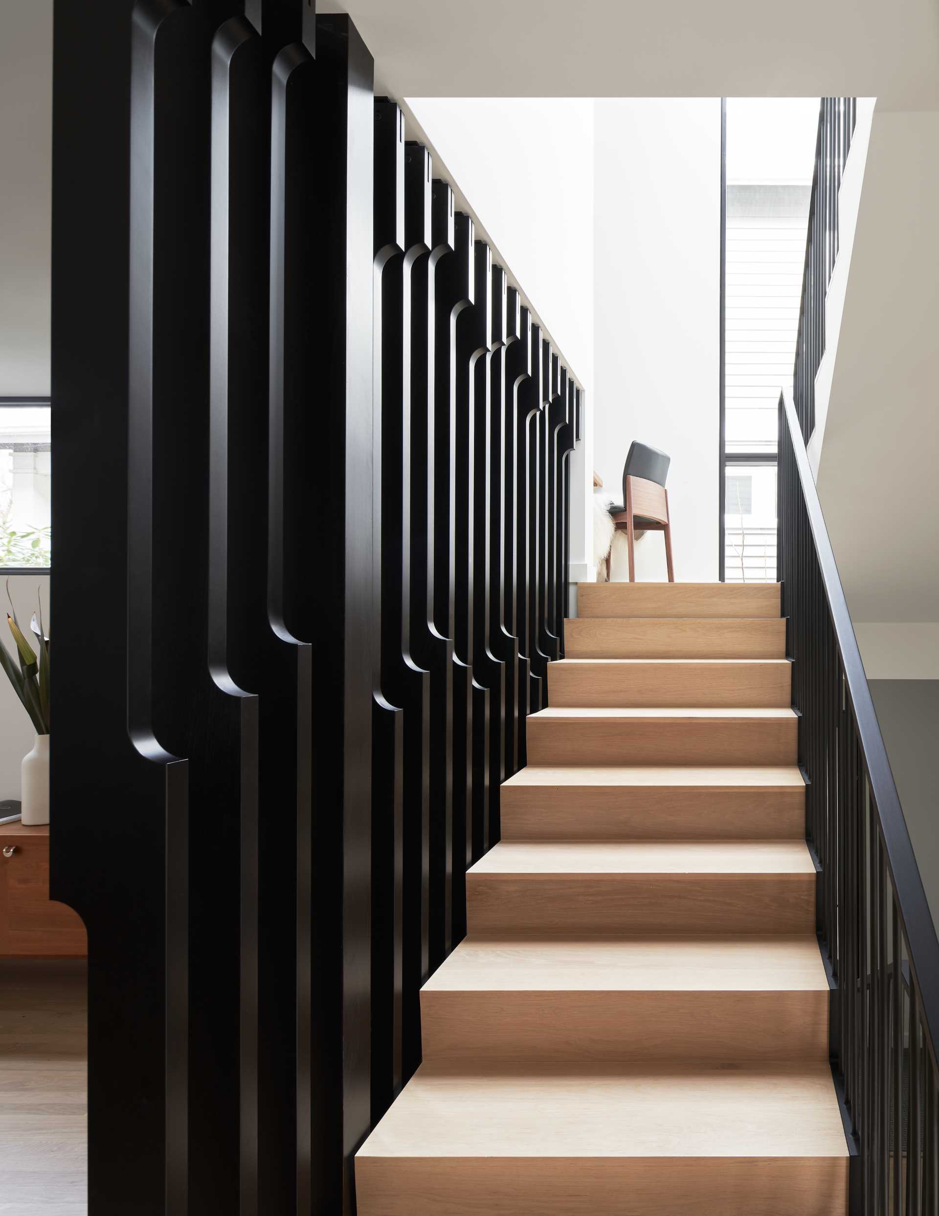
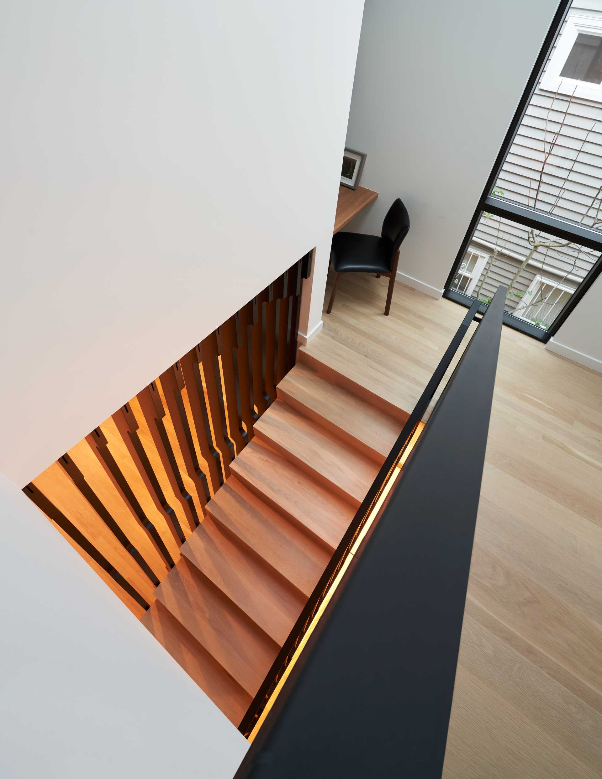
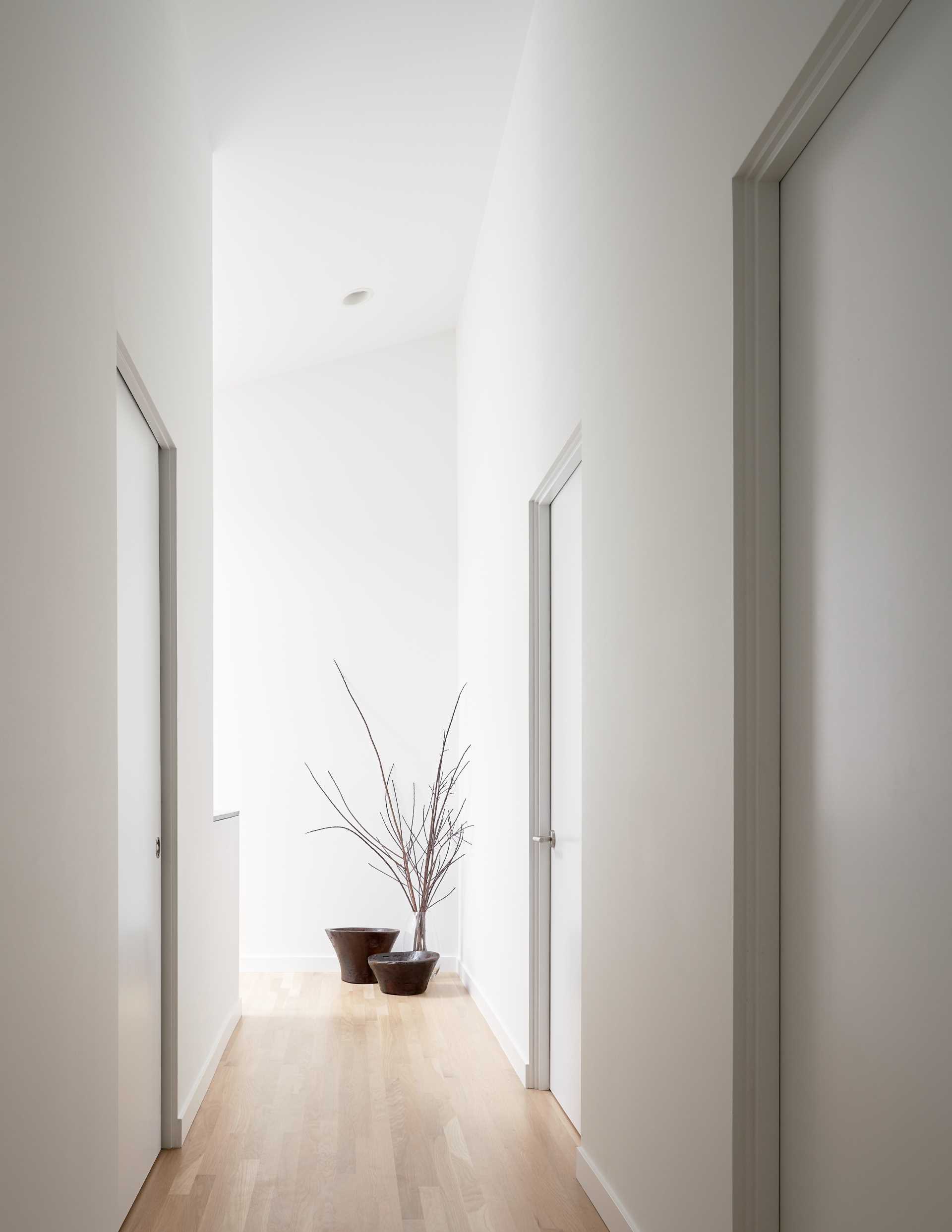
Upstairs, the hallway walls are white with wood flooring.
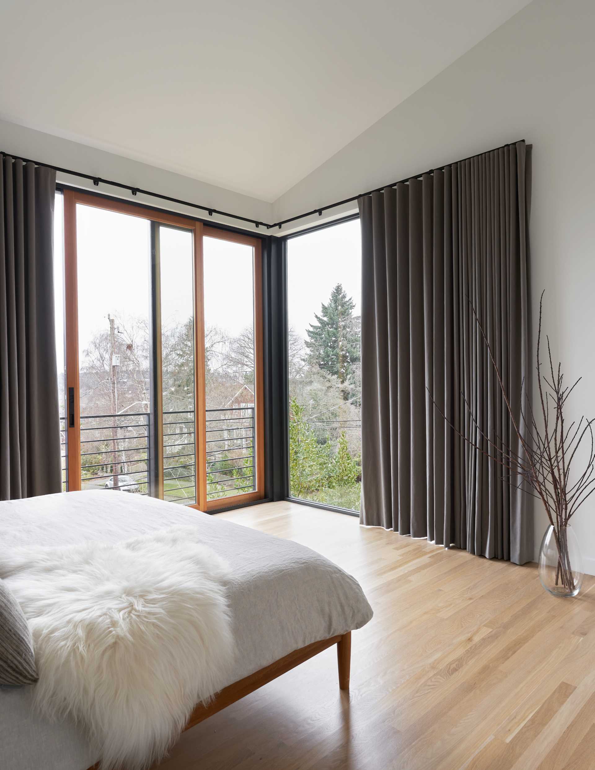
In one of the bedrooms, large windows add natural light, while a sliding door can be opened.
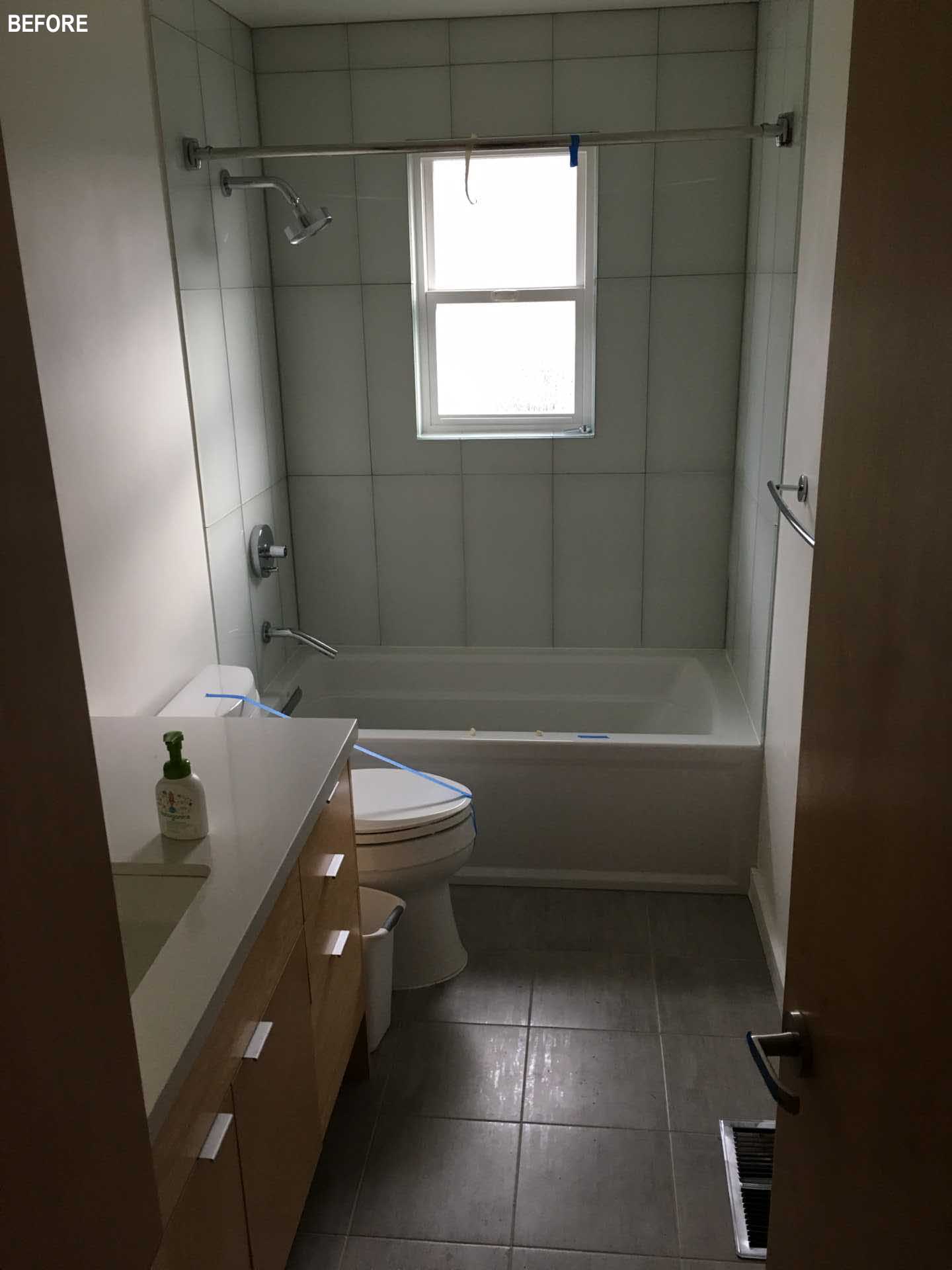
The bathroom in the original house had a small window making it dark.
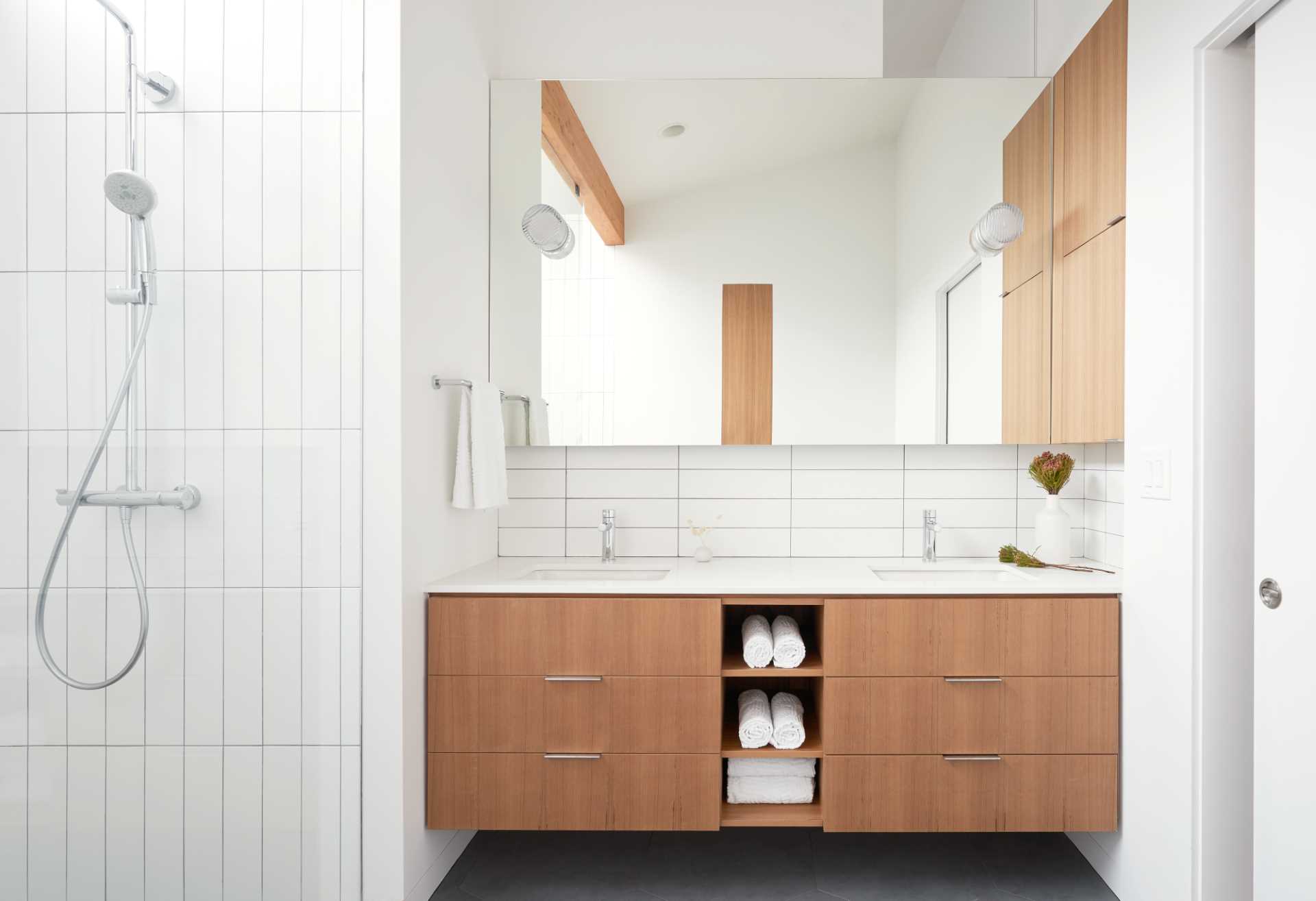
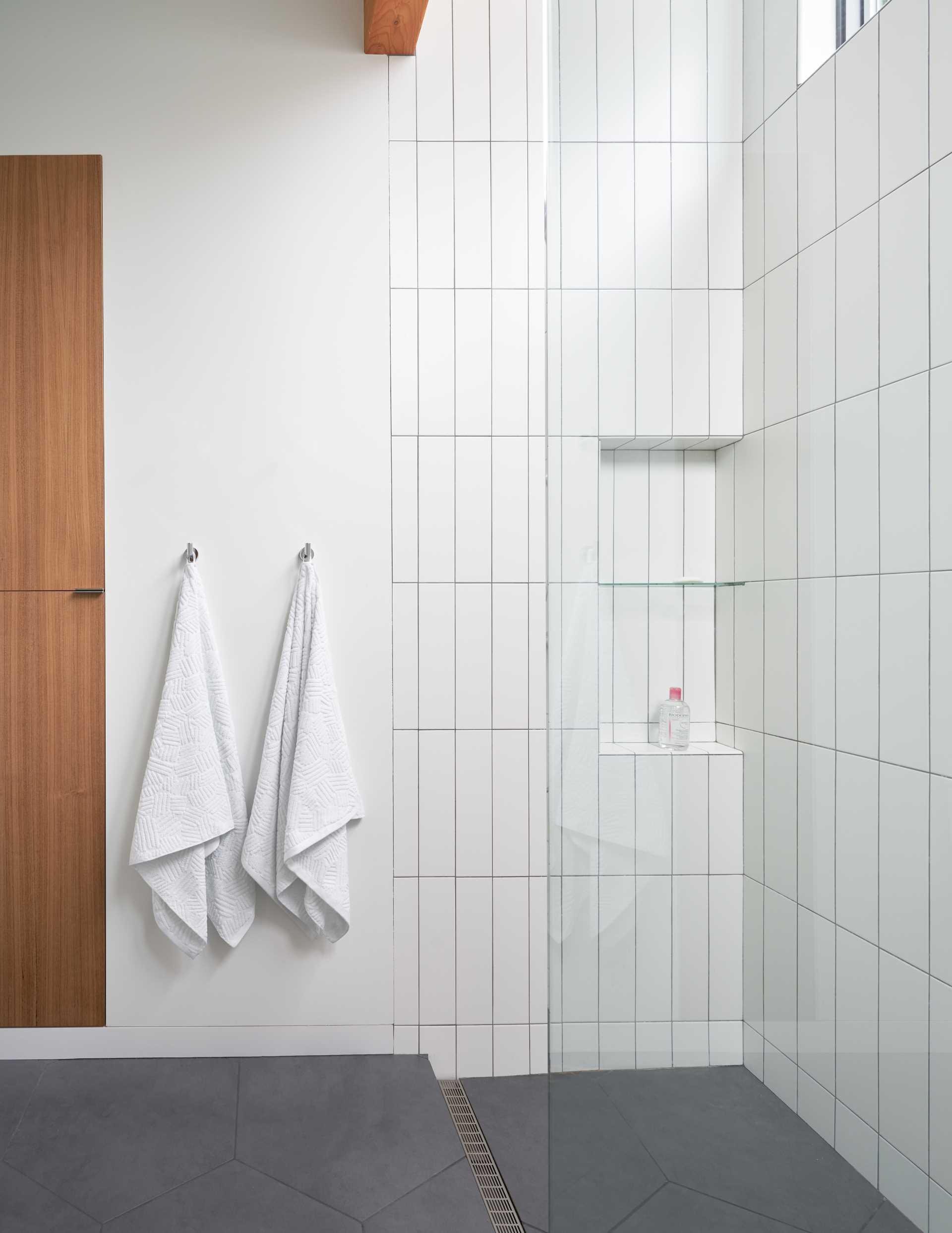
In the updated home, the bathrooms are bright and include wood elements, like the vanity and a beam. The shower, with its floor-to-ceiling vertical subway tile, also includes a shower niche.
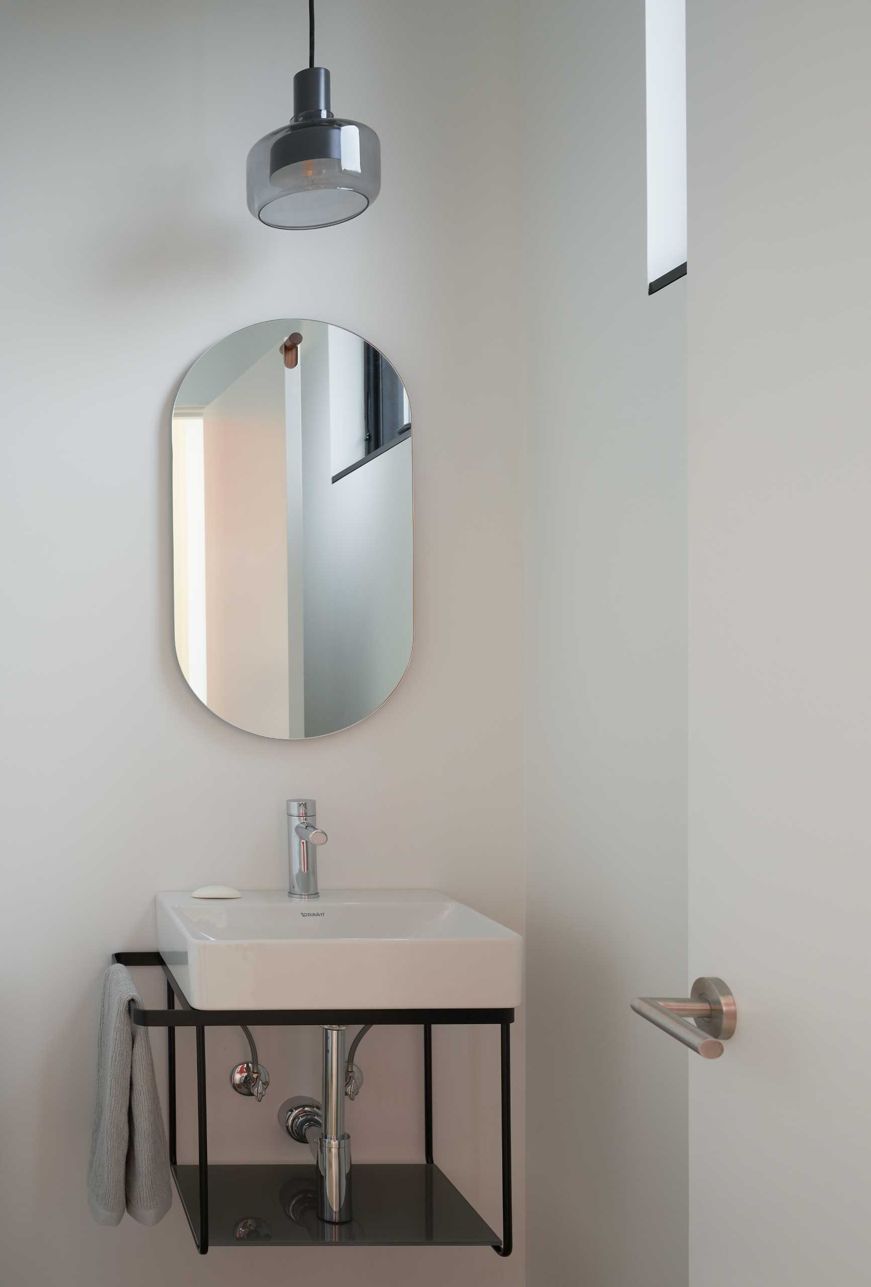
The home also has a powder room with a minimalist design.
Photography: Kevin Scott and Sam Arellano | Design: Floisand Studio Architects | Contractor: Plum Projects LLC
Source: Contemporist

