before-&-after-–-an-extension-adds-new-living-space-for-this-home-in-london

Before & After – An Extension Adds New Living Space For This Home In London

Bradley Van Der Straeten Architects has designed the contemporary renovation and addition of a Grade II listed terrace home in Islington, England.

Bradley Van Der Straeten Architects has designed the contemporary renovation and addition for a Grade II listed terrace home in the London borough of Islington.

The original house, which is spread over three floors, was in poor condition and had lost its charm and original features, such as the covings and skirting boards.
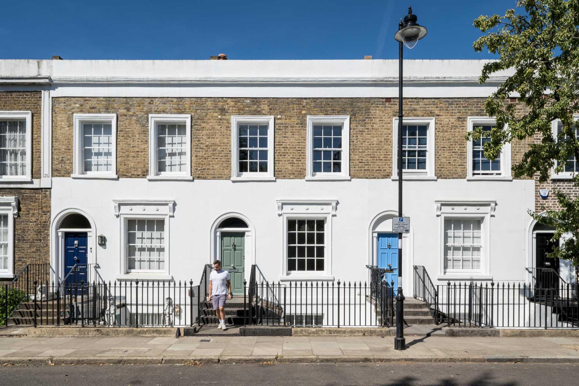
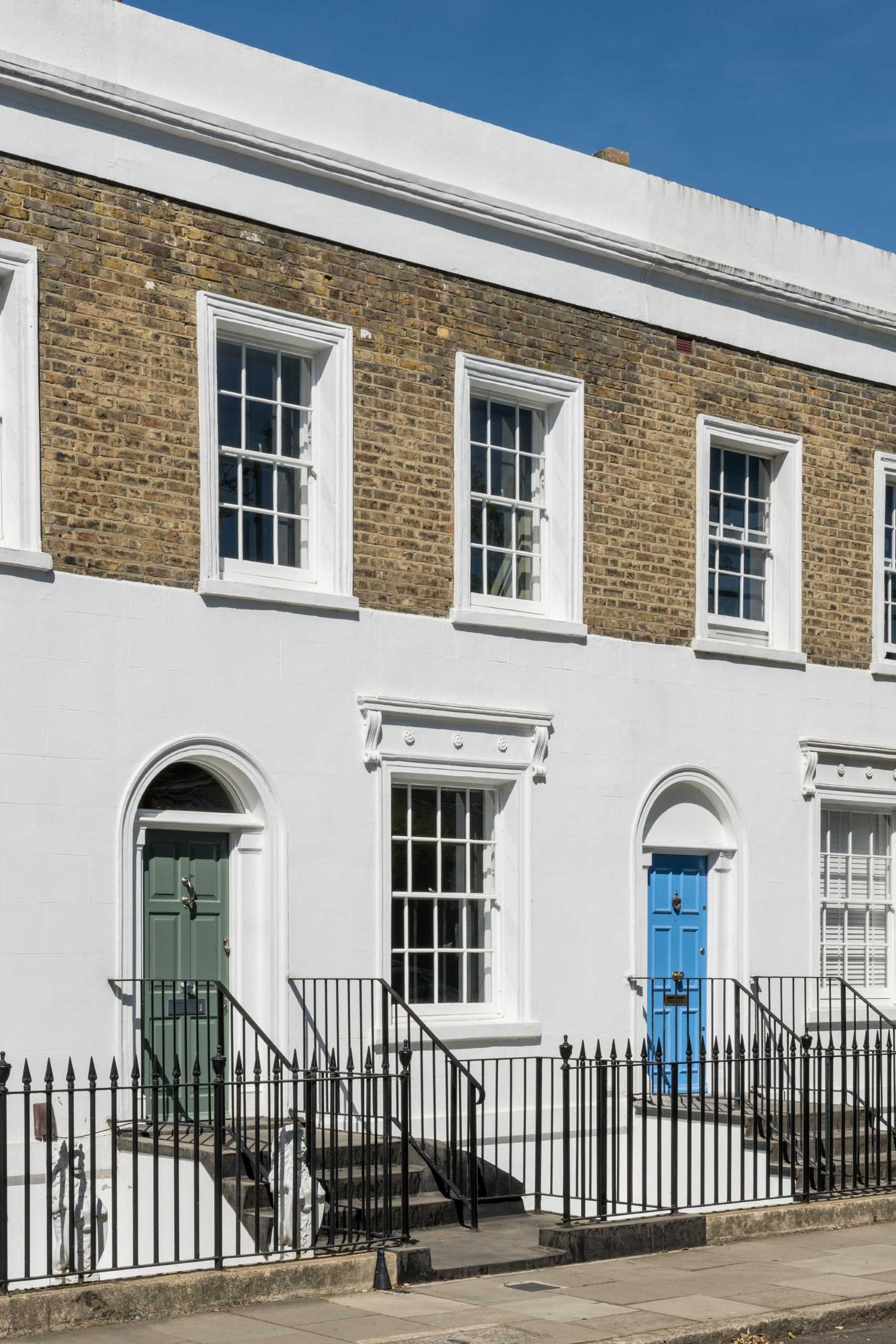
Bradley Van Der Straeten Architects has designed the contemporary renovation and addition of a Grade II listed terrace home in Islington, England.

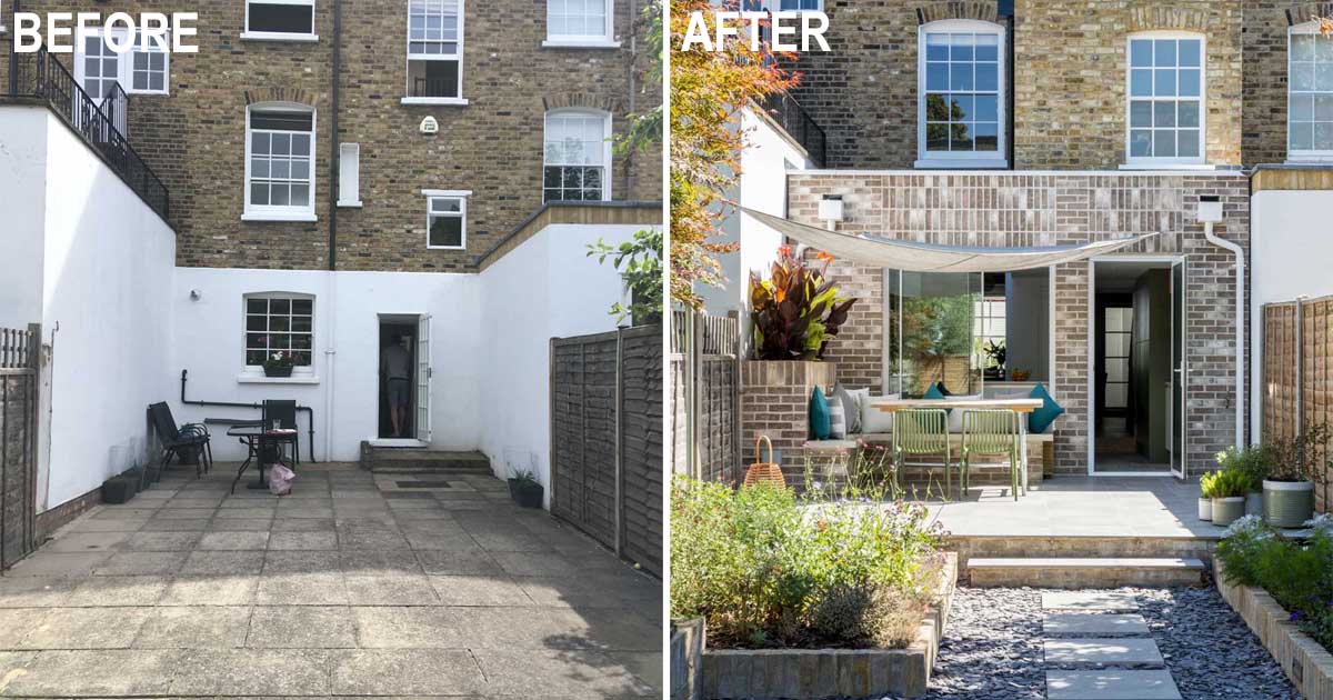
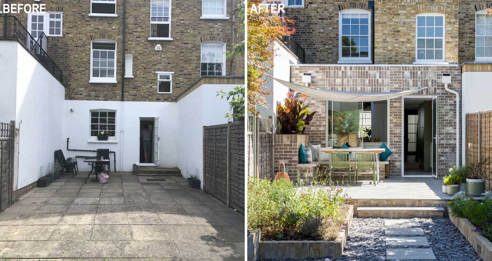
The property had never been extended before, but the neighbors on both sides had, which left the rear of the house with an underwhelming small window, single access door, and an area outside waiting for development.
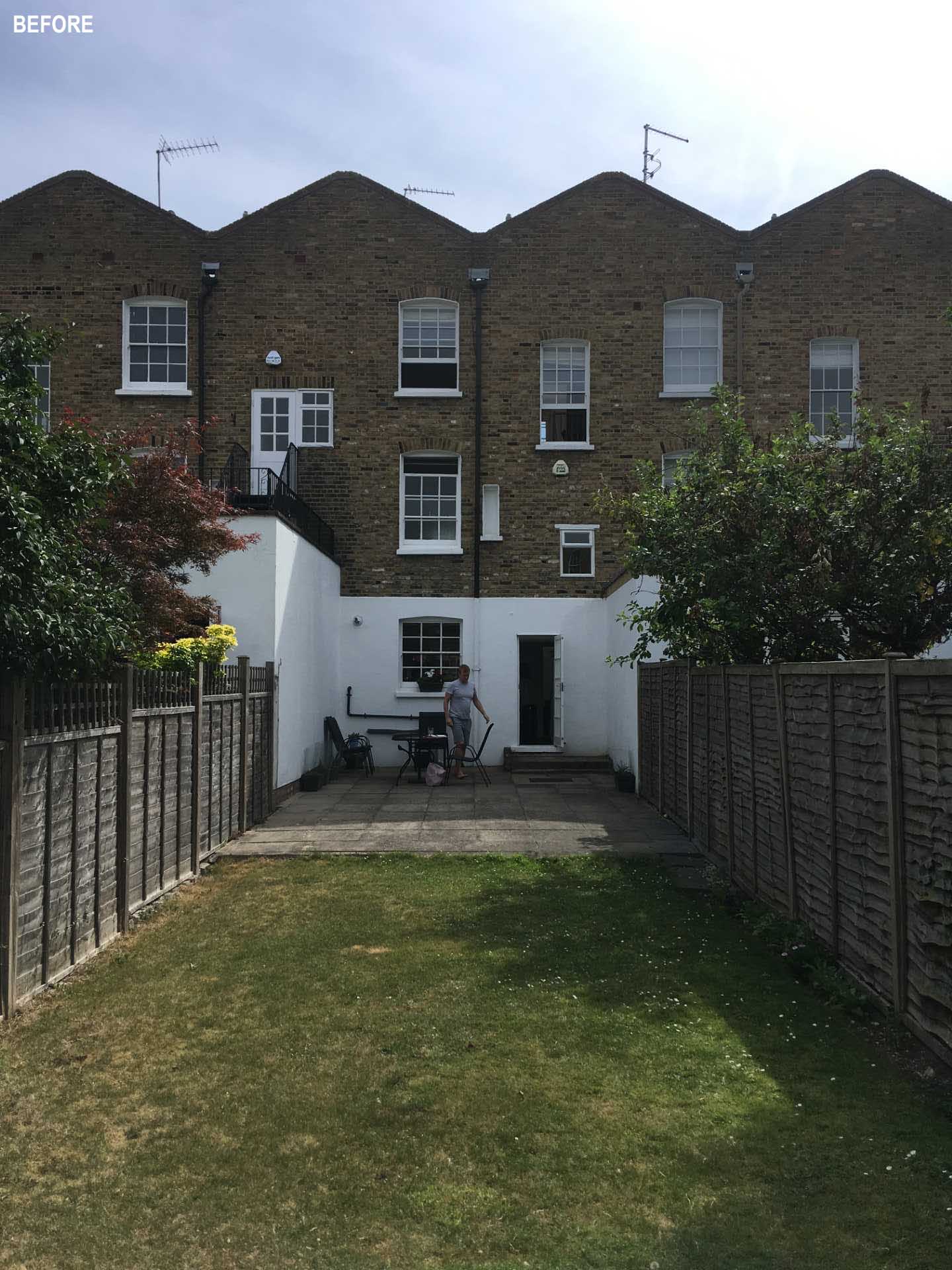
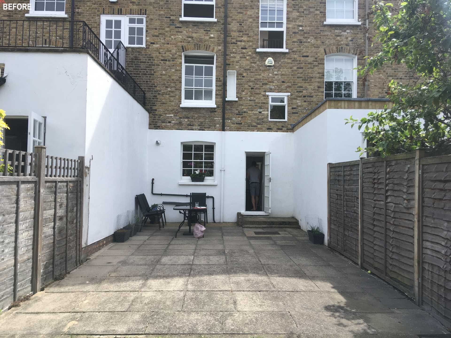
BEFORE - a Grade II listed terrace home in Islington, England.

The clients wanted to renovate the entire property, as well as create a good sized, kitchen, dining, and living space. This was achieved by adding a brown brick extension to the rear of the home.
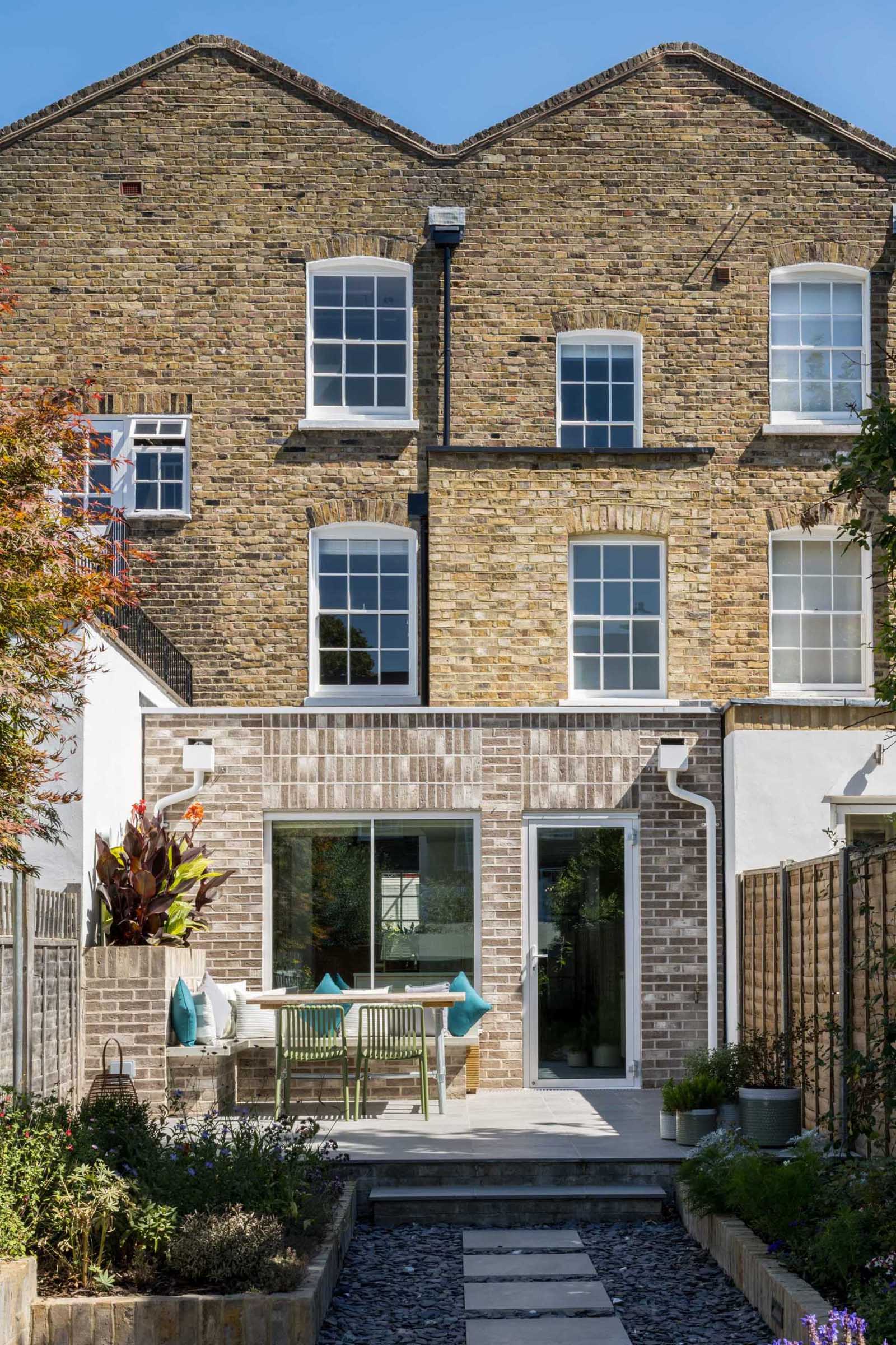
A Grade II listed terrace home in Islington, England, received a new brick addition.

A brick planter on the patio creates an area for L-shaped bench seating and an outdoor table.
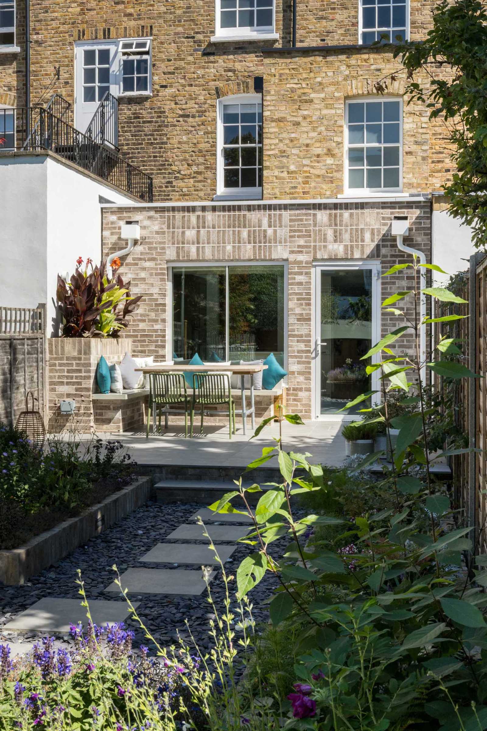
A Grade II listed terrace home in Islington, England, received a new brick addition with outdoor seating.

The patio leads straight into the garden where a path is located between garden beds on either side.
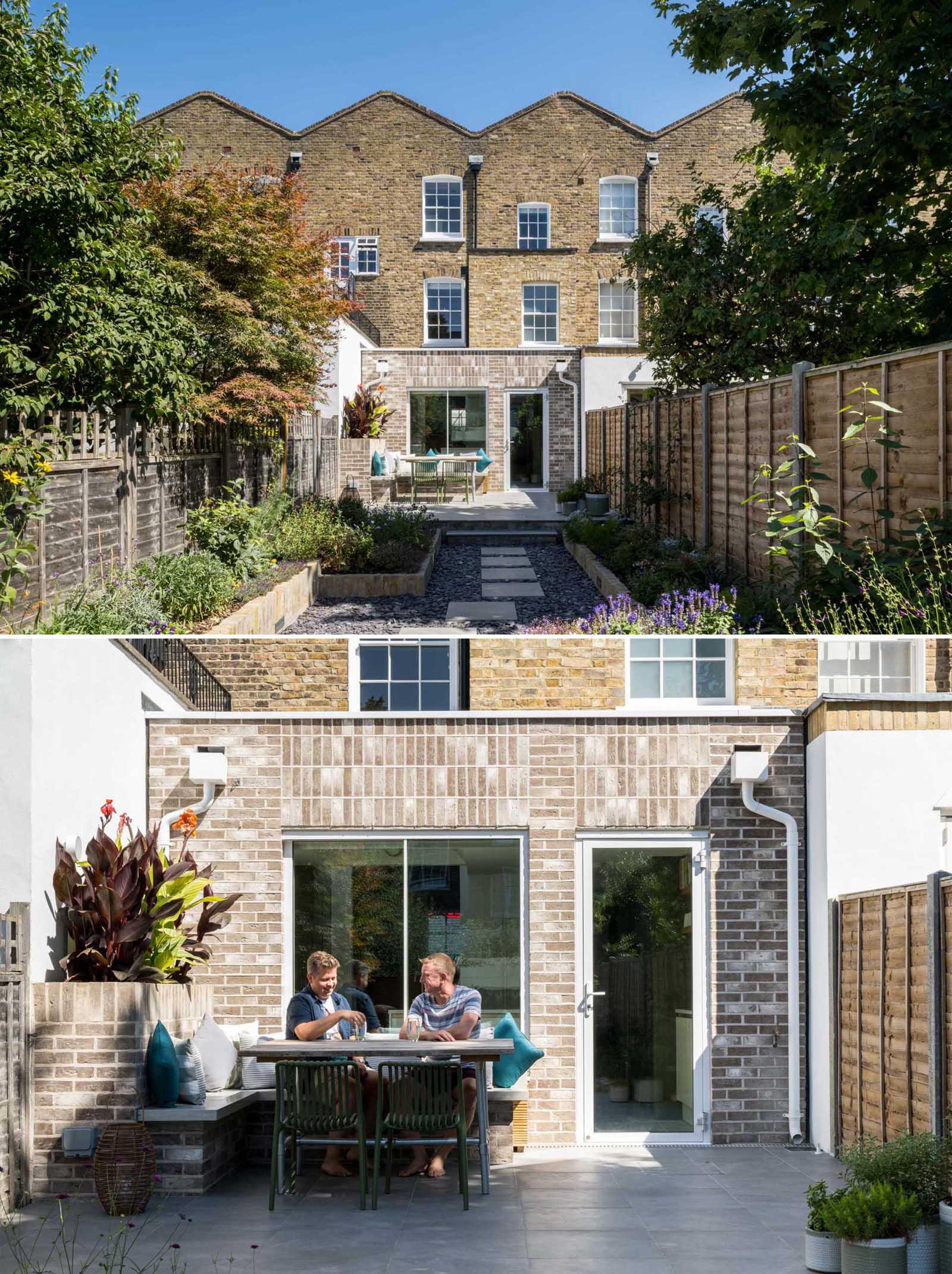
A Grade II listed terrace home in Islington, England, received a new brick addition with outdoor seating, and an updated garden.

The original kitchen was somewhat dark and small, while a small window provided a limited view of the garden.
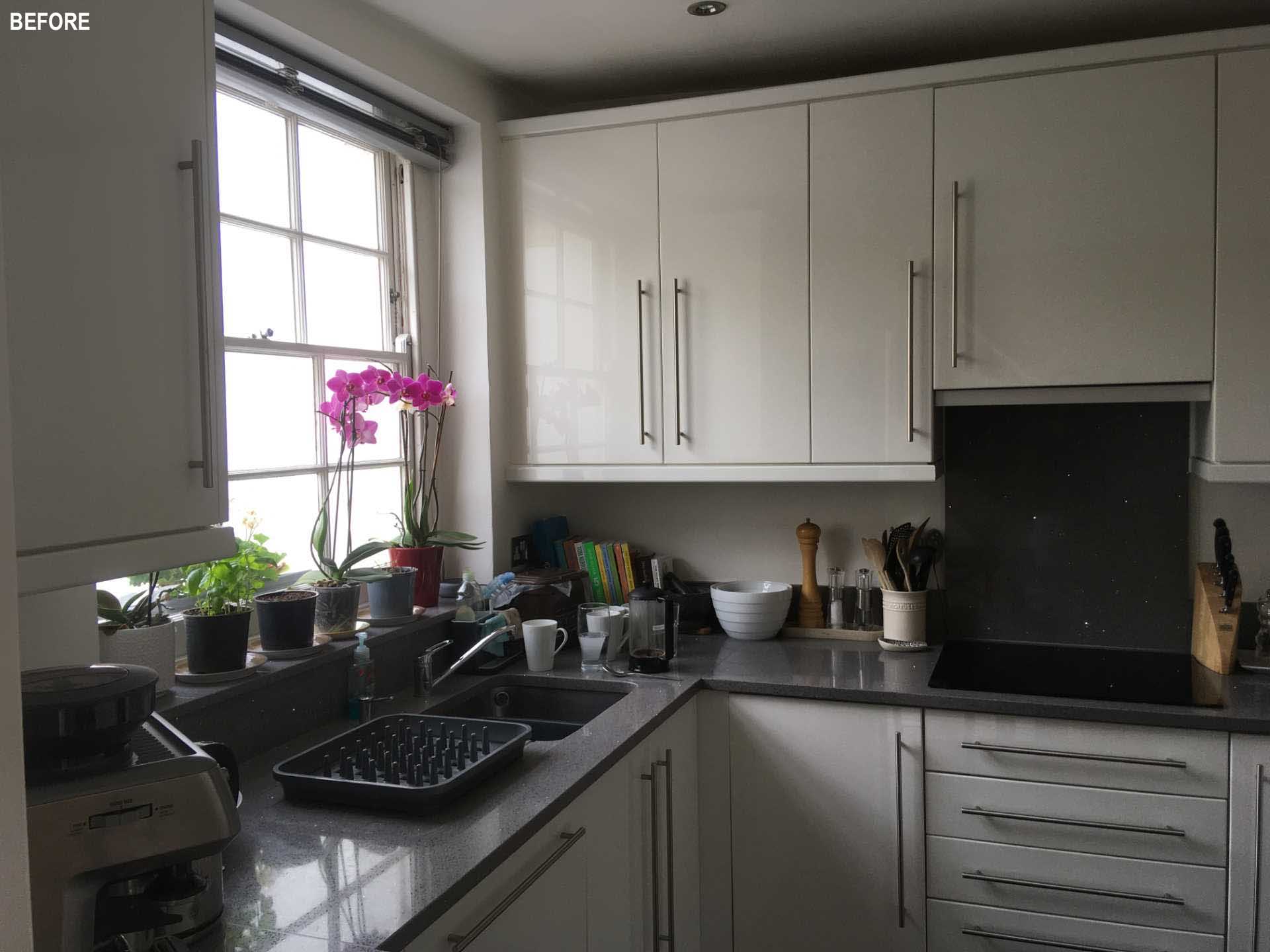
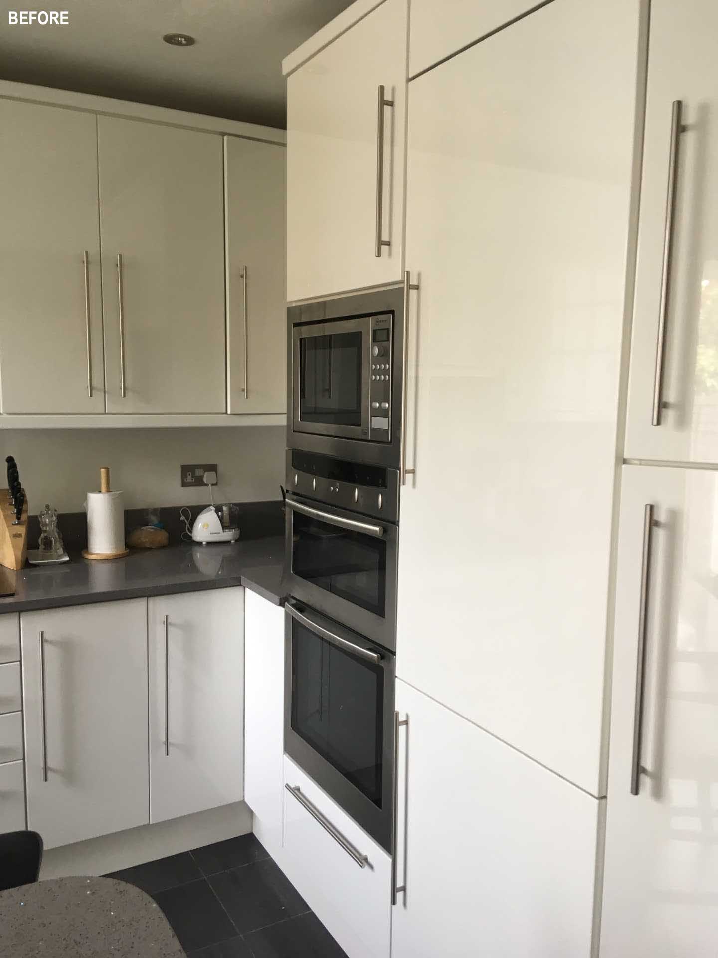
BEFORE - a small white kitchen.

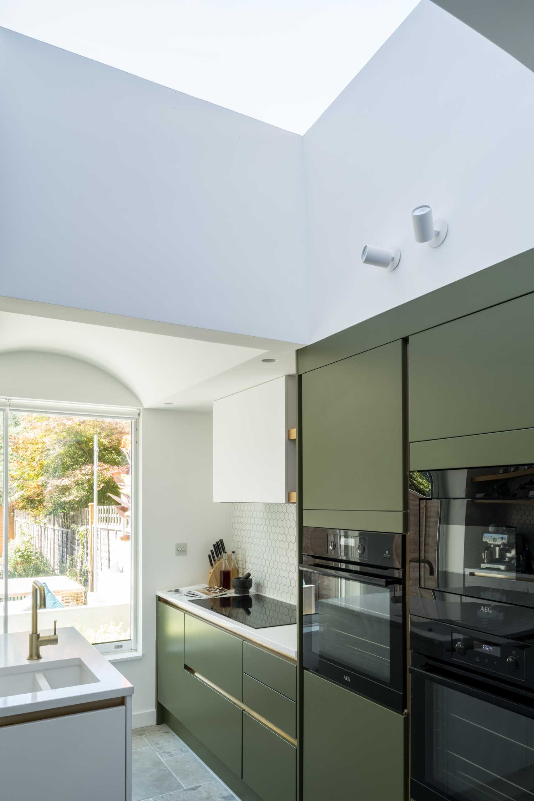
The new kitchen, which is located in the addition, is bright and open, and is made to feel as spacious as possible with the addition of a new skylight and with a curved ceiling above the island.
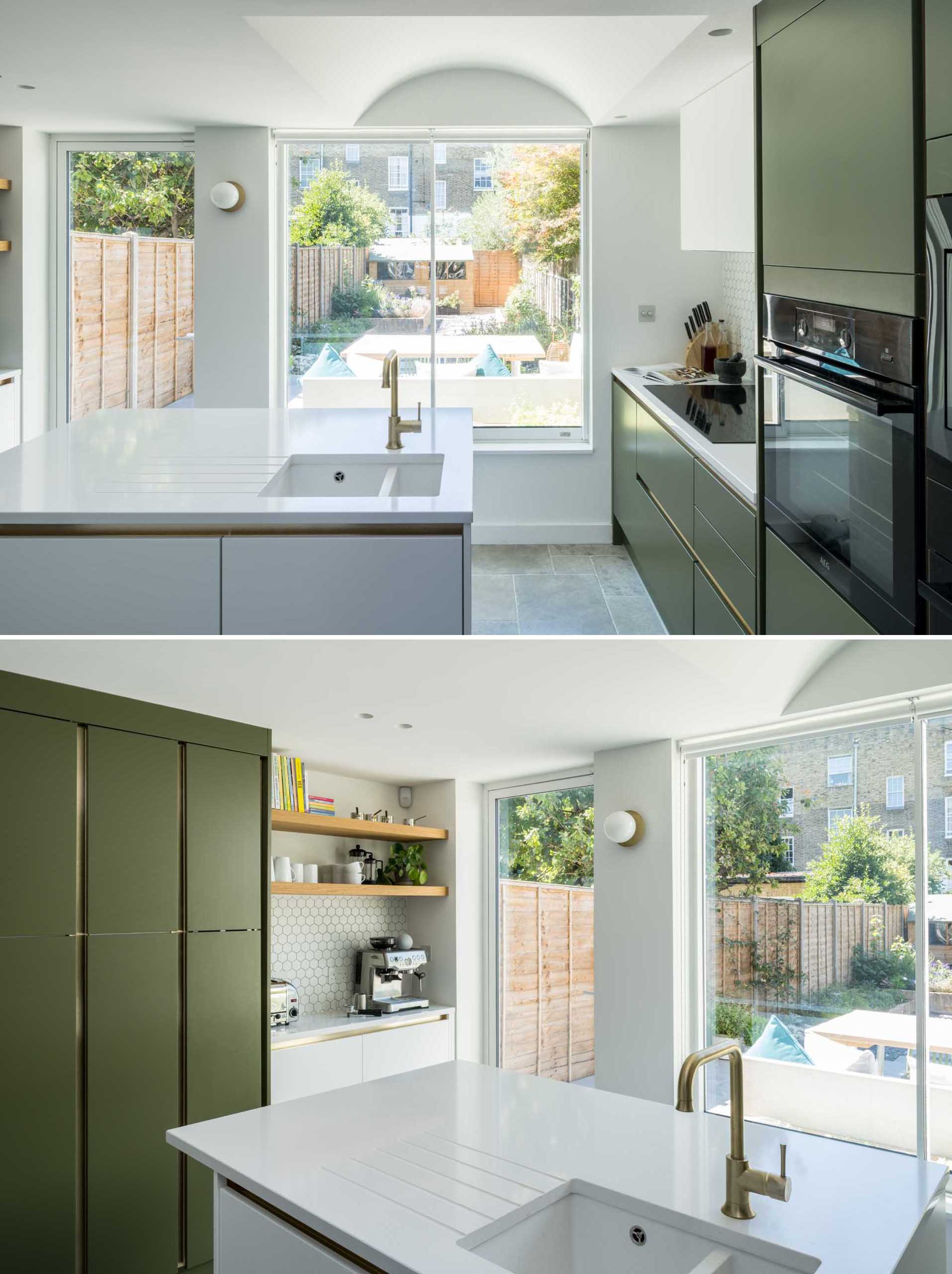
This modern kitchen, which is located in a new addition, is bright and open, and is made to feel as spacious as possible with the addition of a new skylight and with a curved ceiling above the island.

The new kitchen includes matte green and white cabinets, small hexagonal white tile backsplashes, wood shelves, and an island with undermount sink.
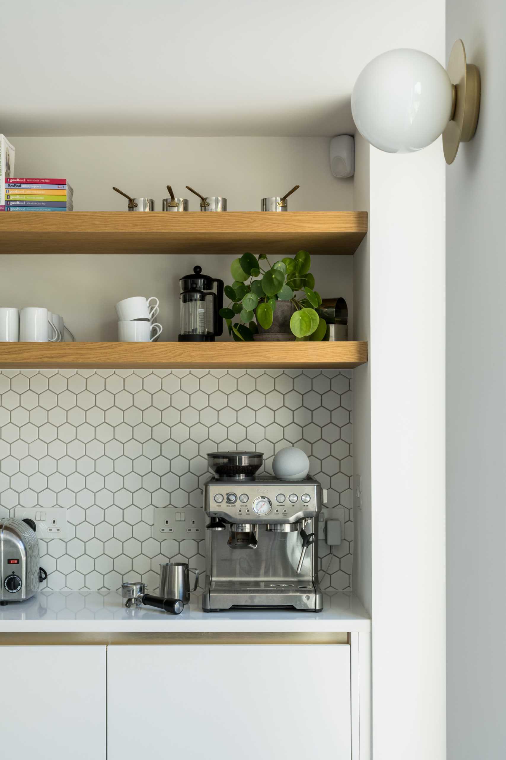
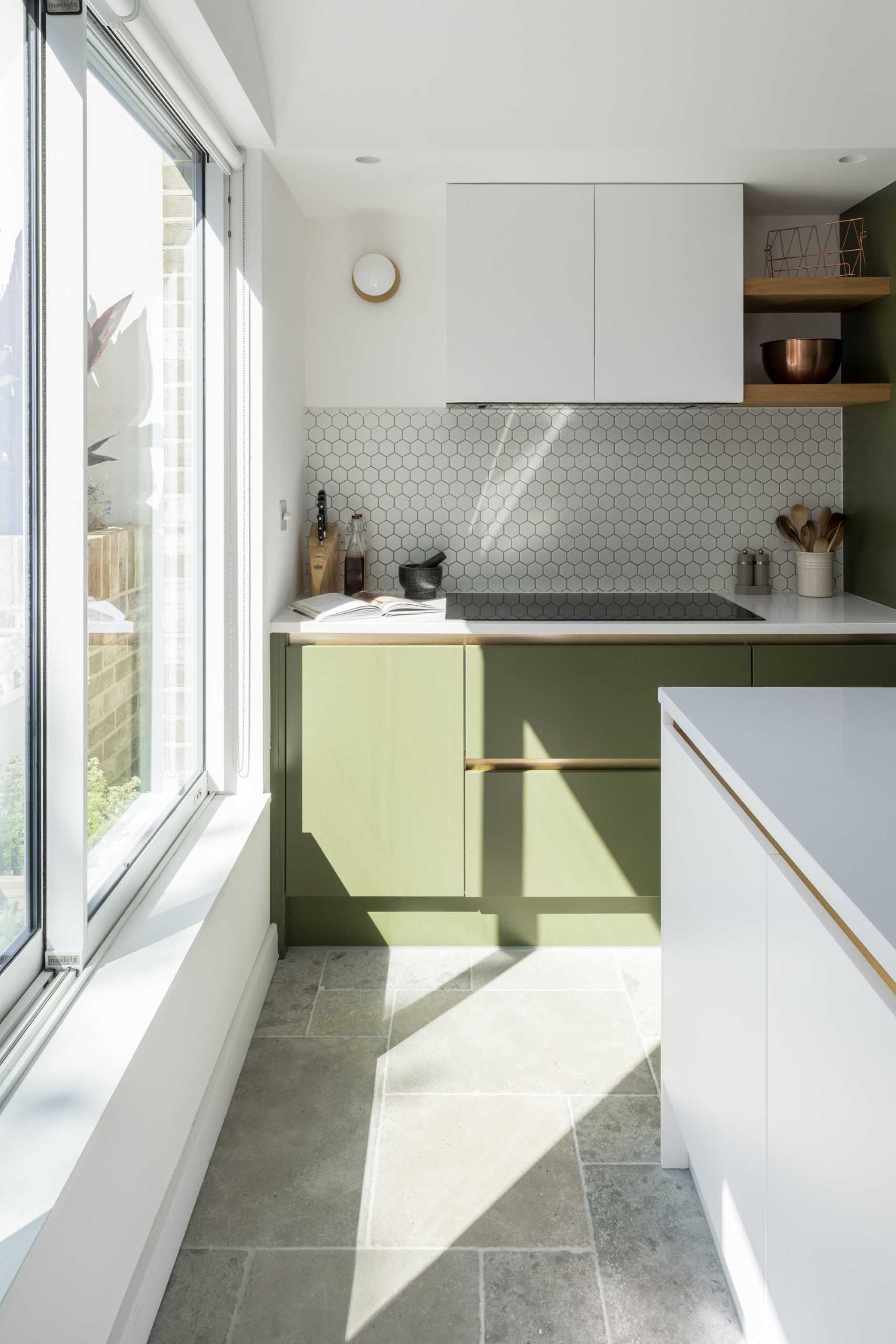
The new kitchen includes matte green cabinets, small hexagonal white tile backsplashes, wood shelves, and an island with undermount sink.
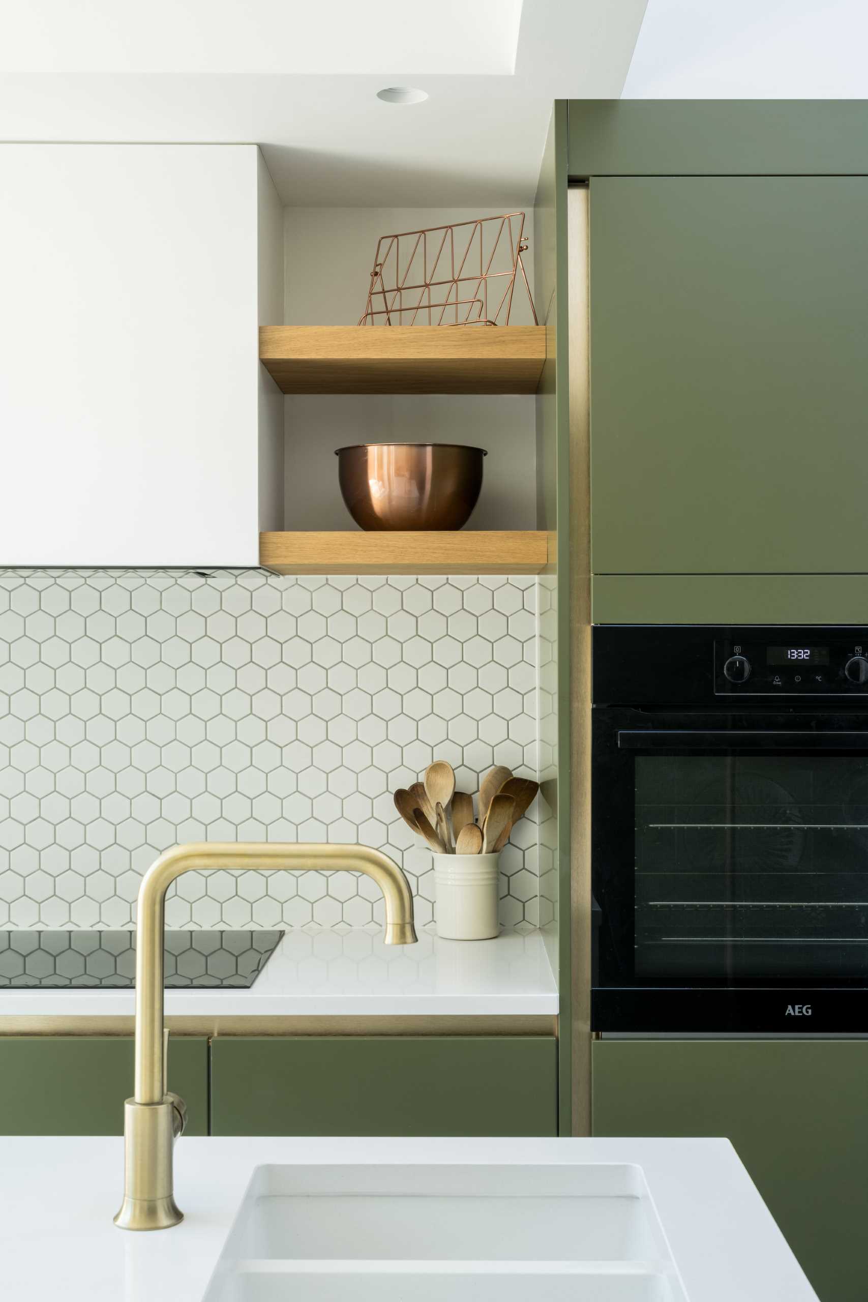
The new kitchen includes matte green and white cabinets, small hexagonal white tile backsplashes, wood shelves, and an island with undermount sink.
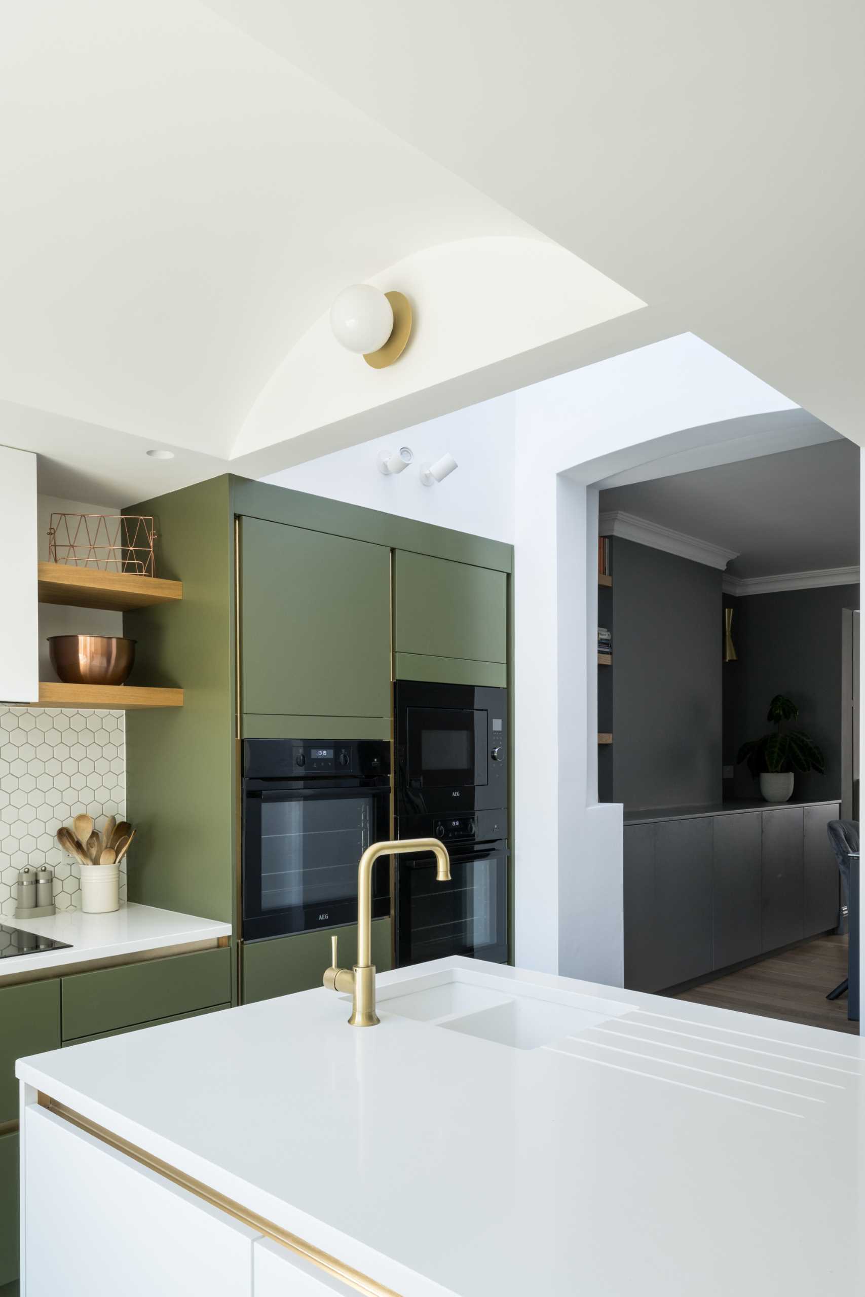
The new kitchen includes matte green cabinets, small hexagonal white tile backsplashes, wood shelves, and an island with undermount sink.

Adjacent to the kitchen is the dining room, where wood shelving has been paired with grey cabinets.
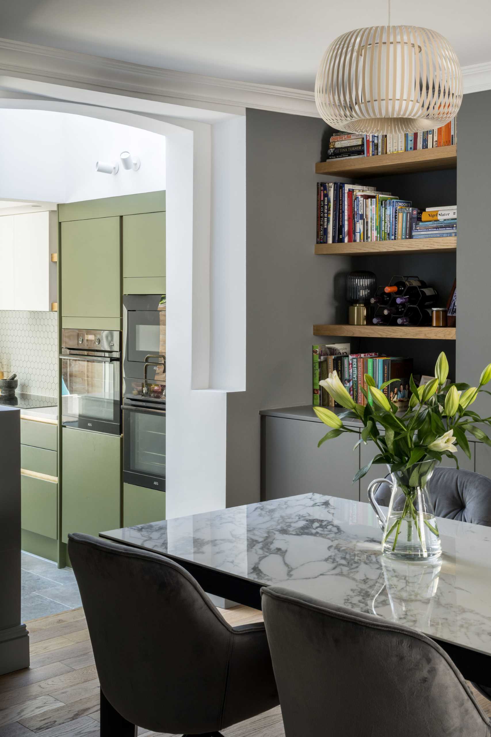
A contemporary dining room with built-in wood shelving and grey cabinets.

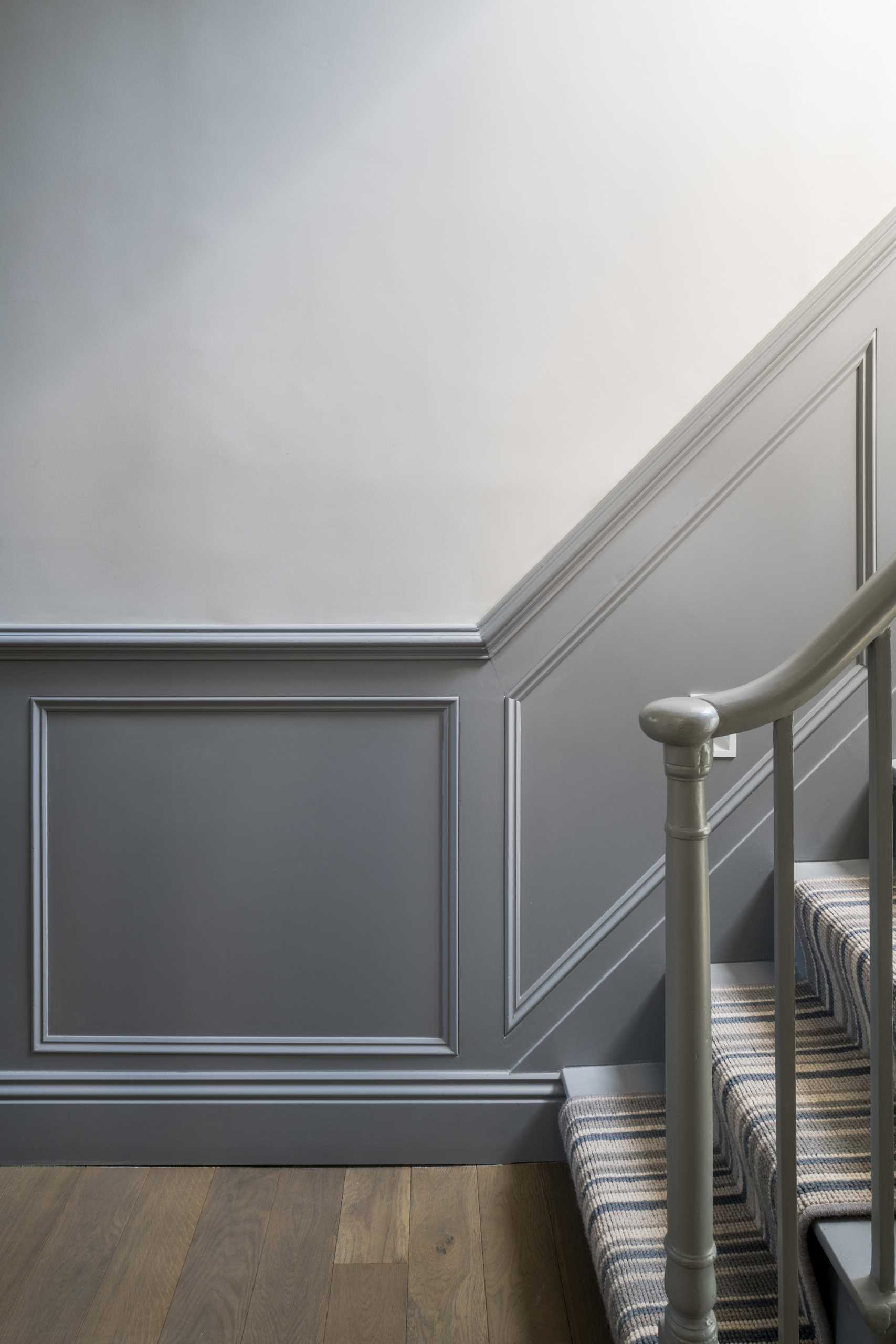
The original staircase was re-painted and received new carpet on the stairs.
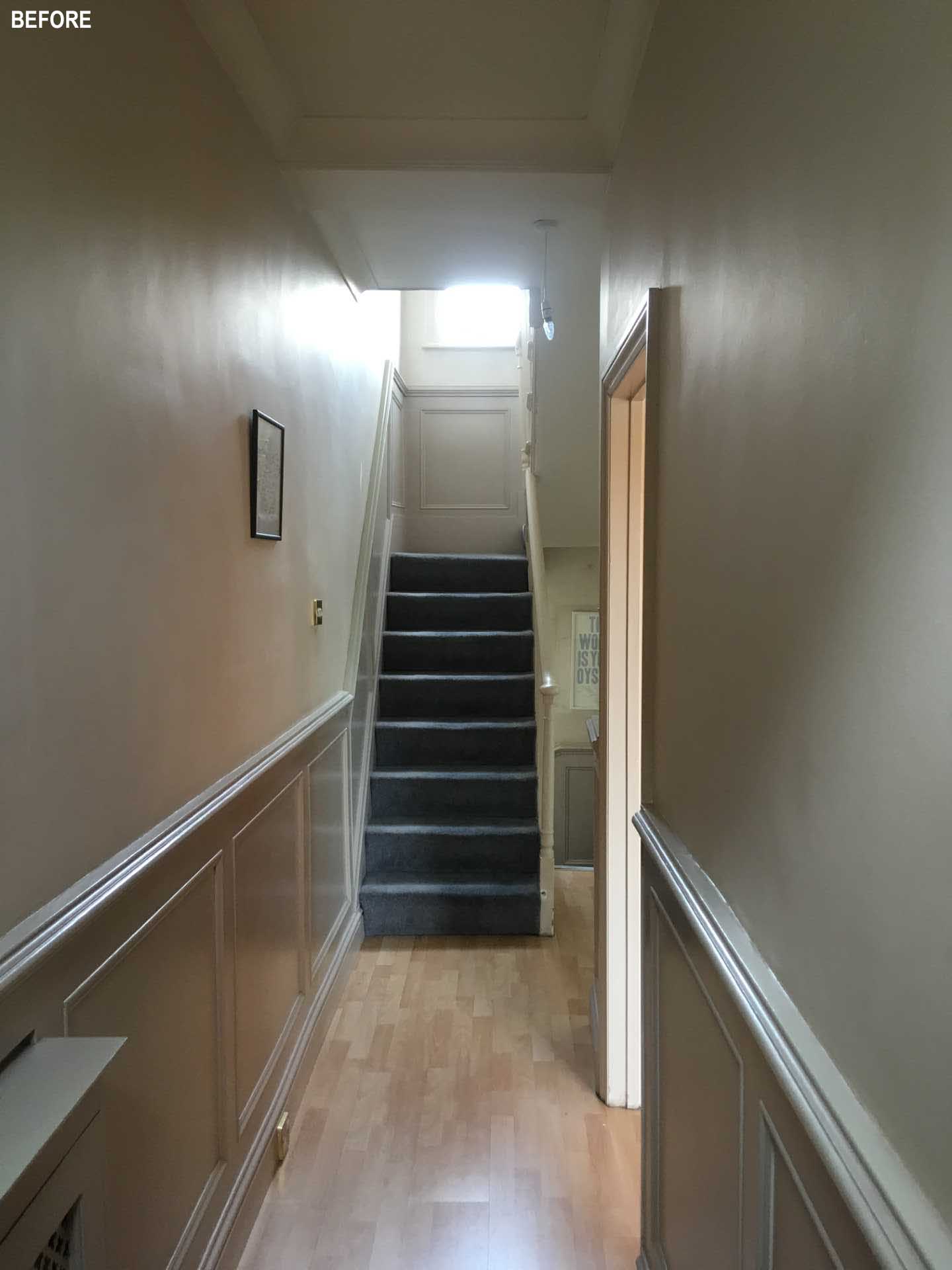
BEFORE - A dark and dated staircase.
A staircase was used with grey panelling and new carpet.

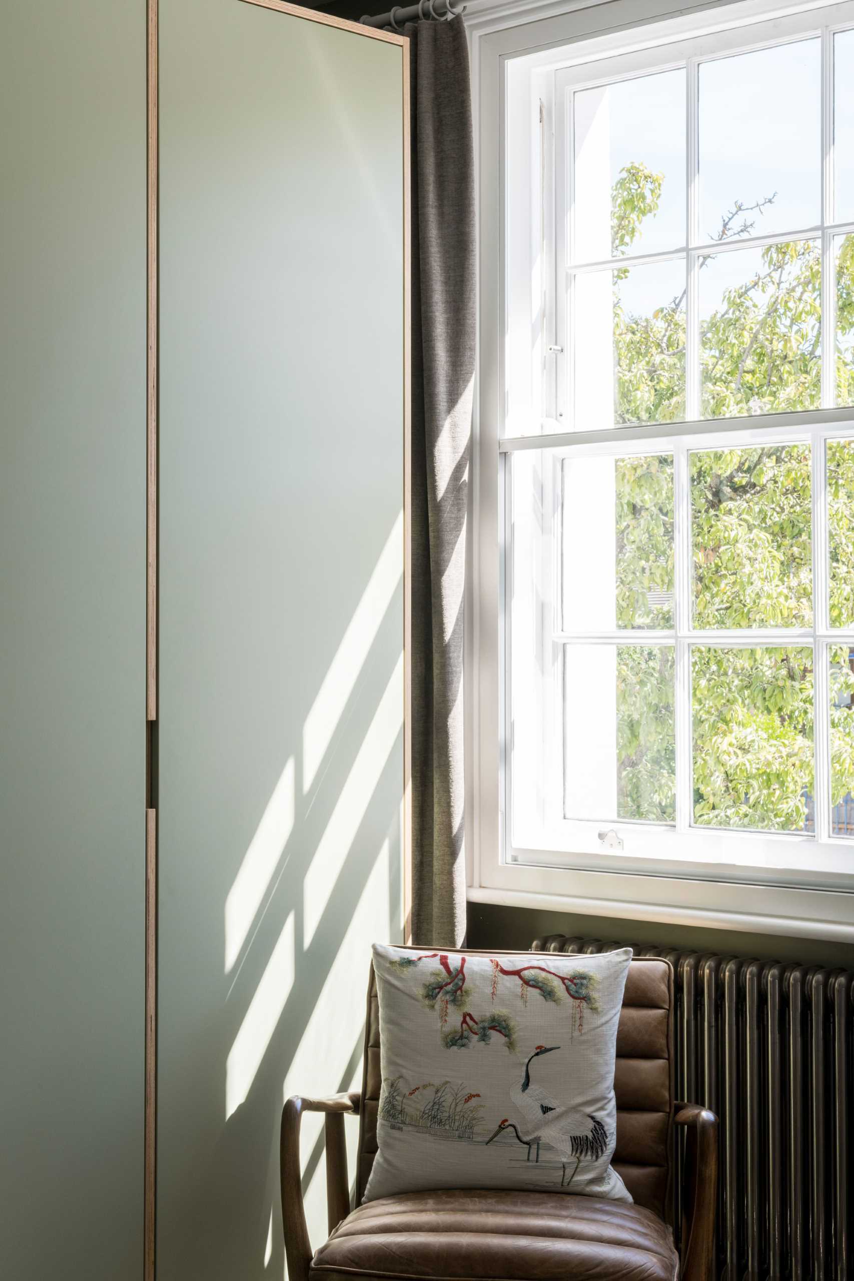
In one of the bedrooms, a matte green was the chosen color, and is featured on the walls as well as the closets. Wood accents provide a natural contrasting element.
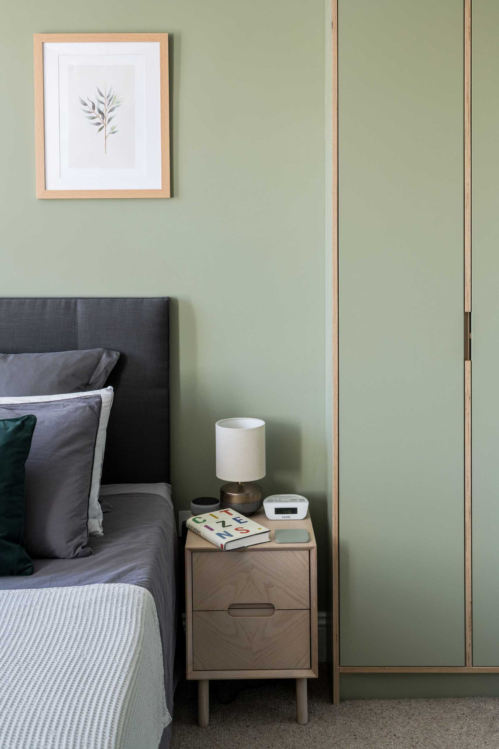
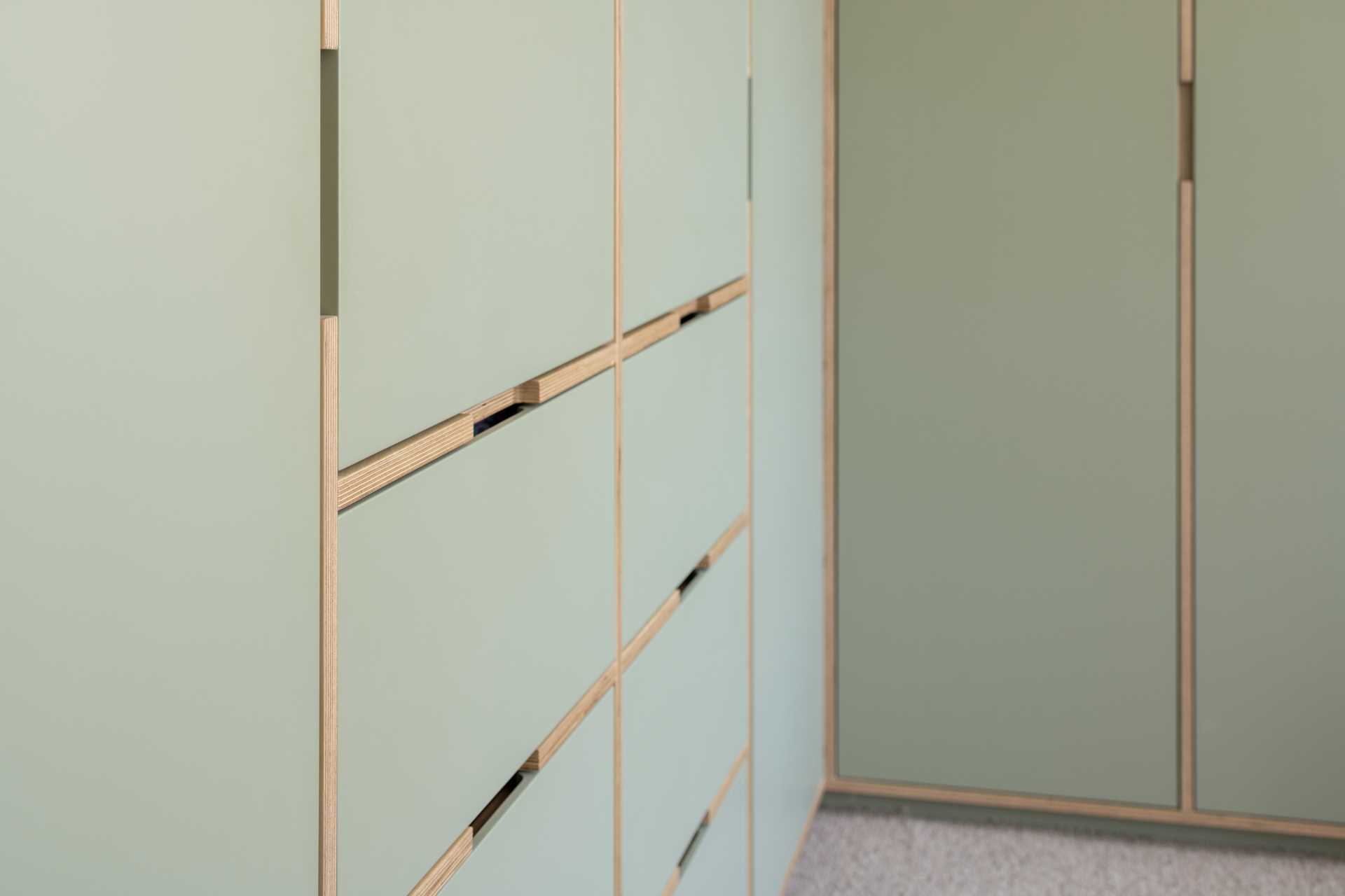
In this modern bedroom, matte green was the chosen color, and is featured on the walls as well as the closets. Wood accents provide a natural contrasting element.

In another bedroom, the walls are neutral, however, the blue headboard and bedding add a pop of color.
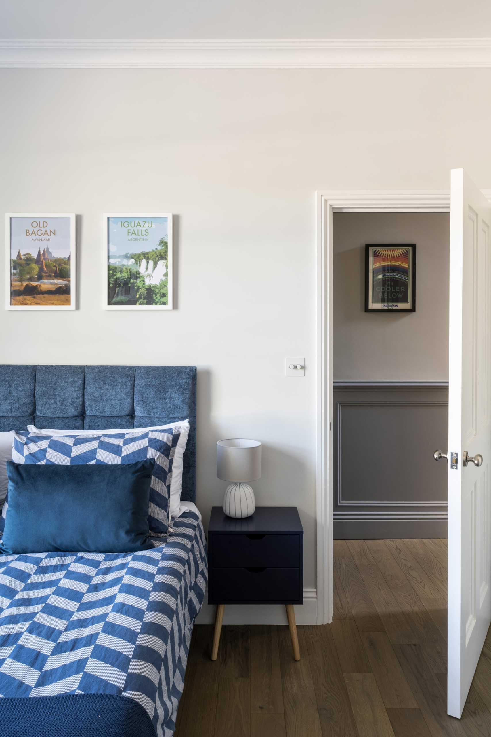
A neutral bedroom with a blue headboard and bedding that add a pop color.

A niche was filled with built-in shelves and a desk to create a small work area.
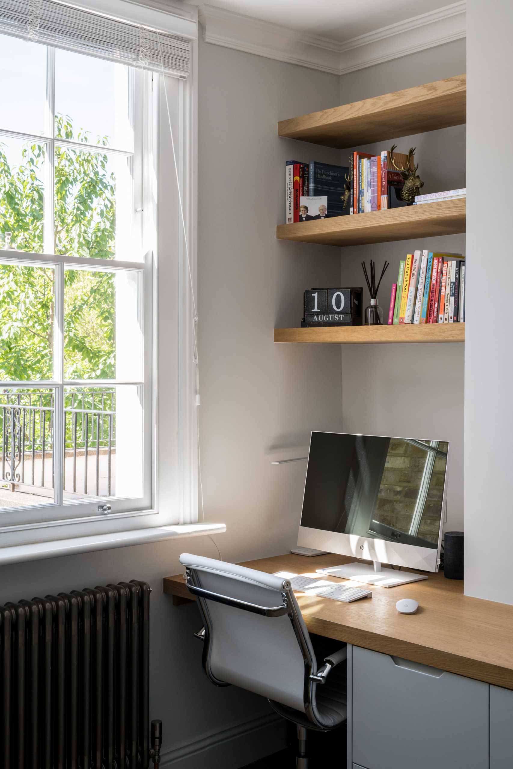
A bedroom niche was filled with built-in shelves and a desk to create a small work area.

In the bathroom, pink subway tiles in a vertical layout cover the shower wall and the bathtub surround.
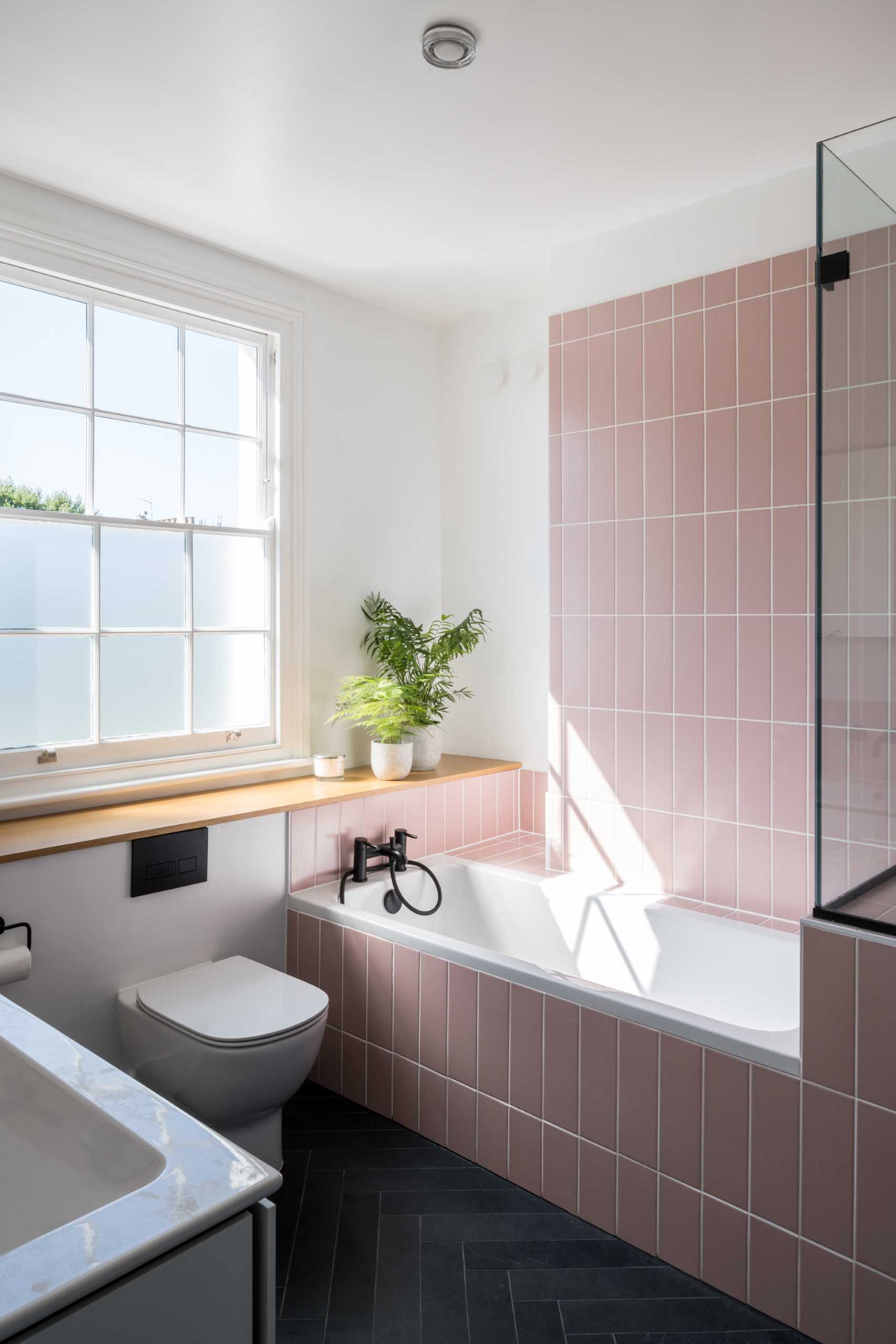
In this bathroom, pink subway tiles in a vertical layout cover the shower wall and the bathtub surround.
Photography by French + Tye | Architects: Bradley Van Der Straeten | Project Architect: Jessica Williamson | Project Director: George Bradley

Source: Contemporist