Multidisciplinary studio chromastudio has transformed an apartment in Milan, Italy, and they have shared the design process with us.
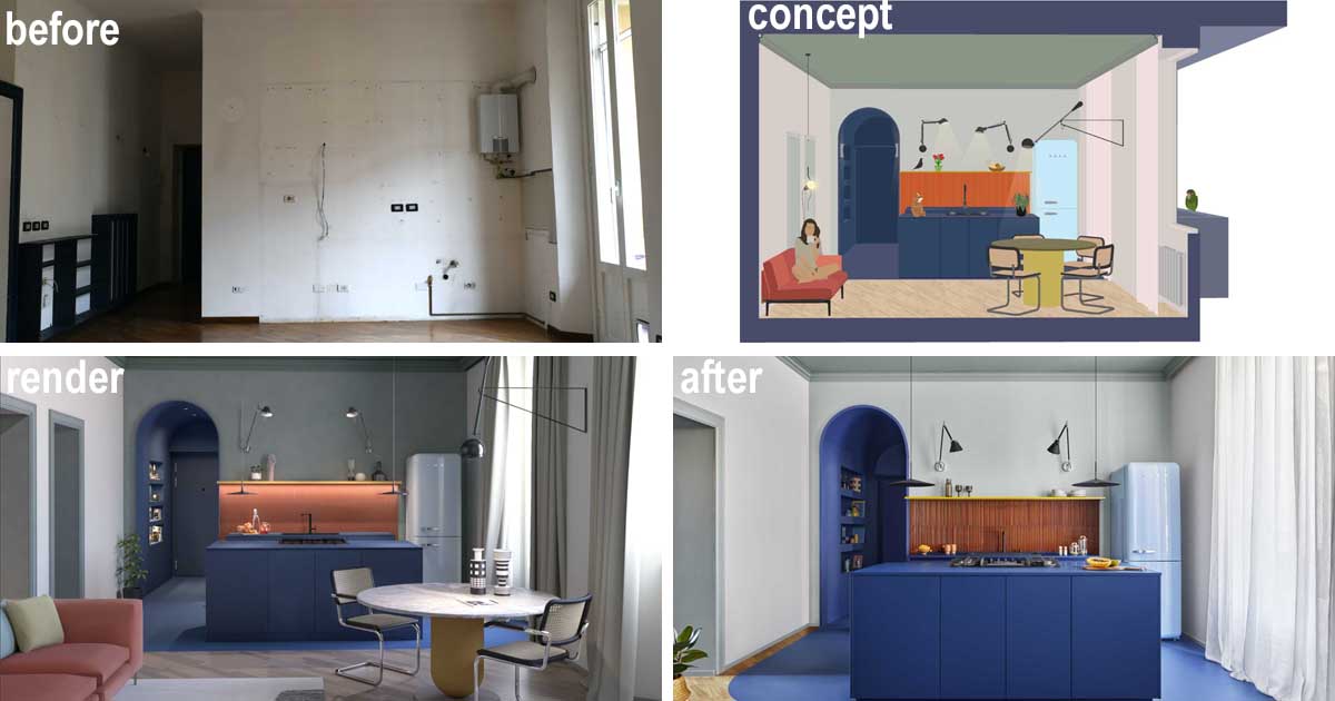
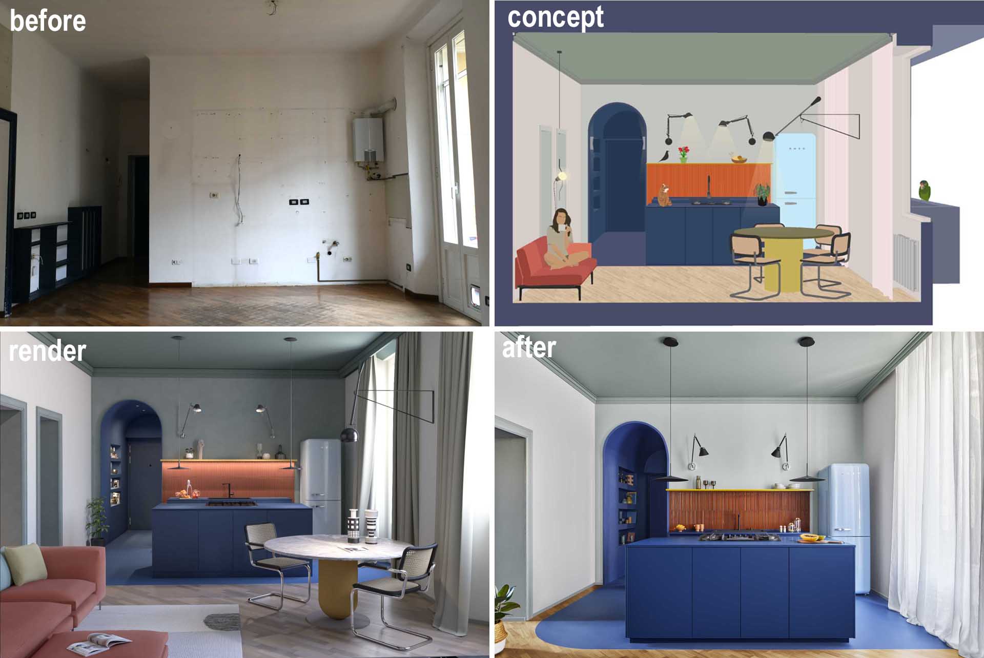
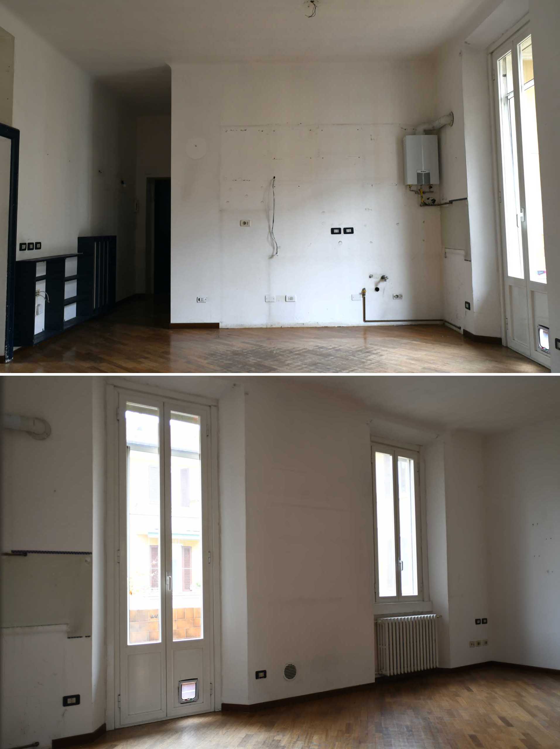
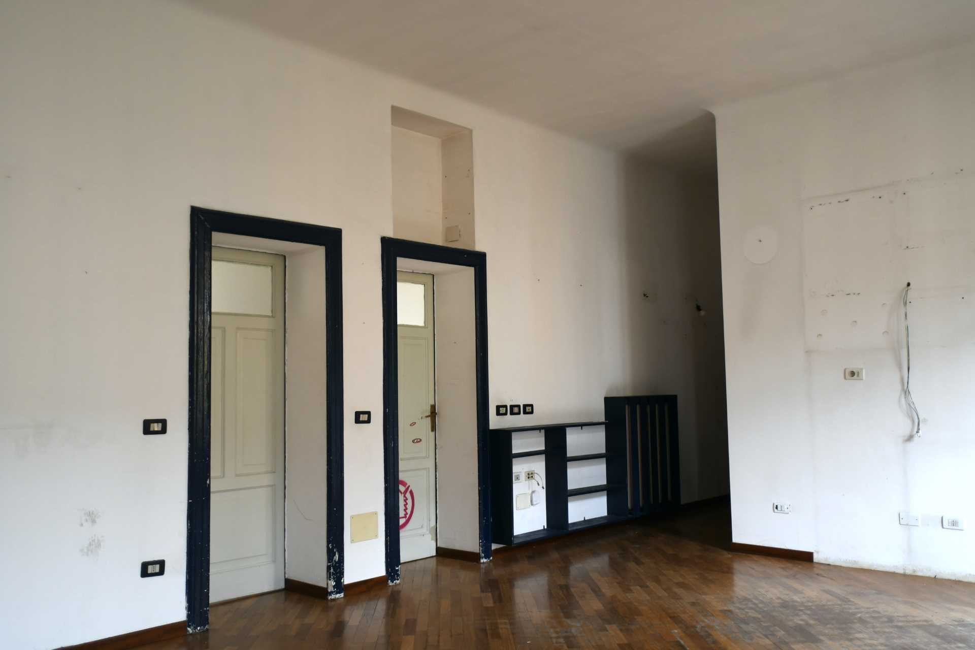
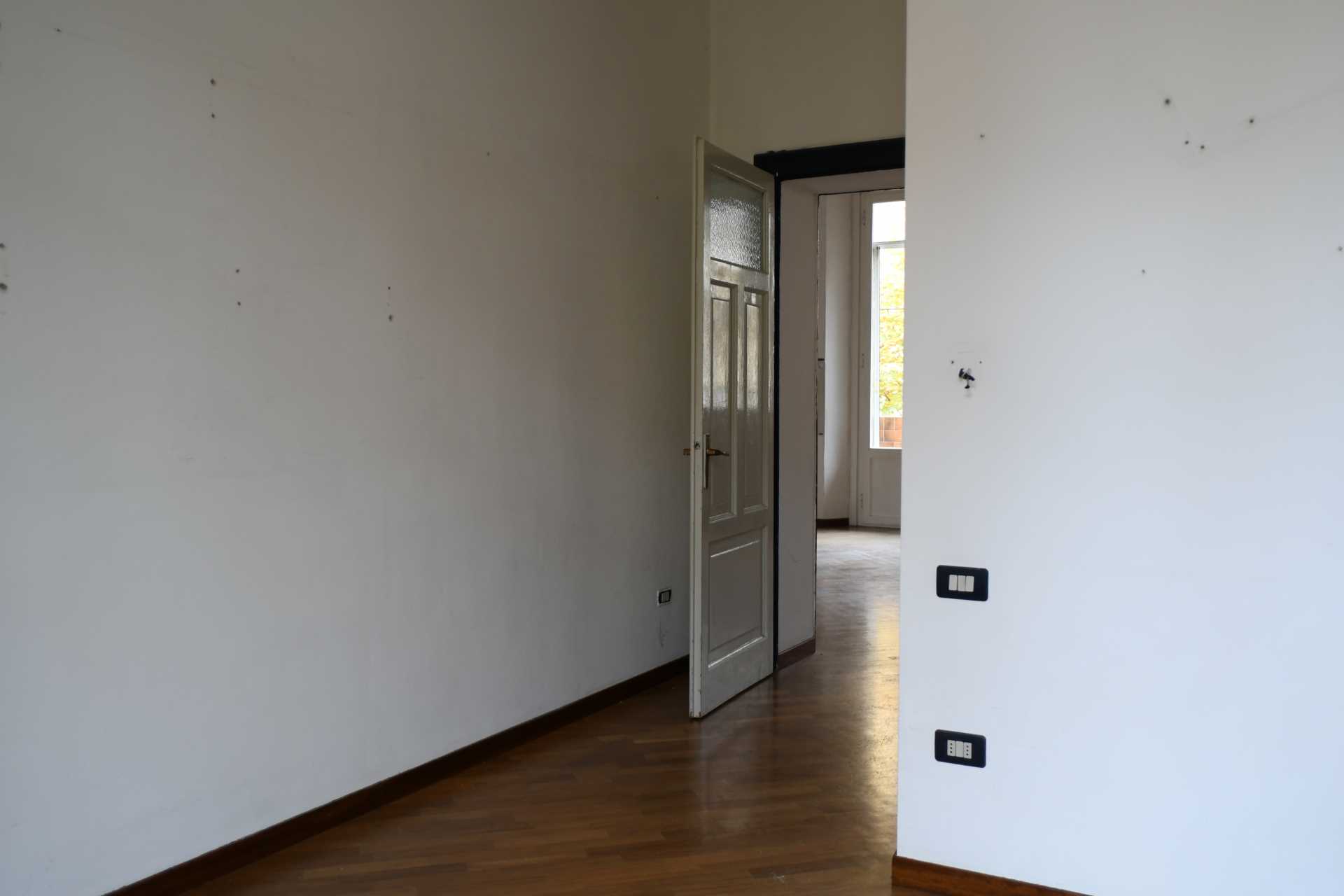
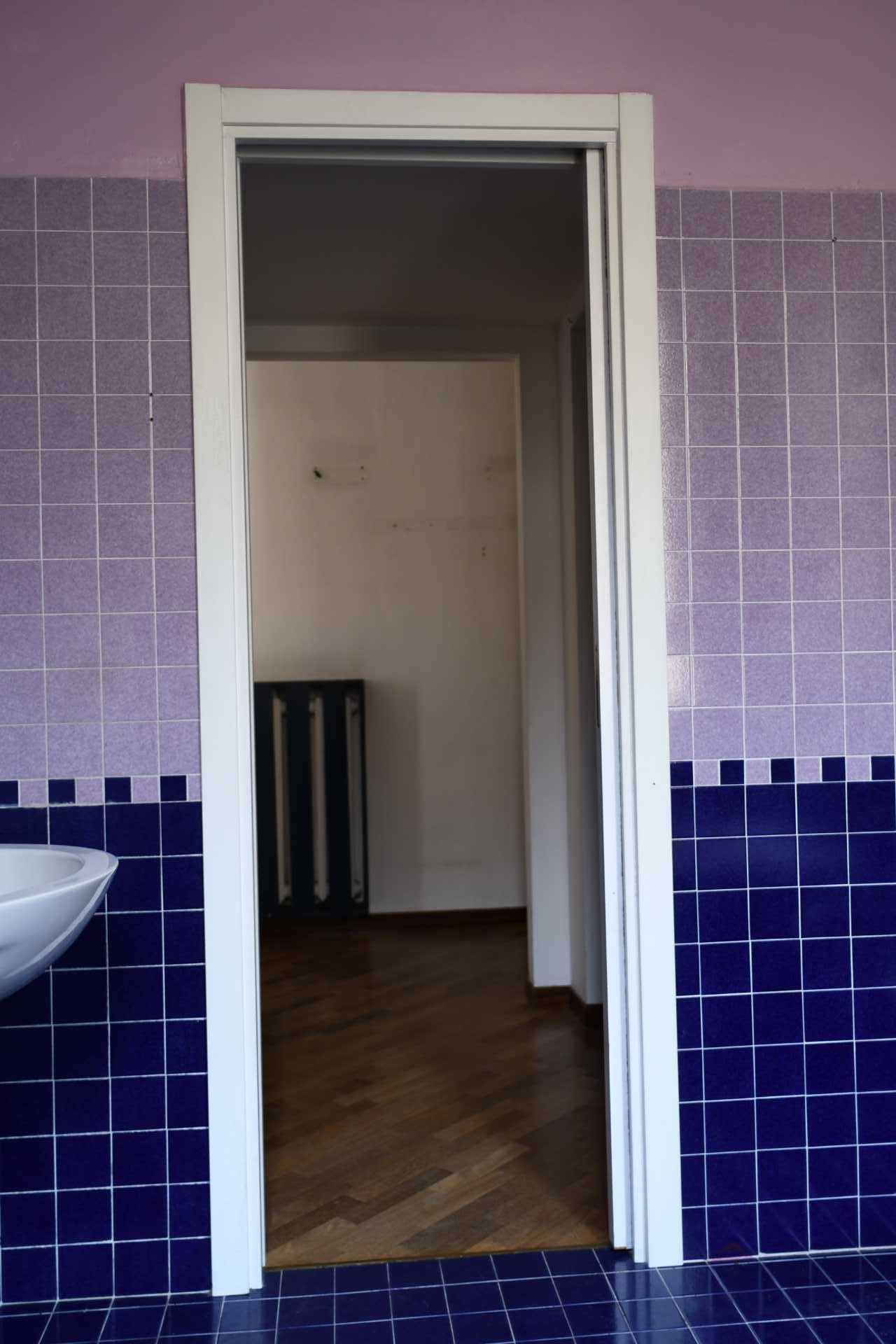
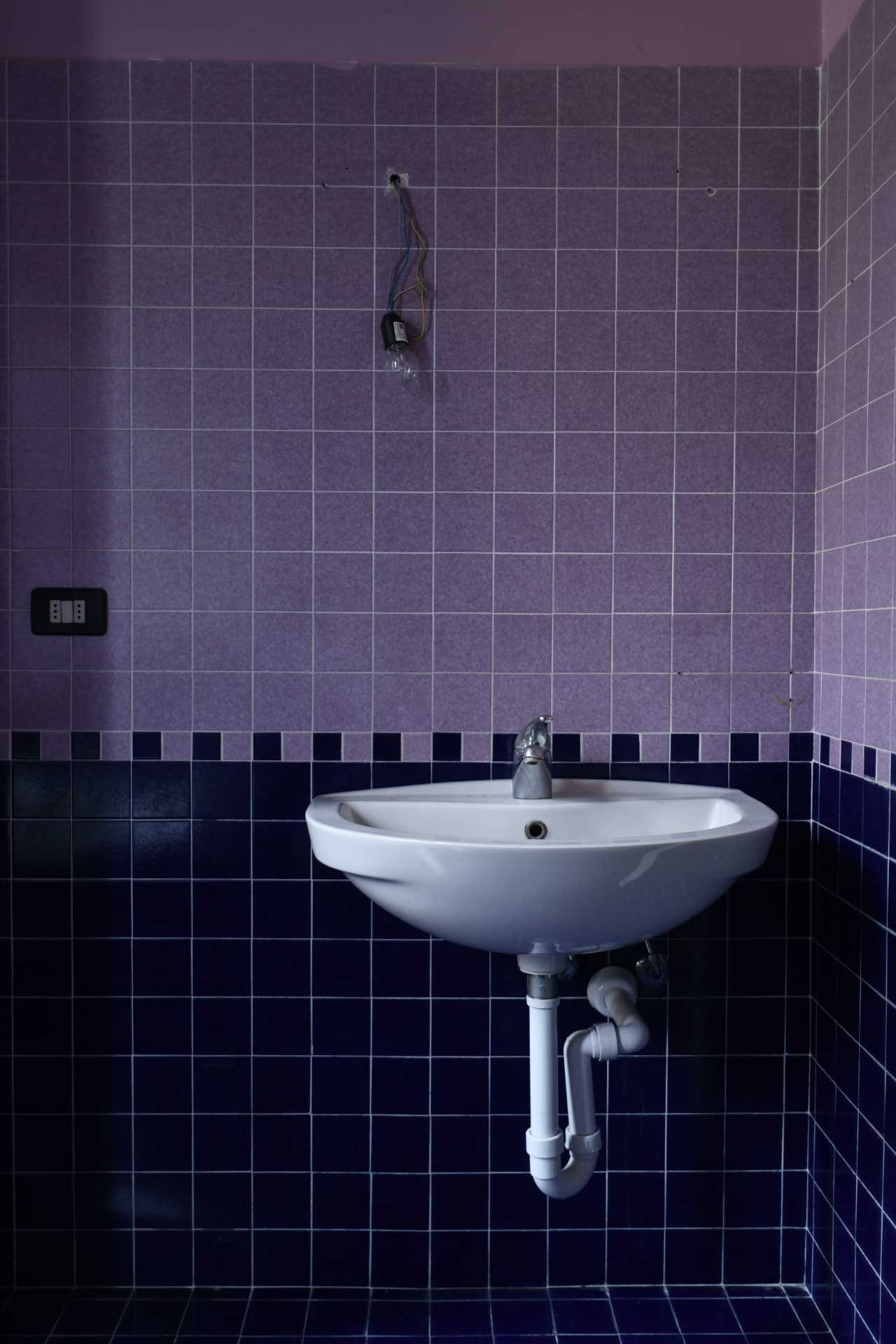
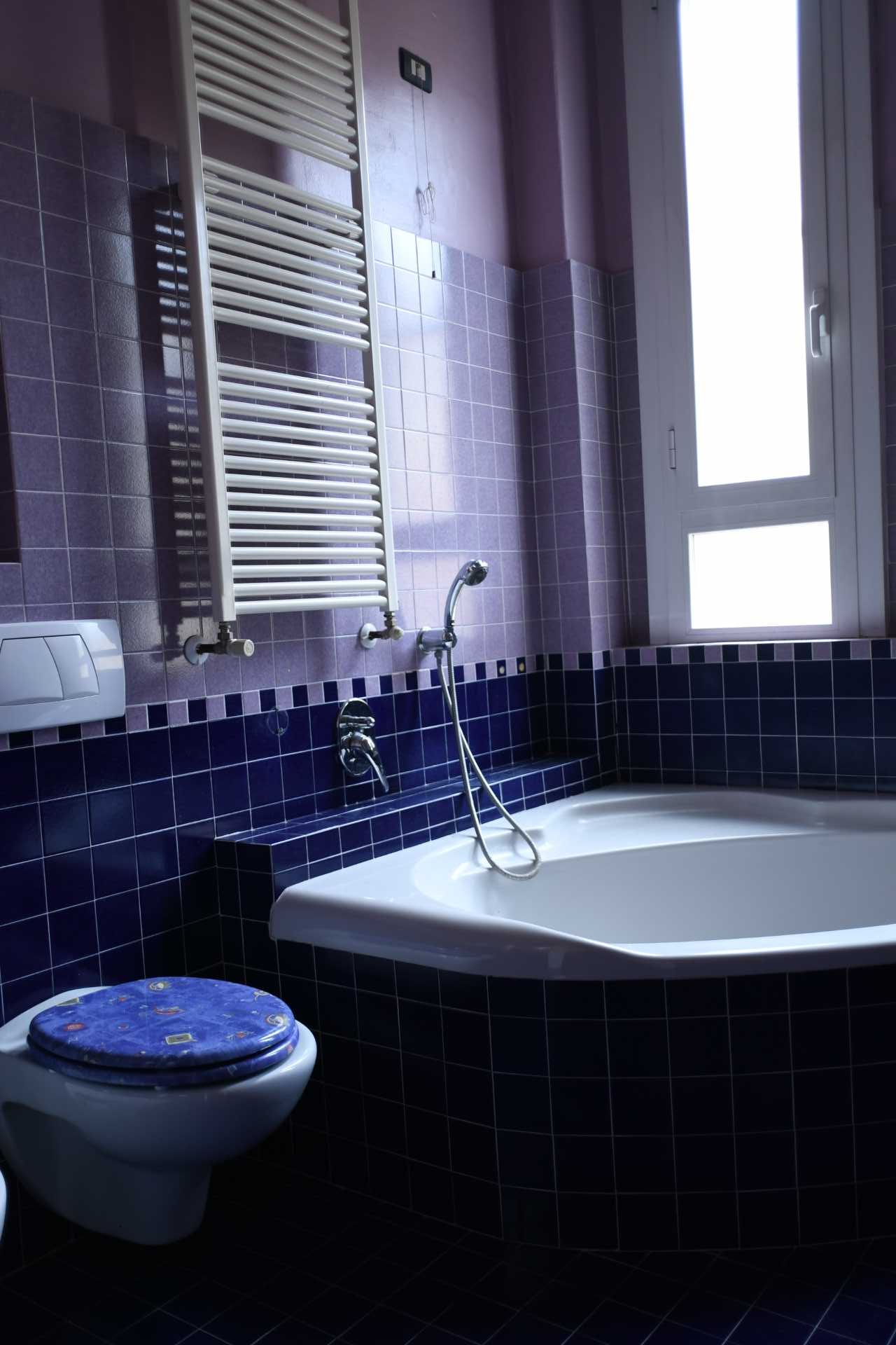
Before we look at the illustrations, renderings, and finished apartment, let’s view the empty ‘before’ apartment.
The Apartment ‘Before’
Measuring 968 square feet (90sqm), the apartment’s main living area was void of color, with one large main room, two bedrooms, and a bathroom. Tall windows provide natural light, however, the apartment was run down and in need of updating.
The Concept For The Apartment
The designers mentioned that the apartment would be, “A retro-style house, elegant and exclusive, where design plays a big role and the taste for beauty leaves no room for interpretation”.
The complete renovation focused on redistributing the areas to make them more usable, where color and geometry, in contrast with neutral tones, shape new scenarios, in a continuous play between what’s horizontal and vertical, curved and linear.
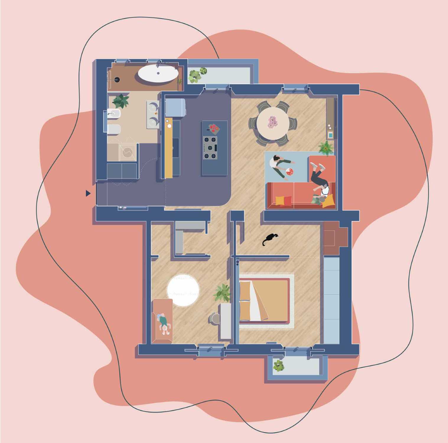
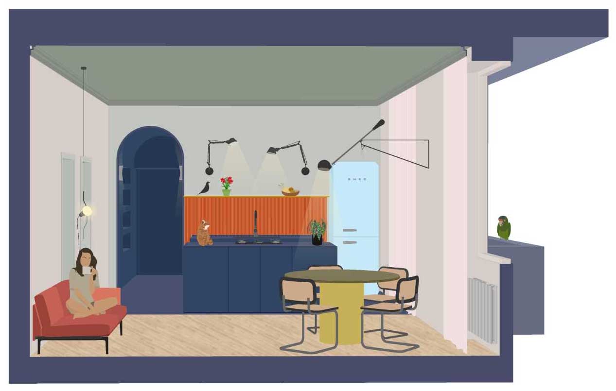

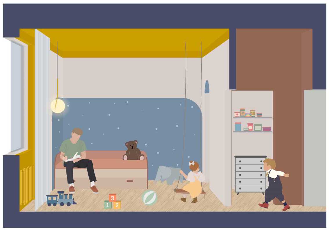
Seeing A Preview Of The Apartment
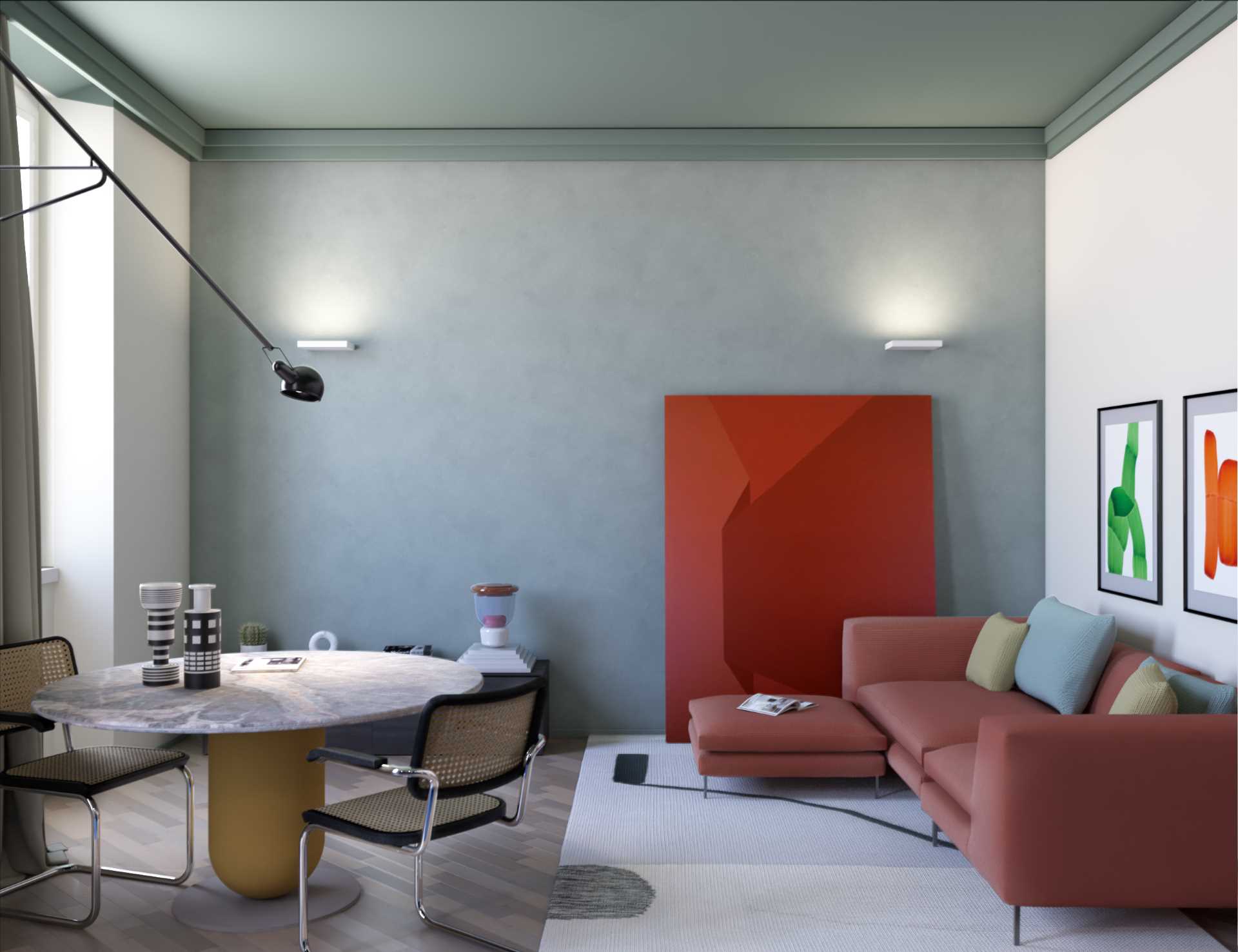
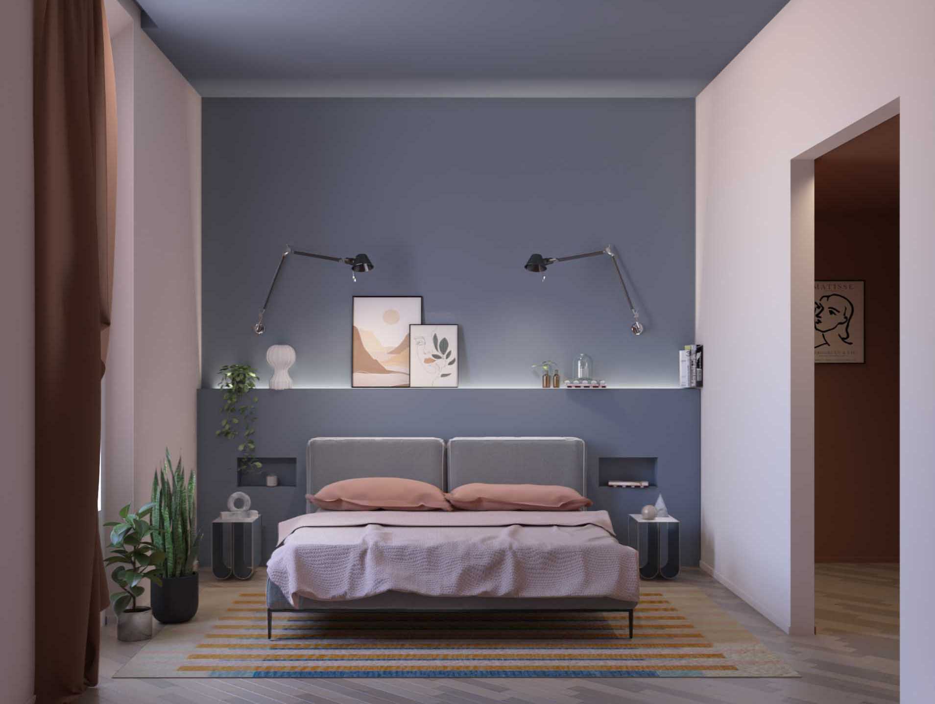
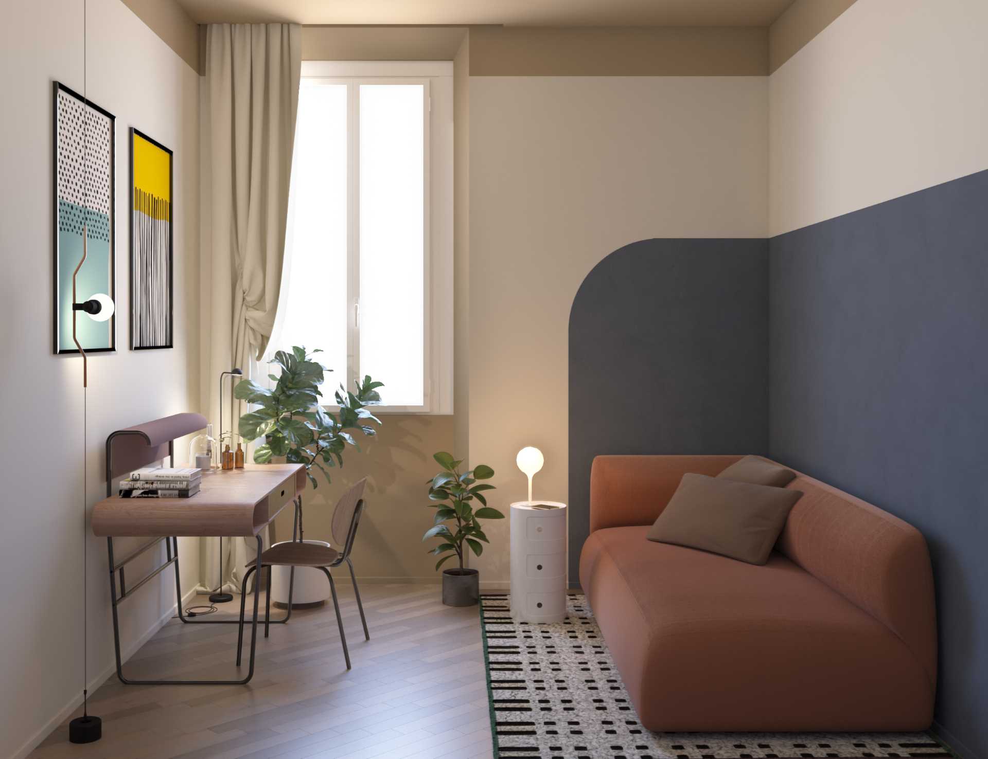
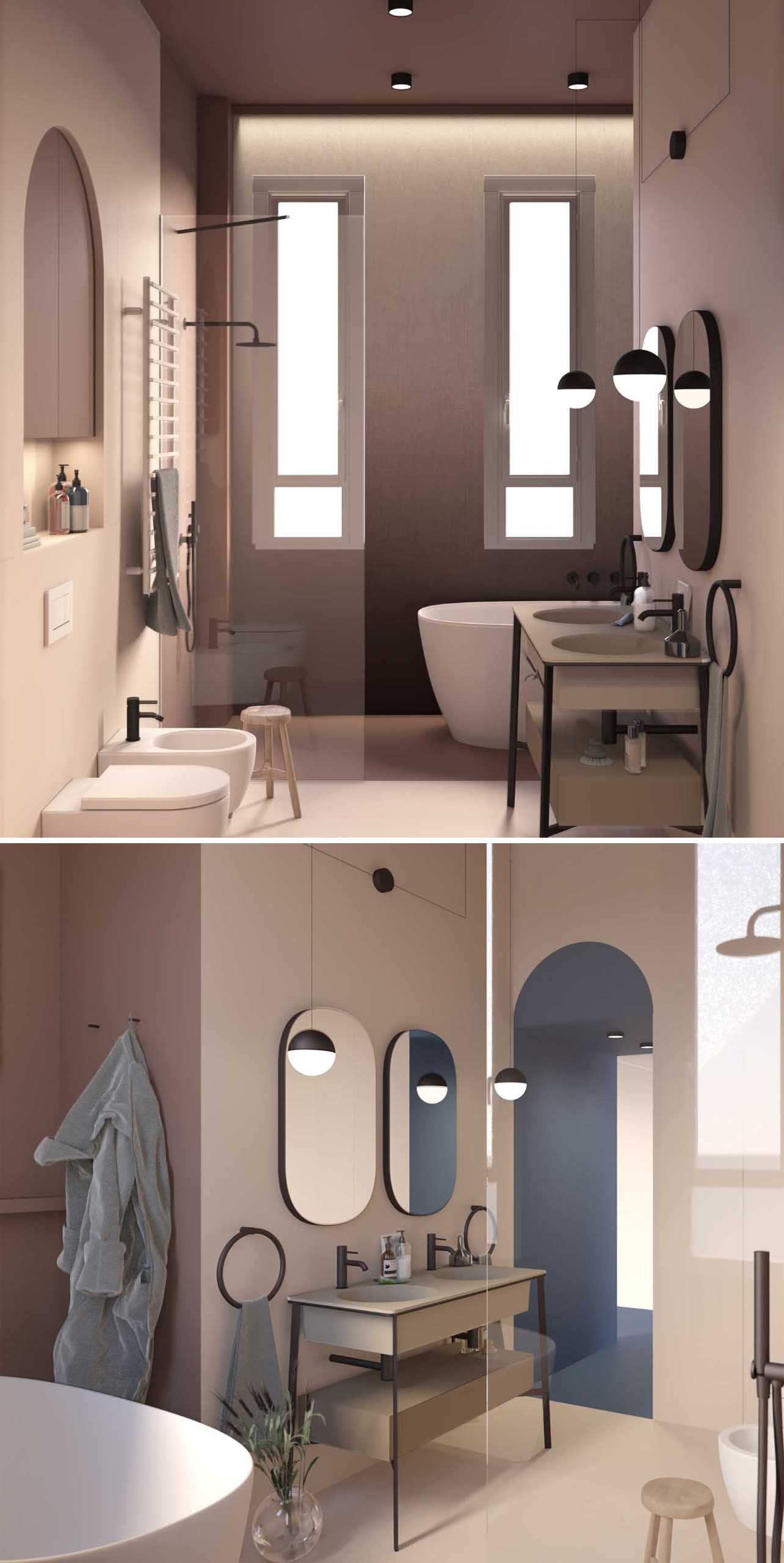
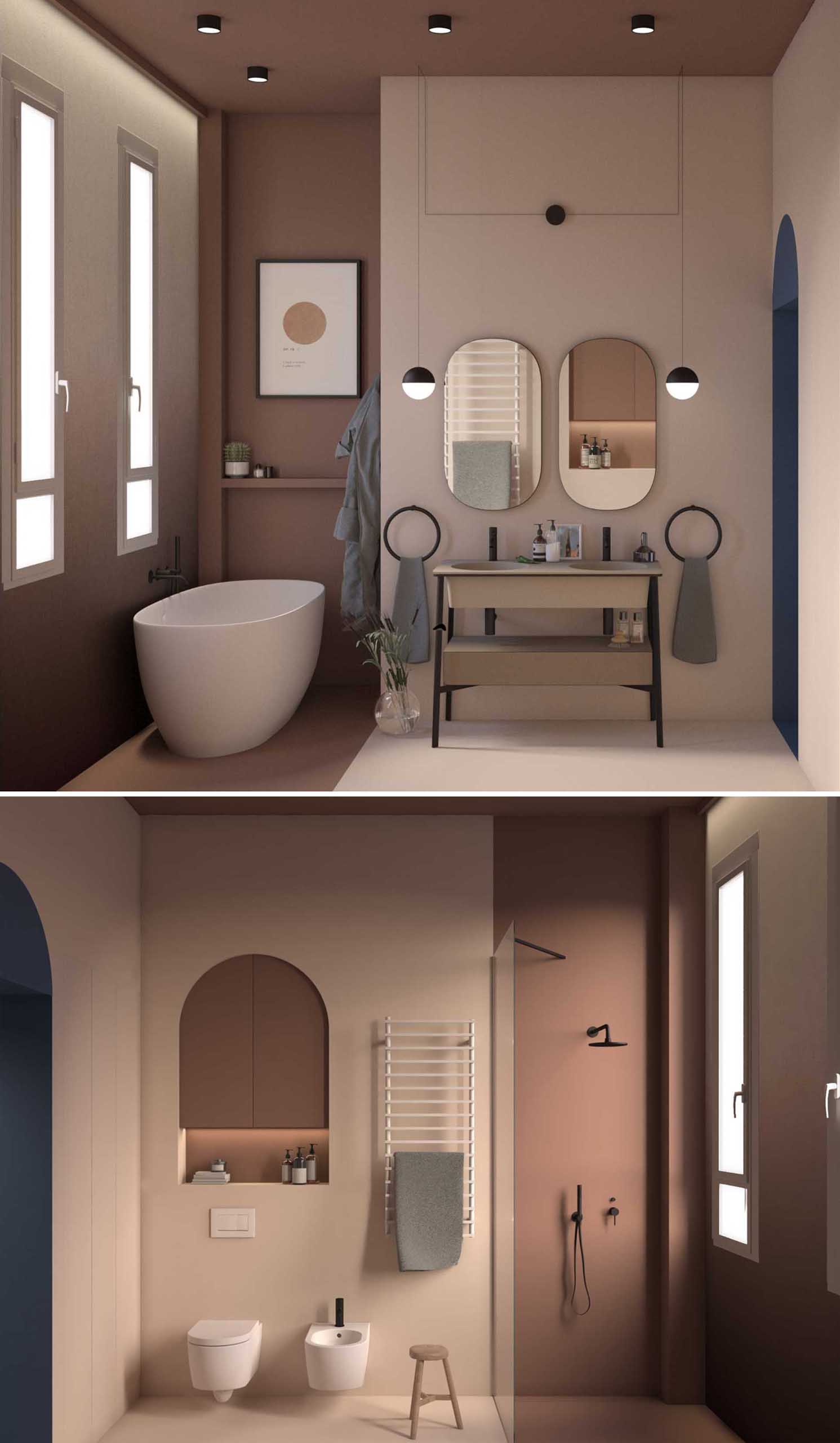
The renderings enabled the clients to see the apartment before any work was done, showing the designer’s vision coming to life.
The Finished Apartment
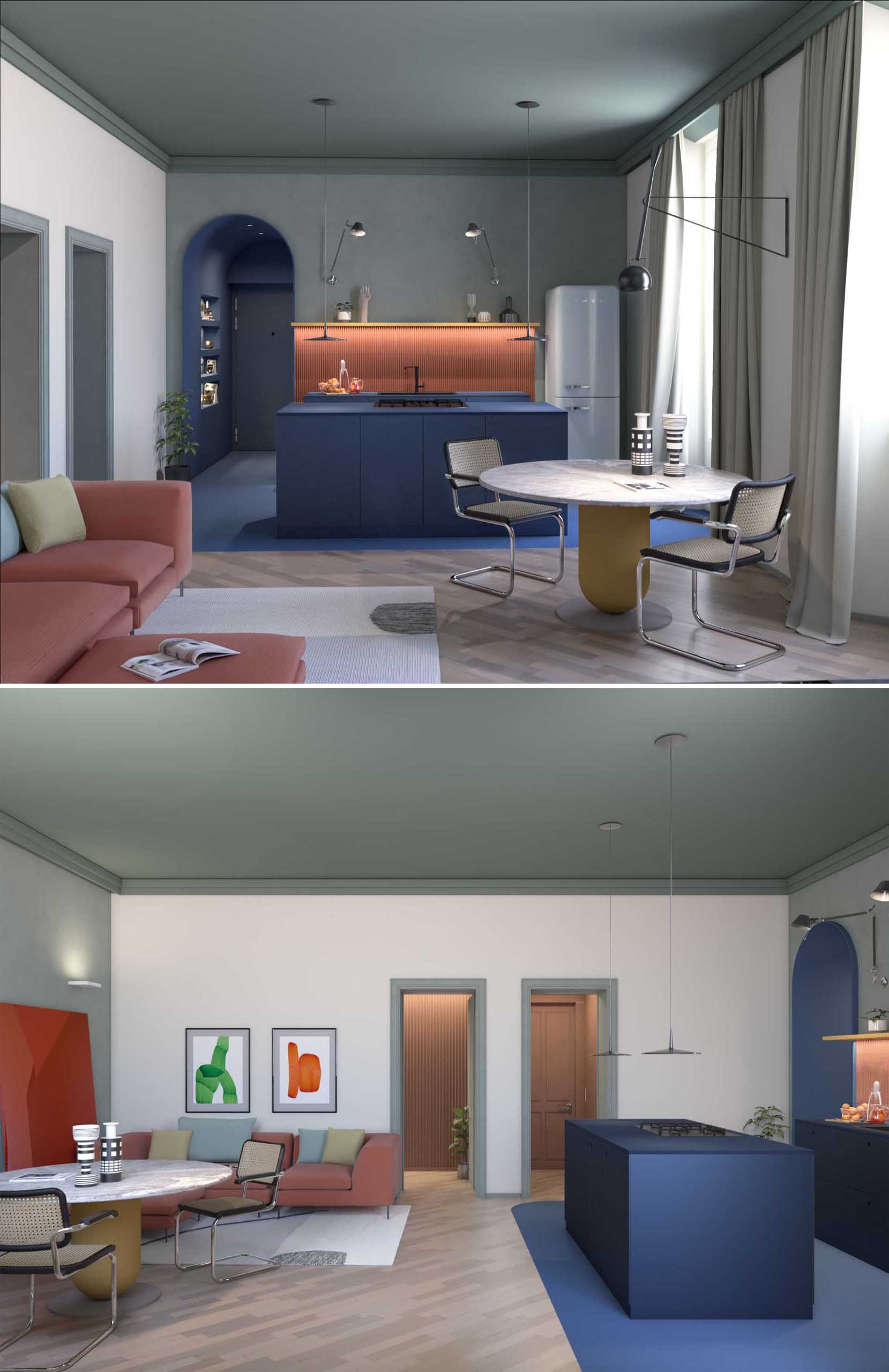
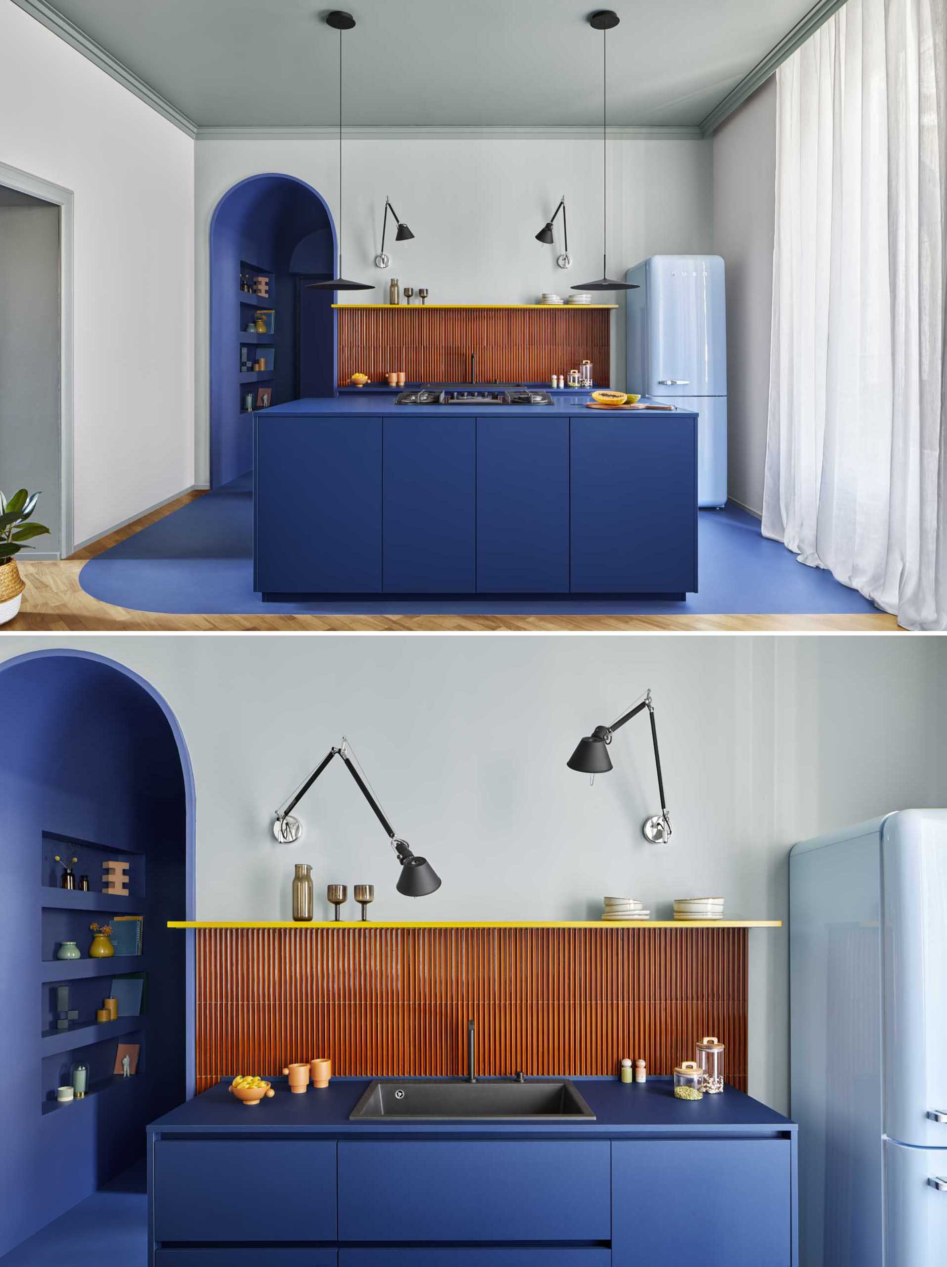
After the work was done, the apartment became a fun and vibrant space, with the main room dedicated to the kitchen, dining, and living room.
The kitchen has been defined in the open-plan room by using blue, which matches the entrance corridor. The Iroko wood floor was removed and replaced with a cement material in the same shade of blue.
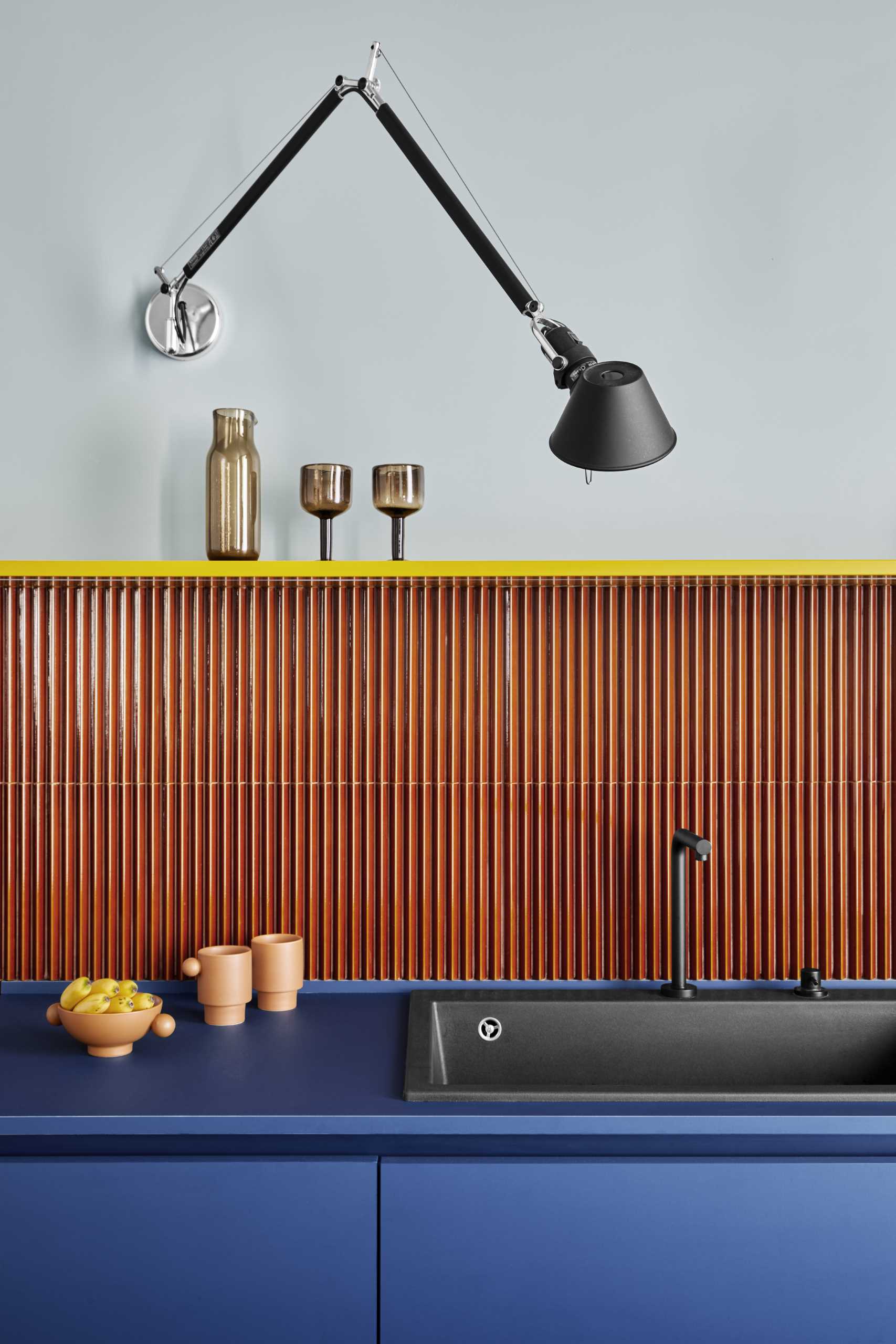
The kitchen walls feature 3D tiles with a triangular section, and in keeping with the retro style of the project, a light blue Smeg refrigerator was also included.
The dining area separates the kitchen from the living room and includes a wall-mounted light fixture.
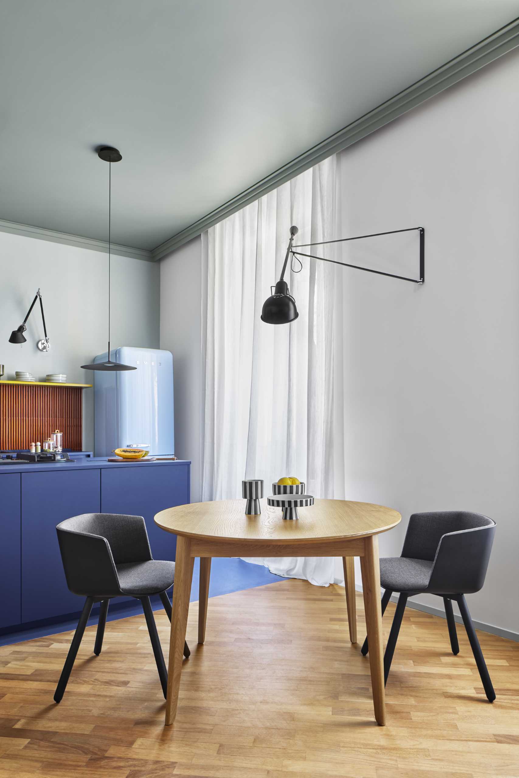
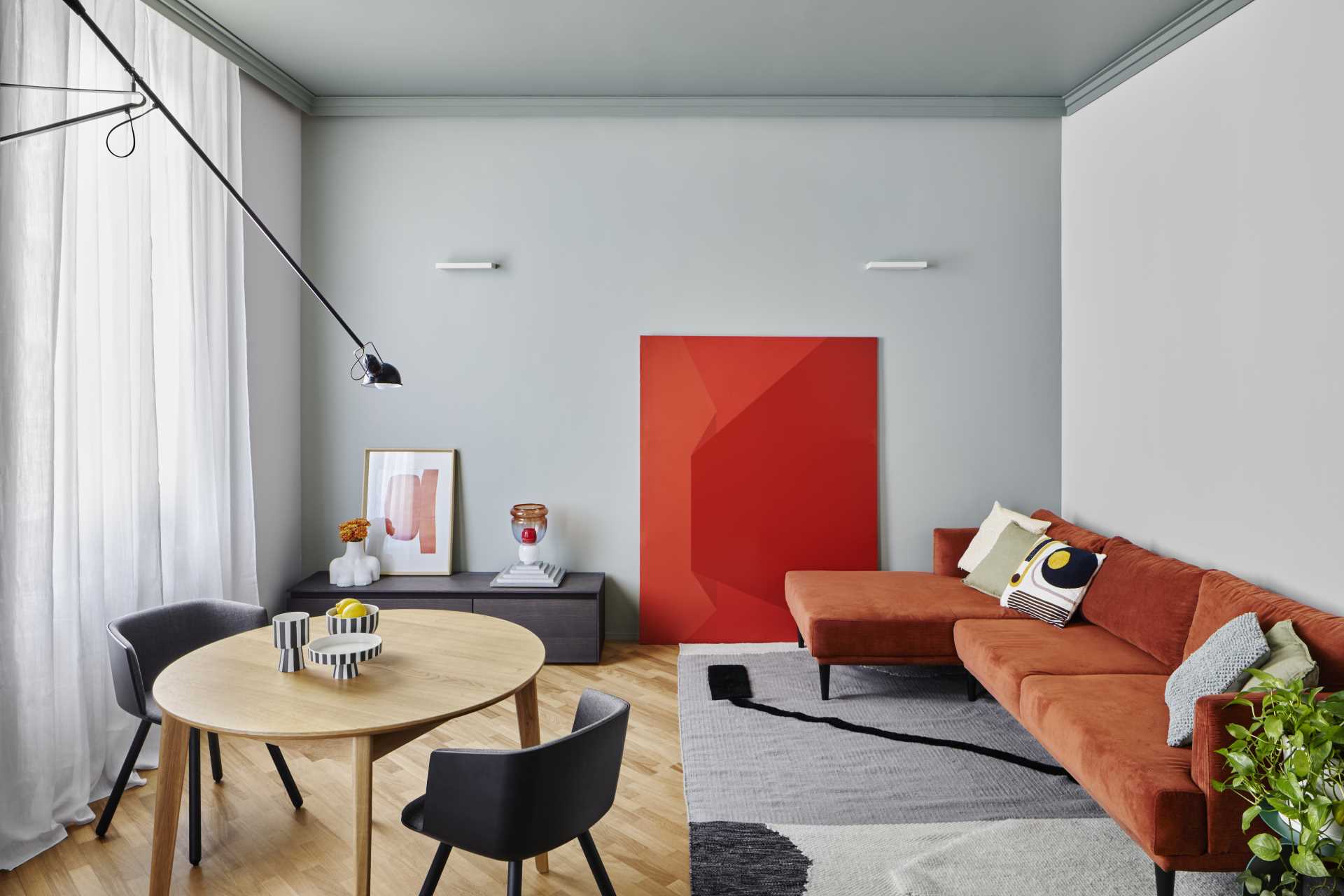
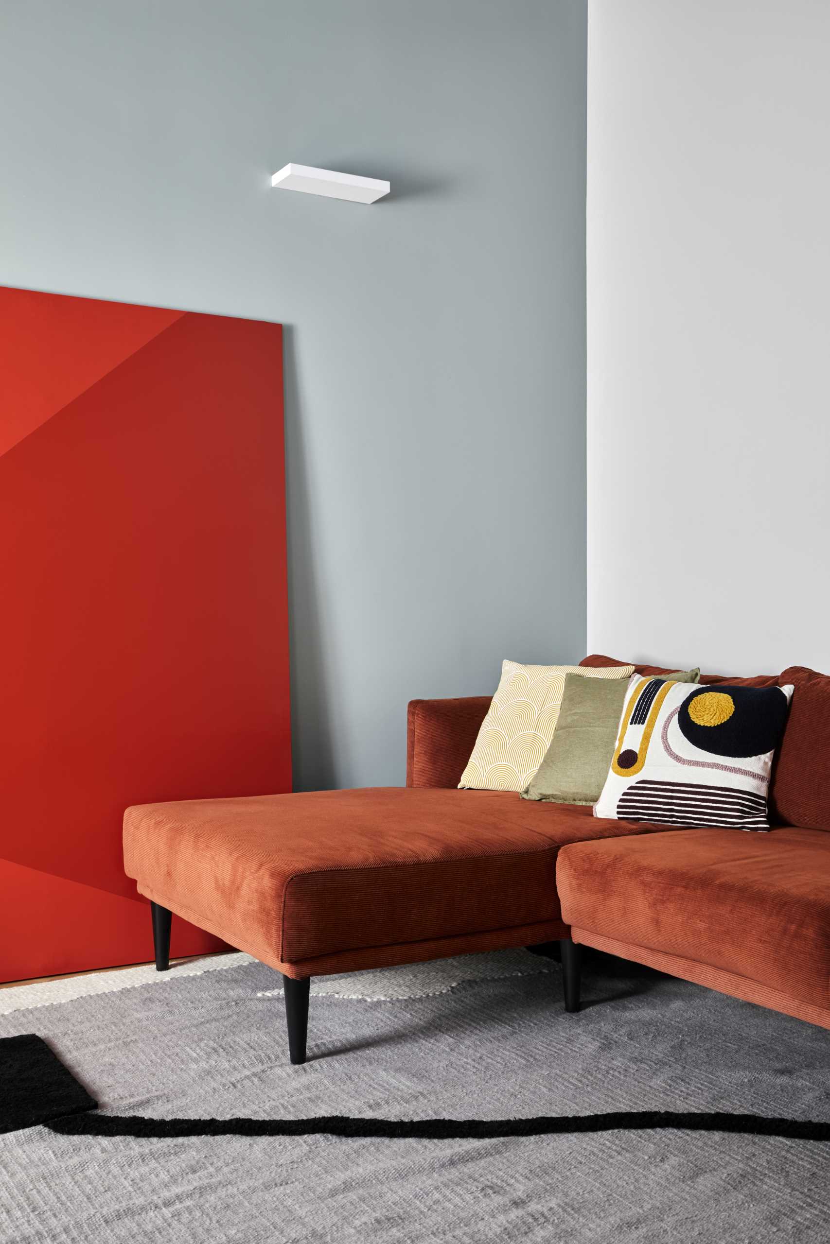
In the living room, the long, brighter walls, pierced by windows and the two doors leading to the sleeping area, are painted in a light ash color, contrasting with the light Celadon green on the short walls and its darker version on the ceiling.
The main bedroom received a new entryway, painted in a red clay tone, that hides two storage closets. The room has its long sides finished in a light ash tone, while an inverted U with the short walls and the ceiling, is painted in cornflower blue.
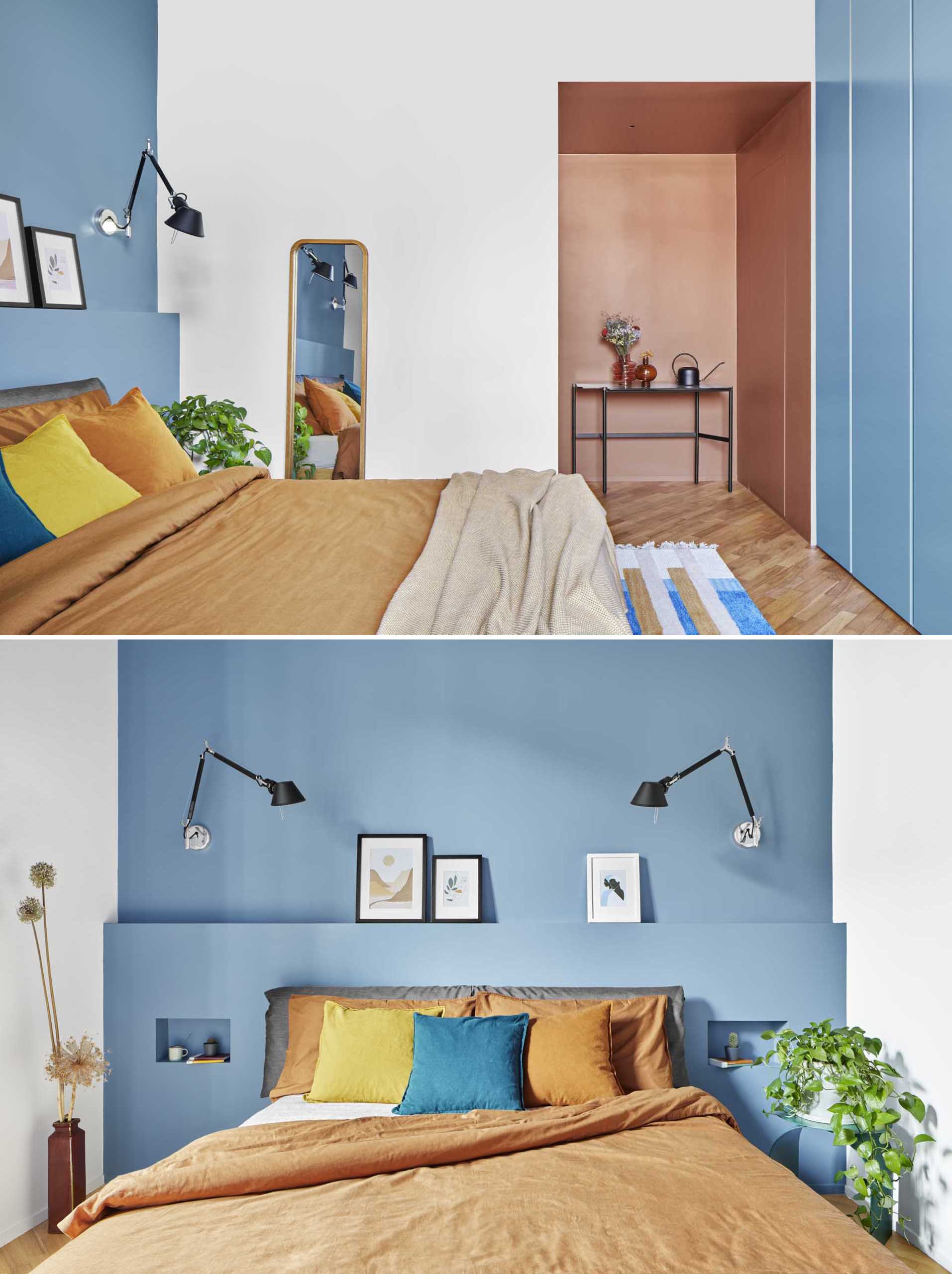
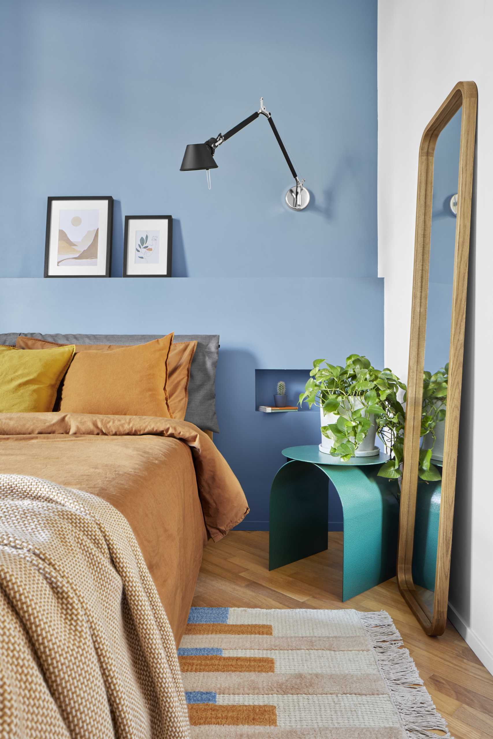
The headboard has been enriched with a 47-inch (120cm) high wall section containing two bedside tables. On the opposite wall, the wardrobe has 6 flush-to-wall doors matching its surroundings.
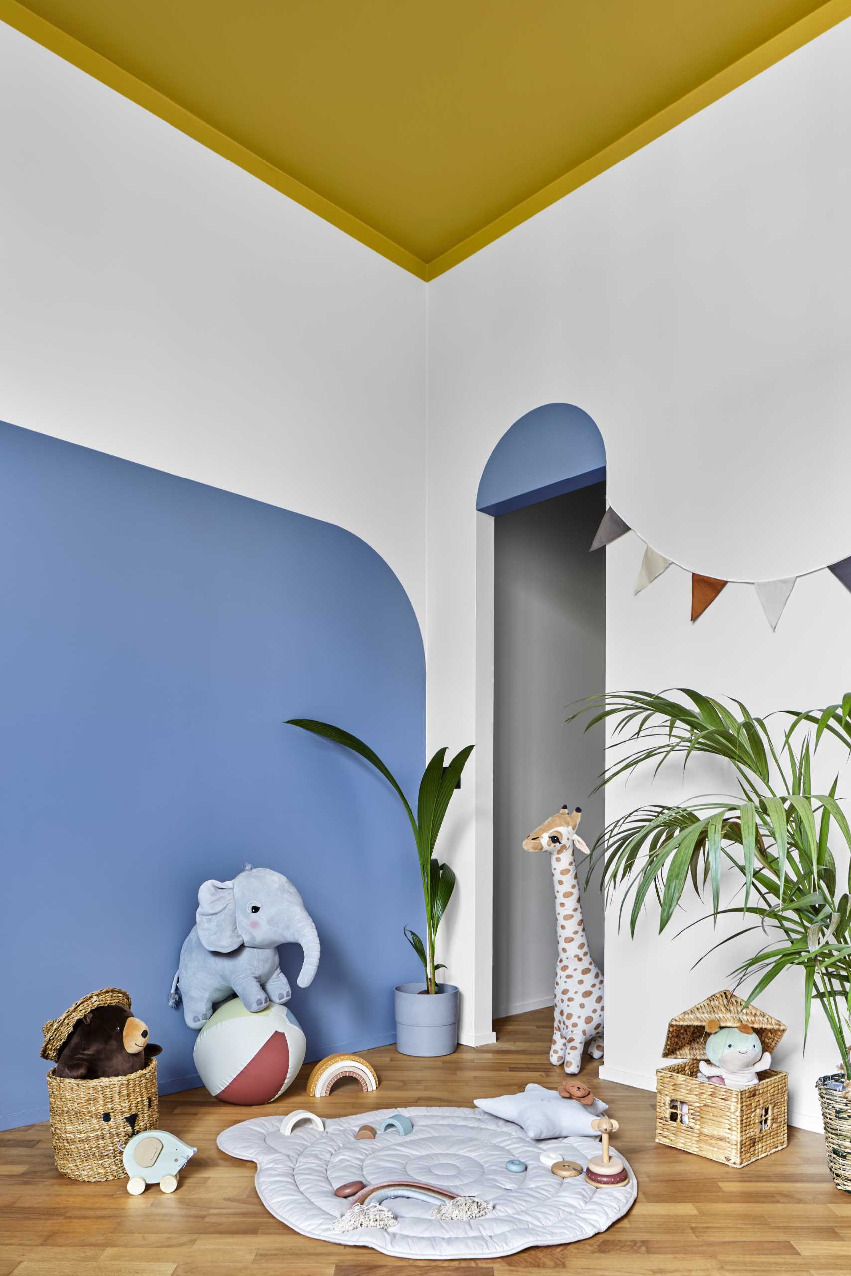
In the kid’s bedroom, simple geometric shapes and primary colors were used. The high wainscoting in Savoy blue creates a chromatic corner, which is also used in the decorative arch of the walk-in closet.
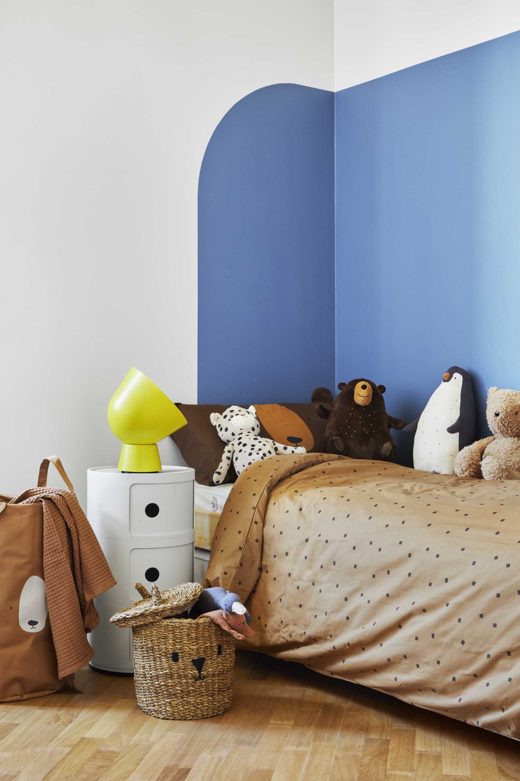
Ocher yellow descends slightly from the ceiling to the walls to convey the sense of a safe and protected area.
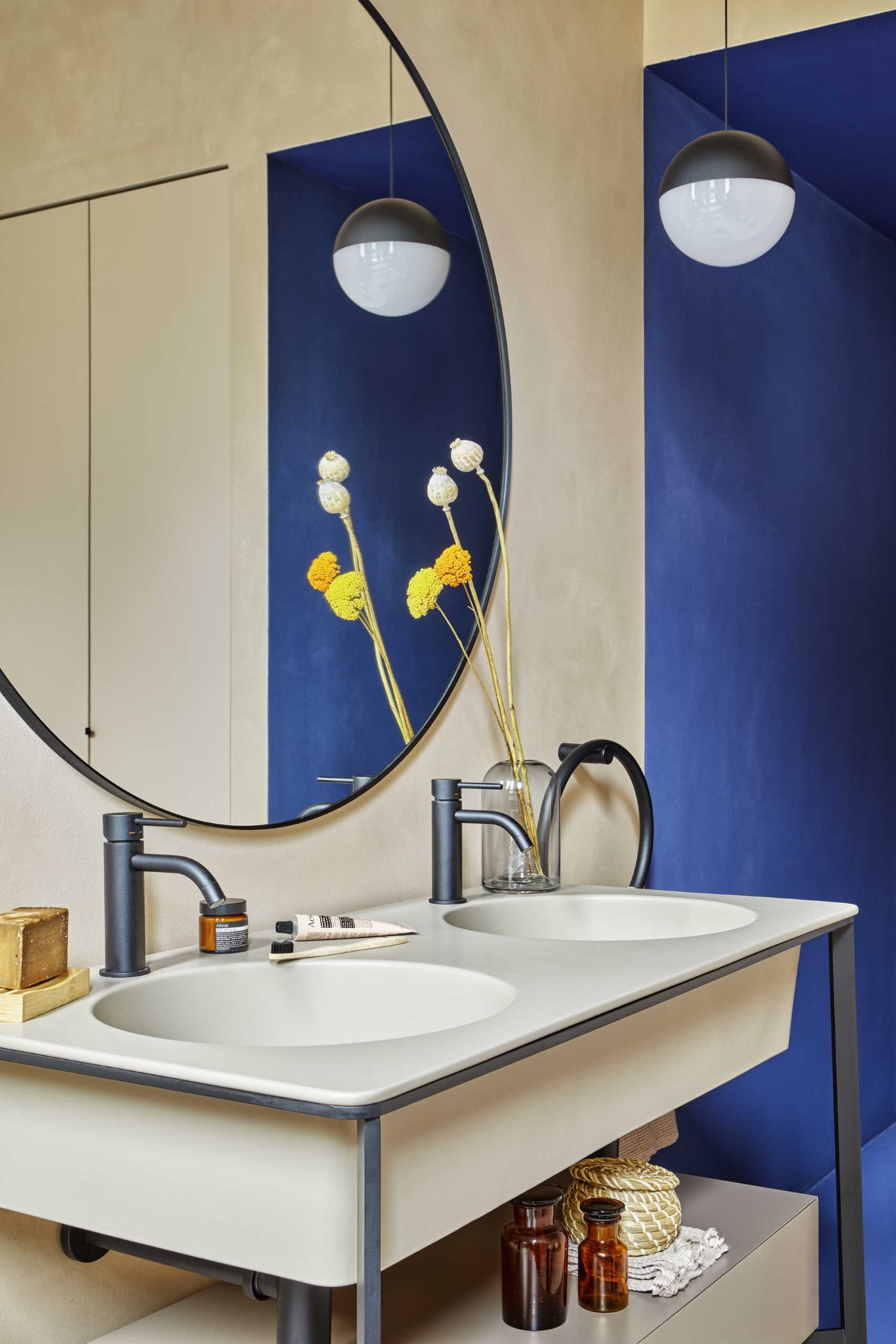
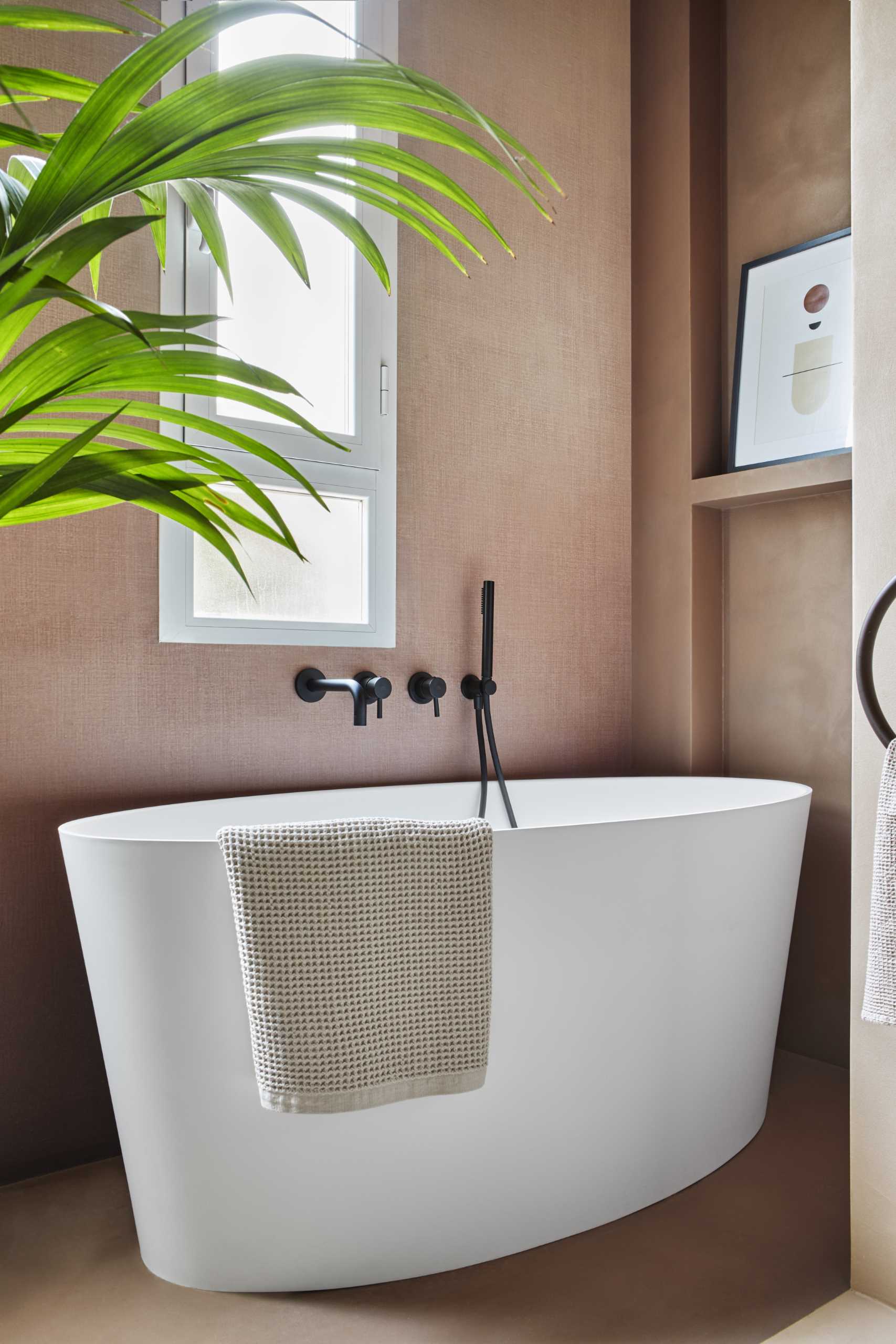
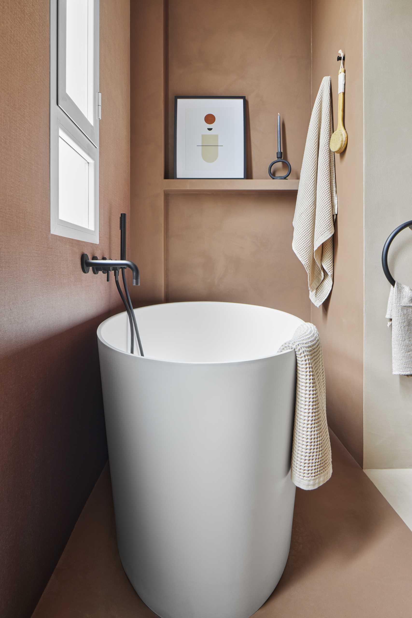
The bathroom has been completely customized to fit the client’s needs and includes a double vanity, a spacious walk-in shower, a bathtub, and a laundry area built into a custom wardrobe.
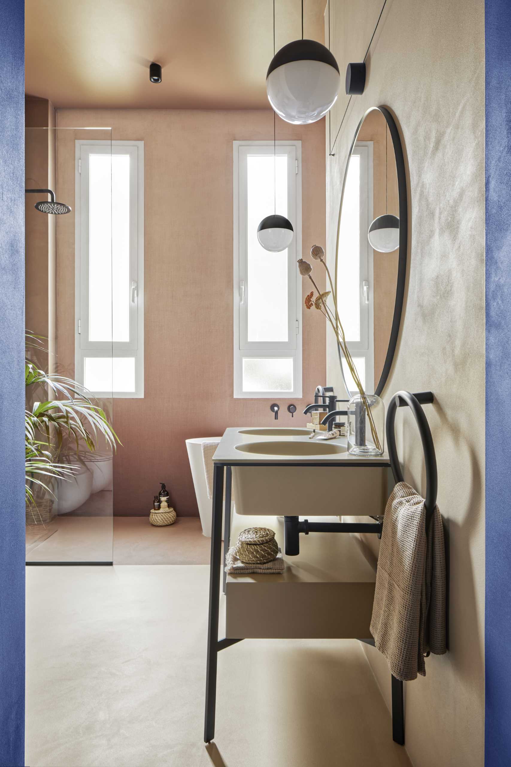
For the shower/tub wall, the designers chose a fiberglass wallpaper, where the two main colors fade from dark to light.
Photography by Riccardo Gasperoni | Styling by Elga Ancona
Source: Contemporist

