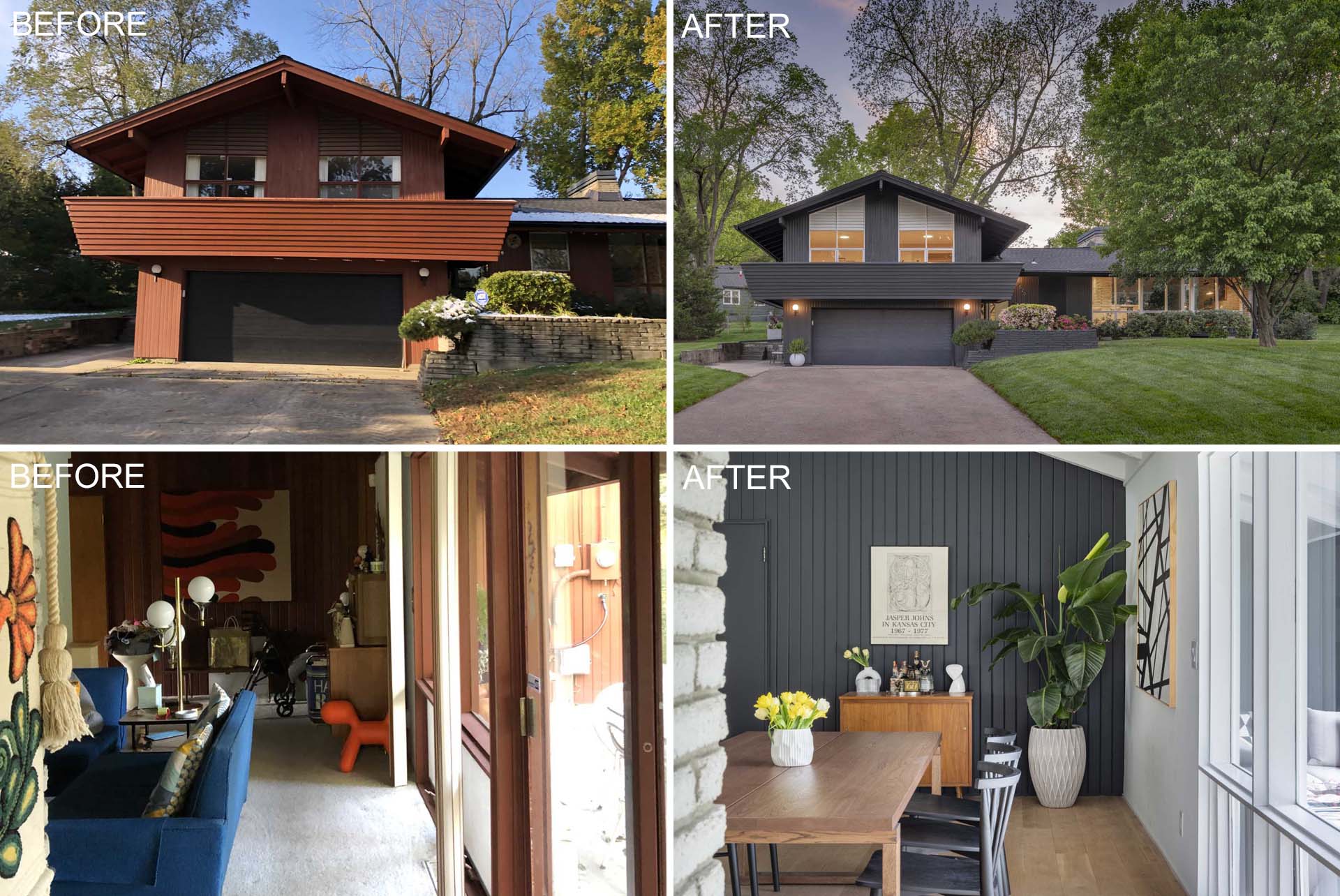
FORWARD Design | Architecture has shared photos with us of the renovation that was done on this mid-century modern home in Kansas City, Missouri.
The home, originally designed by the architecture firm Linscott, Kiene & Haylett and built-in 1954, was revolutionary at the time for its T-shaped split-level plan, which allowed for a more spacious, two-story bedroom wing.
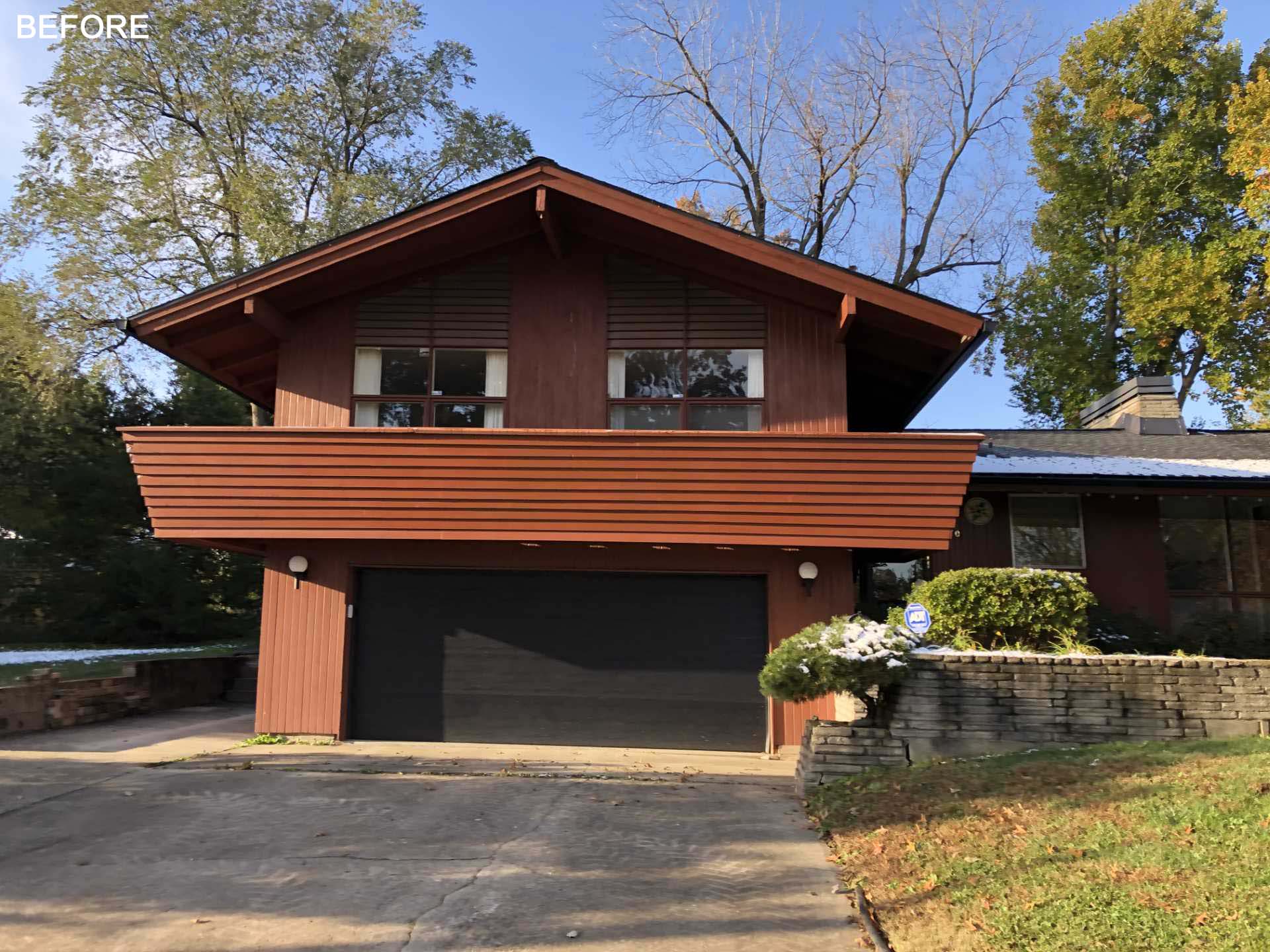
The current owner wanted to honor the house’s history but also to open up the main spaces to be more in keeping with 21st-century living and to have a larger and more gracious feel.
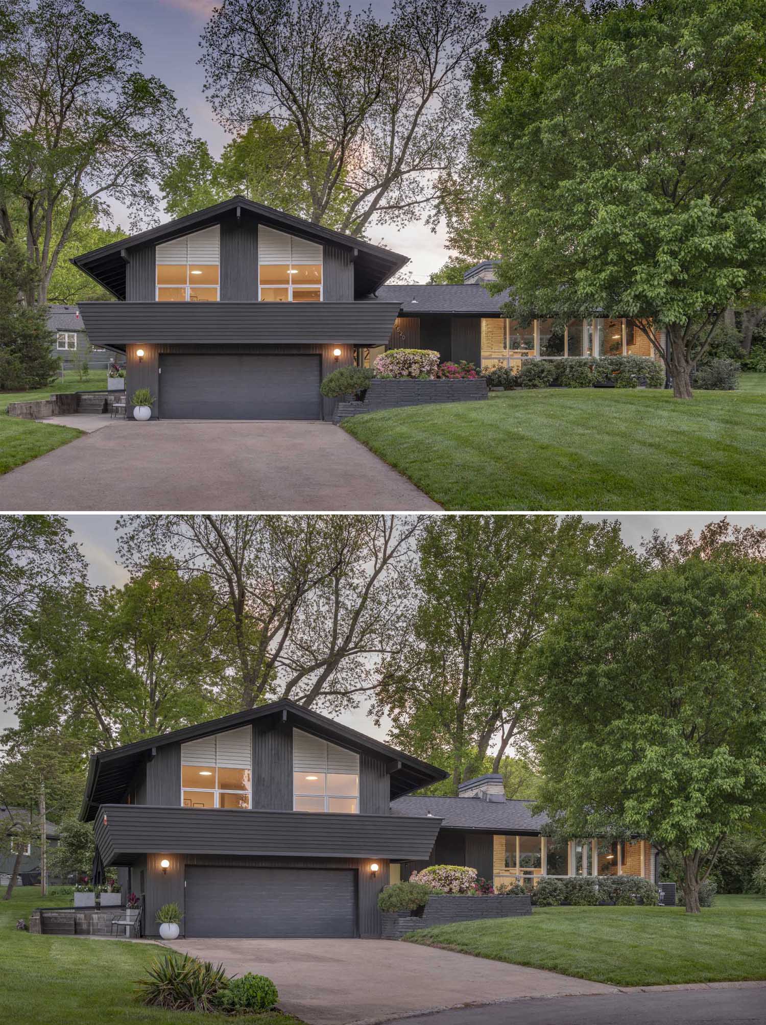
The first update you can see as you arrive at the house is the new dark exterior that complements the greenery and makes it more current.
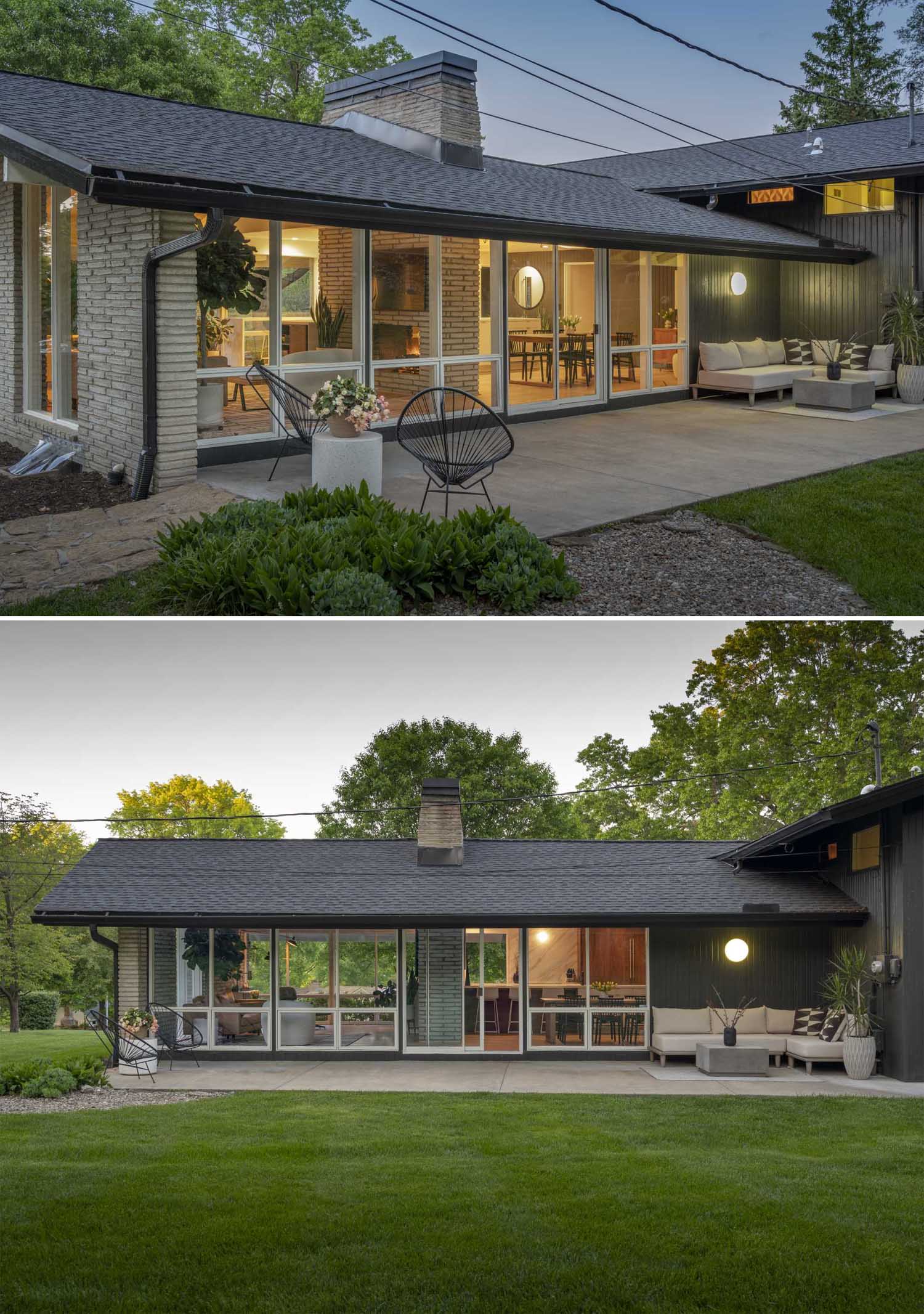
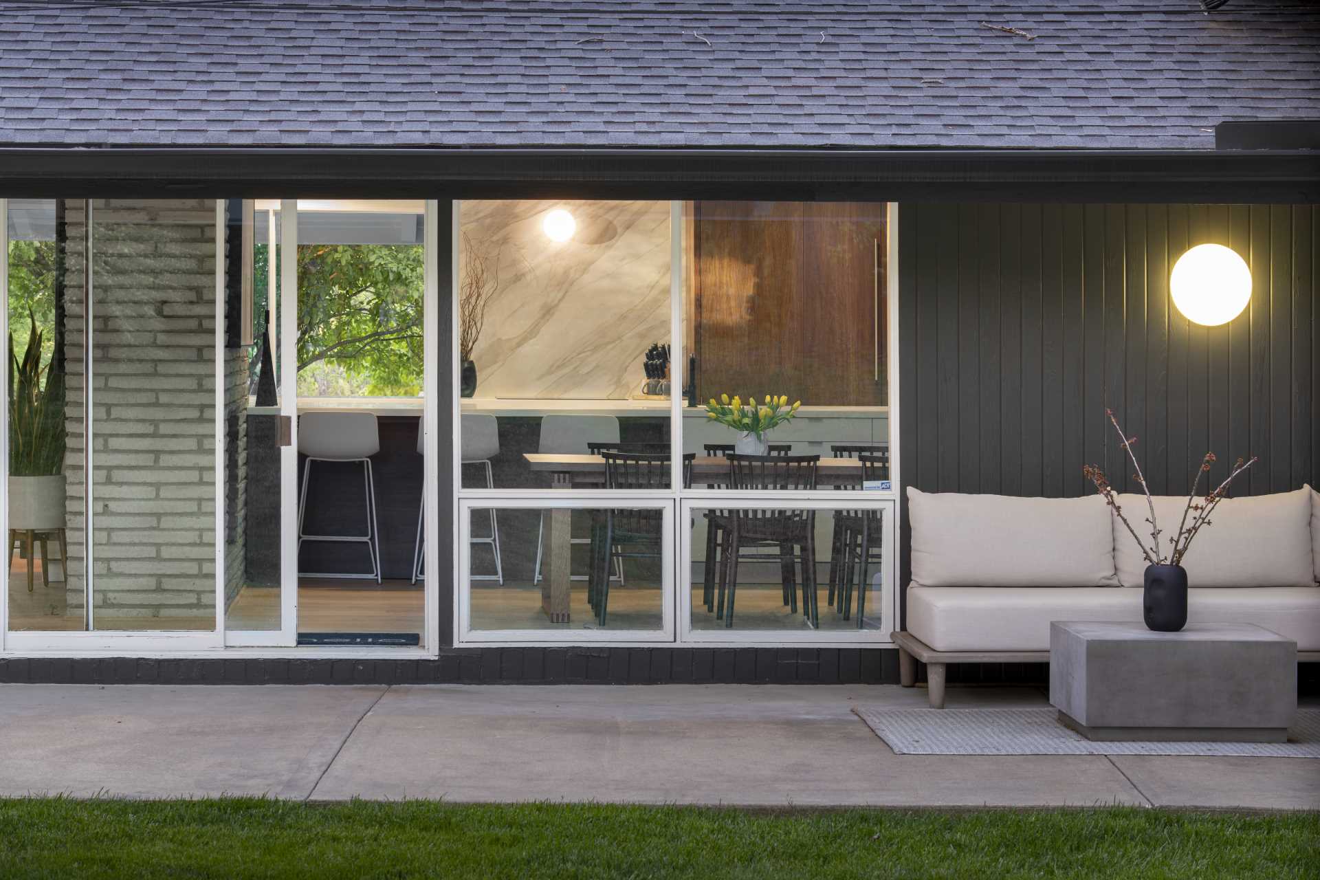
At the rear of the home, there’s a patio with a lounge and a separate seating area. The floor-to-ceiling windows allow a view of the interior and let the natural light flood the interior.
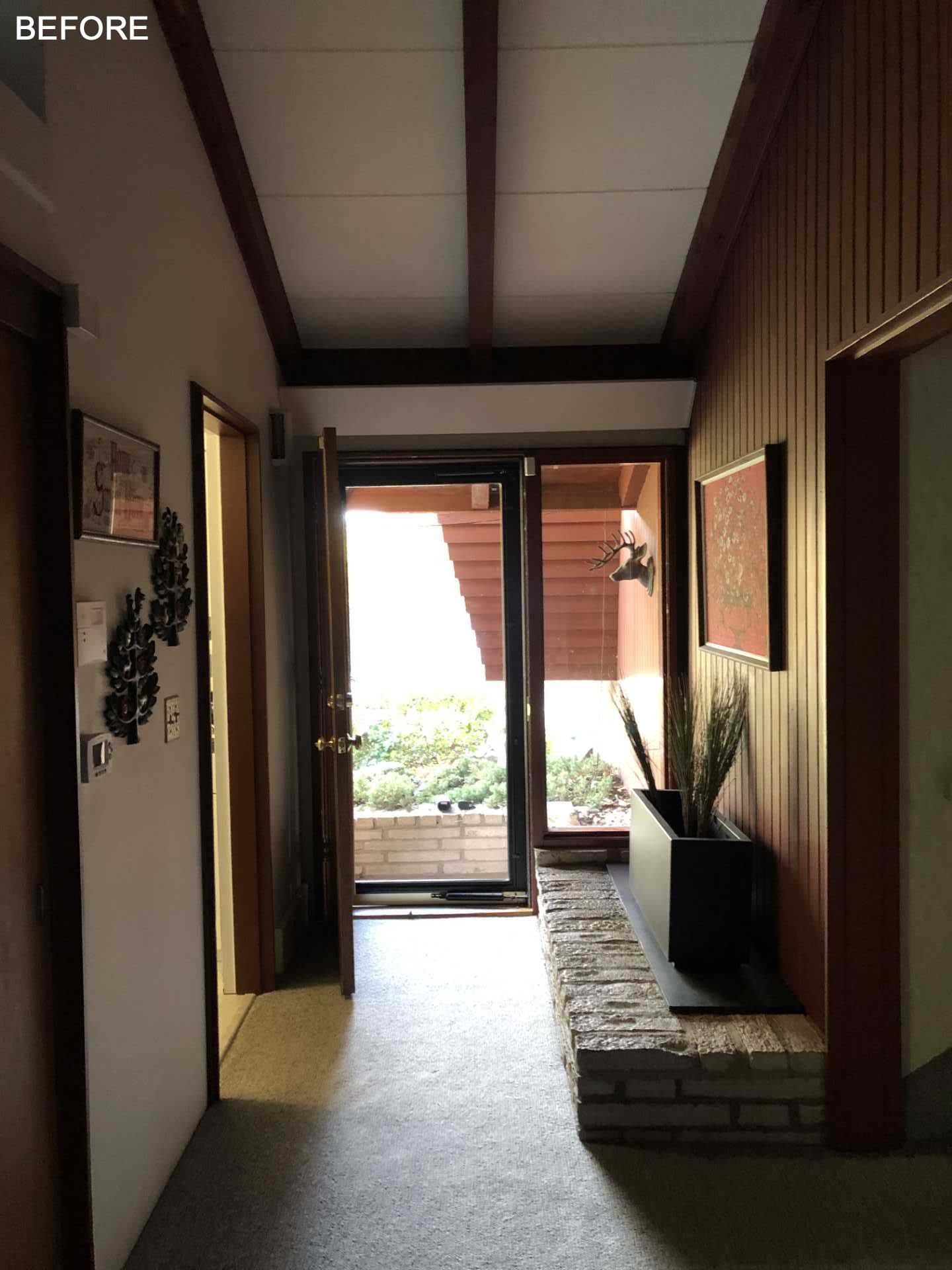
The original entryway was dark with the only natural light from the window by the front door.
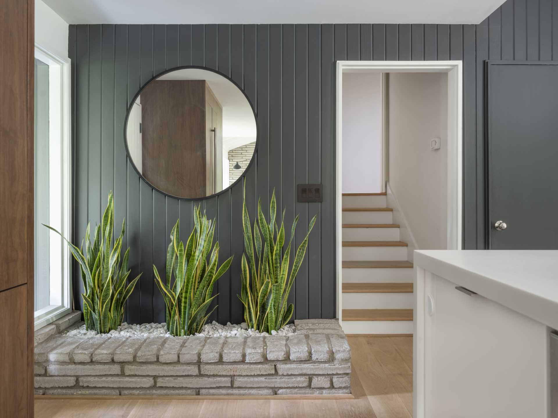
The updated entryway kept the brick planter by the wall, but now the wood has been painted grey and light wood flooring has been added. A large round mirror helps to reflect light in the space.
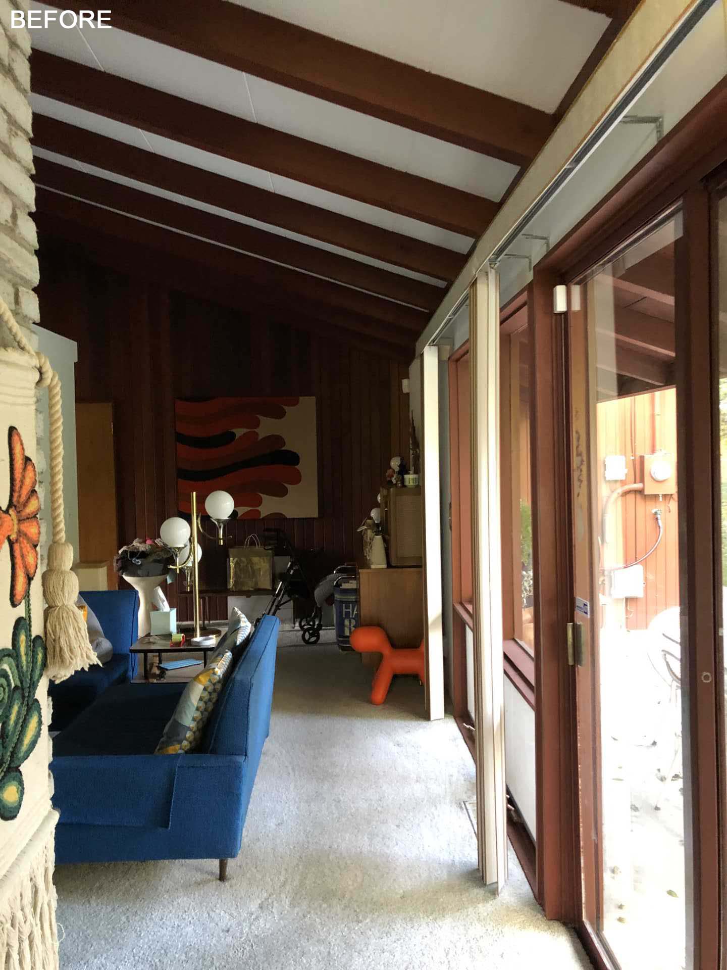
The entryway has a view of the kitchen and opens up to the dining room. Before, the space was used as a living room and was dark, with lots of wood and carpet.
The original living room was transformed into a bright and open dining room. The grey wall of the entryway continues into the dining area where there’s a wood cabinet chosen as a representation of the mid-century modern era.
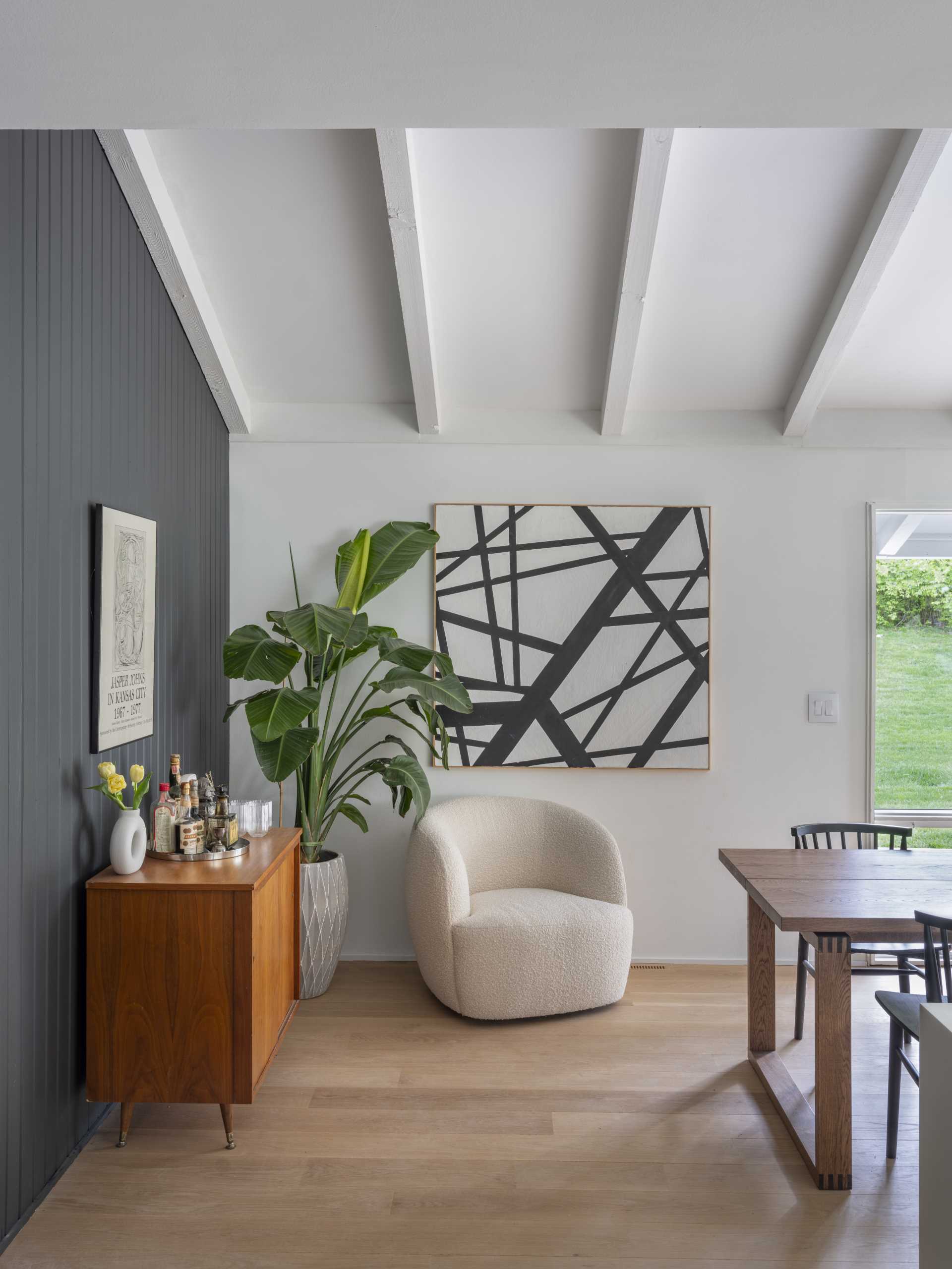
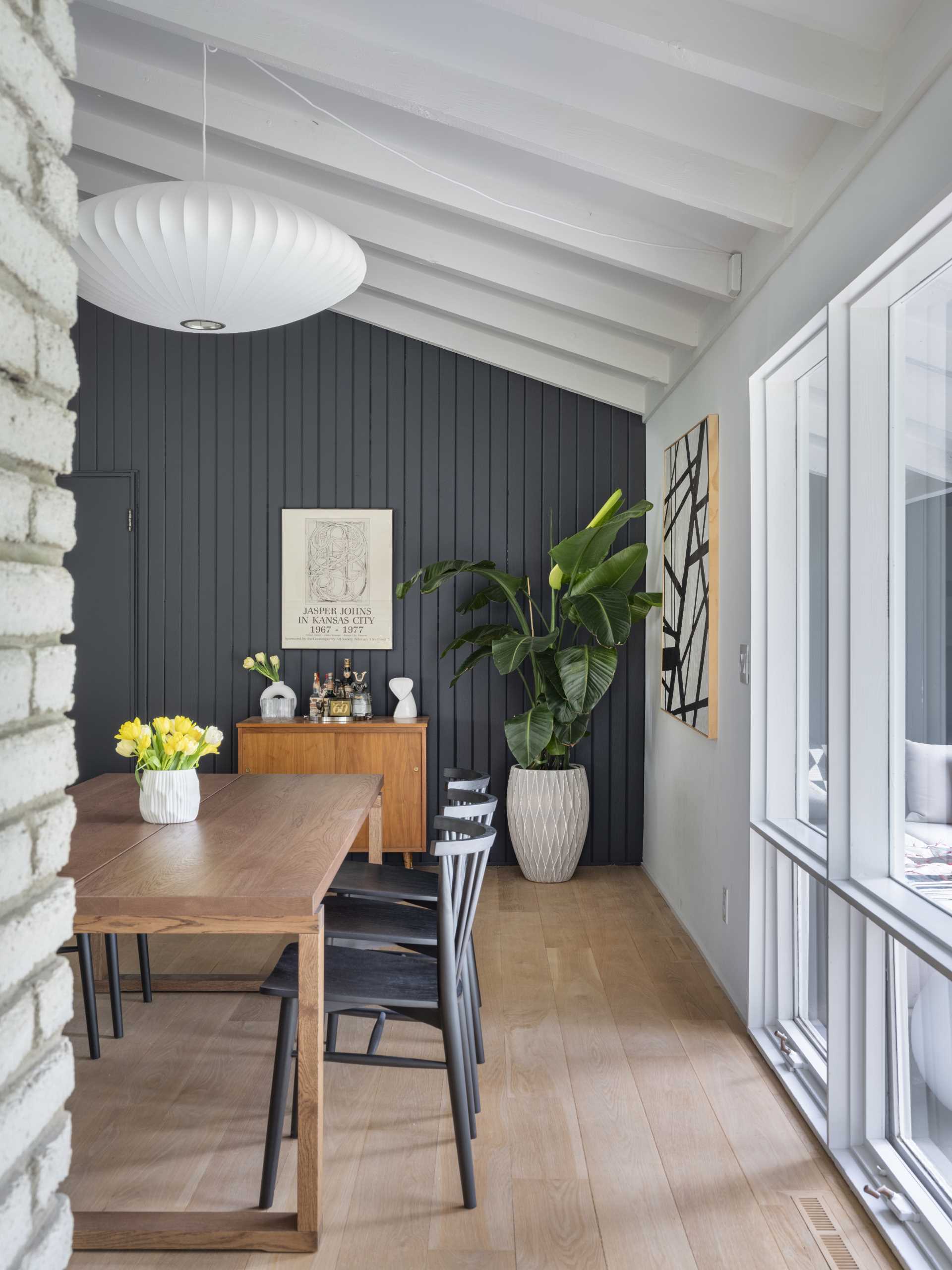
A large wood table creates plenty of space for dining, while the original double-sided fireplace was kept as a feature.
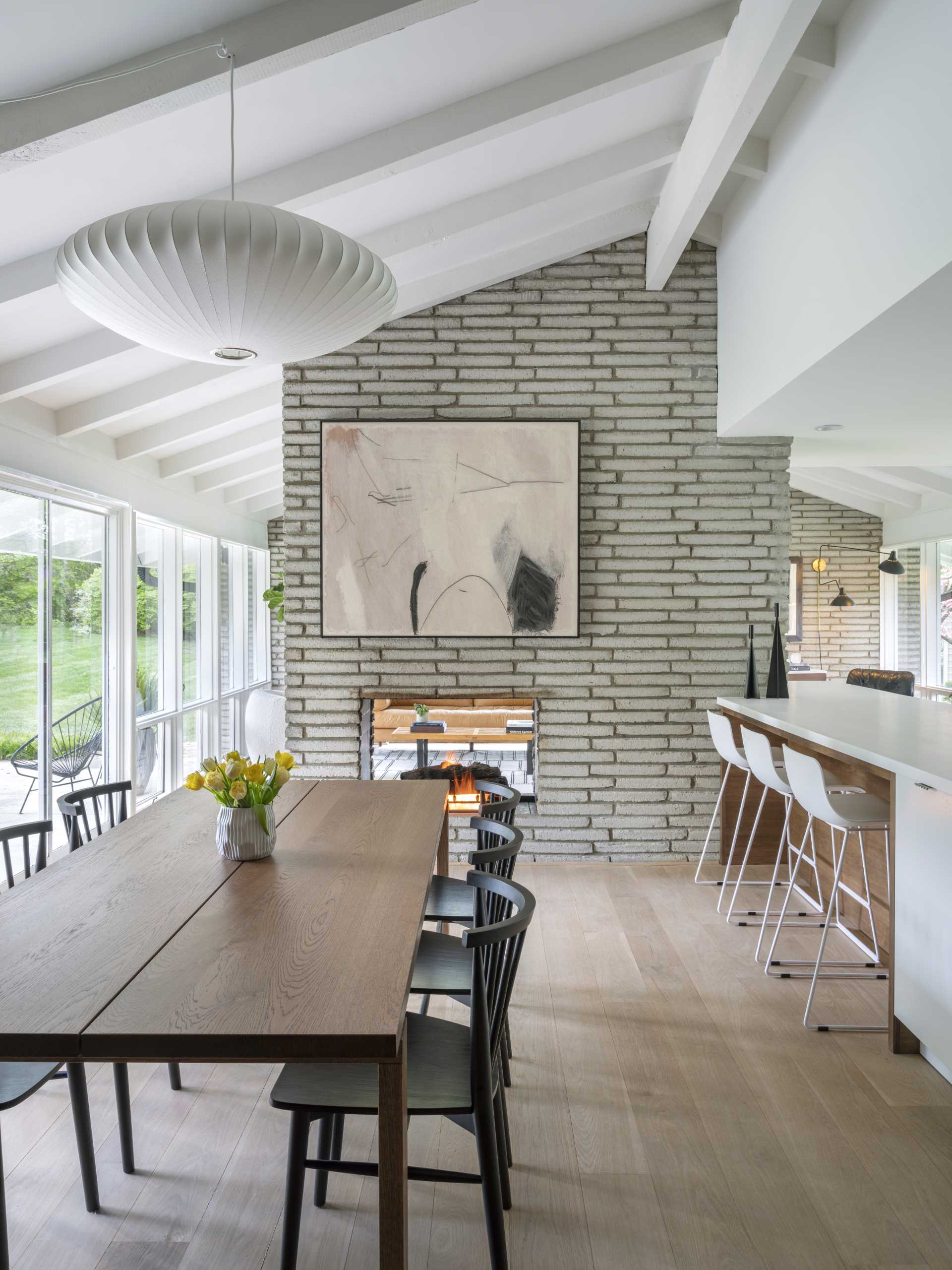
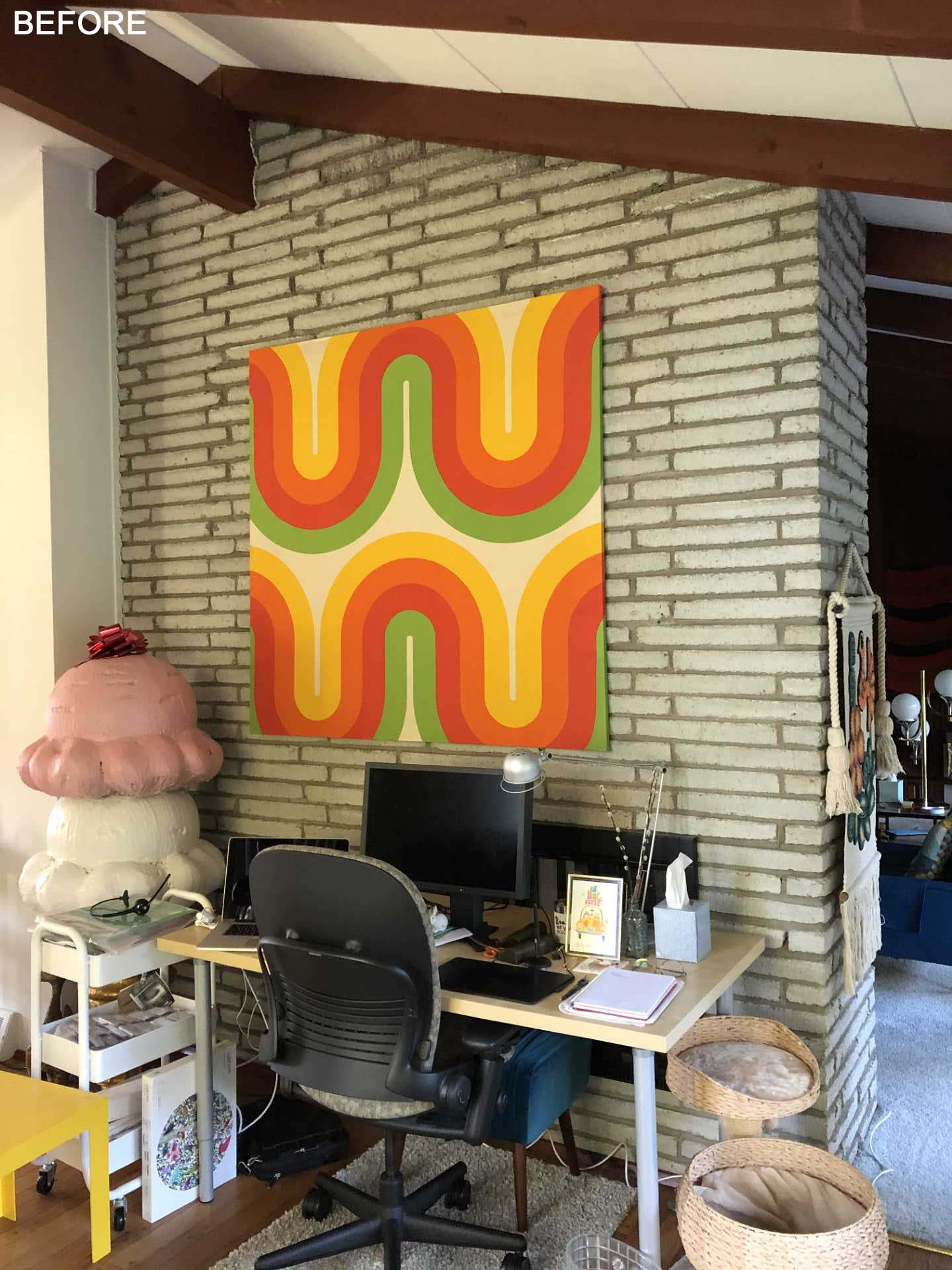
On the other side of the fireplace is the living room. Previously, the fireplace was used as a backdrop for a home office, however now, the double-sided fireplace can be used as intended, with the artwork replaced by a TV.
The minimally furnished living room looks out towards the rear patio, while the other side of the living room opens up into a sitting area that overlooks the street.
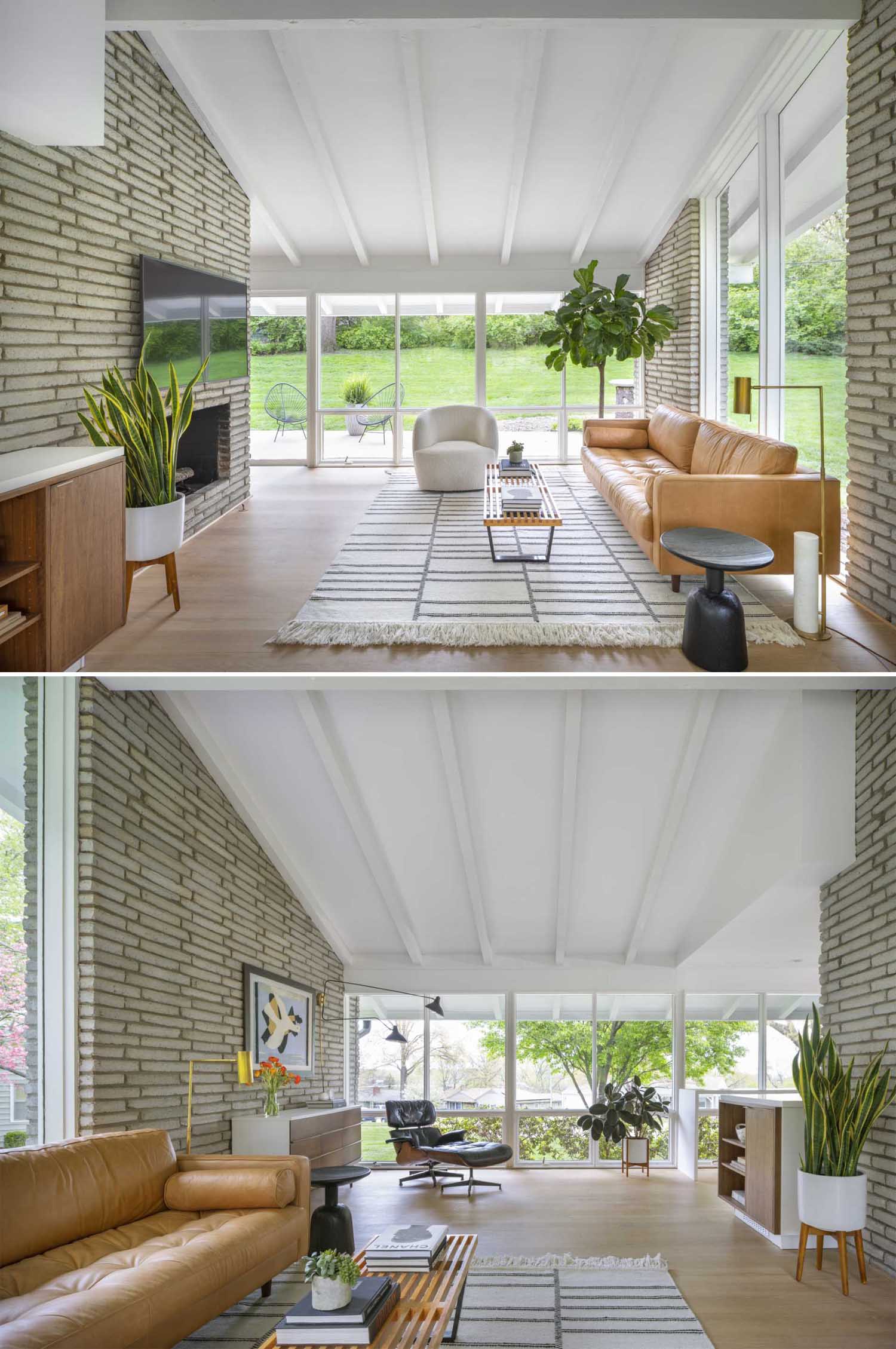
The sitting area has views of the kitchen, which before the renovation, was closed off with a wall of cabinetry and had a doorway connecting it to the entryway.
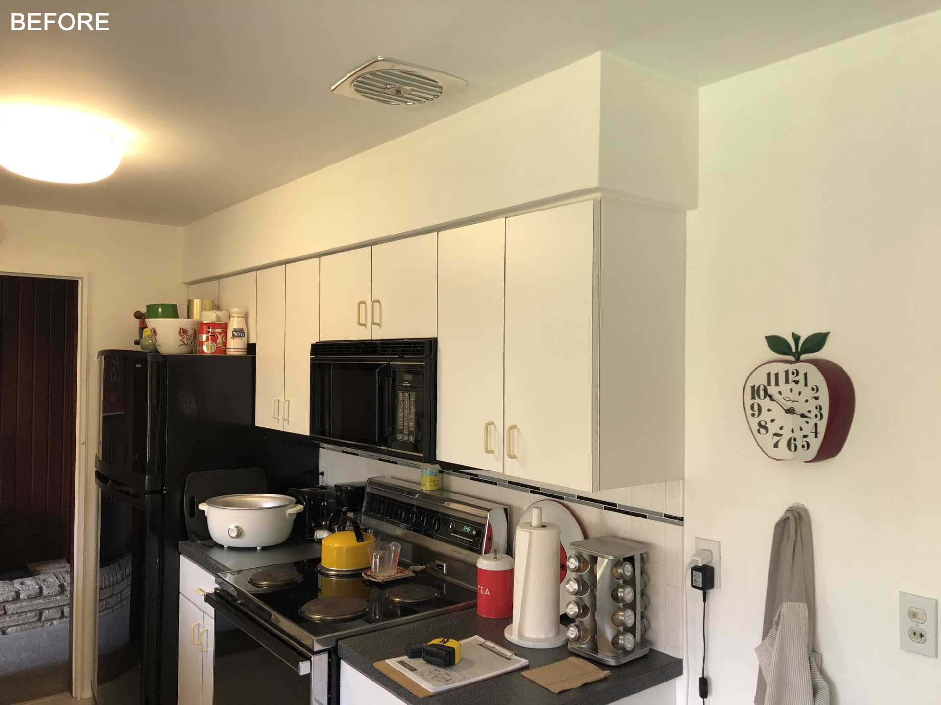
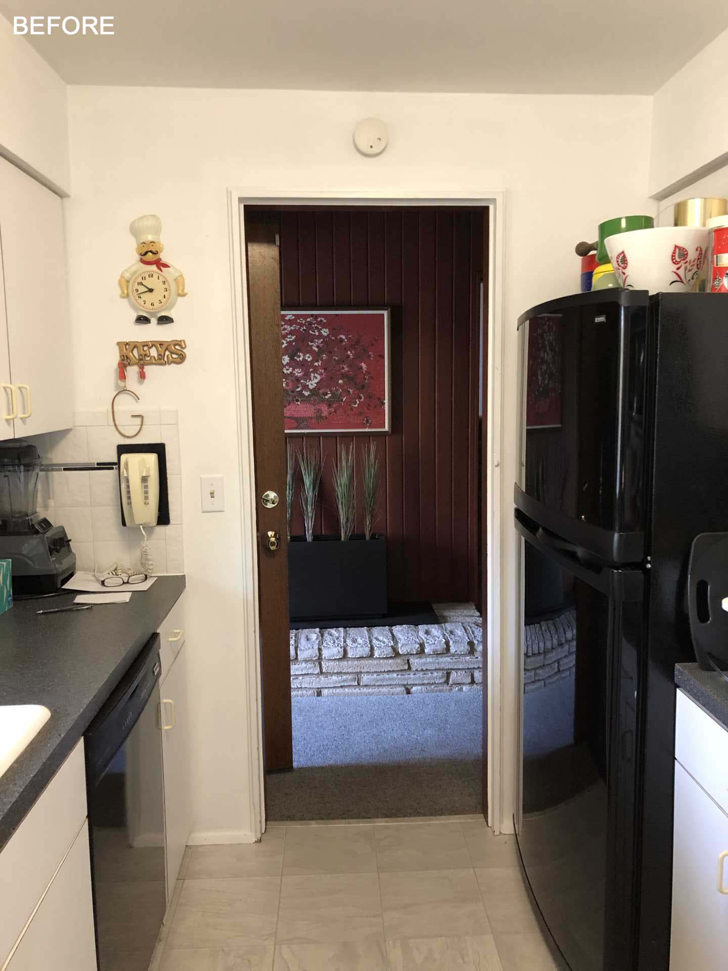
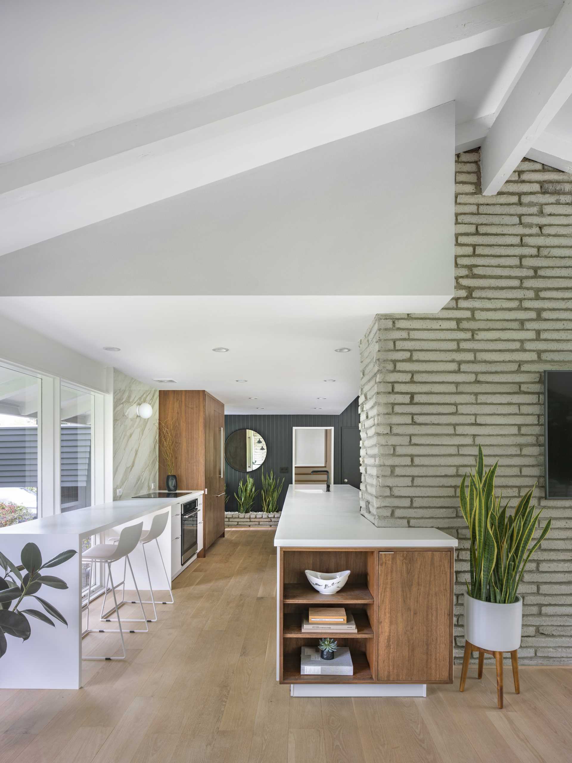
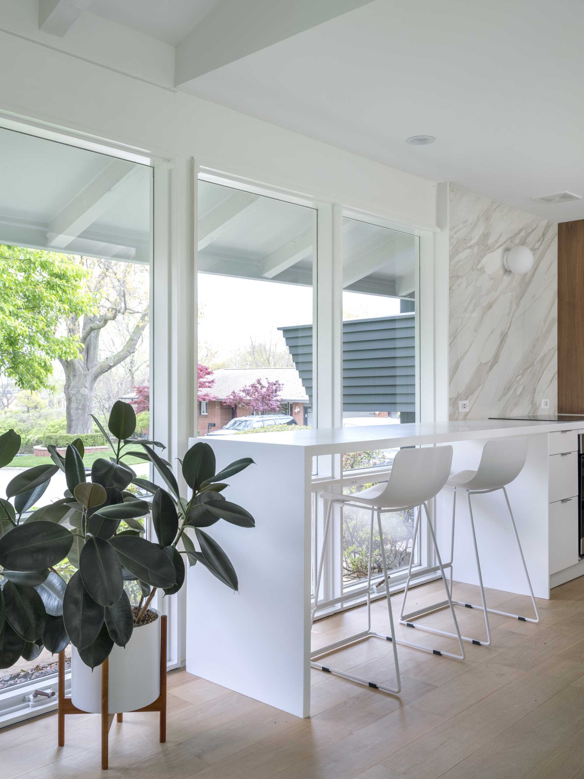
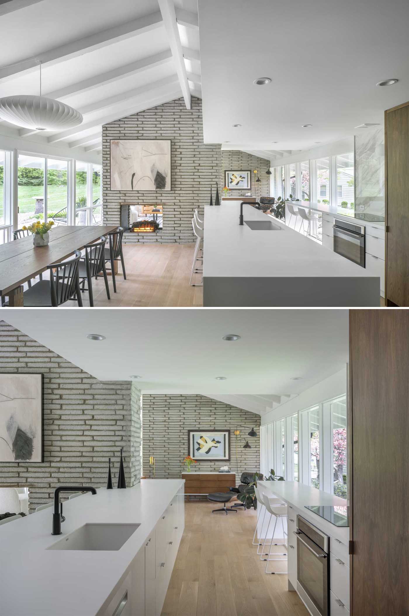
The new kitchen is bright and open with long white countertops and wood cabinets. On the left, a section of the kitchen has been dedicated to a bar area with seats by the window, while the opposite side travels from the living room to the dining room, with the countertop wrapping around the fireplace.
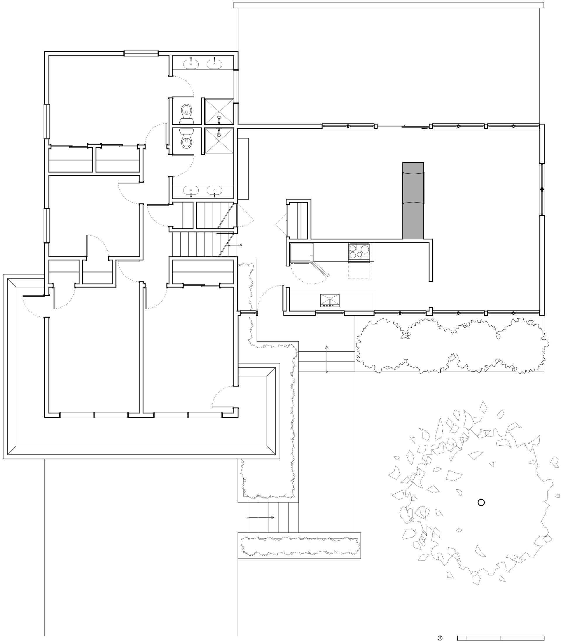
Here’s a look at the floor plan before the renovation that shows the closed-off kitchen.
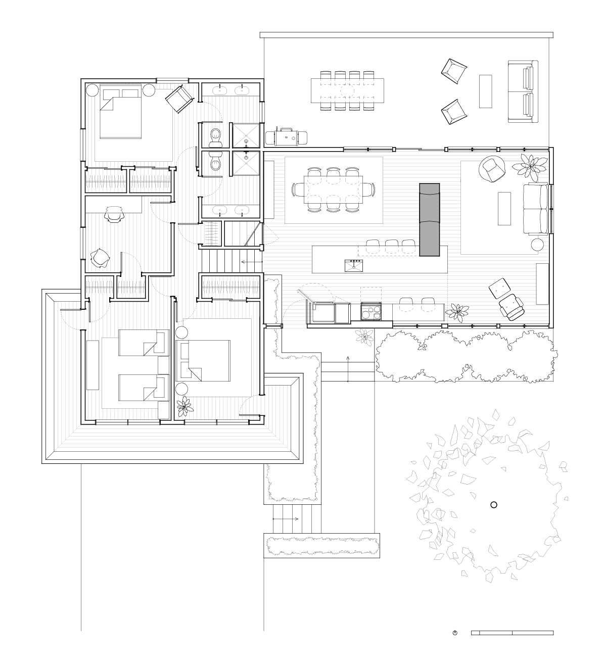
Here’s a look at the floor plan after the renovation that shows how the kitchen was opened up.
Photography by Bob Greenspan Photography
Source: Contemporist

